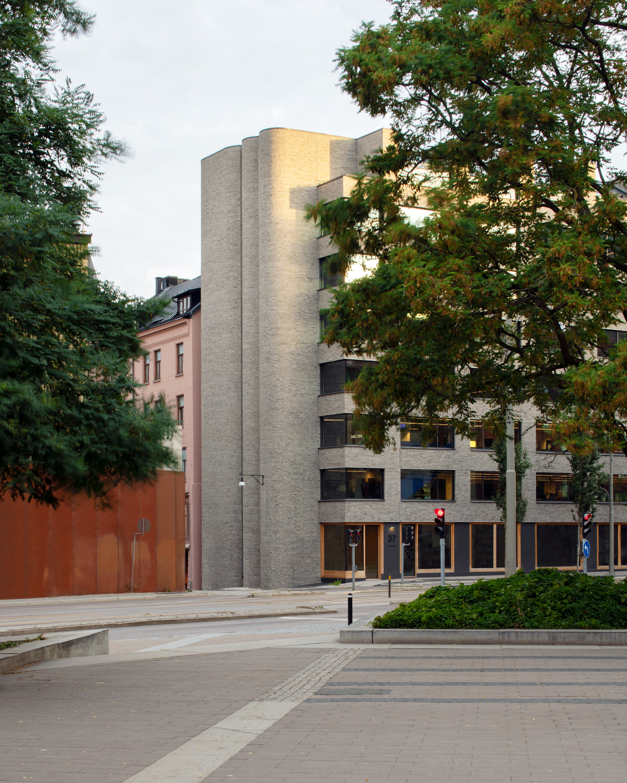
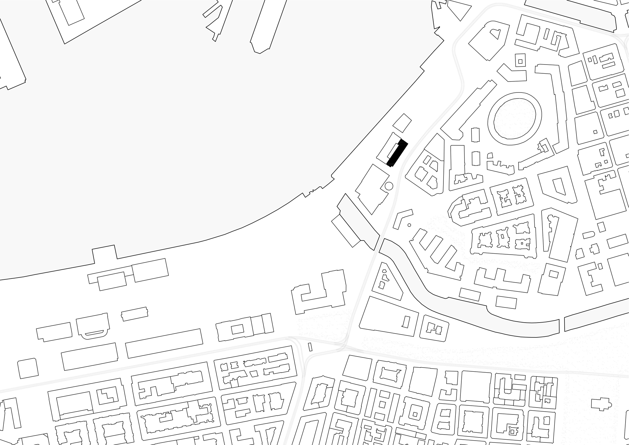
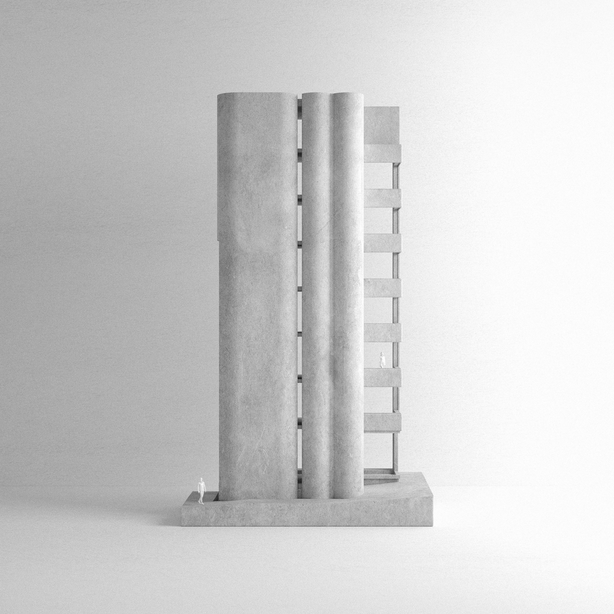
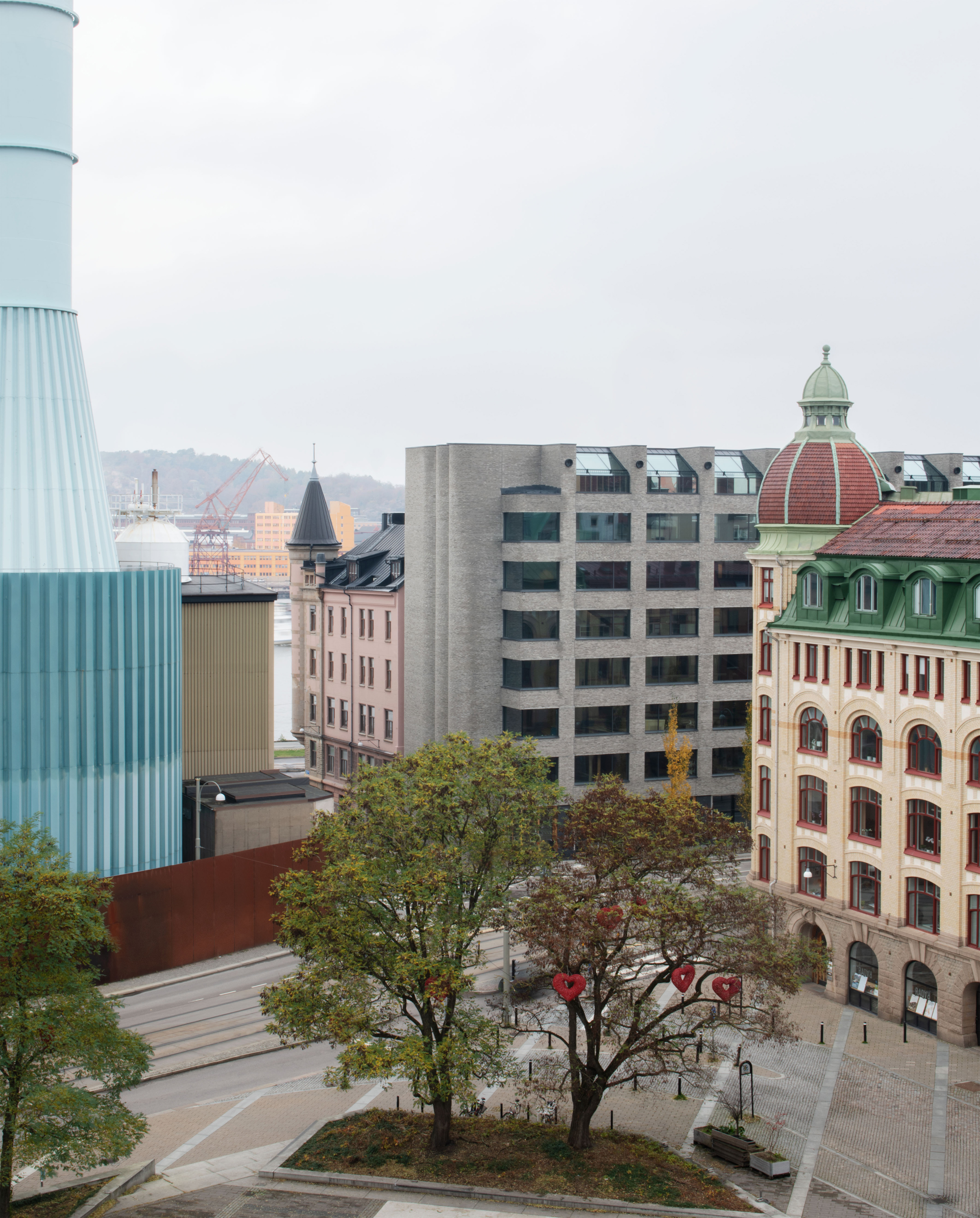
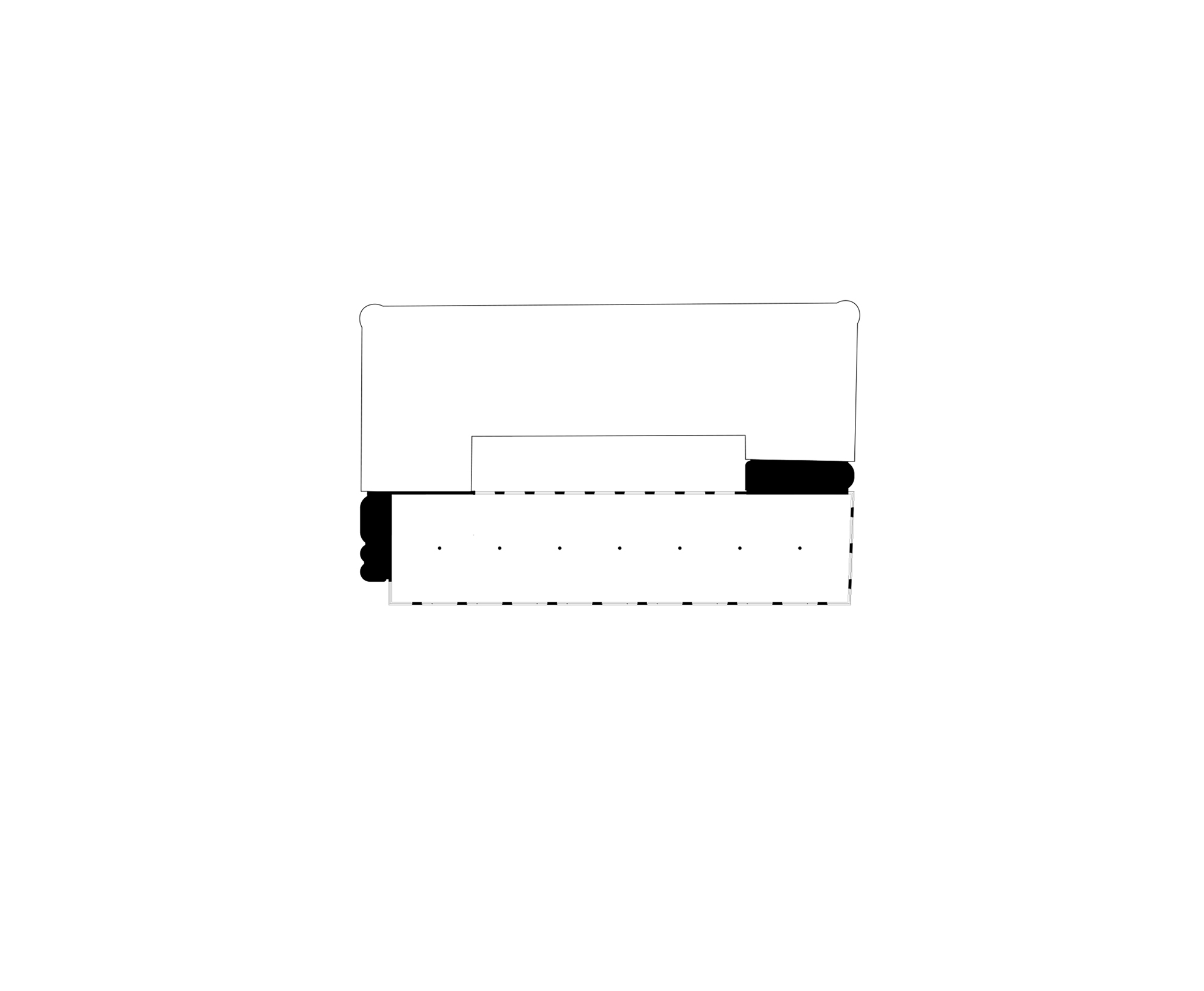
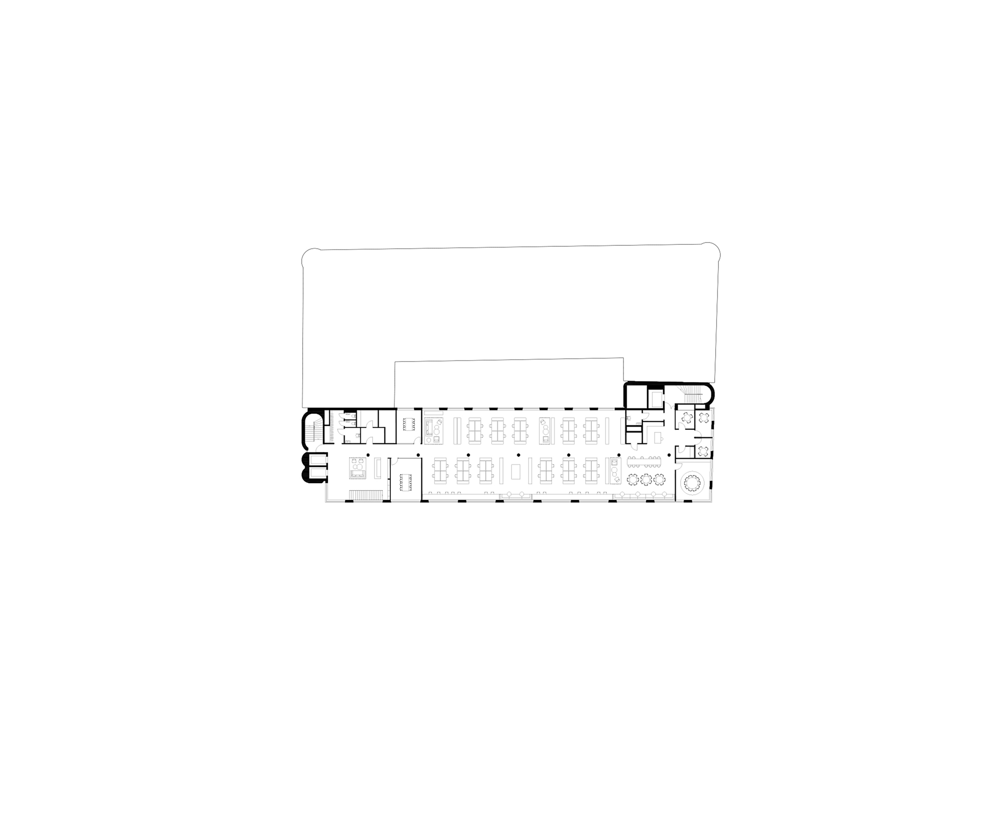
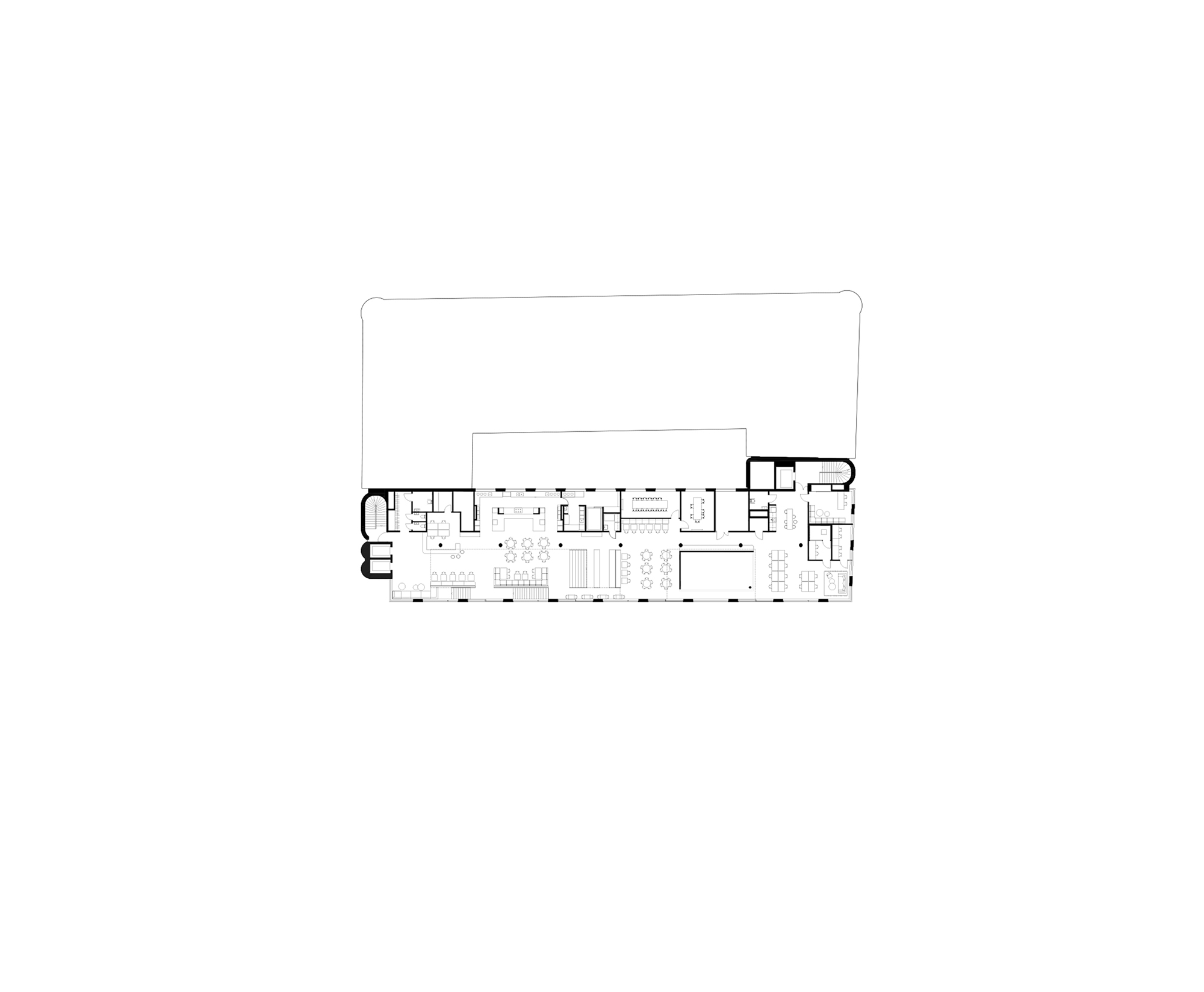
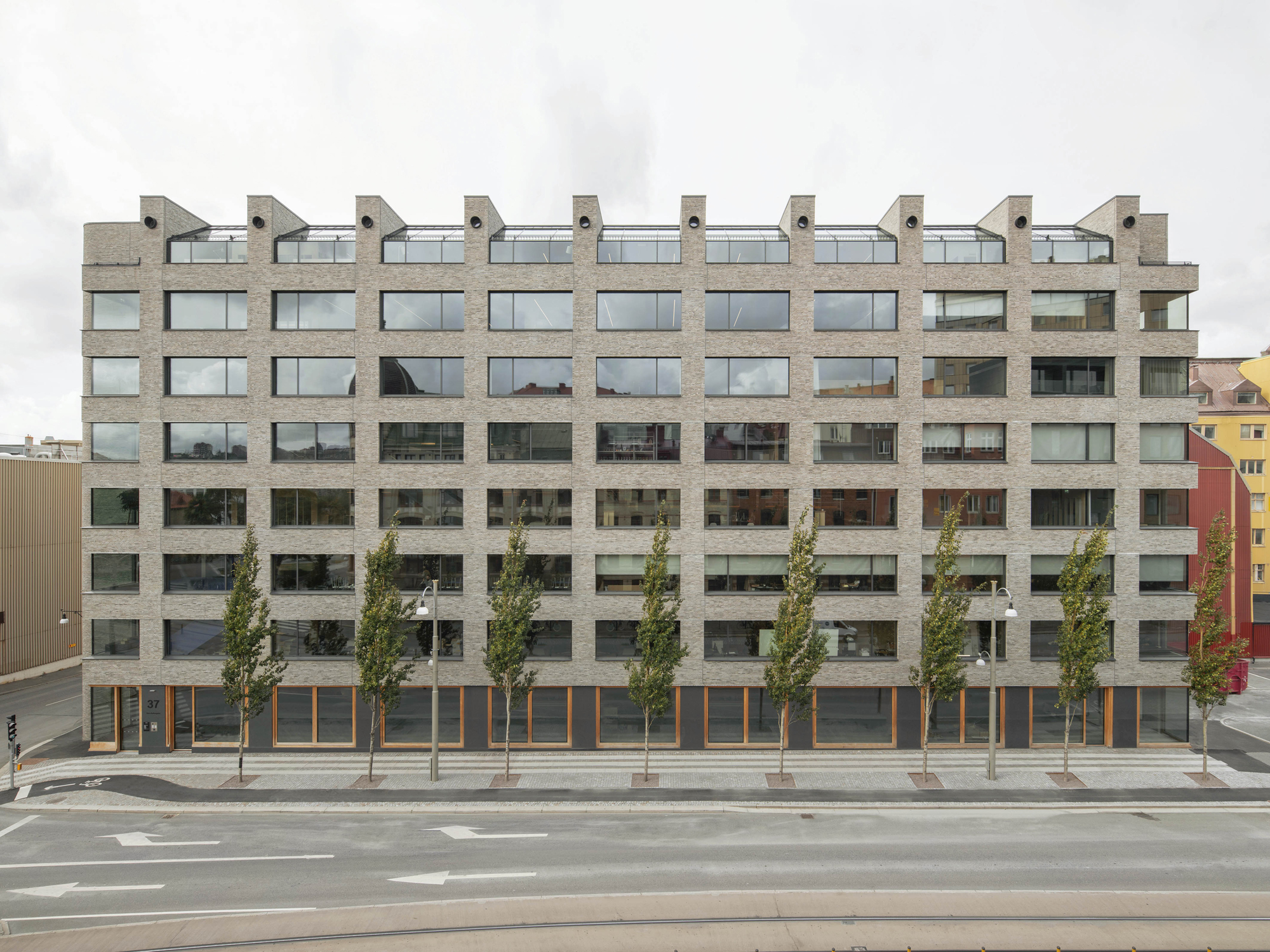
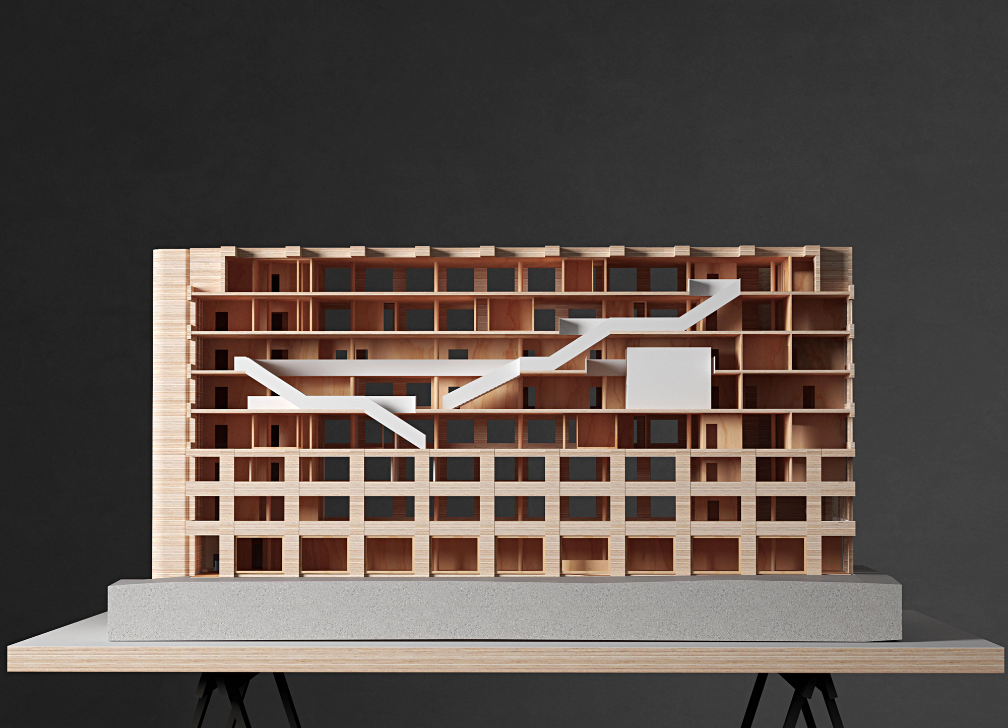
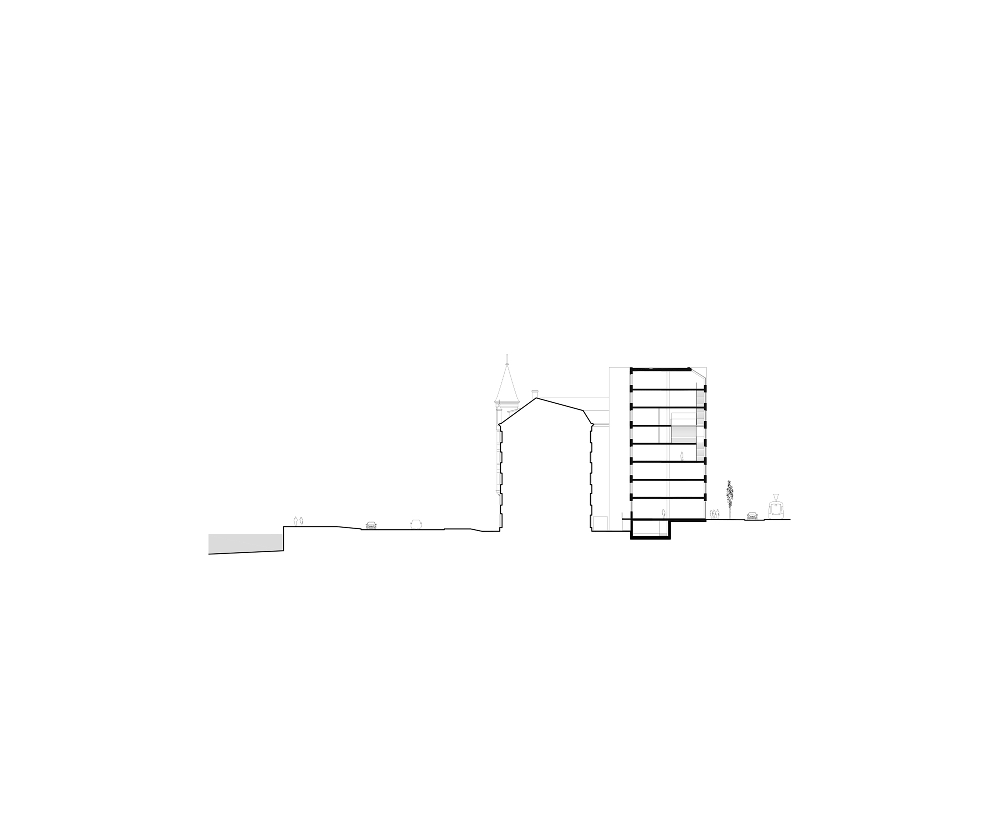
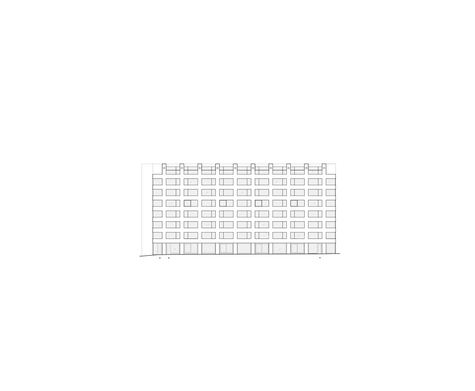
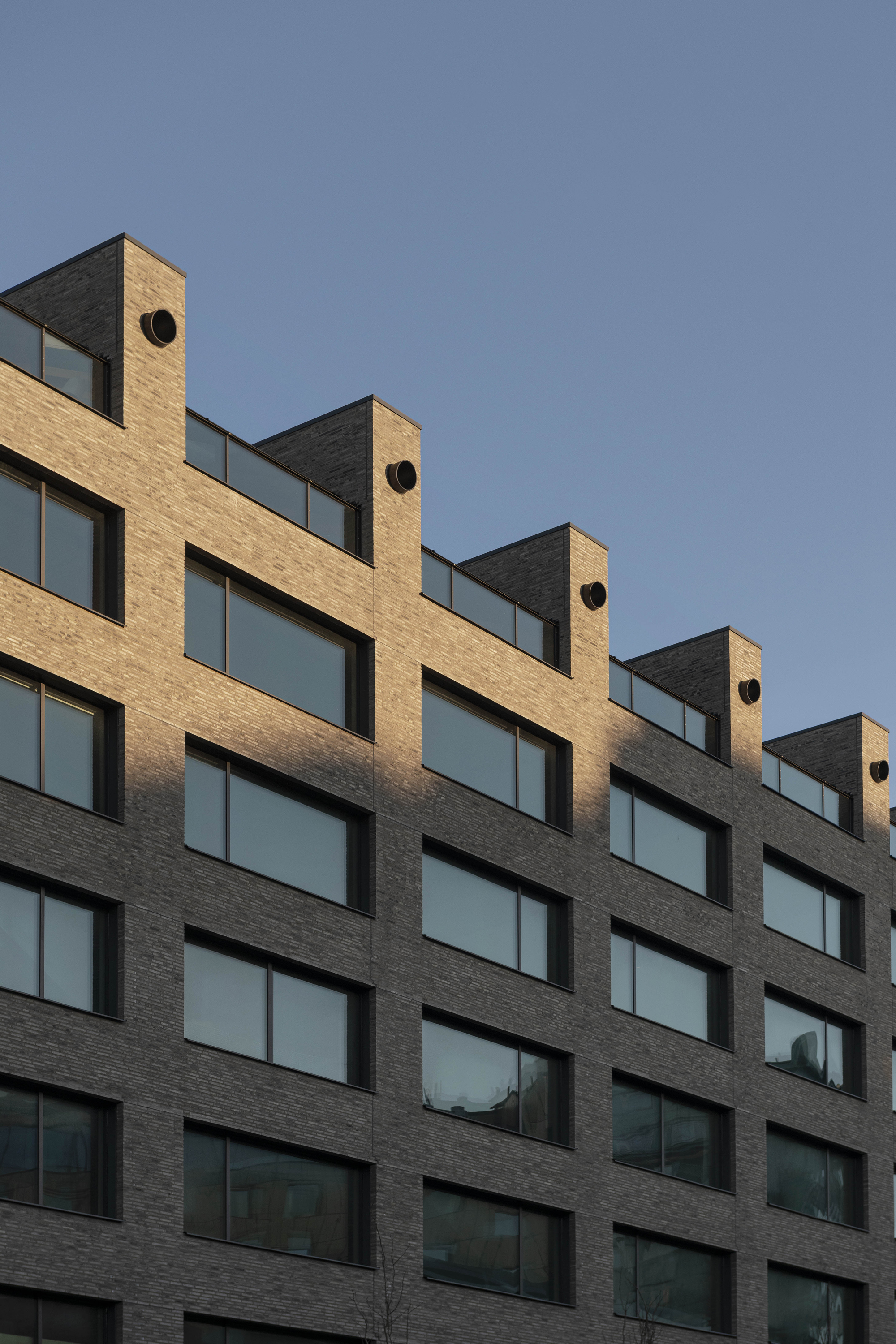
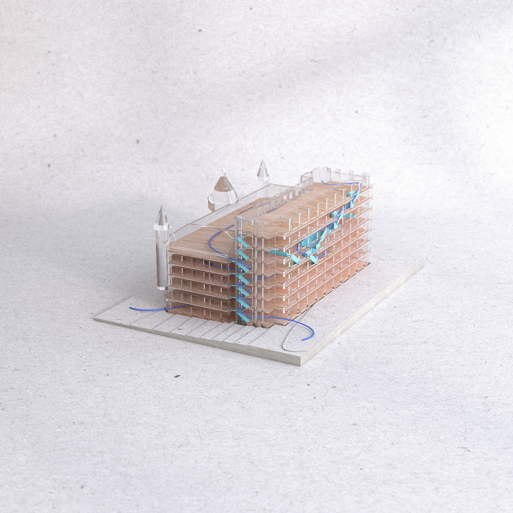
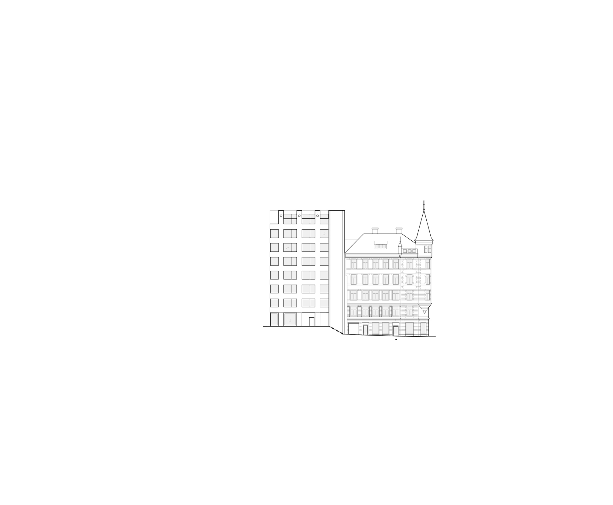
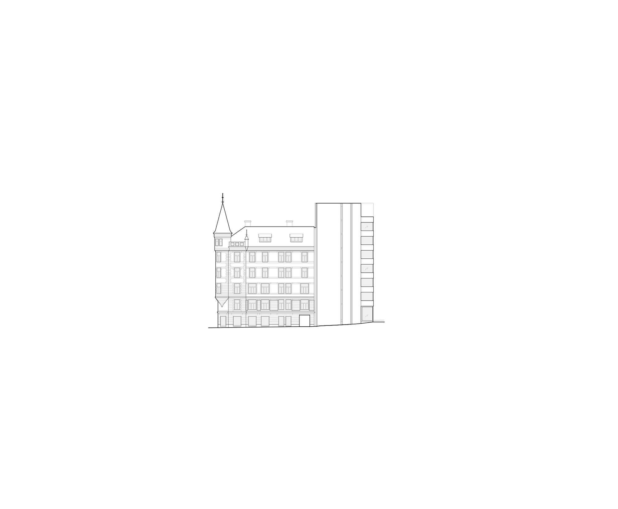
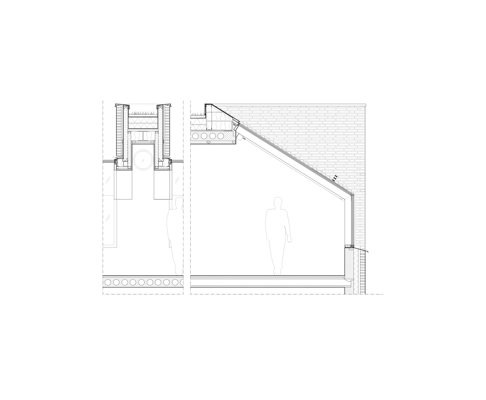
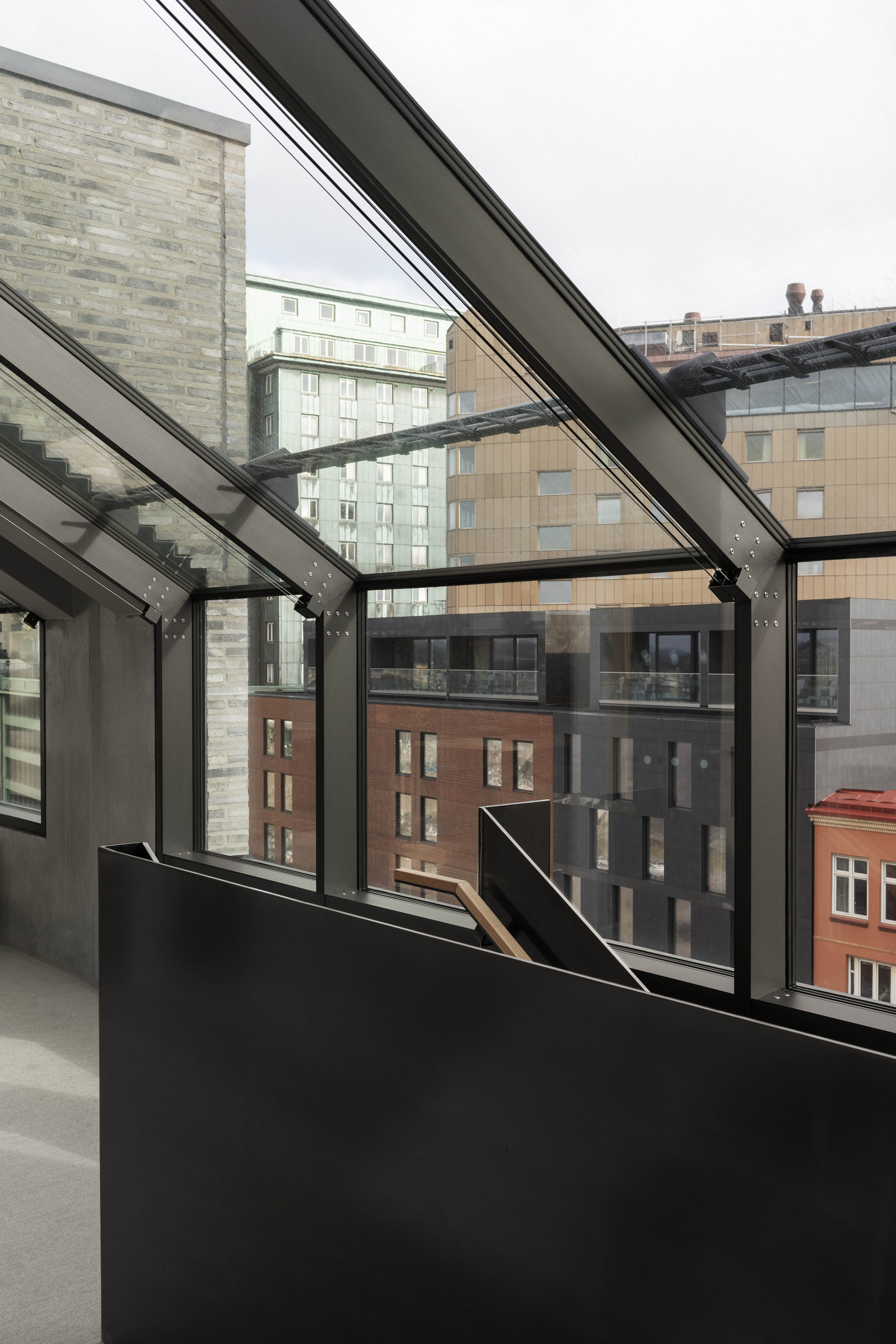
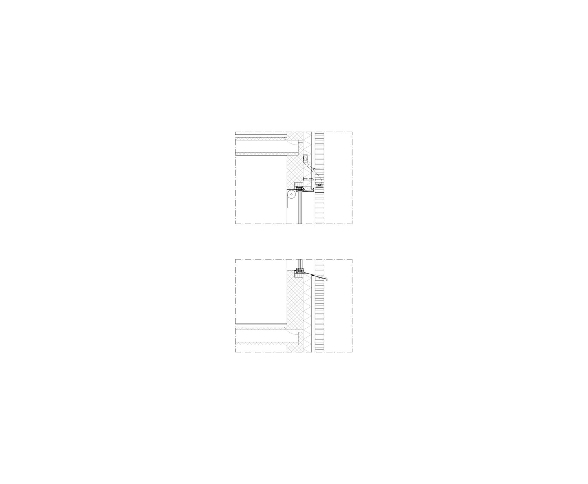
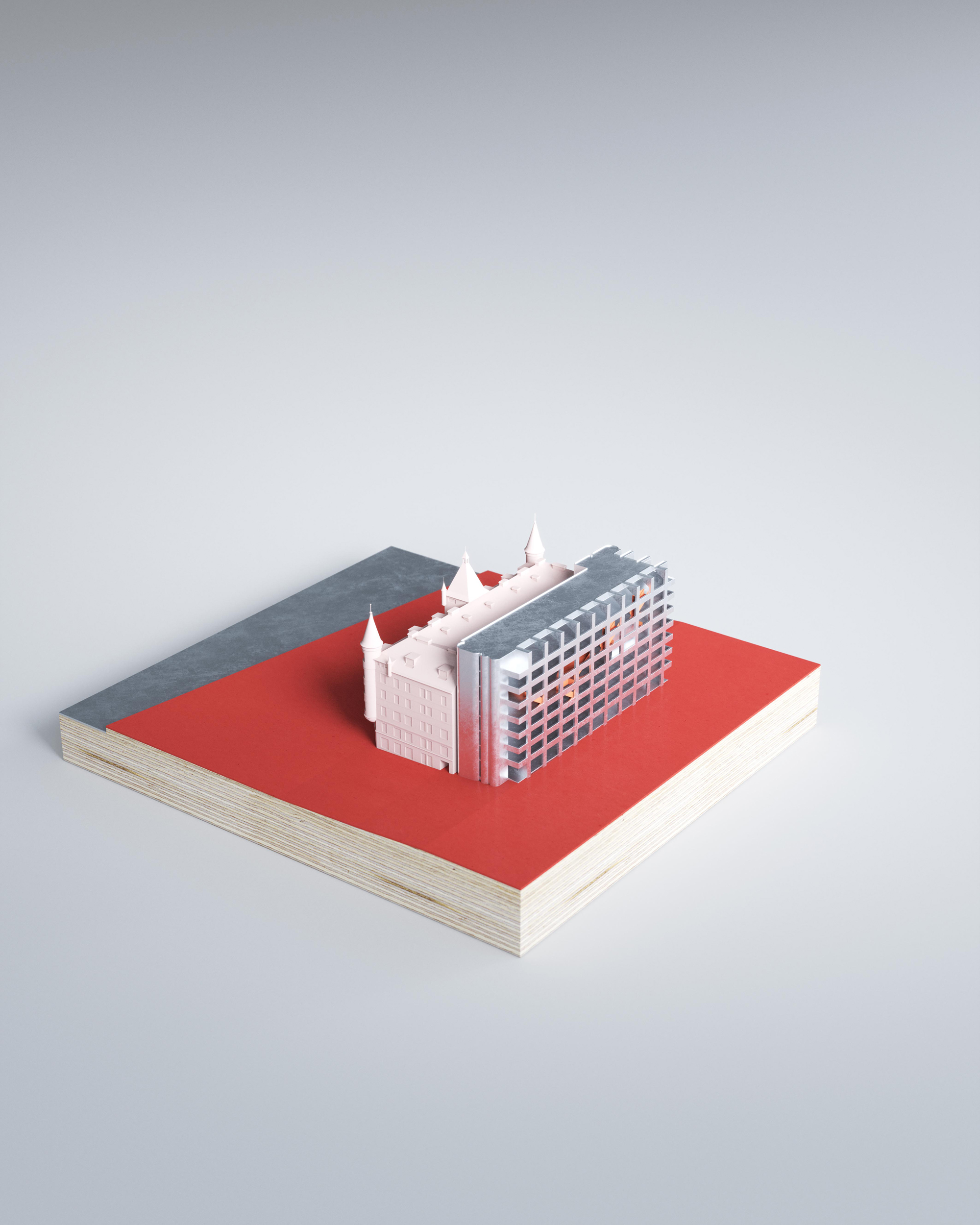
The design of Merkurhuset was largely influenced by the conditions of the zoning plan, as well as the irregular shape and limited area of the plot. As a result of the maximum allowed building height, the outer wall of the top floor was angled, resembling a studio window. By allowing the intermediate pillars to rise through the glass, the building obtained its signature look. Taking inspiration from SOM’s classic Inland Steel Building in Chicago, which was constructed in 1958, Merkurhuset adopted a similar approach. The vertical systems of the building were separated from the horizontal floor plans, forming a separate building volume. This design strategy created open and rational office plans without the need for shafts or pillars. The exterior of the building was defined by the frame, elevators, and stairwells.
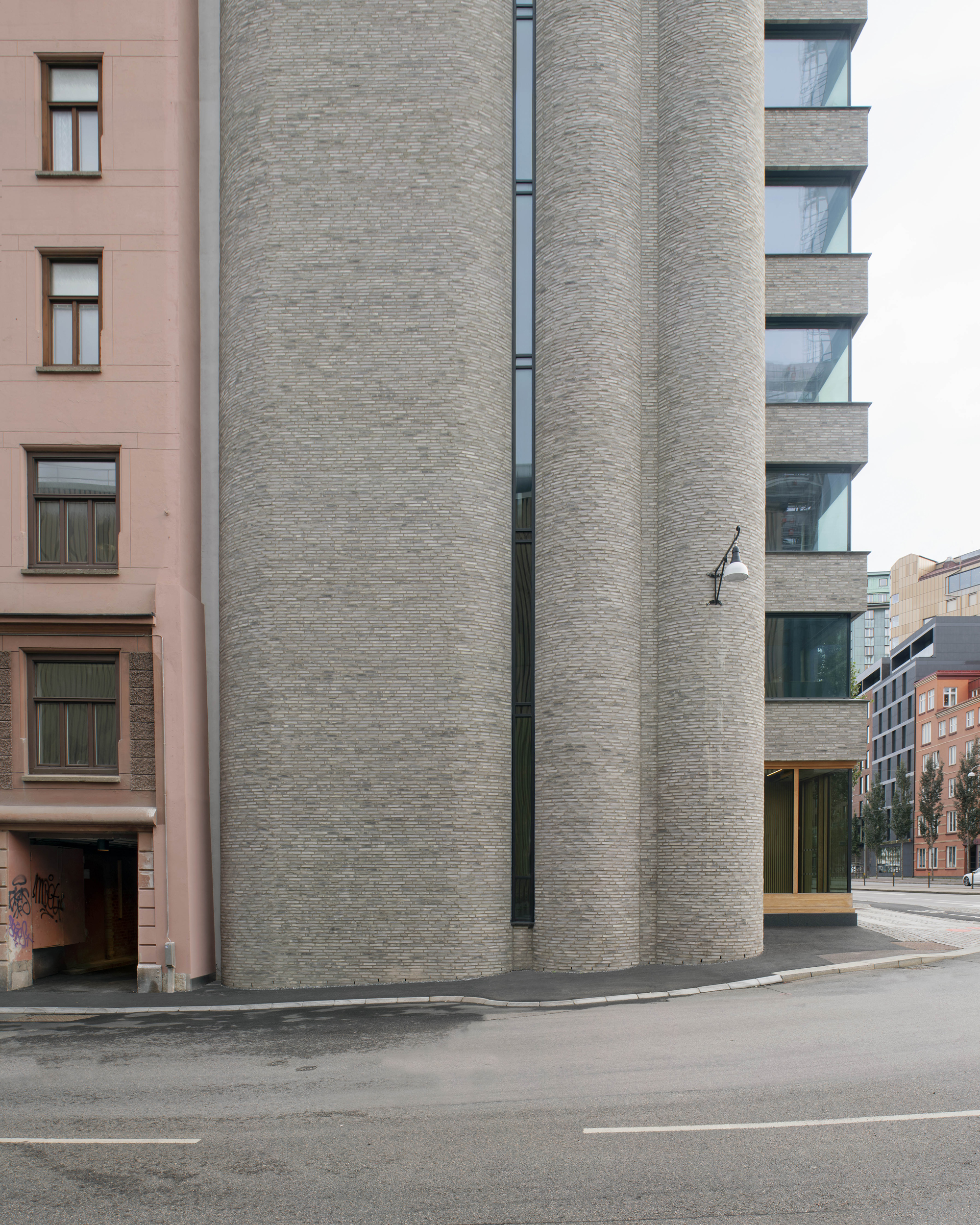
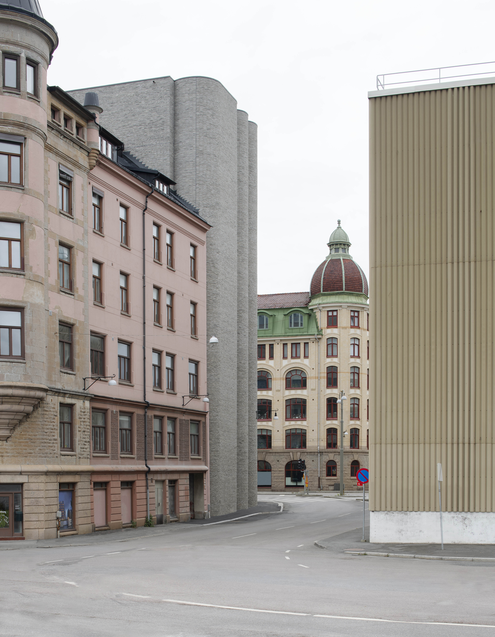
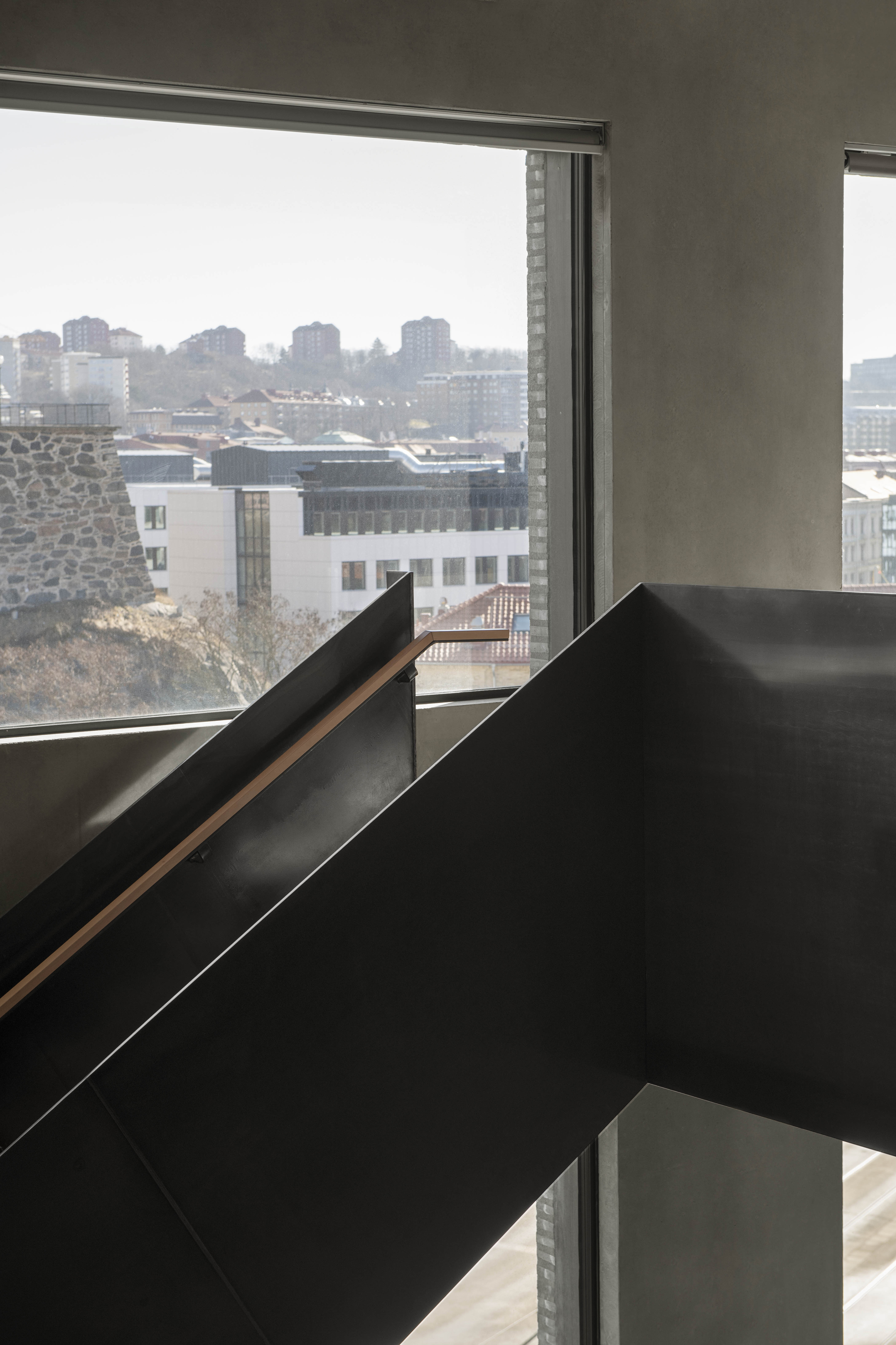
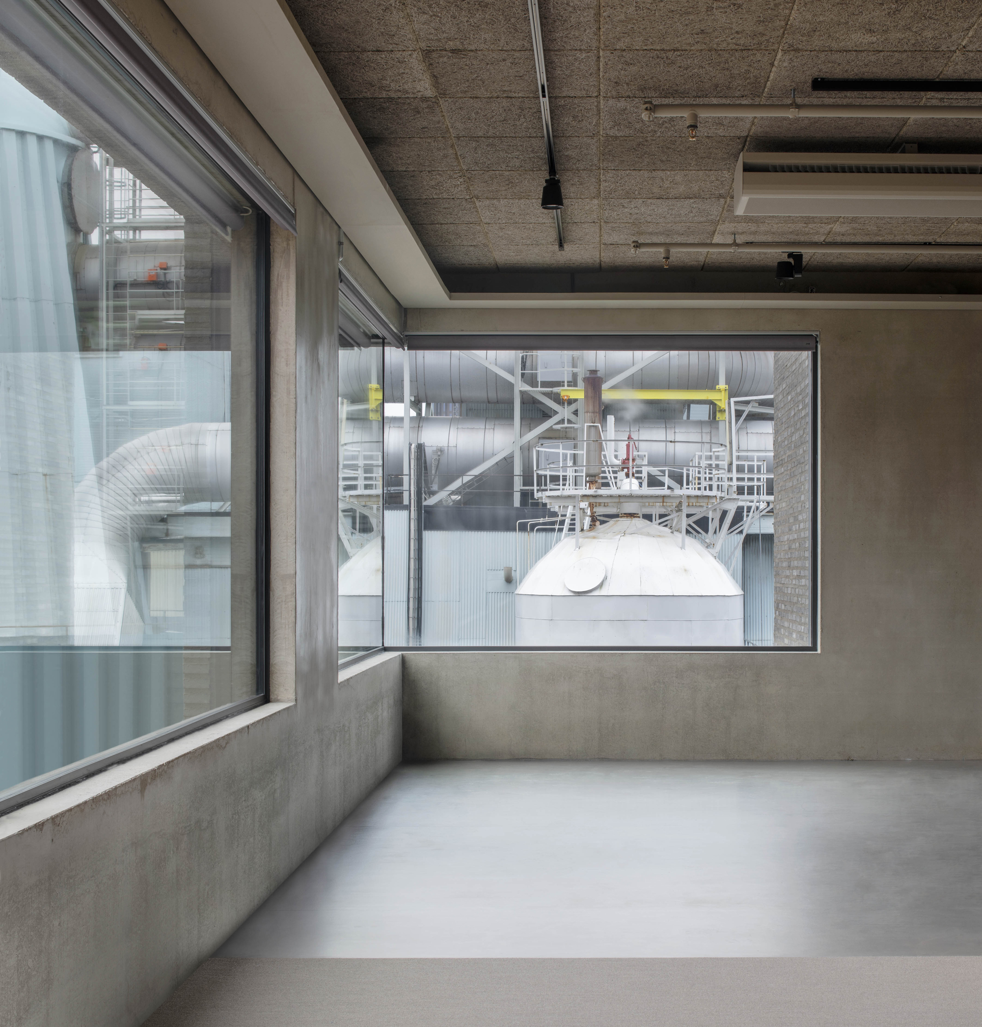
In Merkurhuset, the stairwell and elevator shaft were strategically placed at each end of the building, maximizing the open office plans. The vertical structures took the shape of masonry cylinders built with Danish Flensburg brick, paying homage to the nearby Rosenlundsverket heating plant and the rounded bay windows of the old Merkurhuset. These sculptural elements allowed for the optimal utilization of the plot.
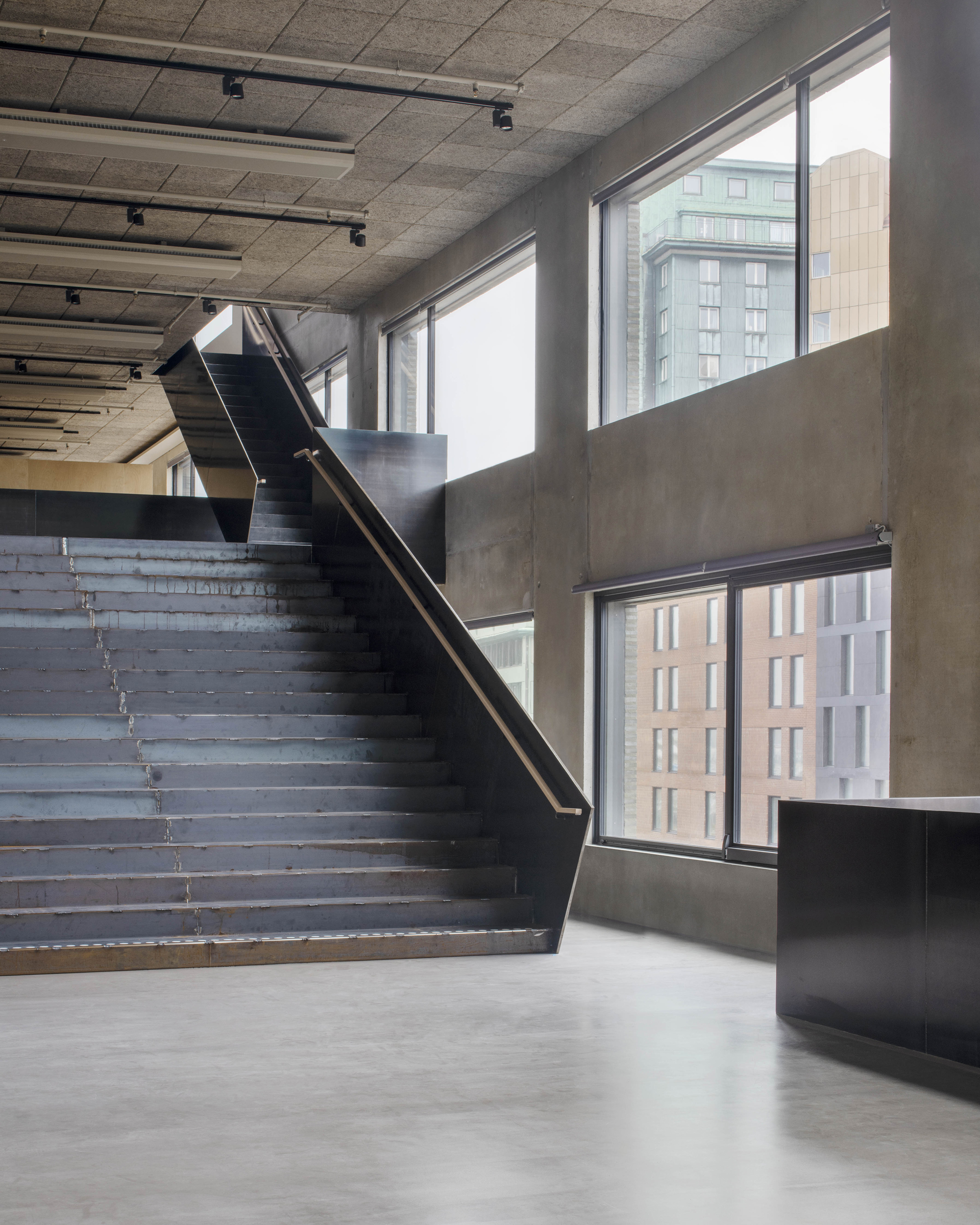
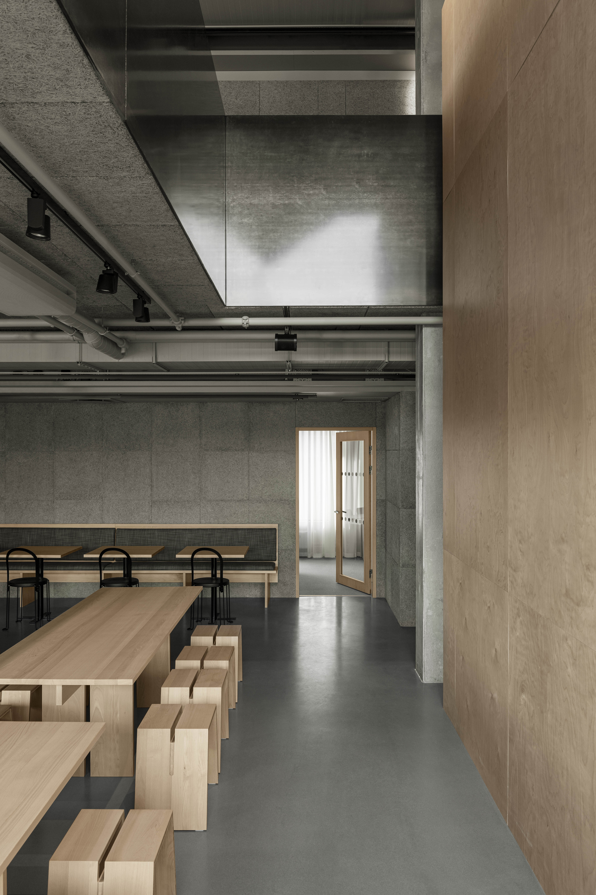
The interior design of Merkurhuset was developed in close collaboration with the tenant, advertising agency Forsman & Bodenfors, and drew inspiration from the aesthetics of industrial buildings. Clean materials and visual simplicity were key elements. The design aimed to emphasize the character of the built materials while minimizing additional surface layers, resulting in an “outside, inside” concept.
