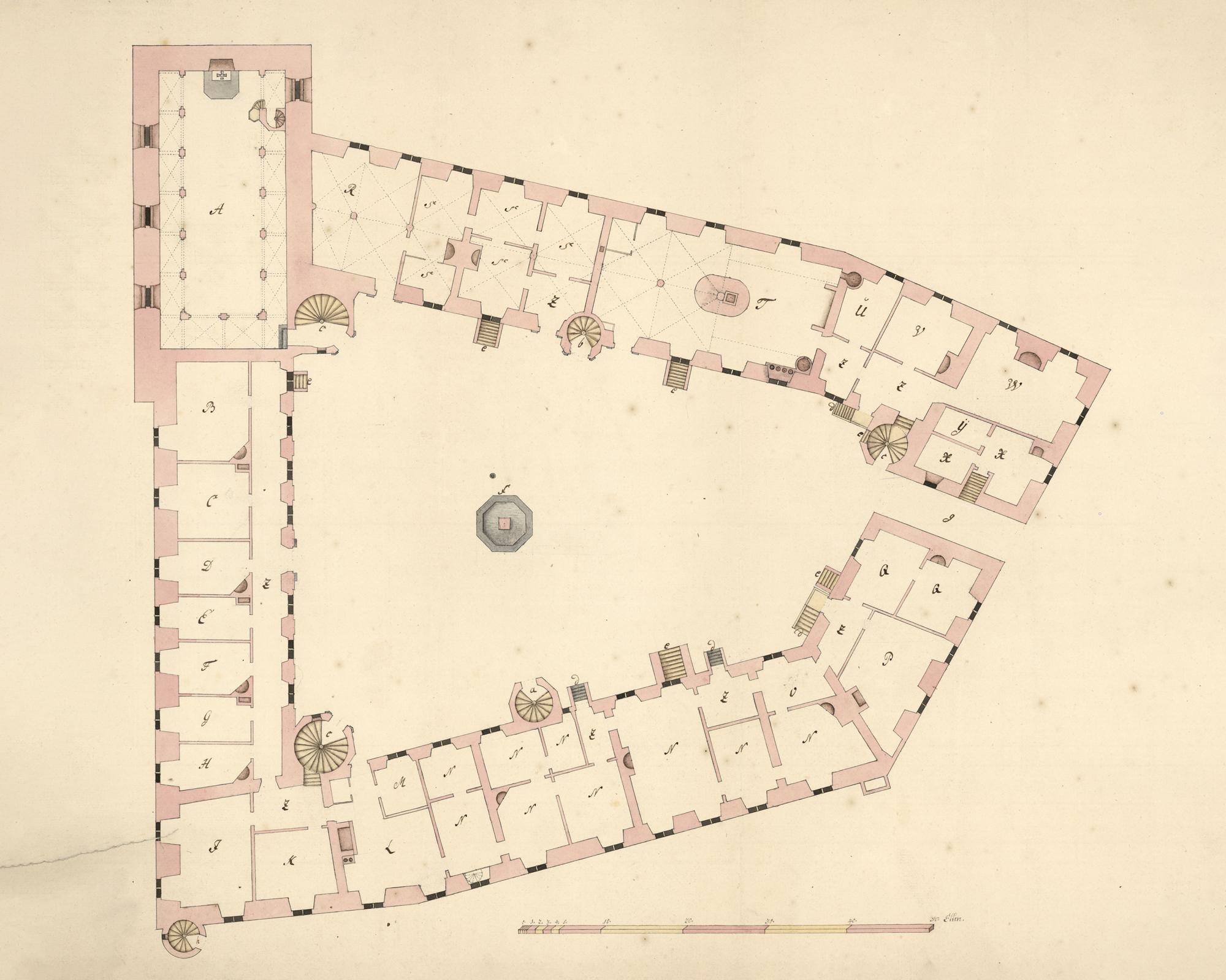
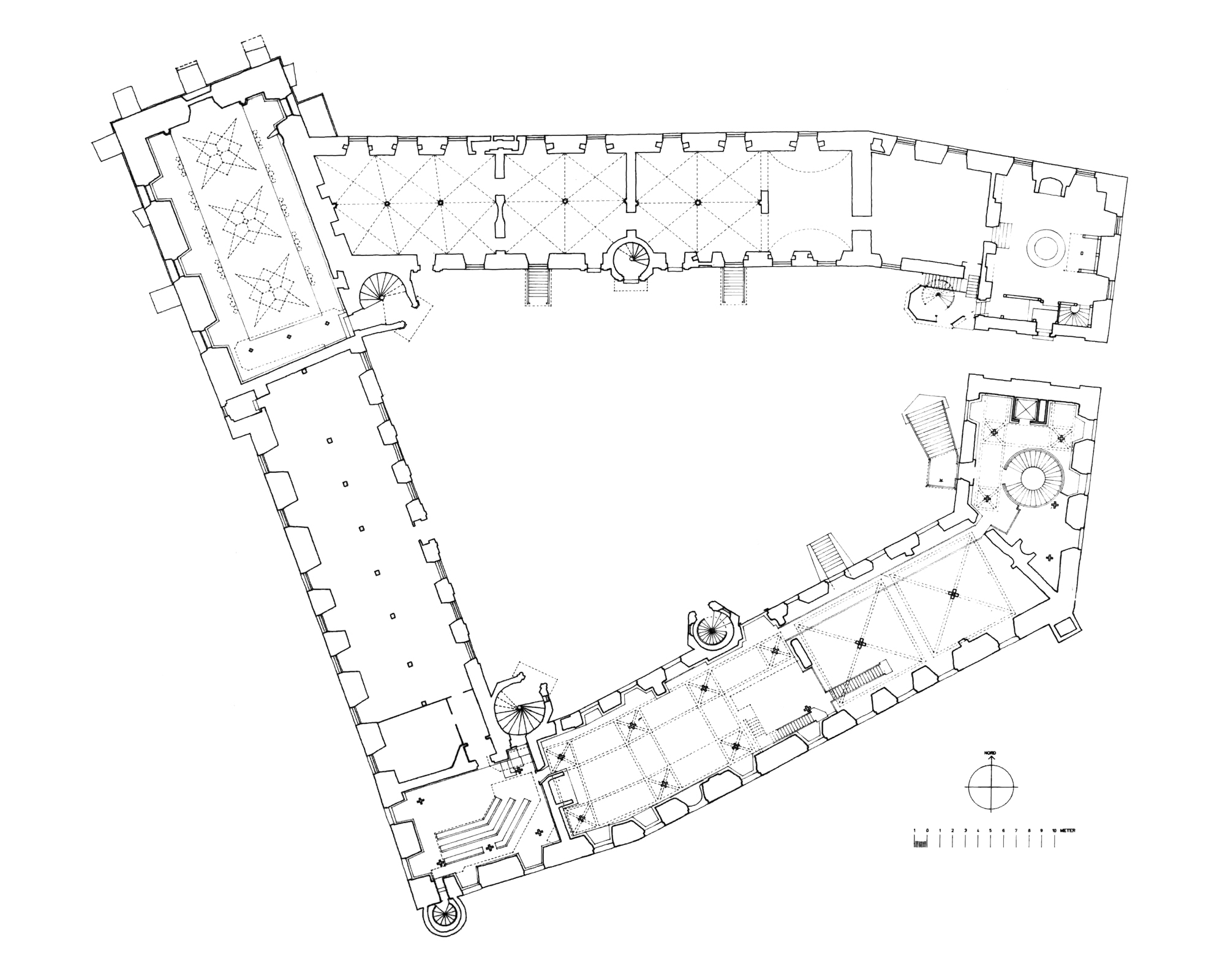
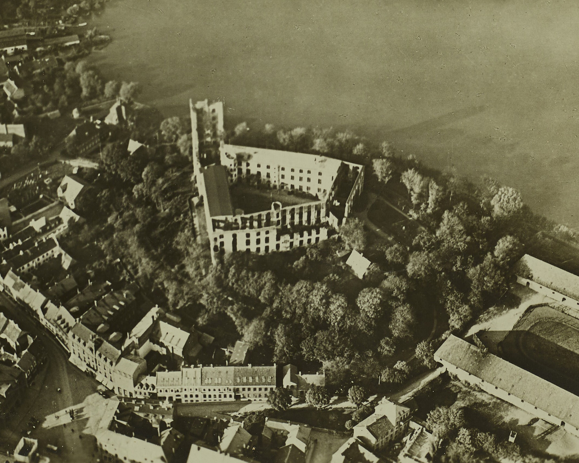
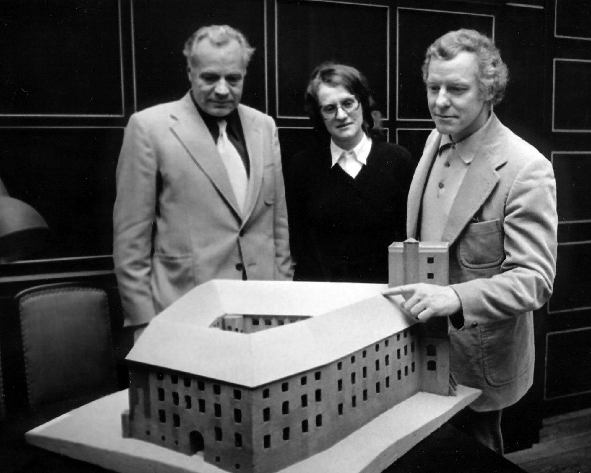
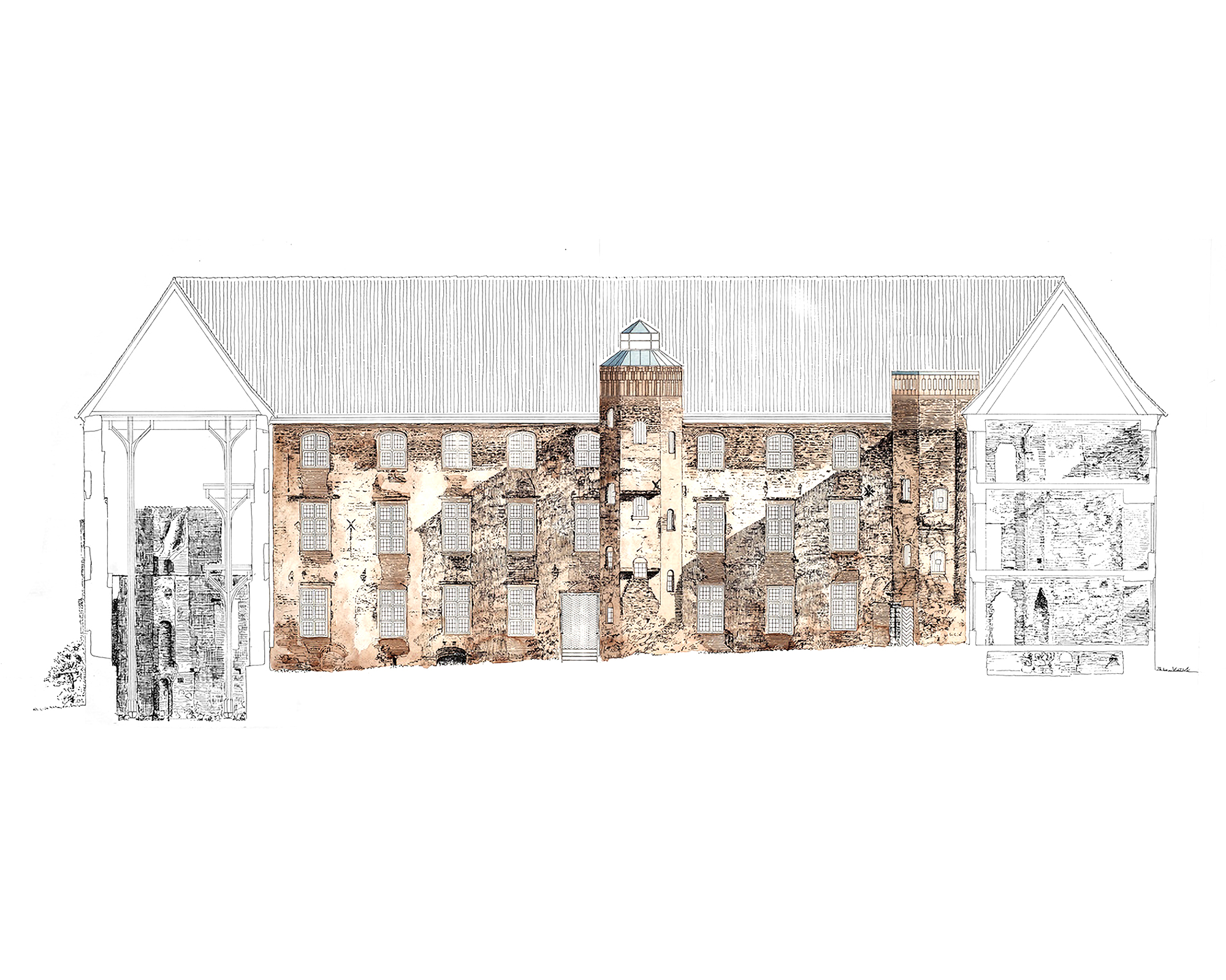
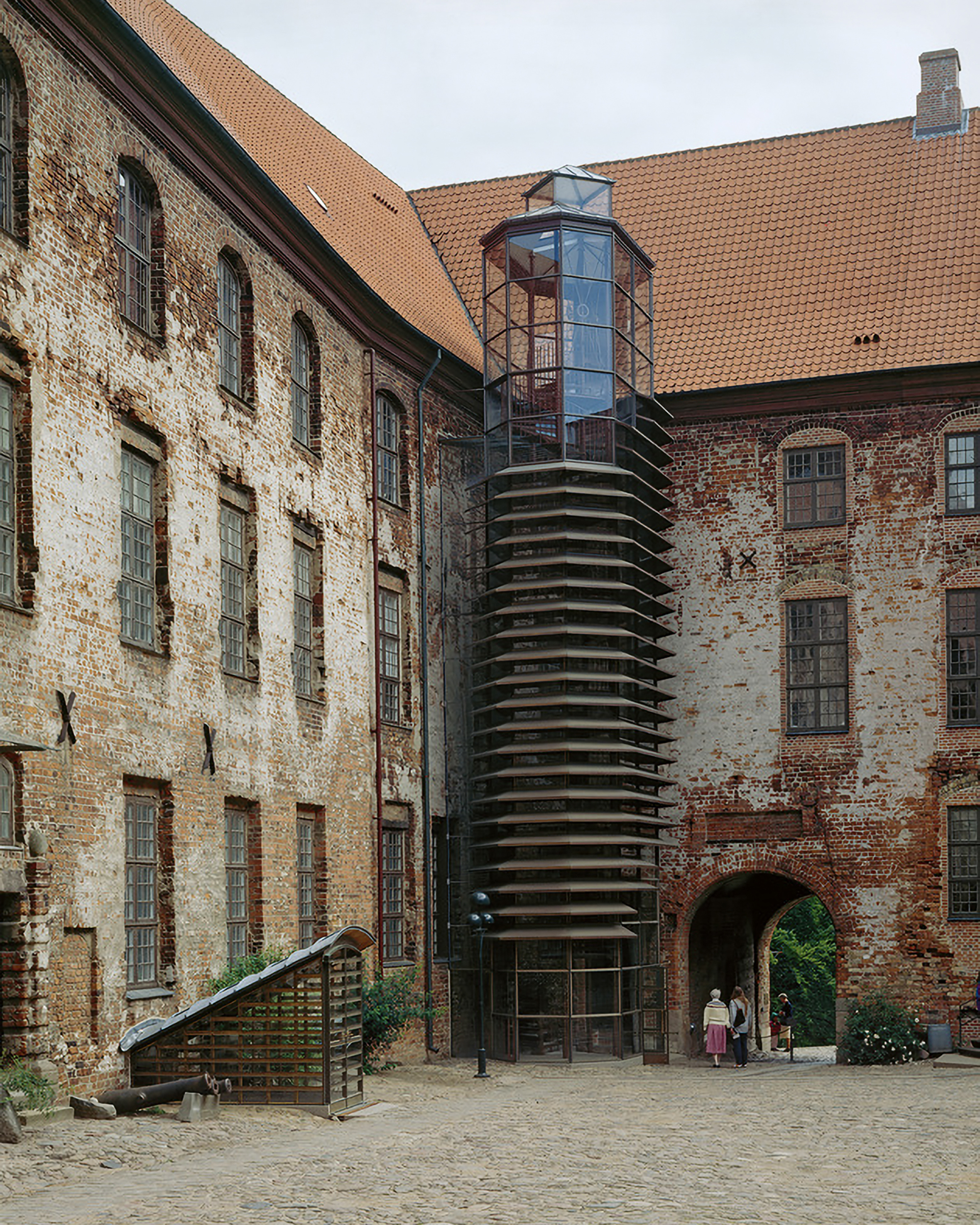
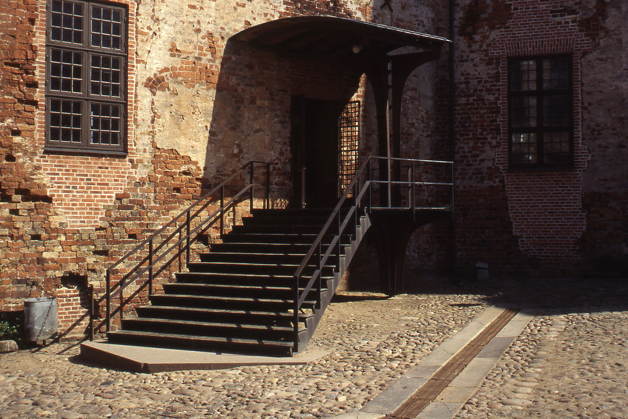
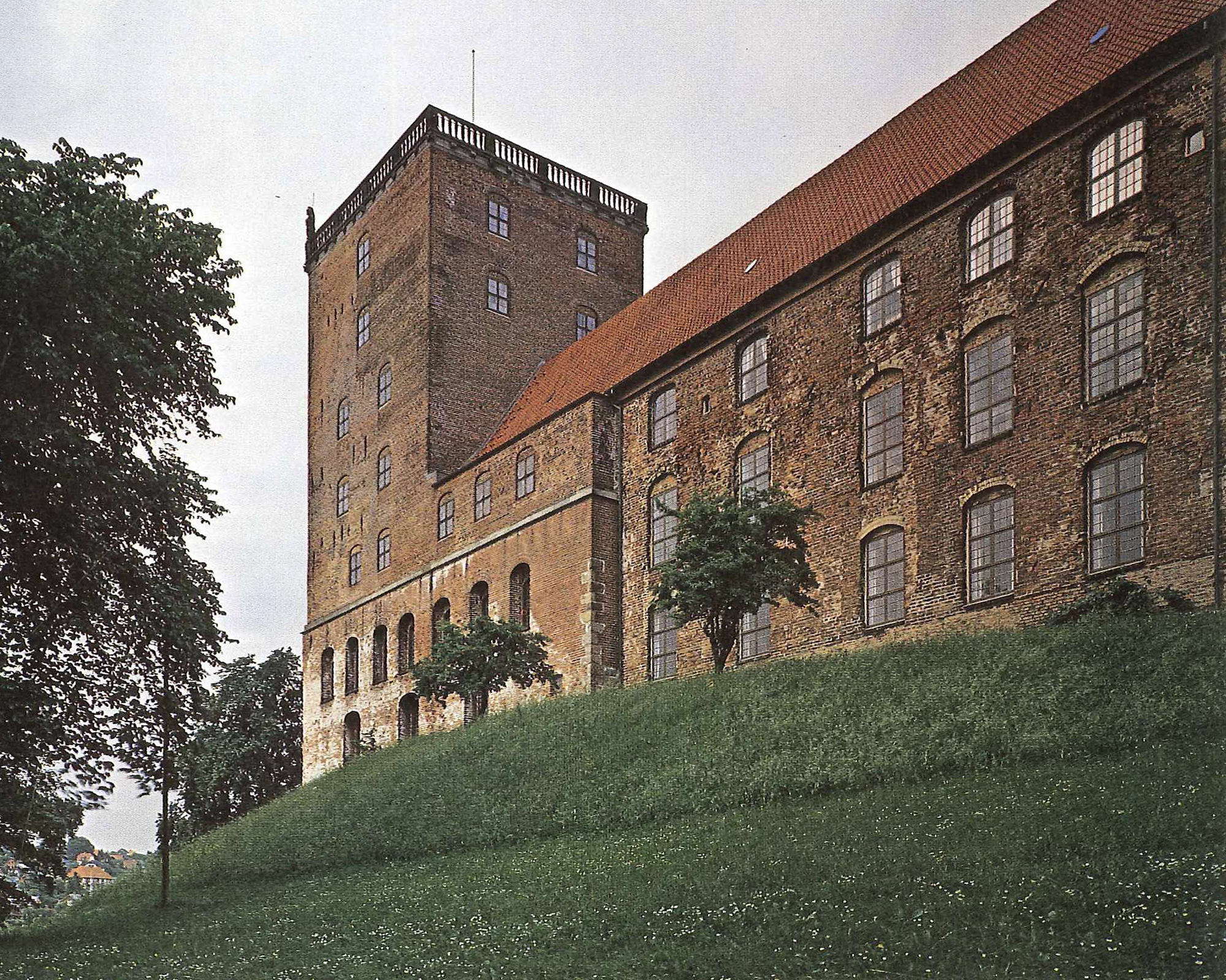
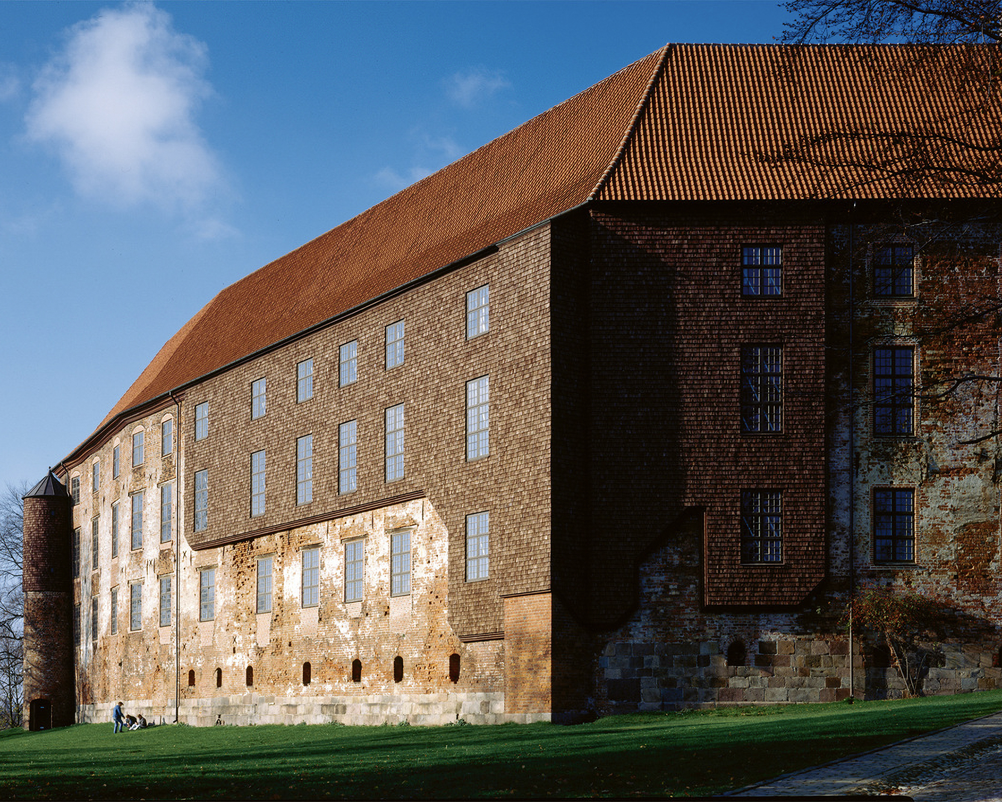
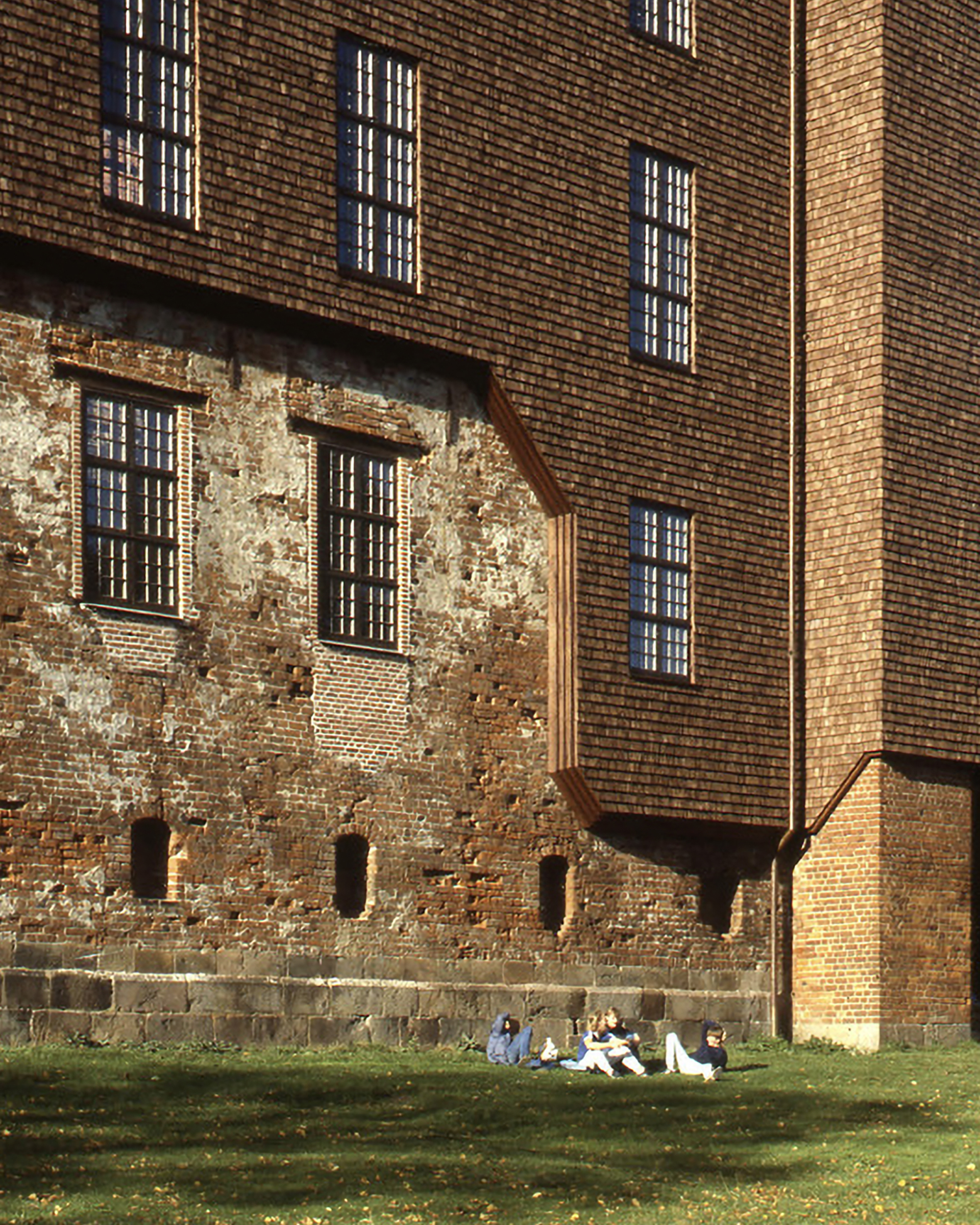
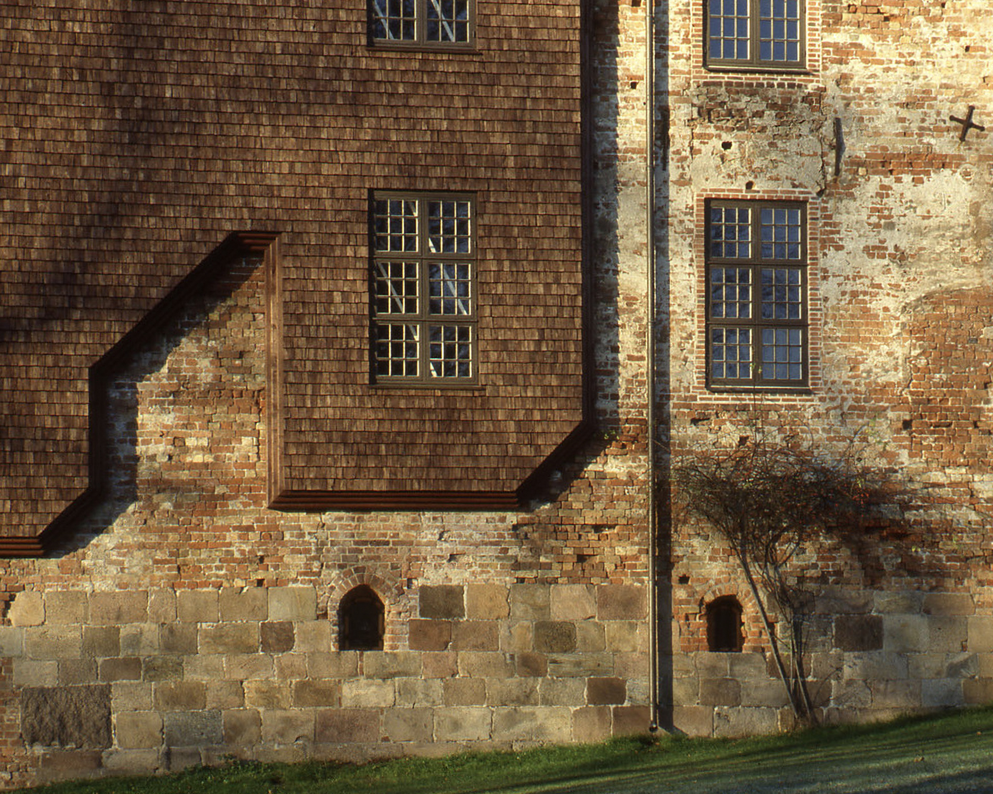
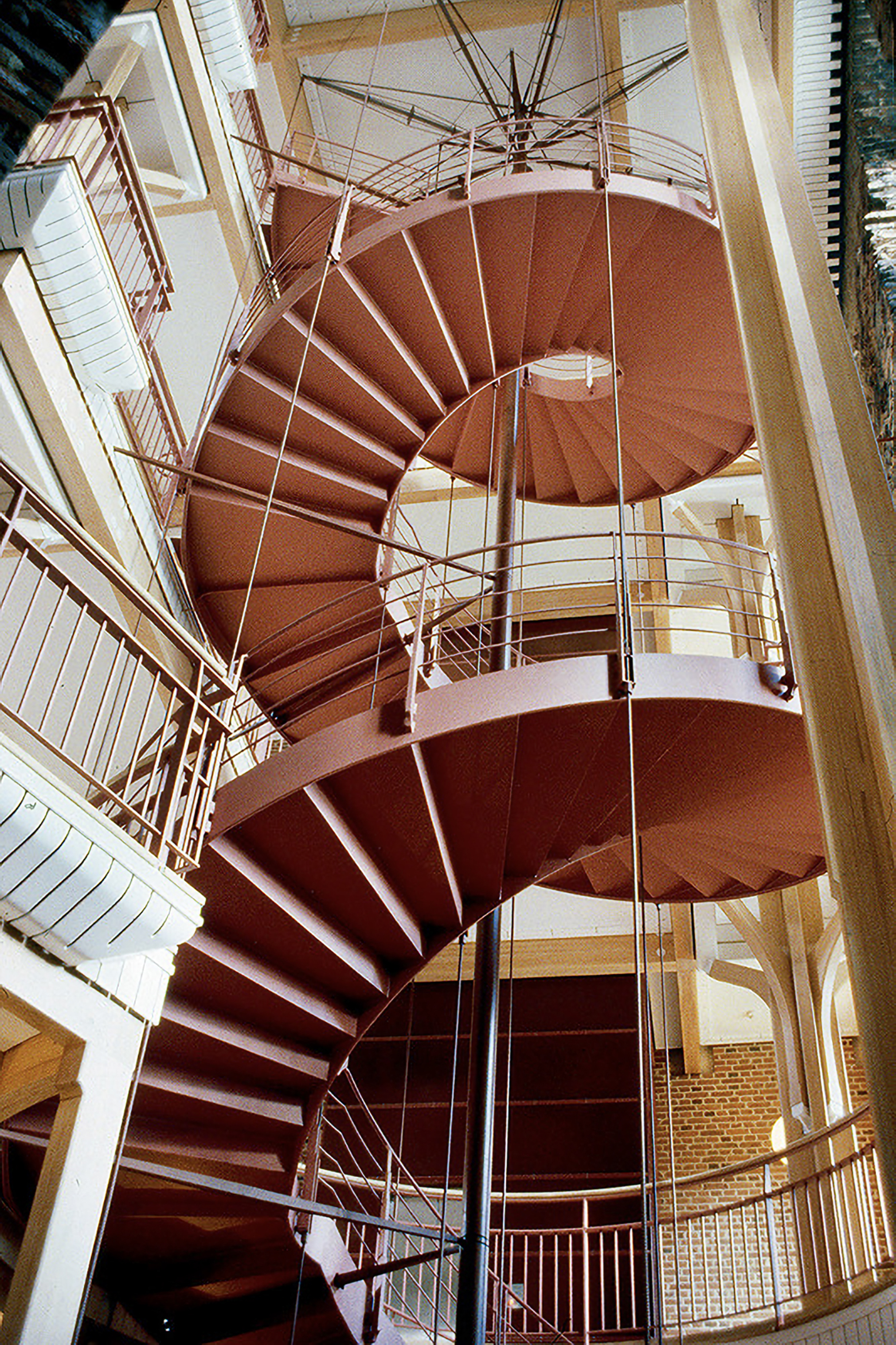
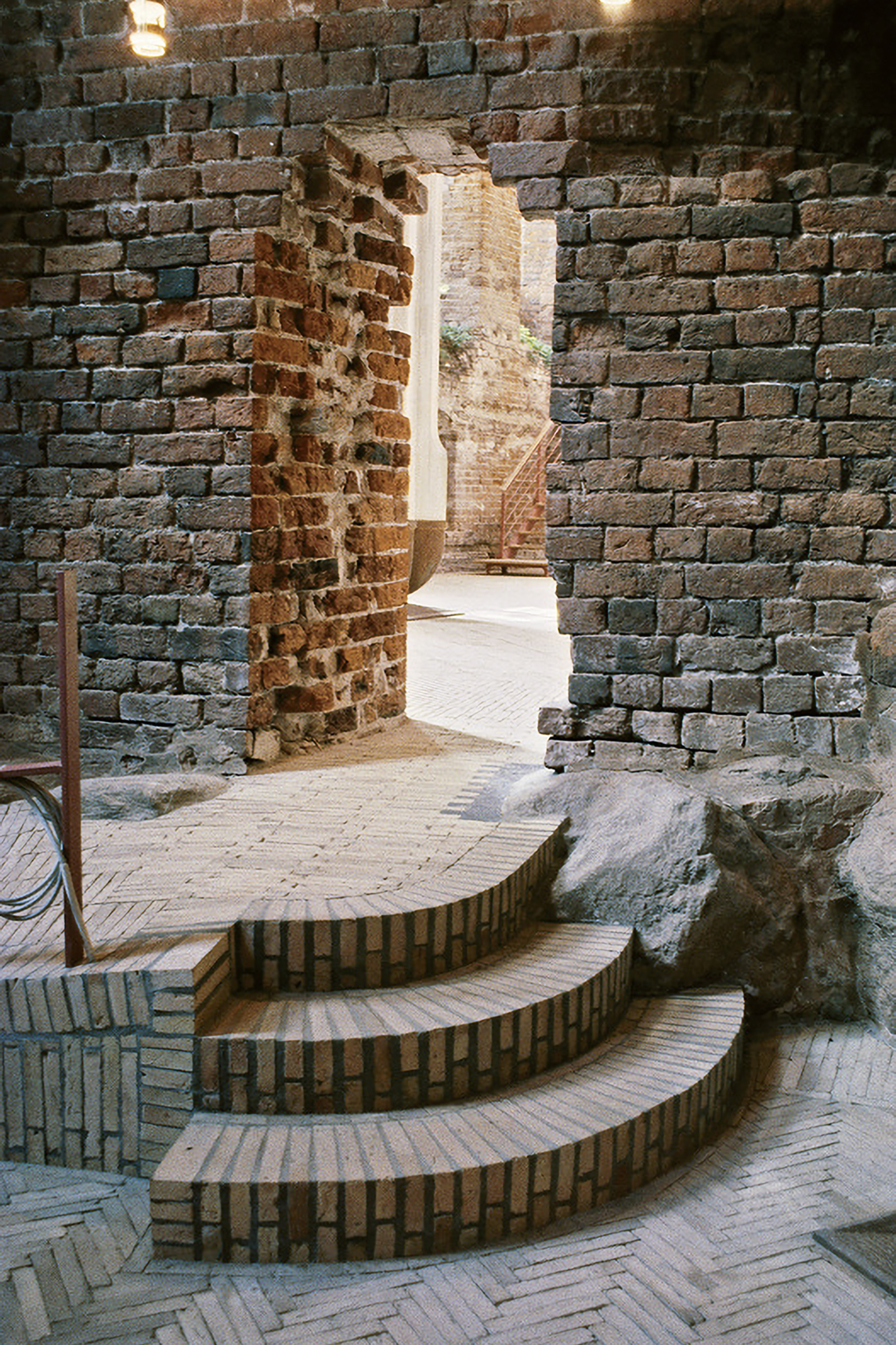
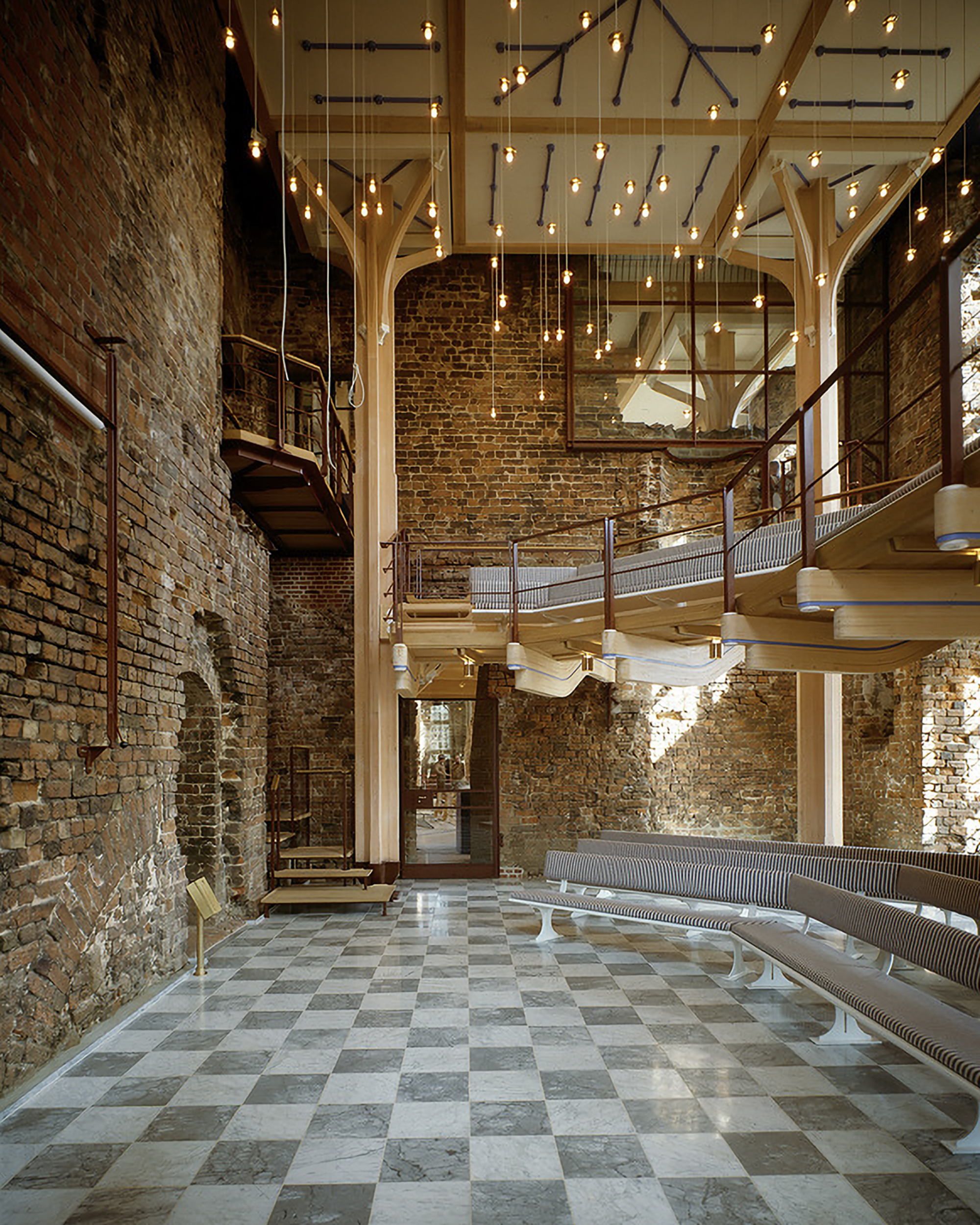
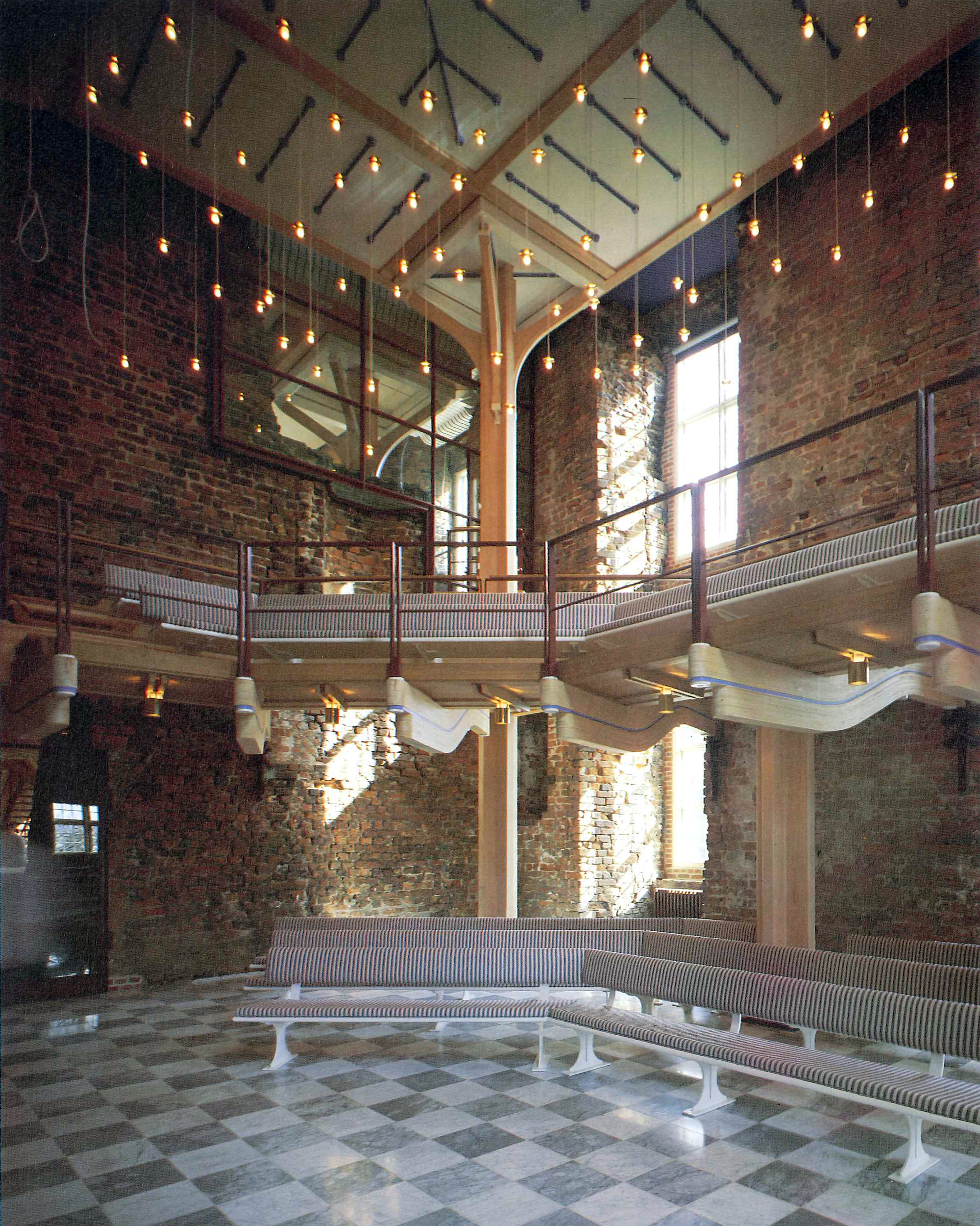
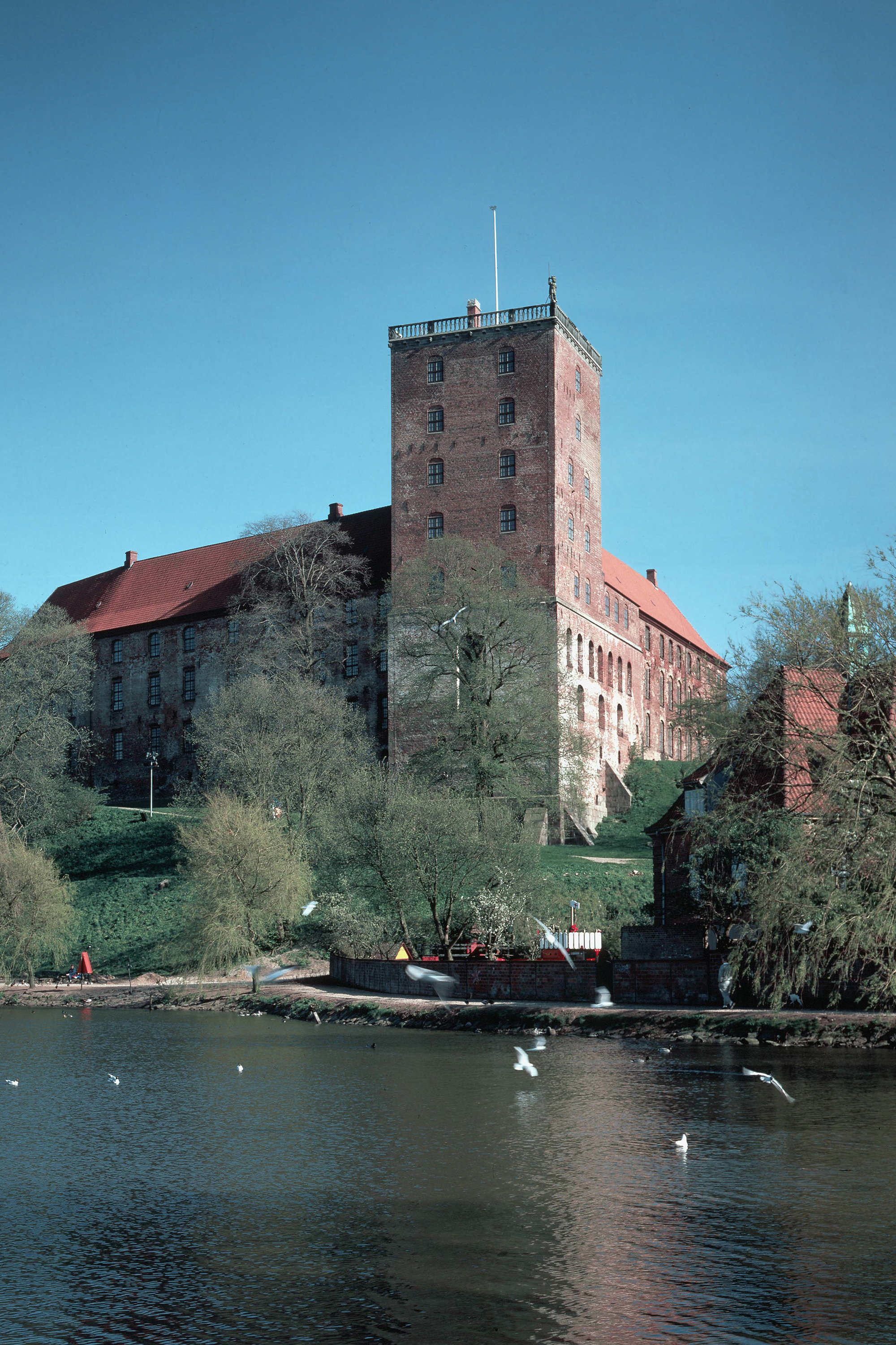
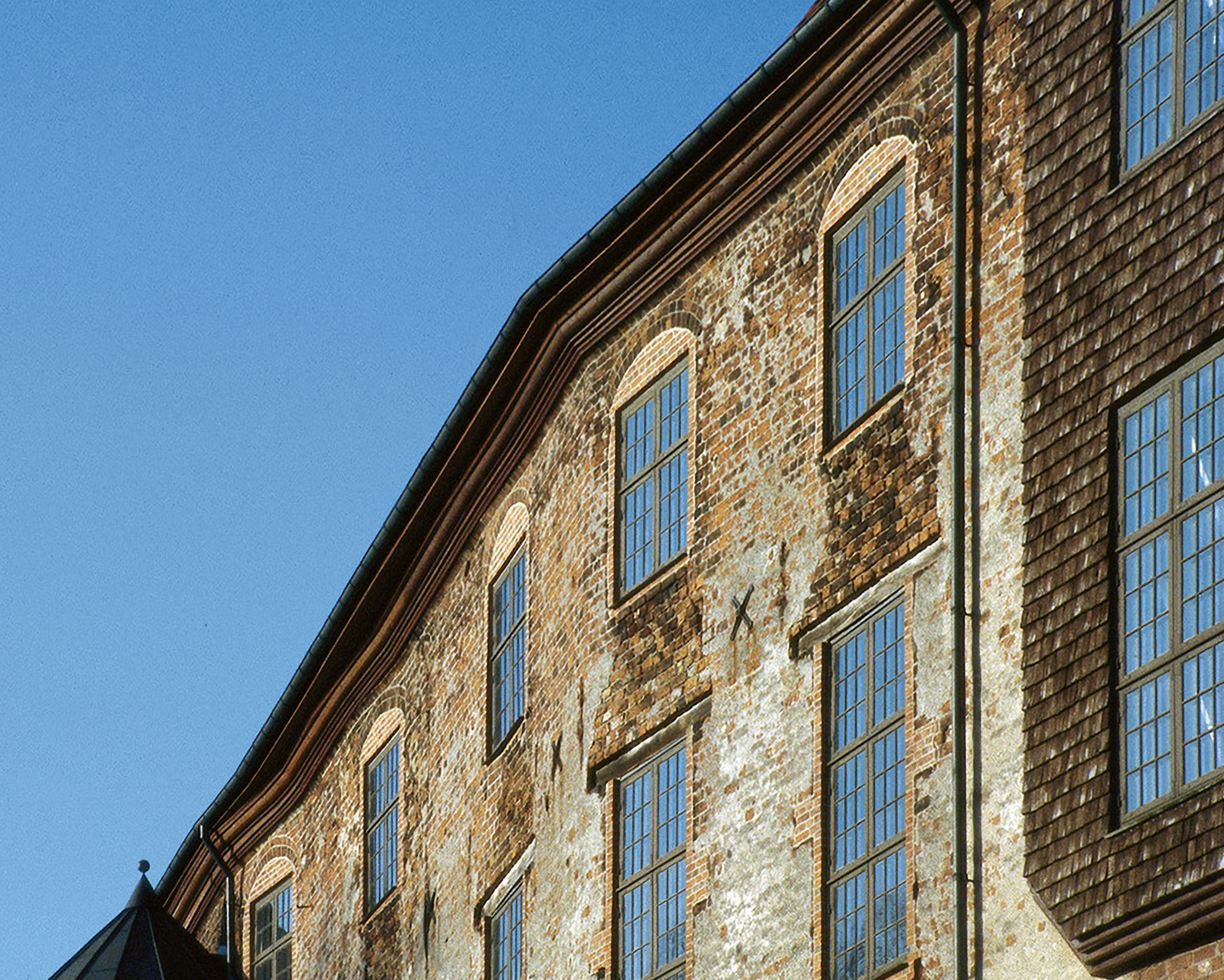
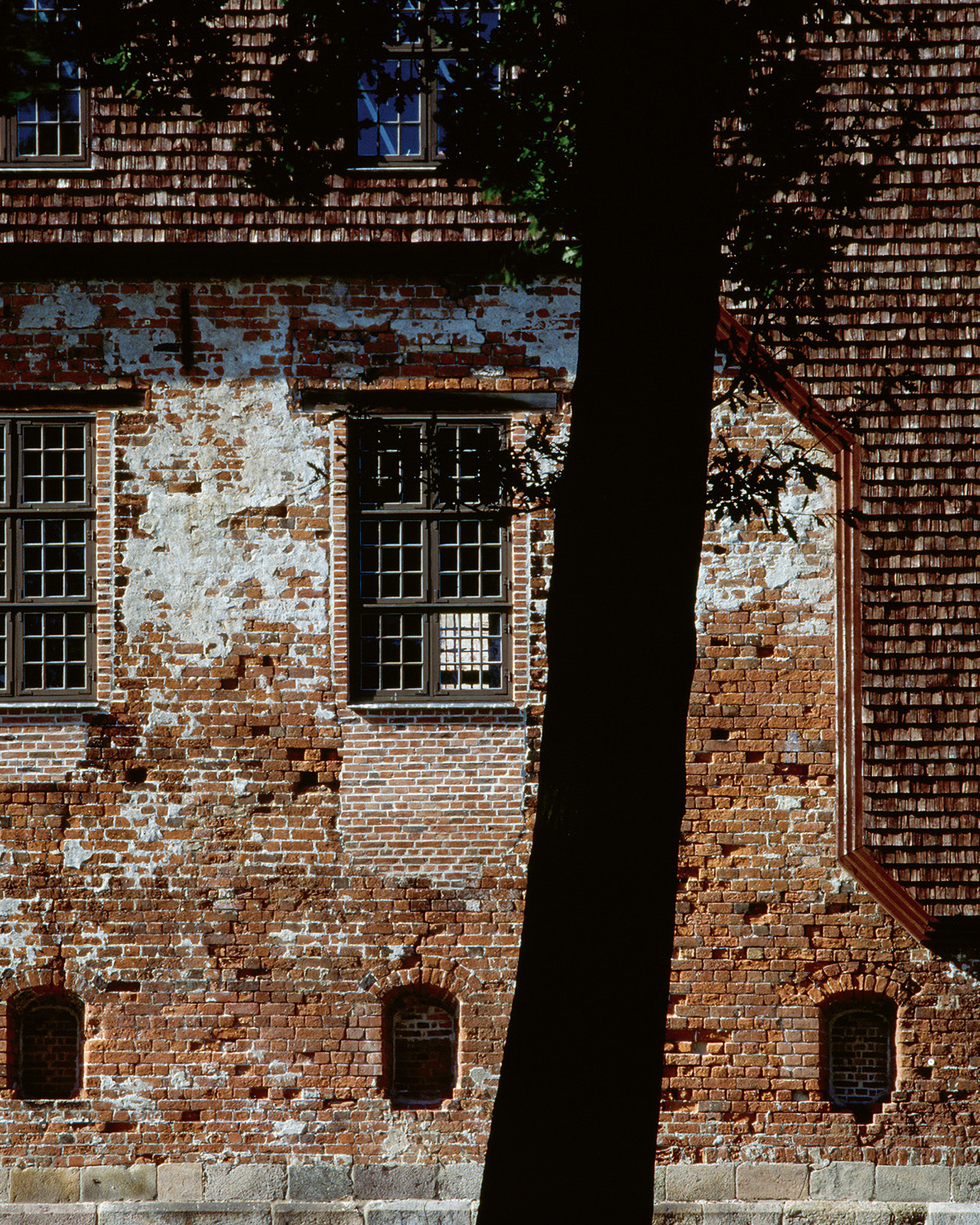
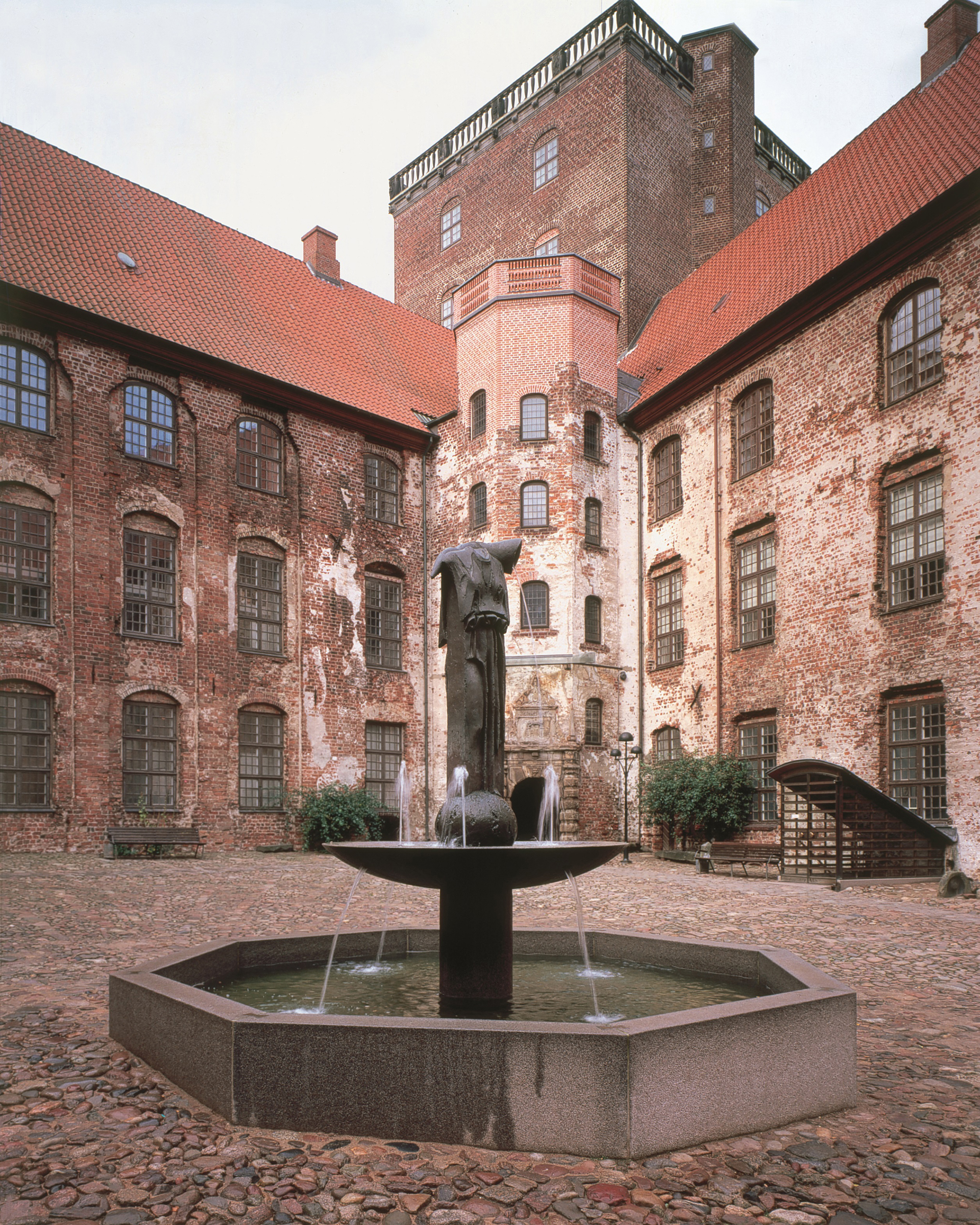
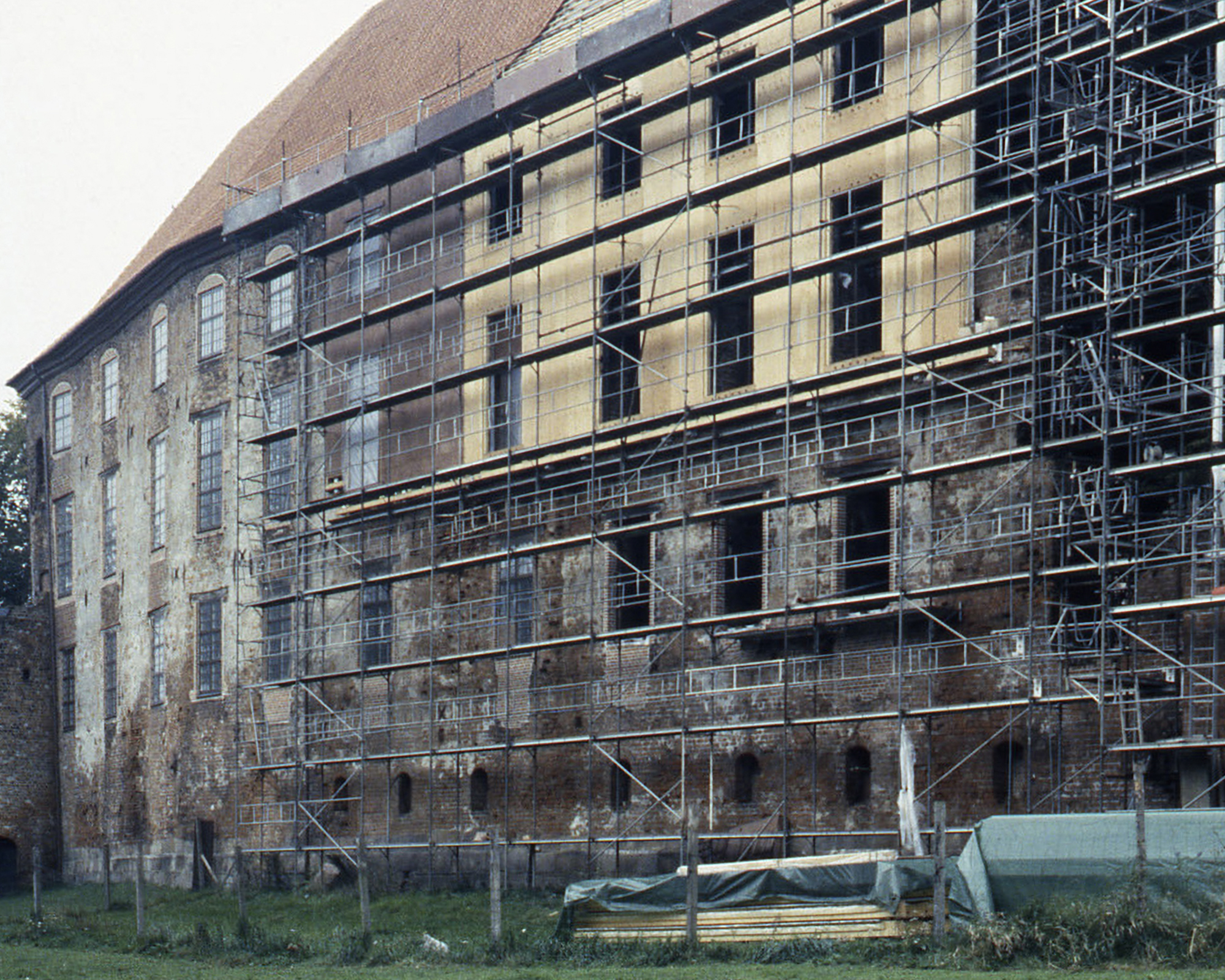
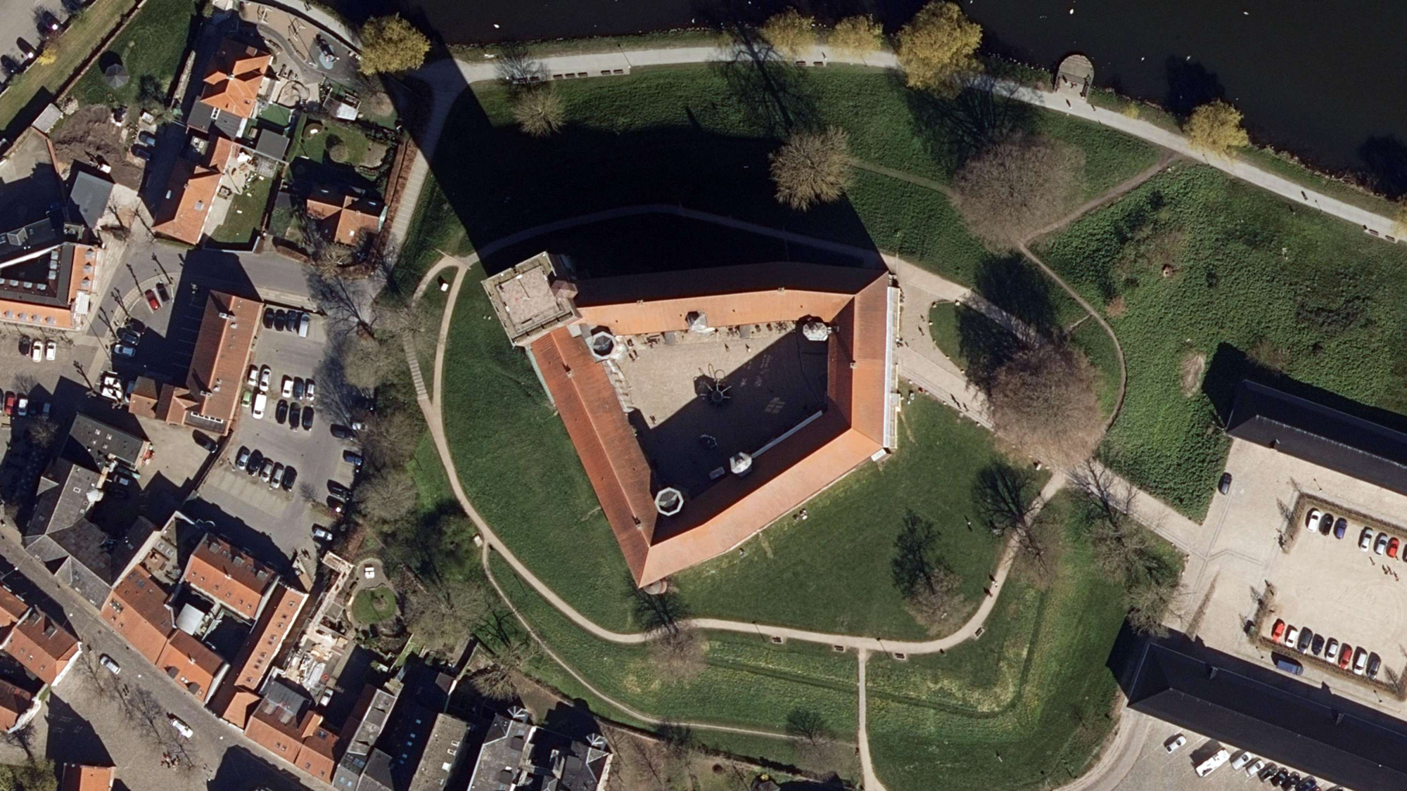
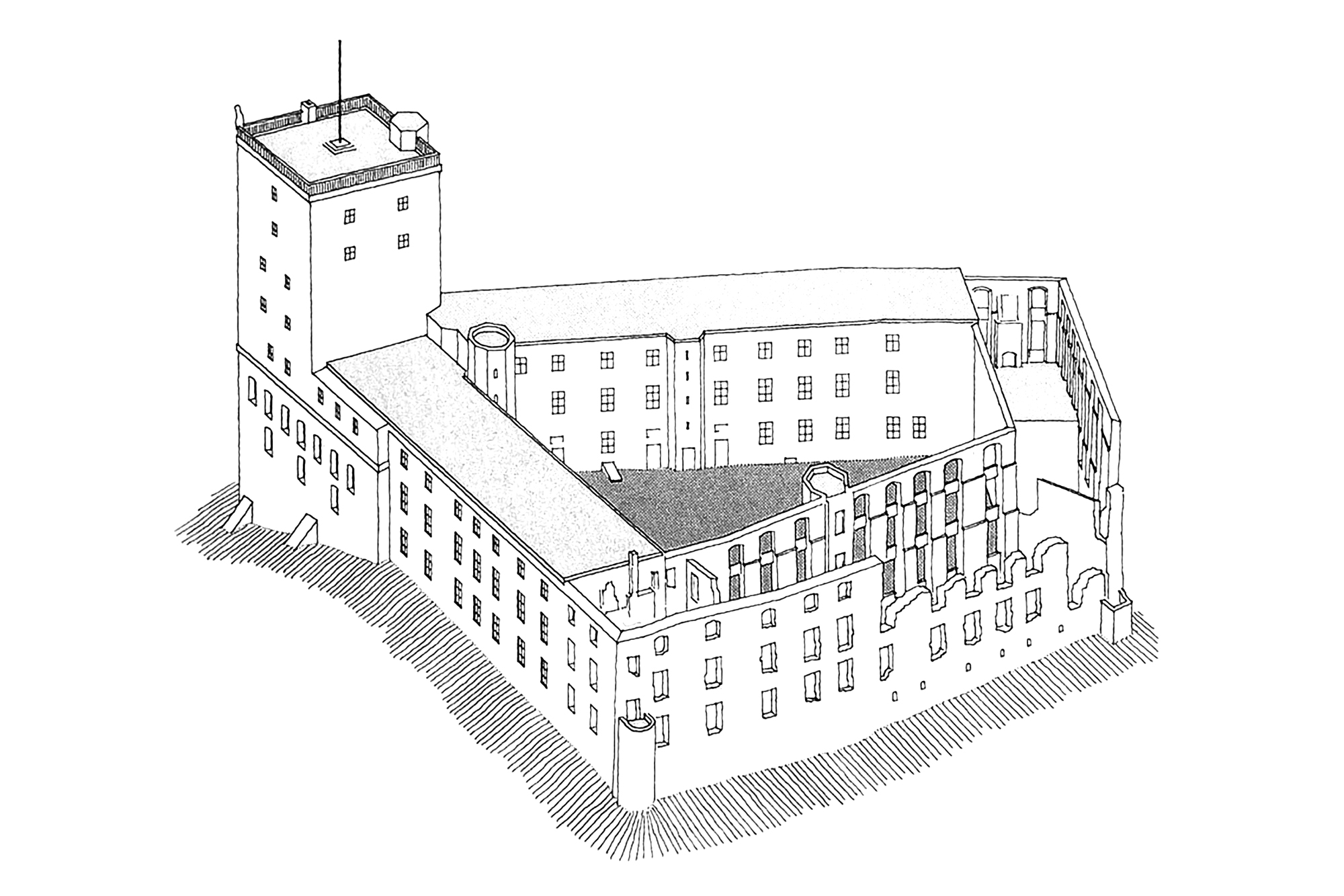
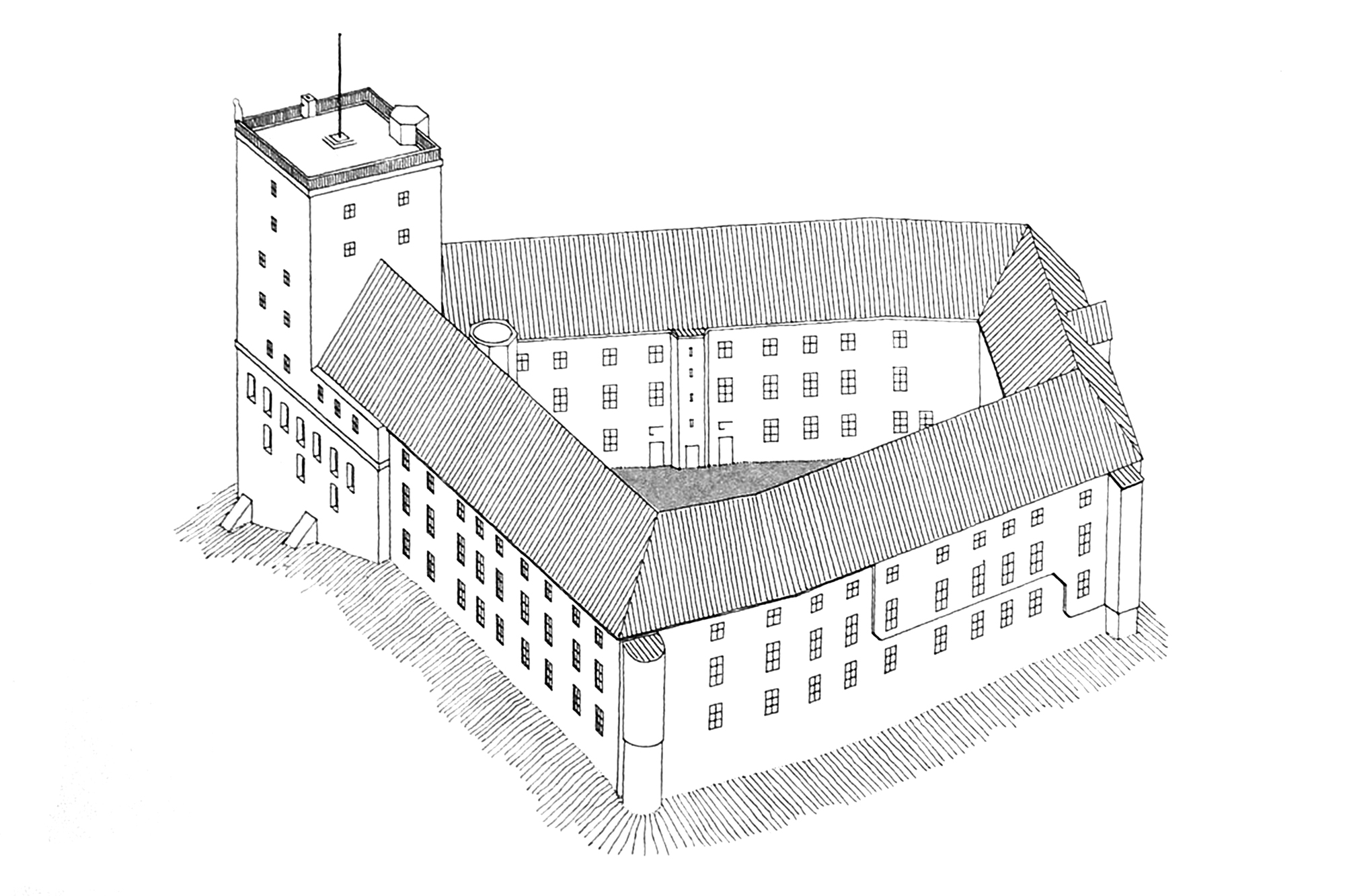
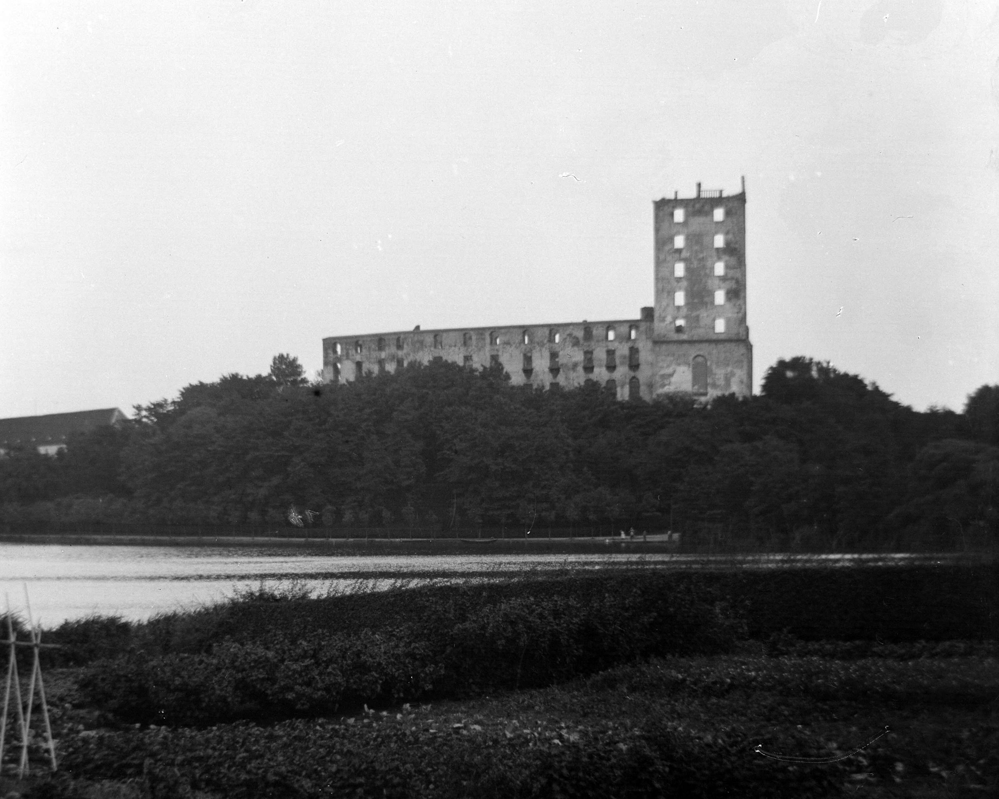
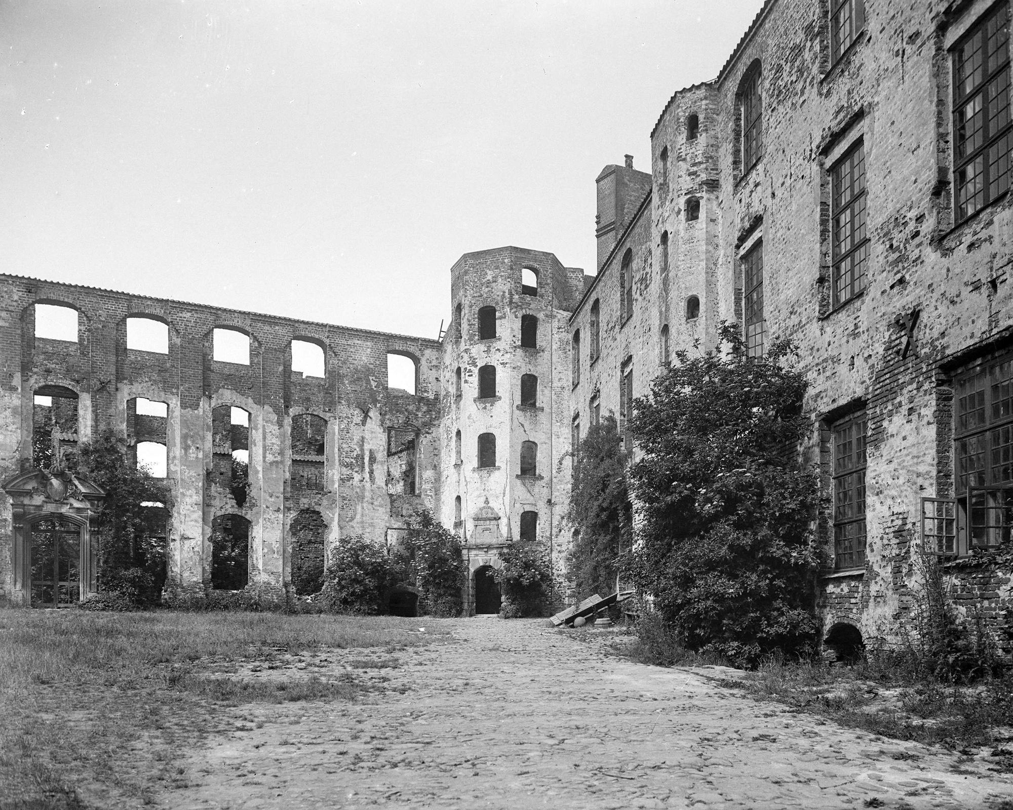
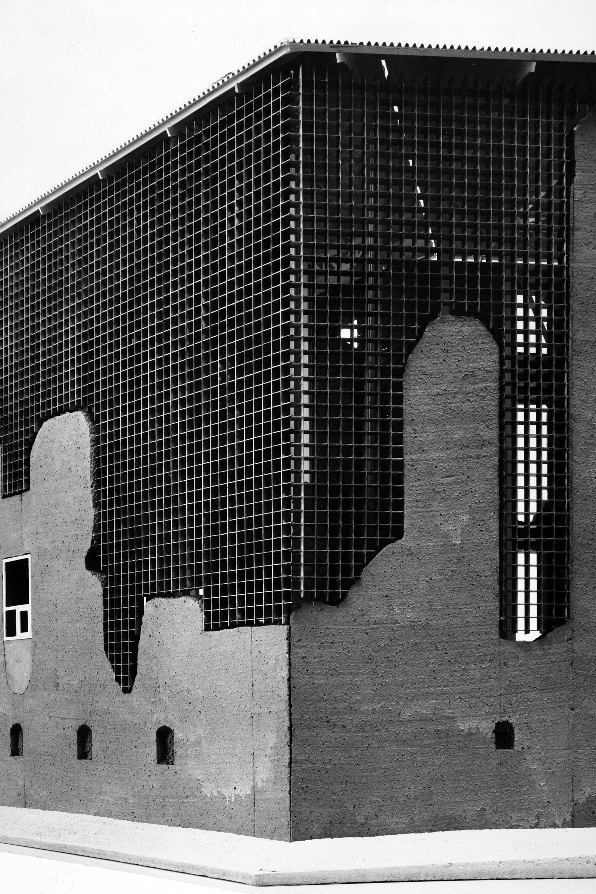
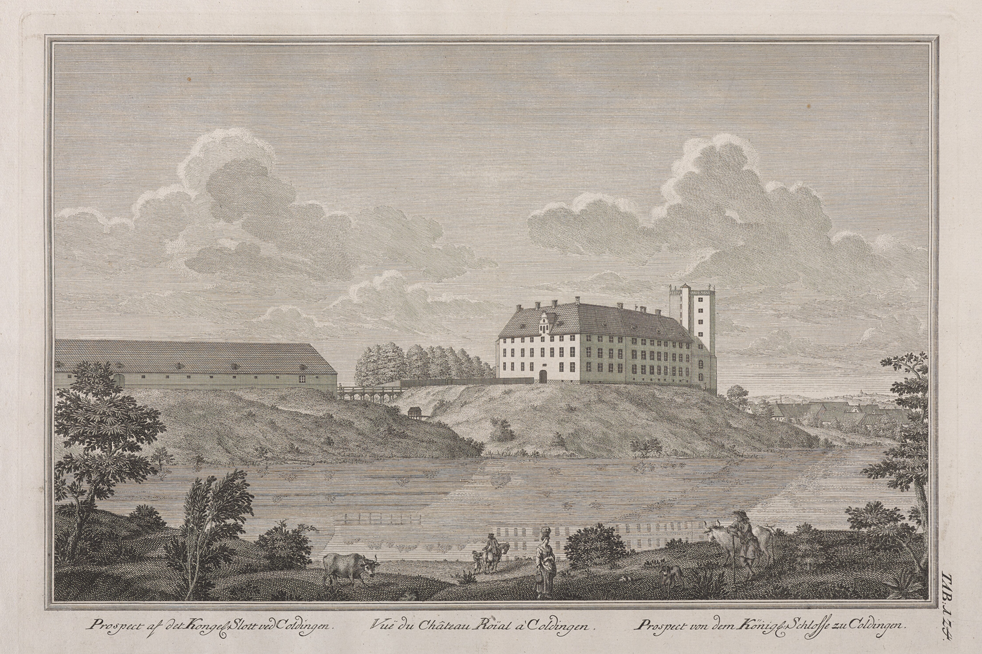
A proposal to protect the ruins by means of a simple structure supporting a roof and walls, otherwise maintaining the ruins untouched, was worked out and approved by the building committee. We believed the proposal would be well received by all the parties concerned, but local opposition arose and Det Saerlige Bygningssy (building surveying committee) would not approve. The result was a compromise which is now being carried out, in which the castle’s exterior is being given a general form corresponding to the time before the fire, while the ruins appear mostly in the interior. We evolved a basic principle that the main periods of the castle’s history were to be respected in such a way that its long and eventful life was clearly illustrated. As it was to be a museum, it was obvious that the most important exhibit was Koldinghus itself, and the different historical periods and events would have to be emphasized architecturally in the various parts of the building.
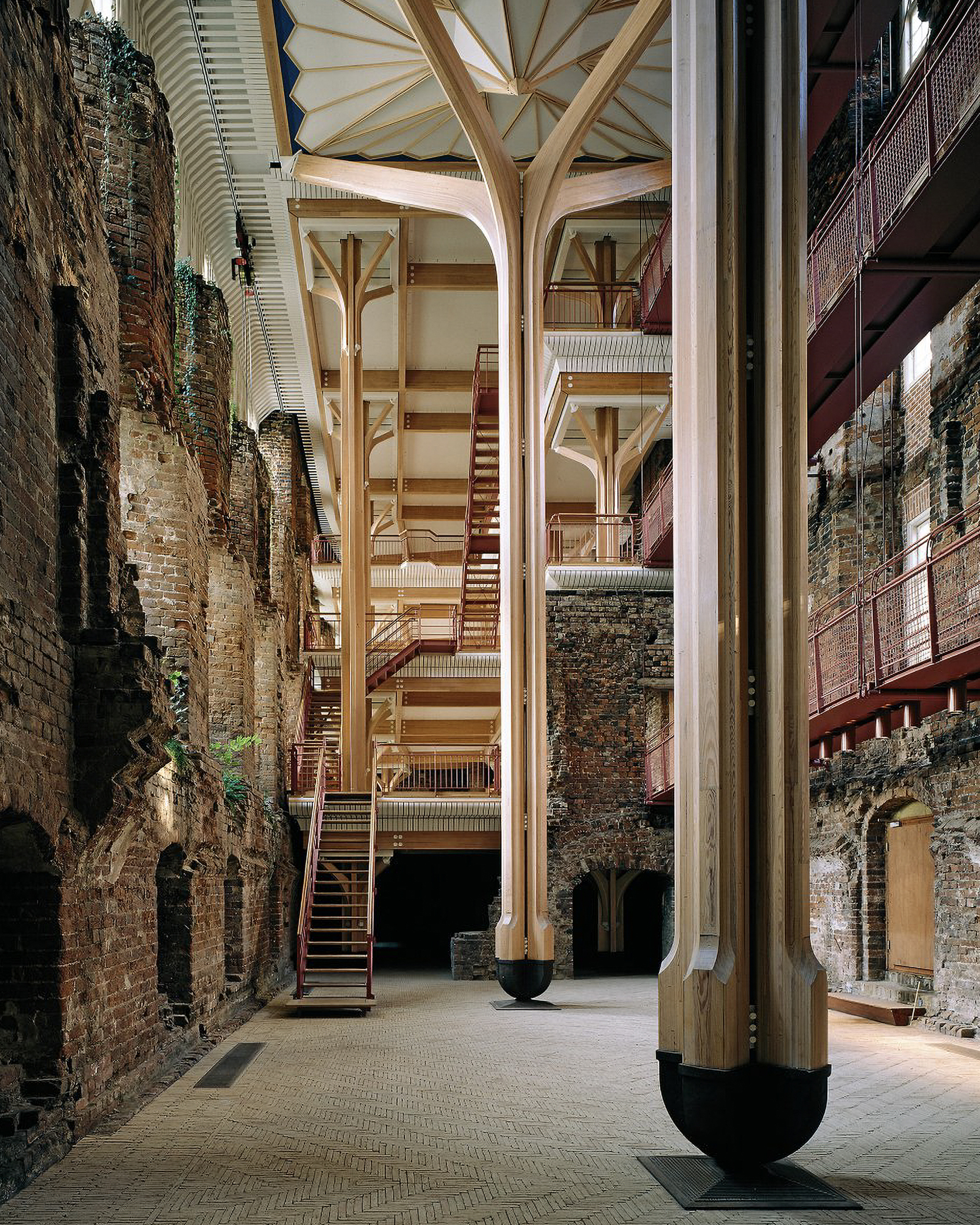
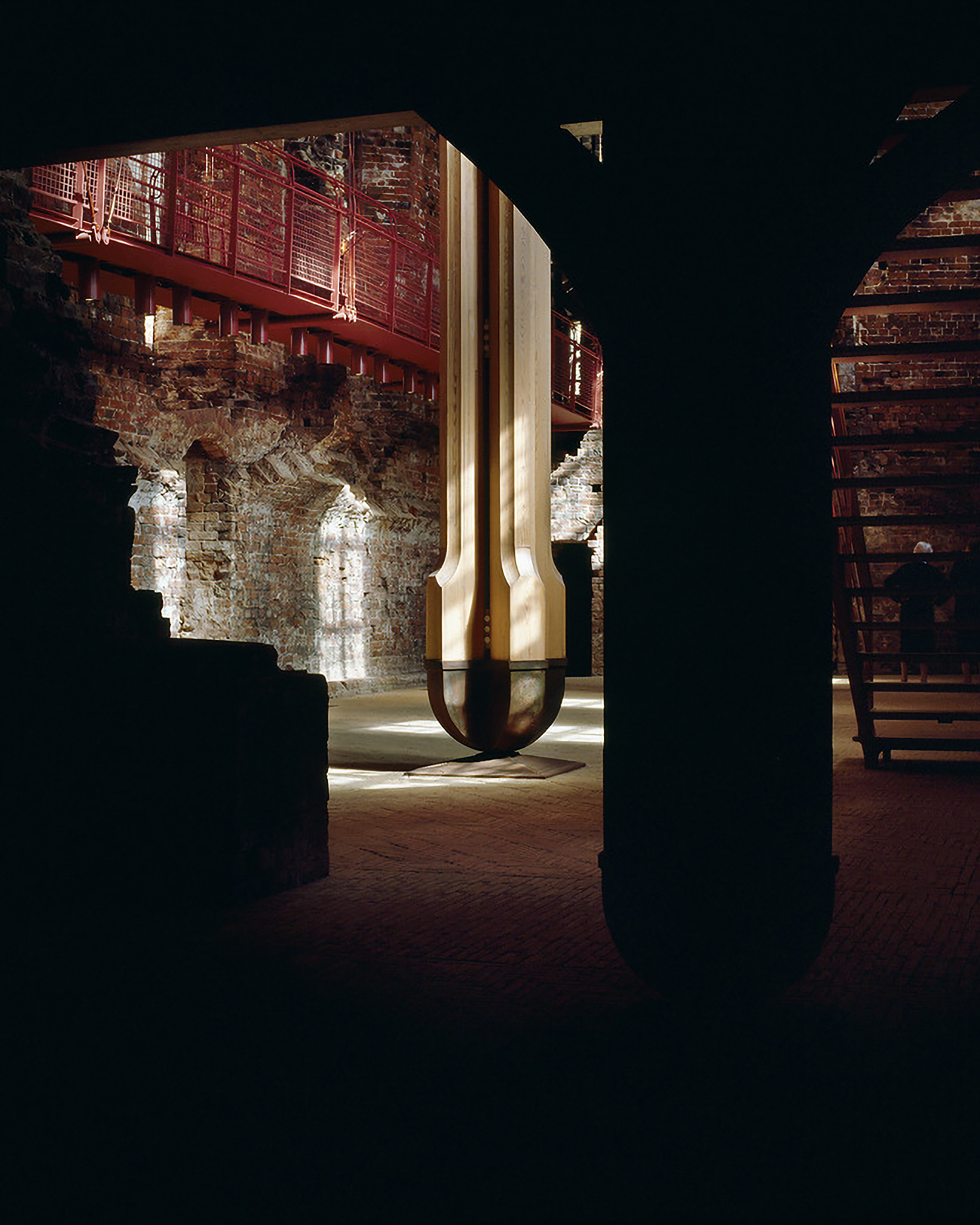
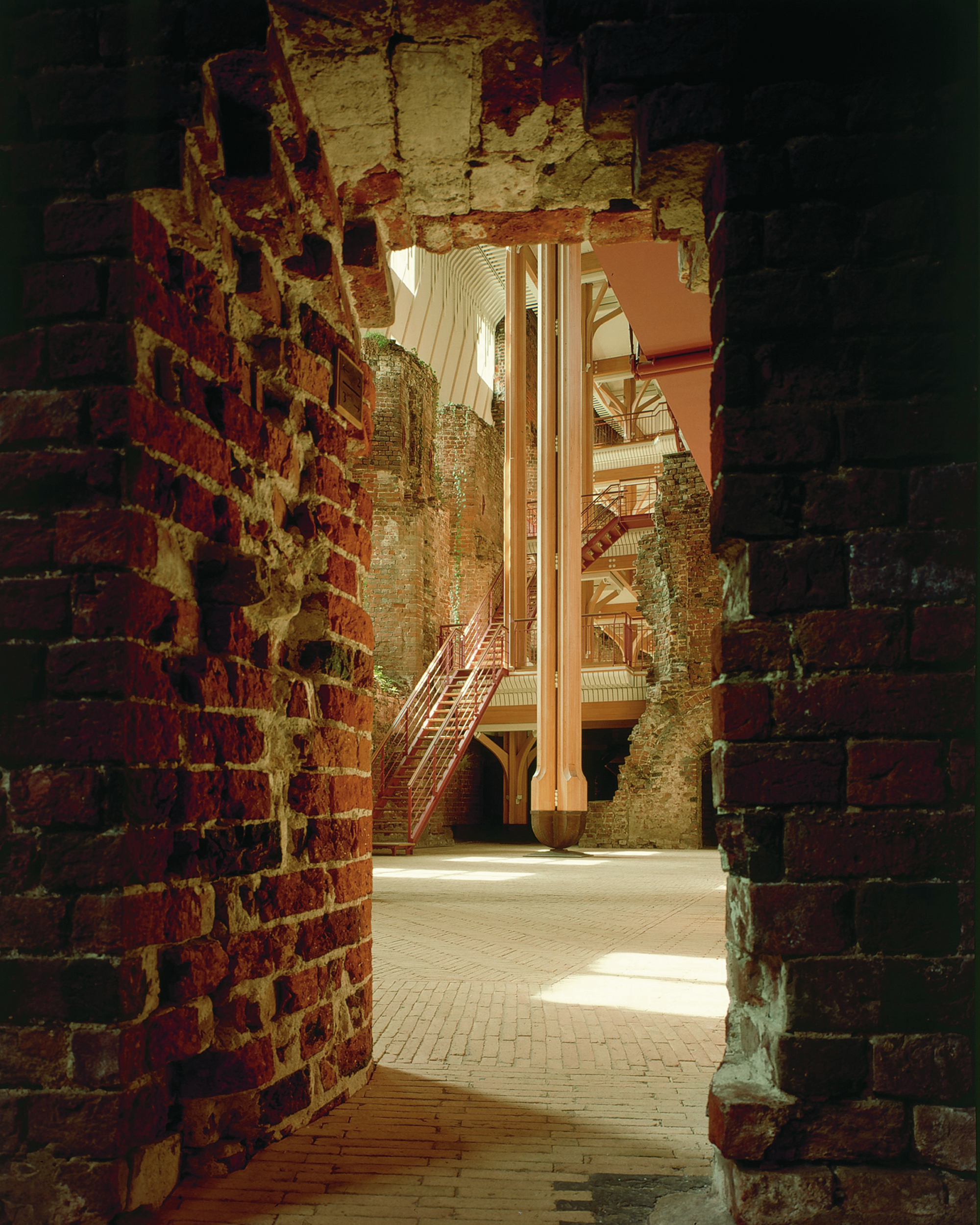
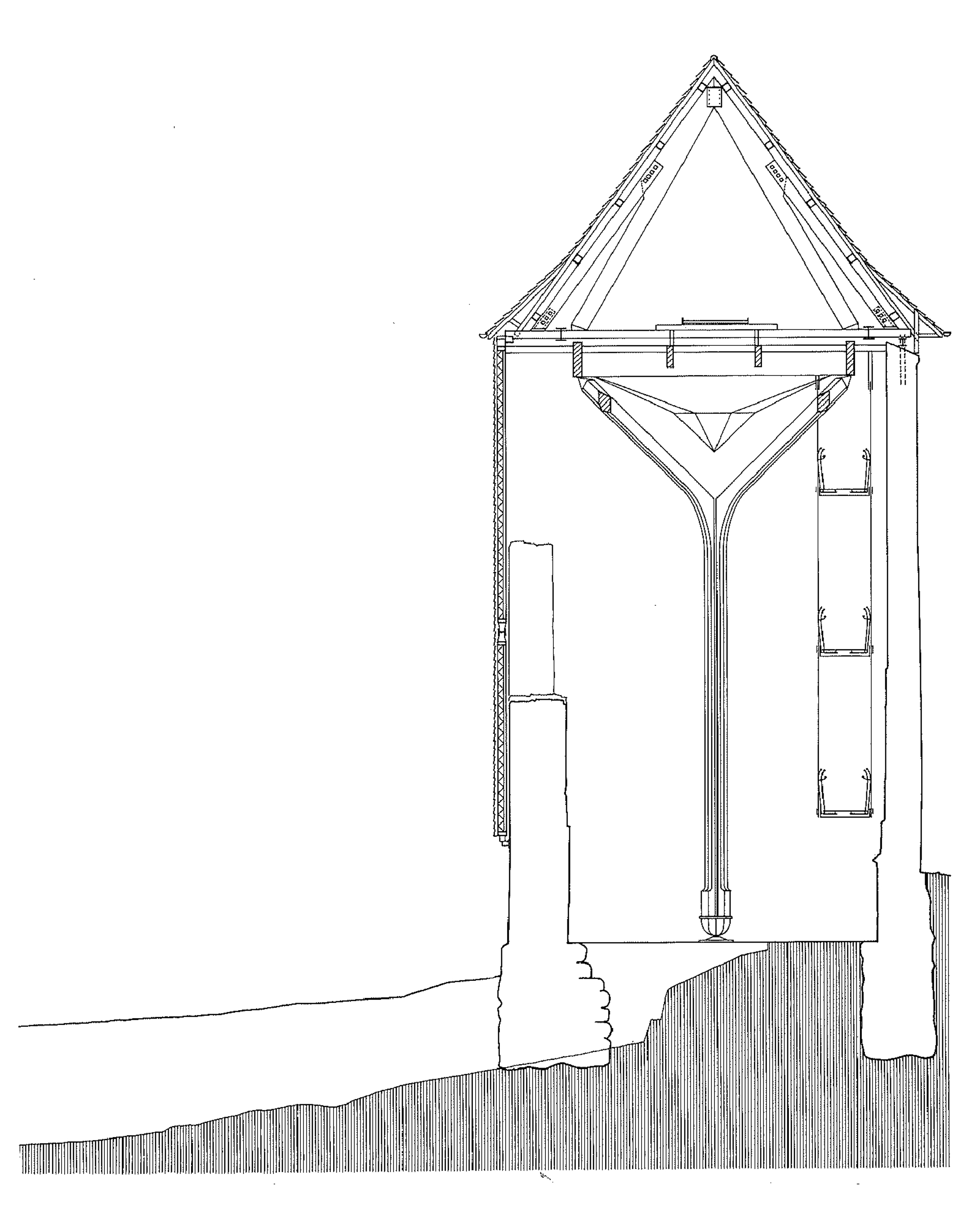
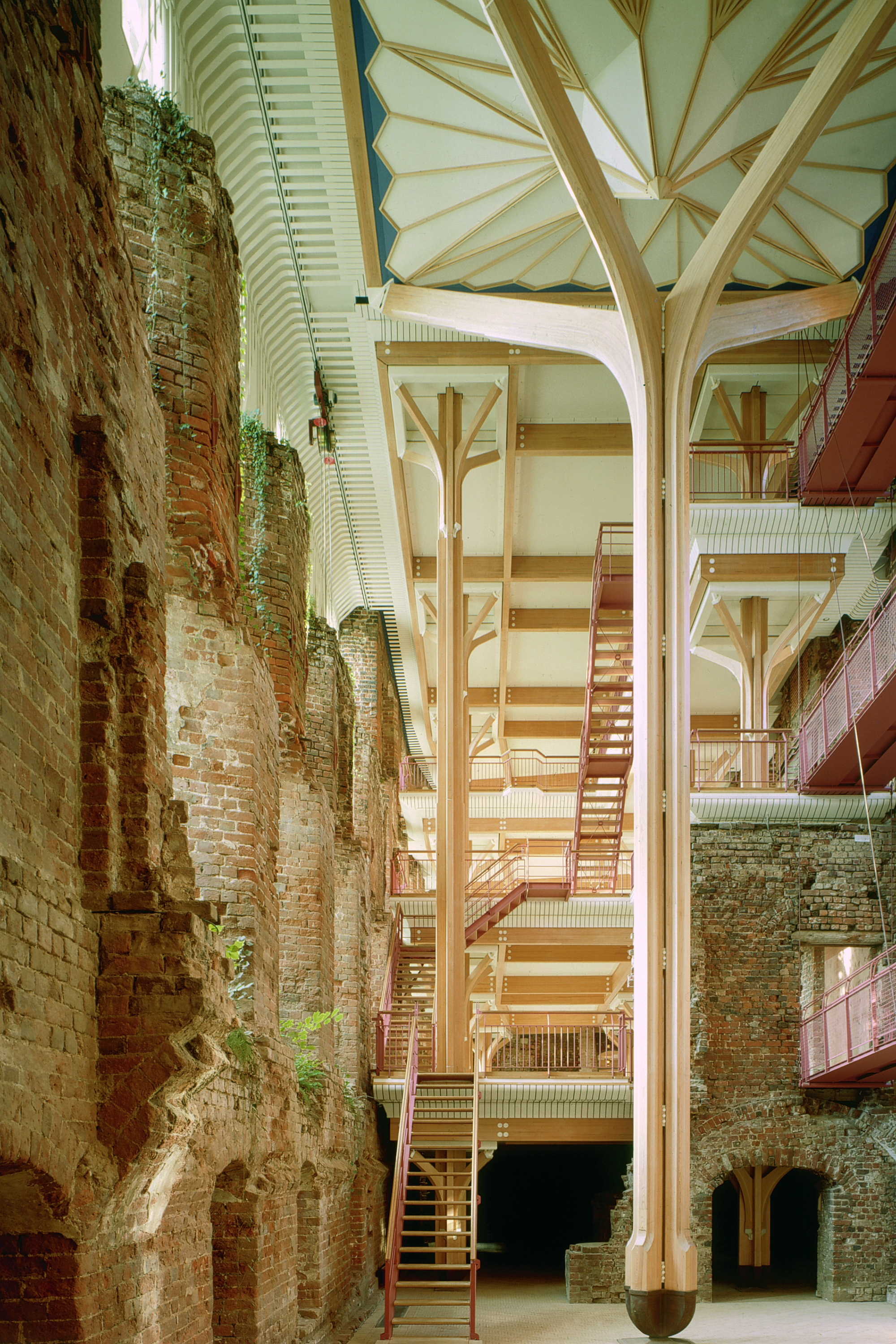
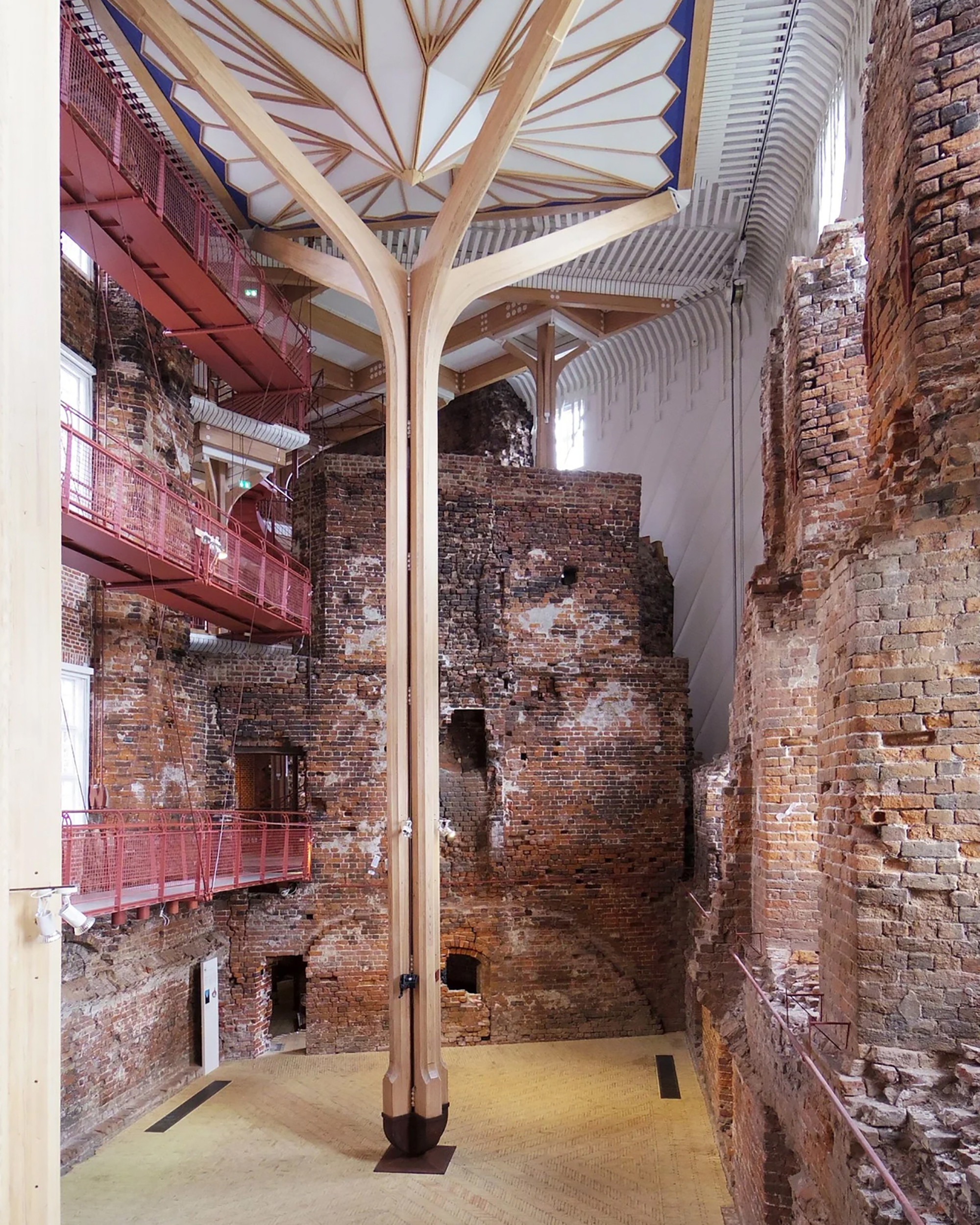
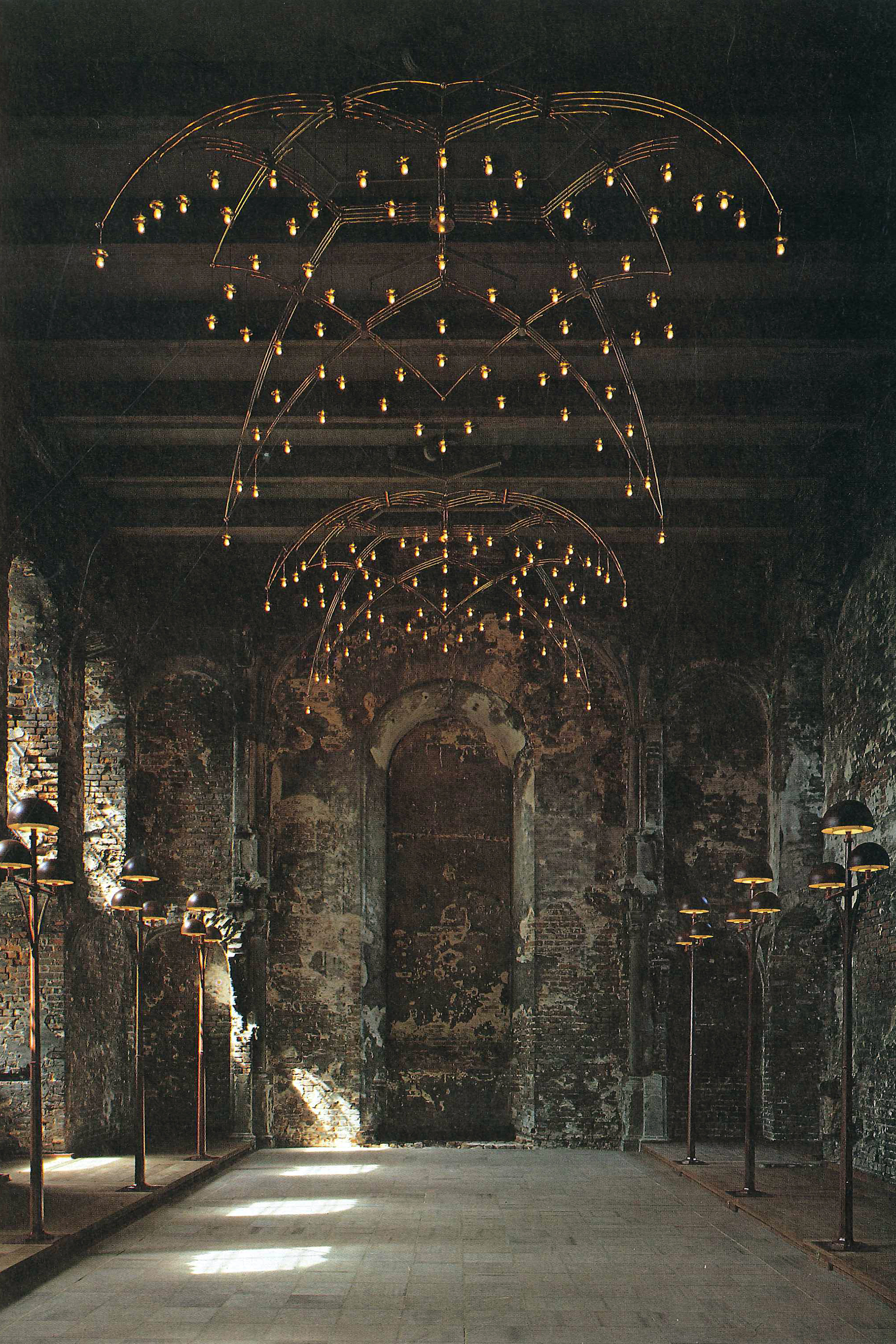
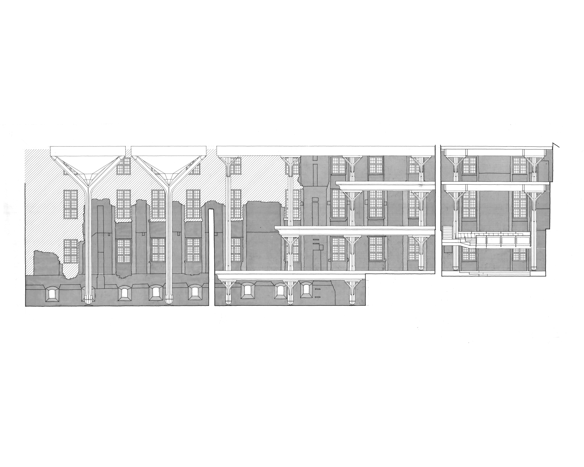
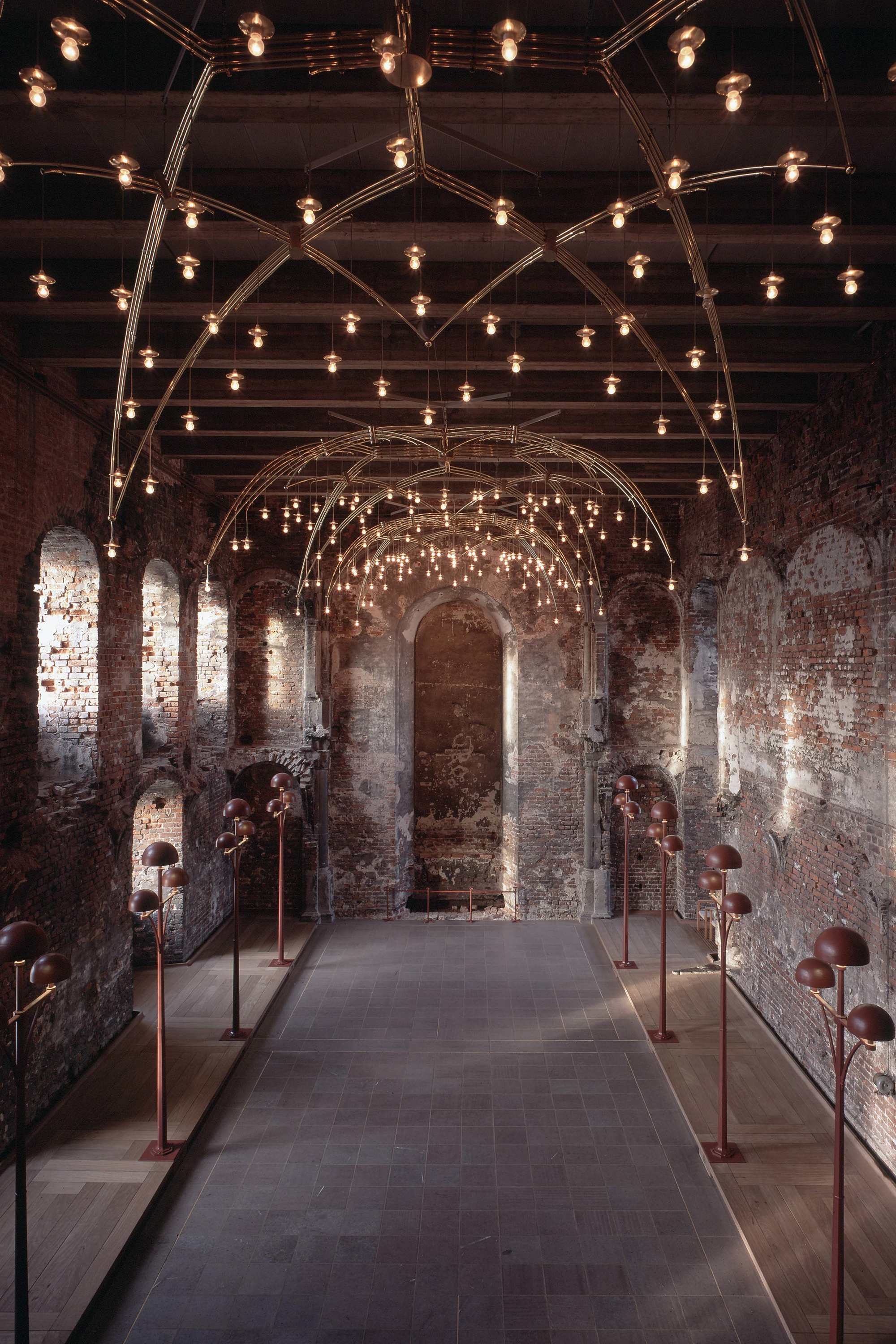
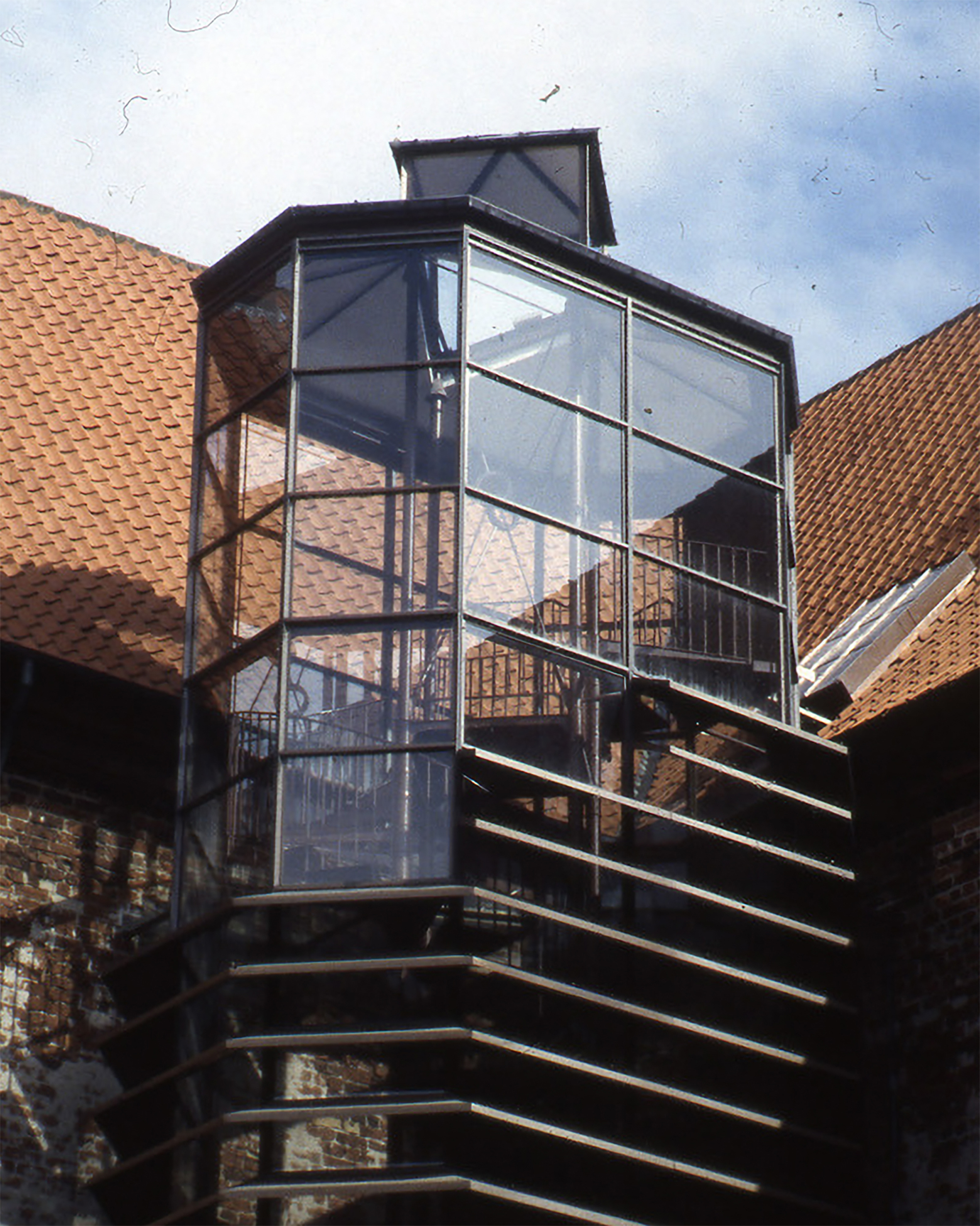
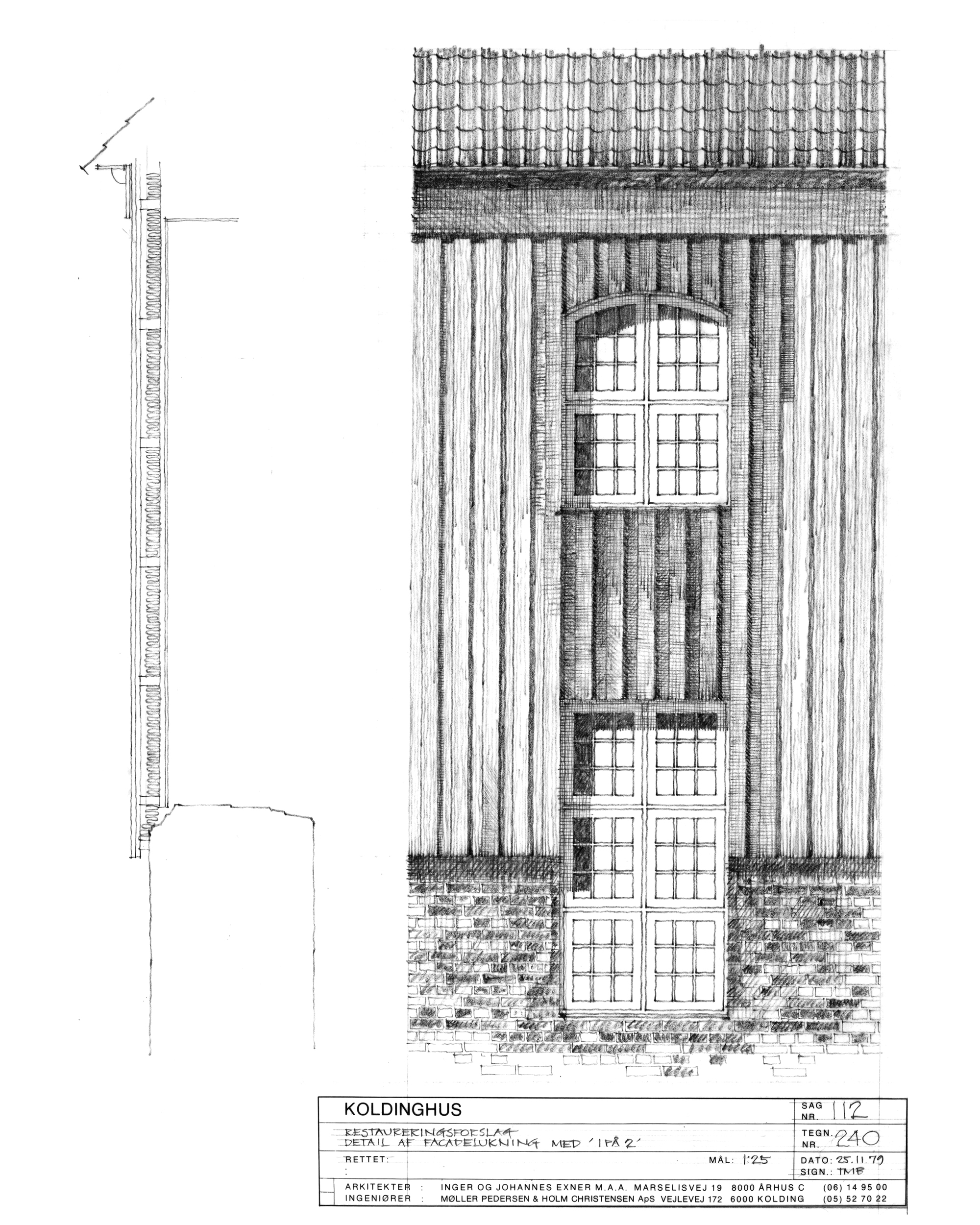
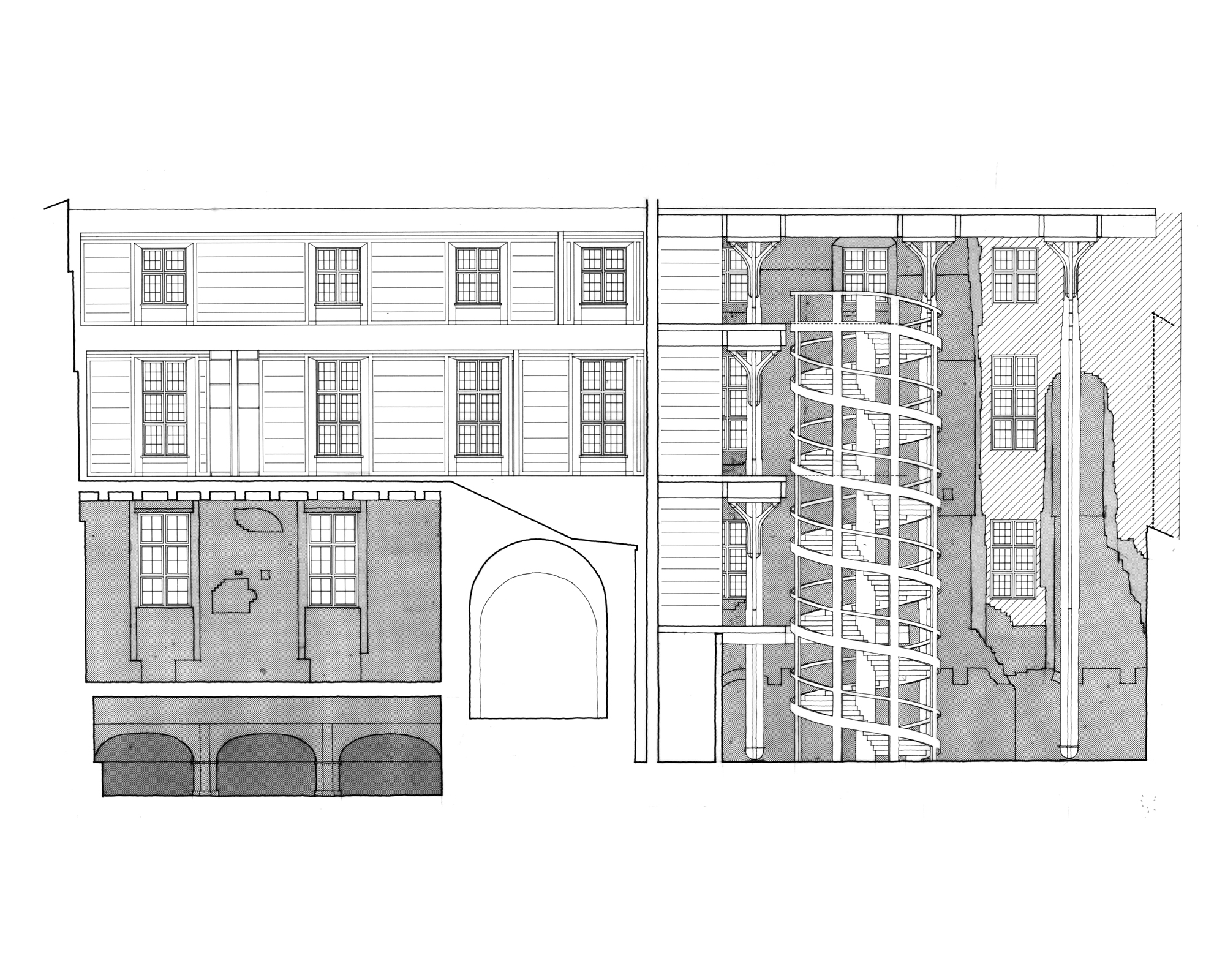
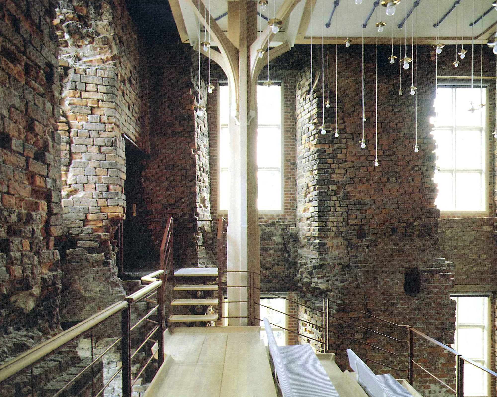
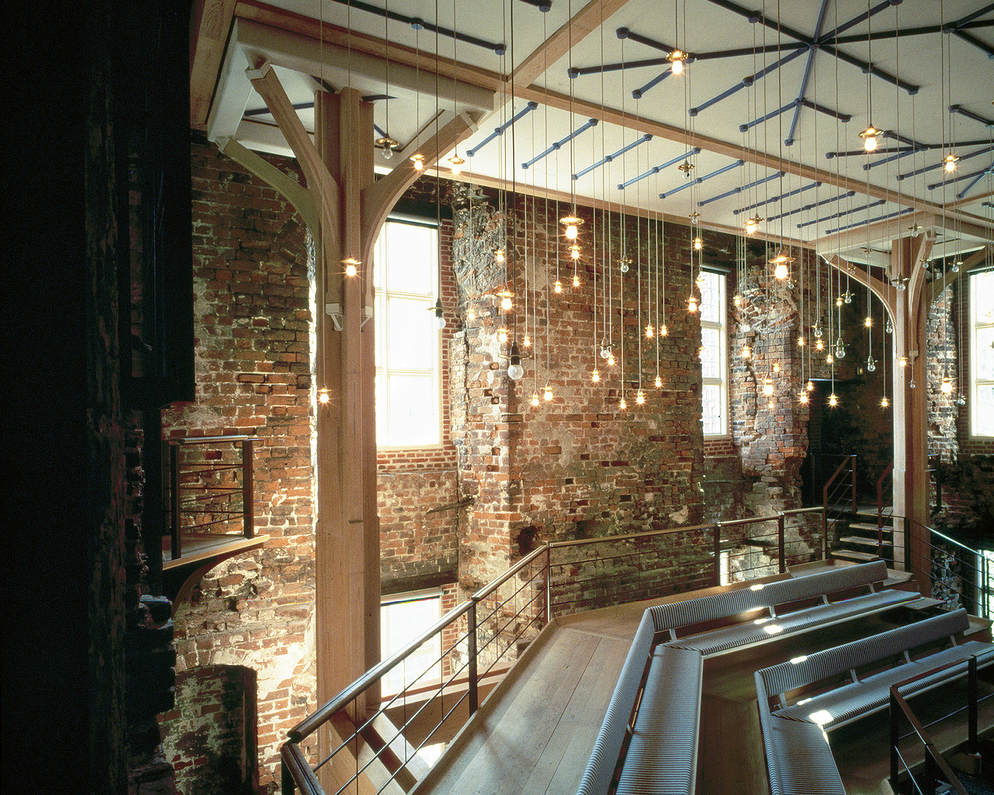
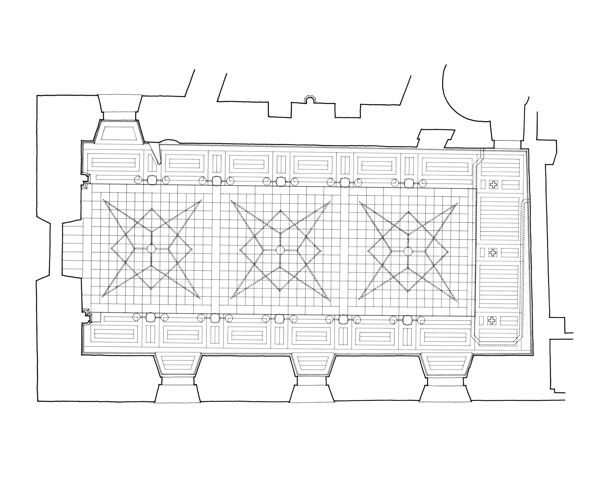
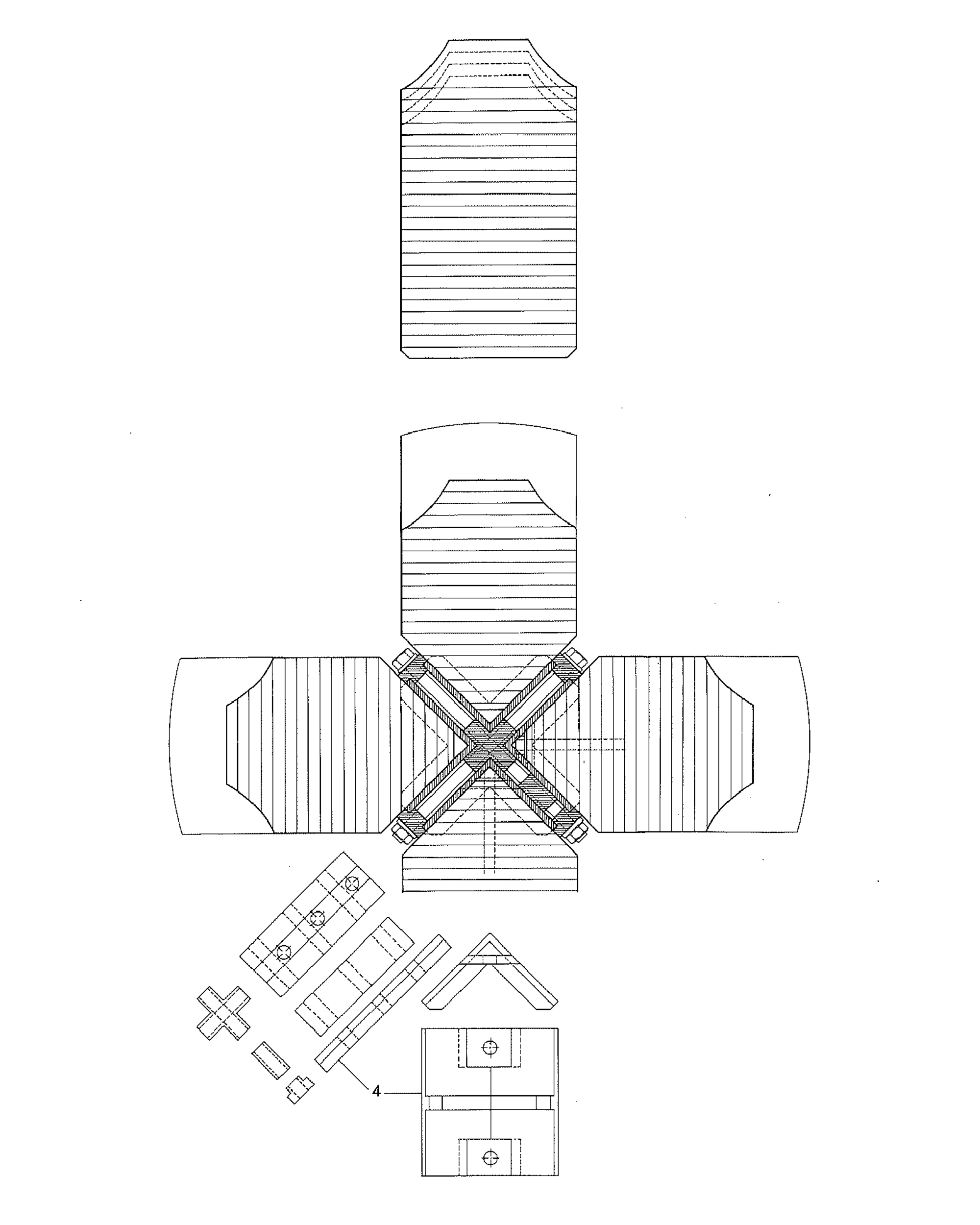
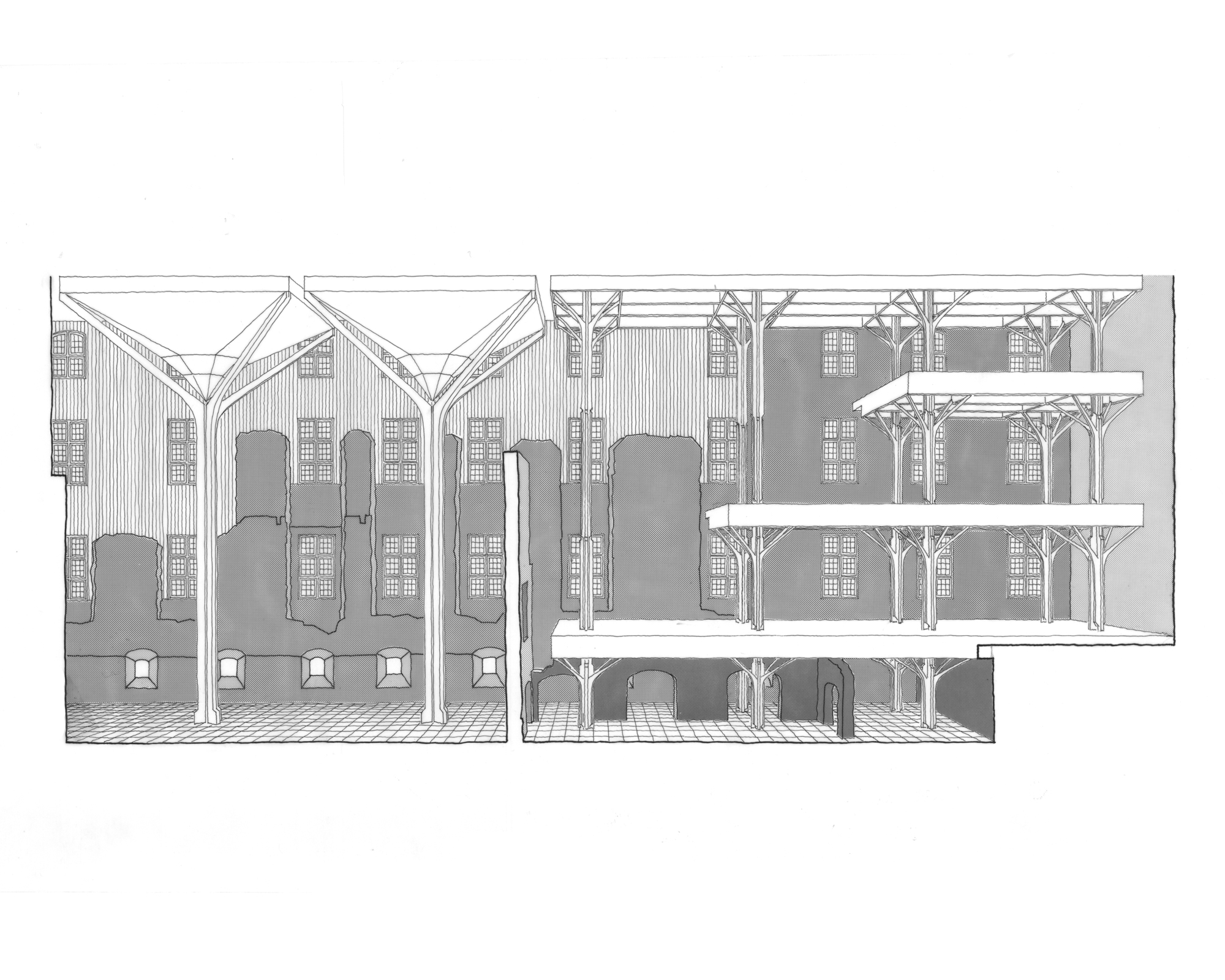
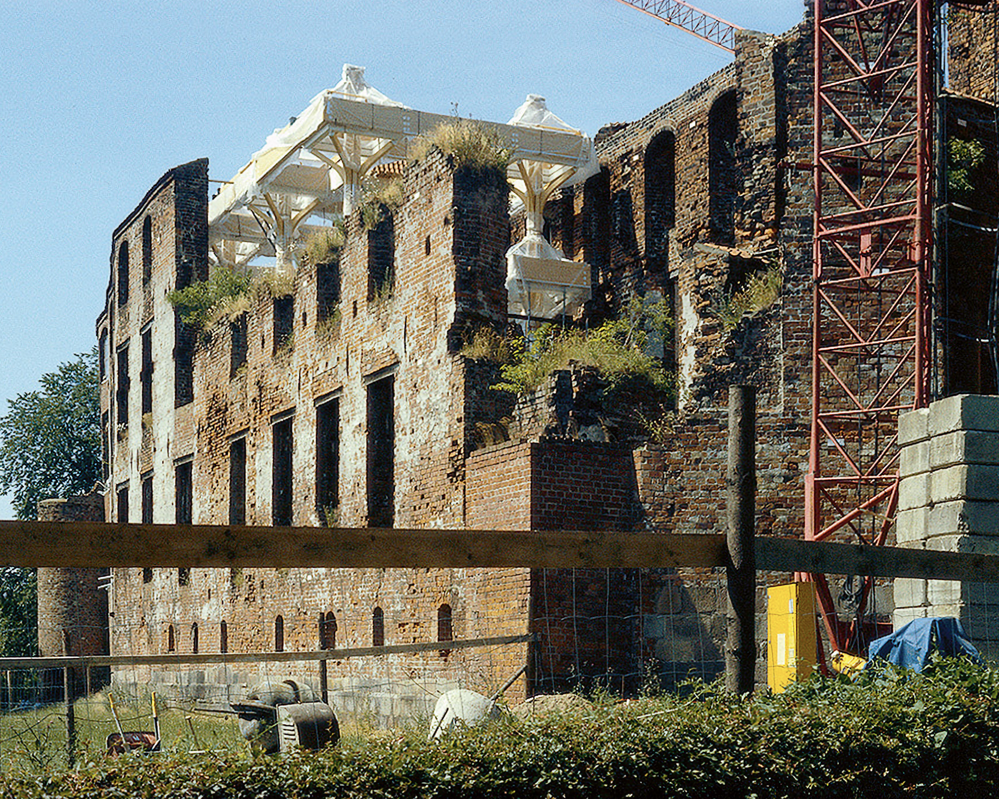
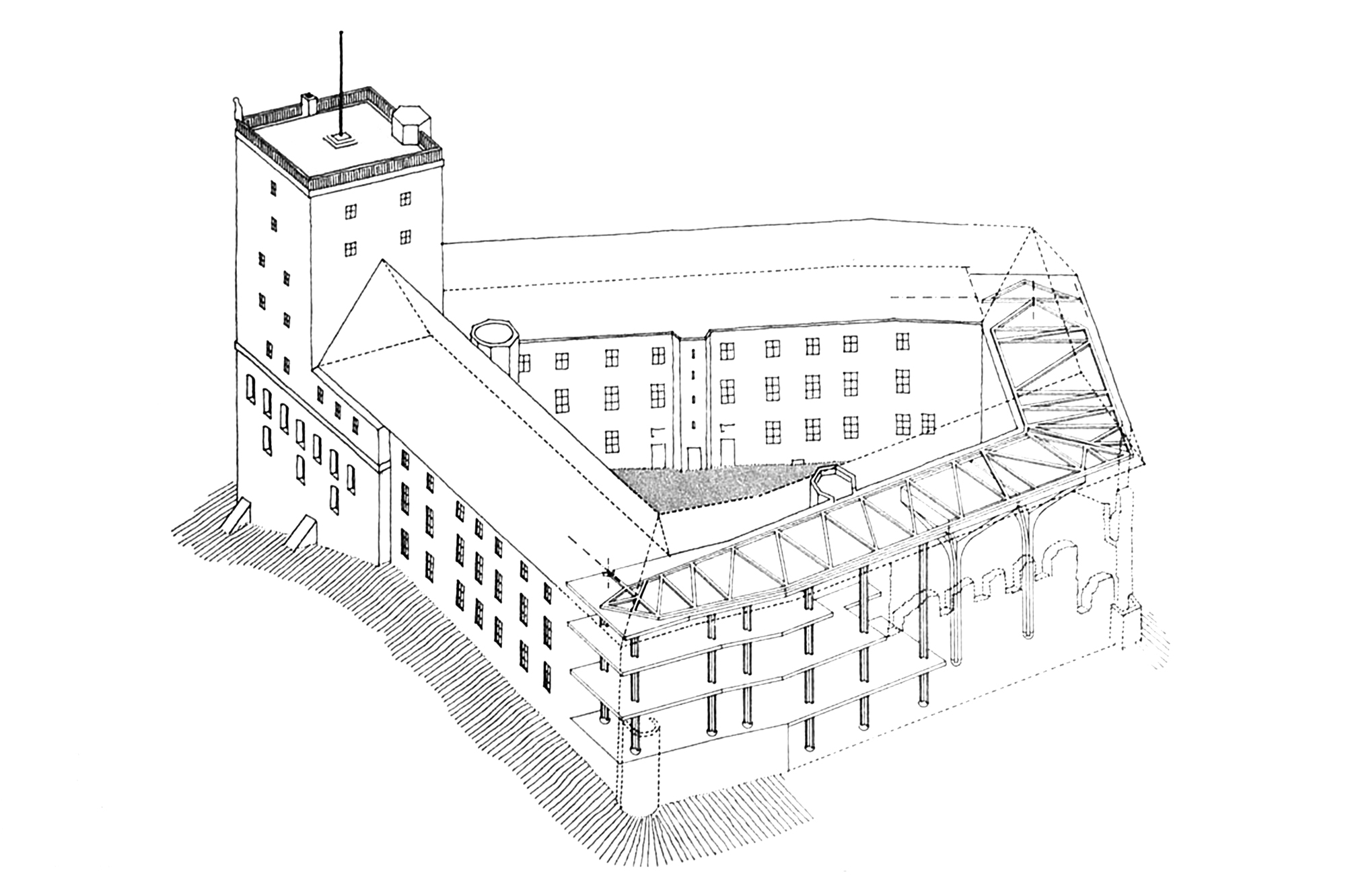
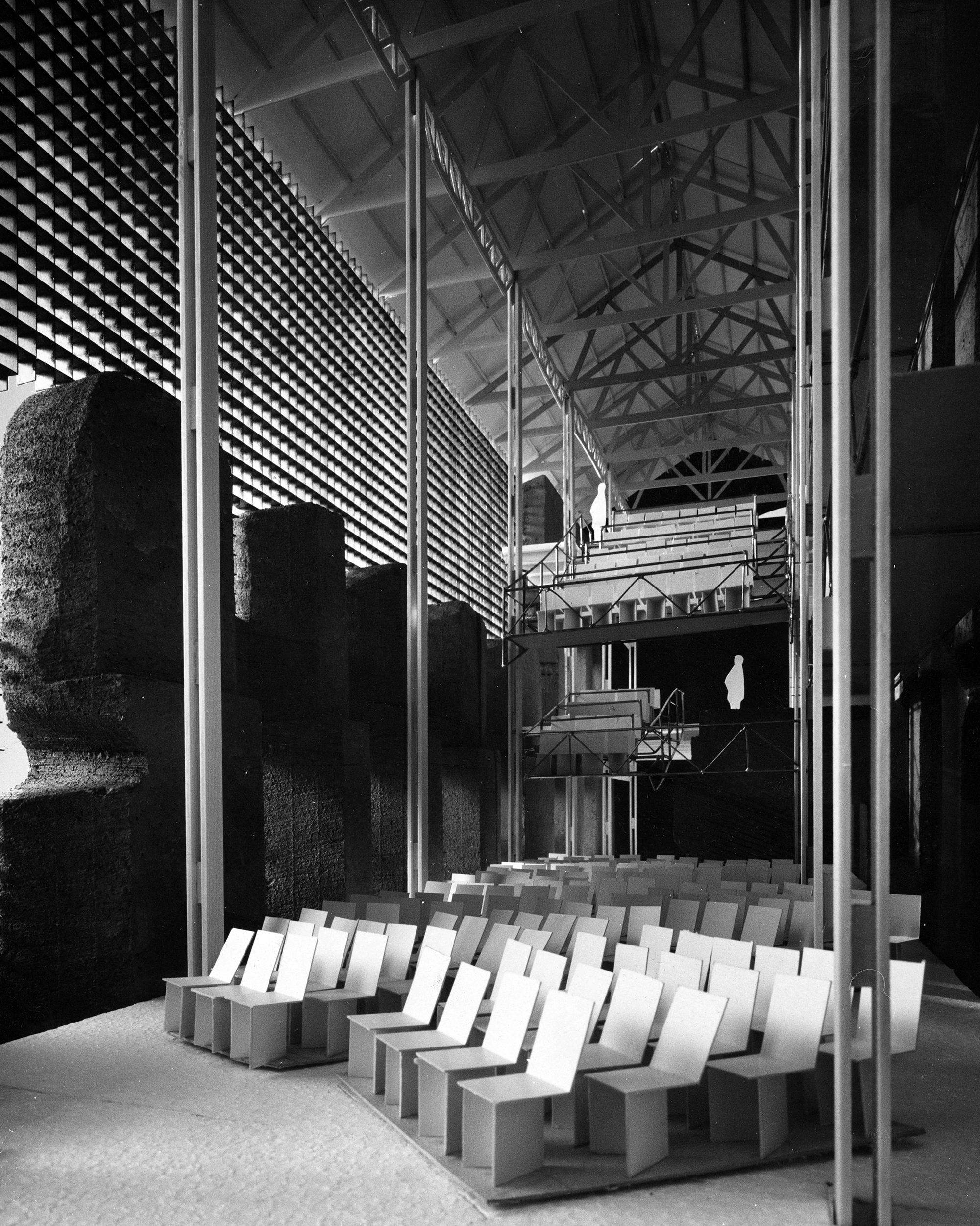
In order to keep the ruins untouched and to preserve their ‘narrative value’, a framed structure has been designed to fit within the walls of the ruin. Columns carry the floor decks and roof, and the design also includes a timber wall that fills in the gap in the brickwork of the south-east facade. This new structure is virtually free-standing within the ruin, and the elements do not touch the old brickwork. One might say that ‘air’ is used as the connecting material. This solution also offered the possibility of using pre-fabrication methods for many of the parts, which allows a more precise programming of the work, both in time and cost. The structure consists of columns reducing in section as they rise through the height, with ‘bases’ and ‘capitals’, and with branching elements which create a vaulted effect. The ‘capitals’ are made with sliding carden-frames, and the bases are cast-iron hemispheres. Above the columns is a horizontal lattice beam spanning from east to west. As a contrast to the heavy red brick walls, the inserted structure and walls are light. The capitals of the columns and the ceilings will be covered with white plates reflecting the daylight from the white painted new windows. The inspiration for the light ‘heaven’ in the ruined hall came first of all from the ruins themselves, but it was suggested also by the characteristics of Baroque architecture, with its manipulation of light and space.
