THE TRAVERSED CUBE
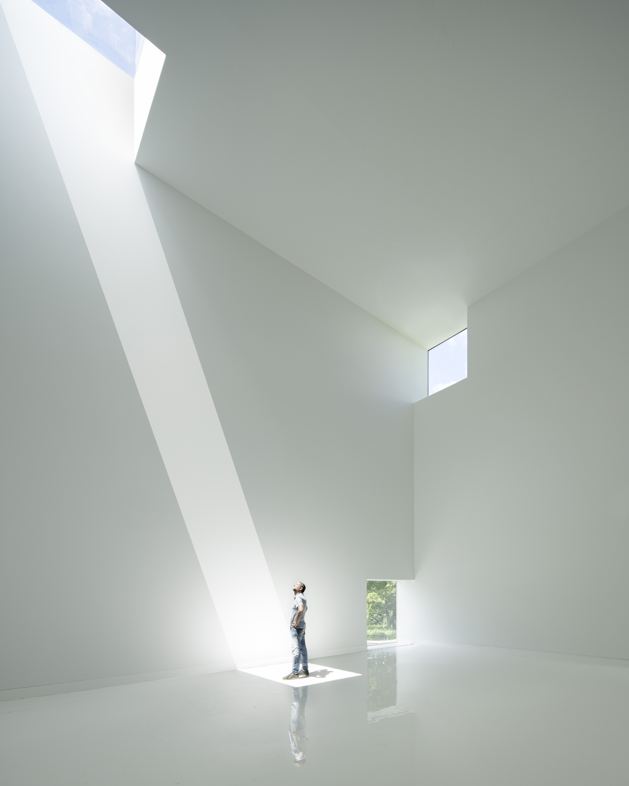
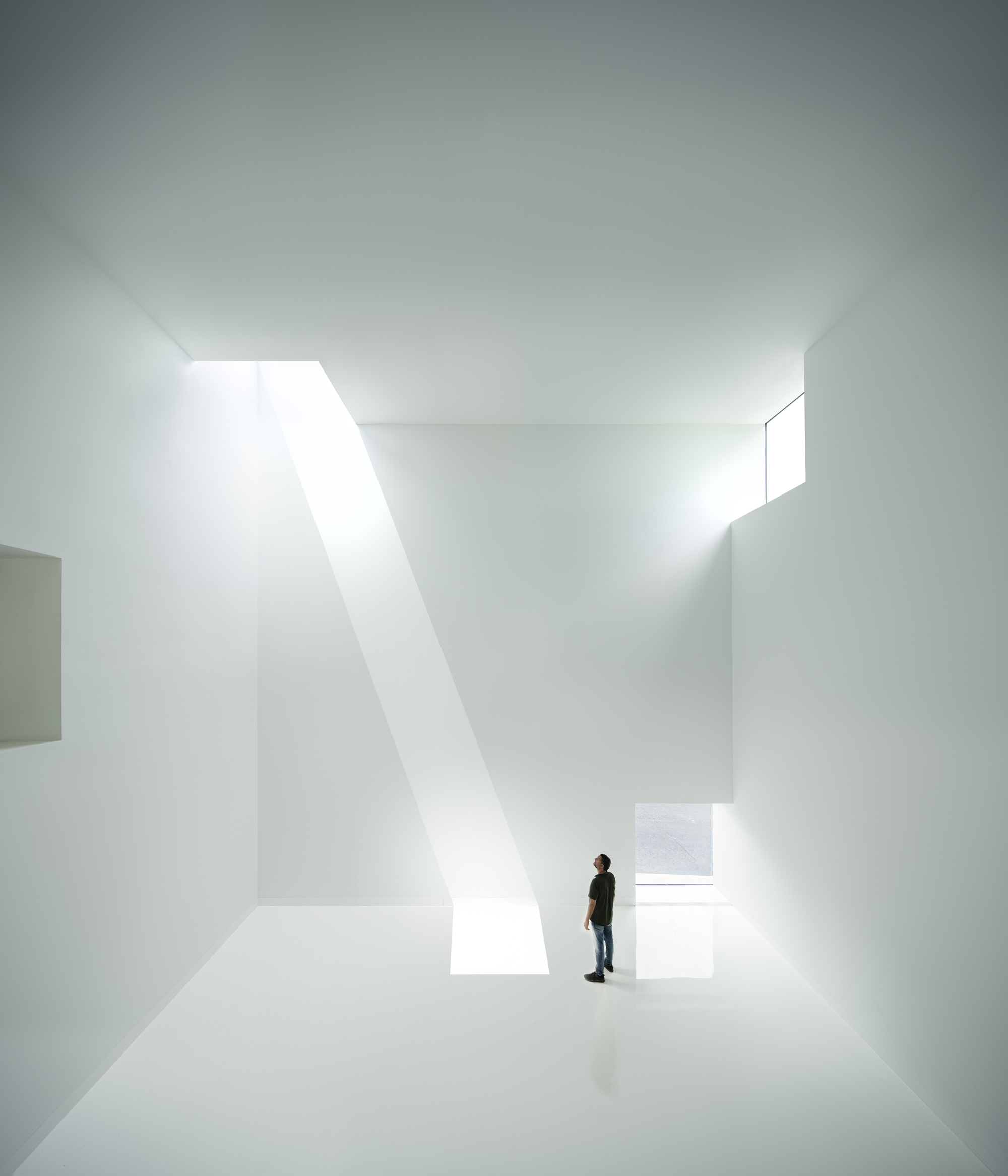
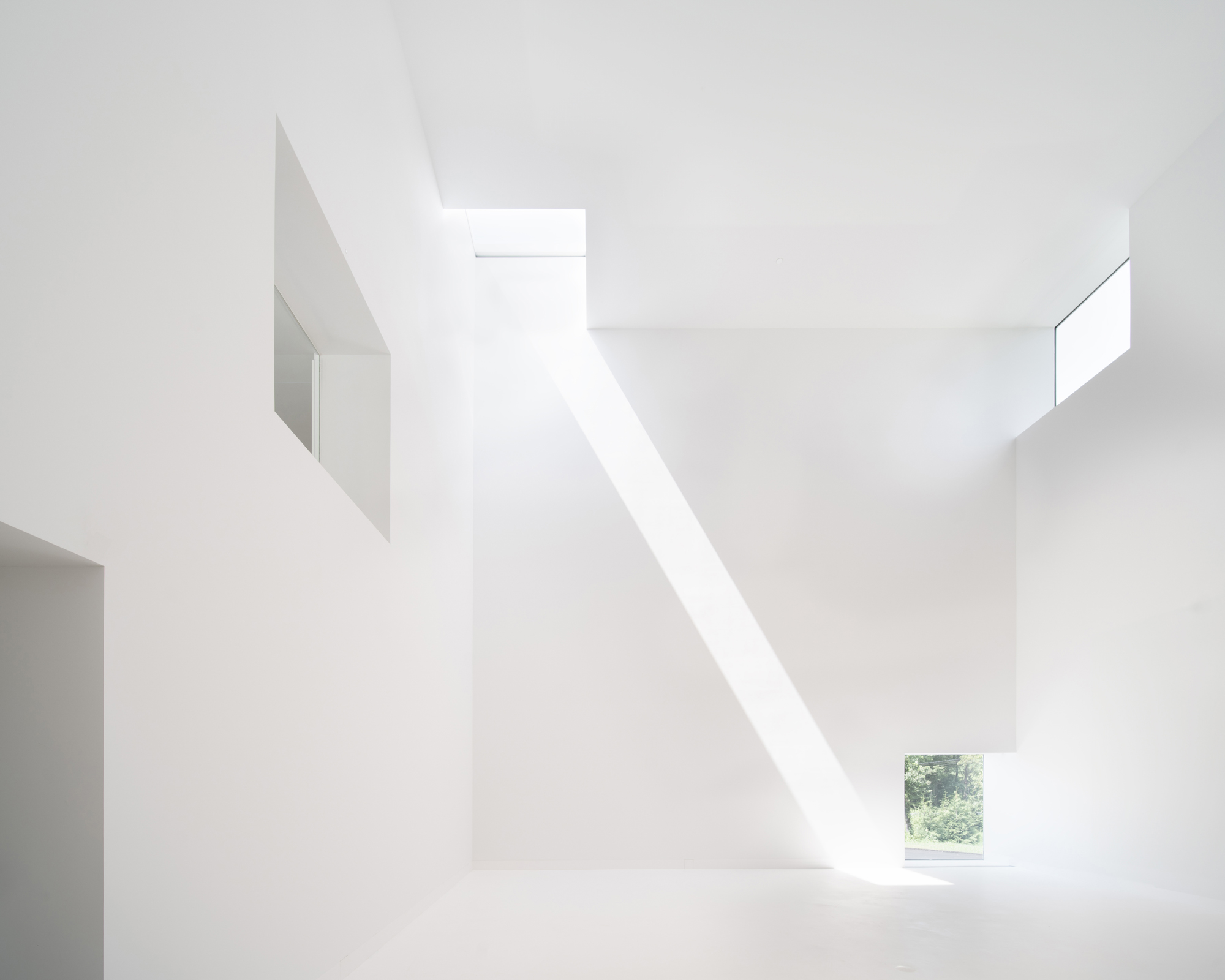
A white cube traversed by light.
In the Robert Olnick Pavilion we would like, one more time, to build the most beautiful Architecture all over the world.
The day the light will traverse the interior in awe is upon us. That day, we will also be in awe looking at those spaces traversed and dwelt by such a splendid light.
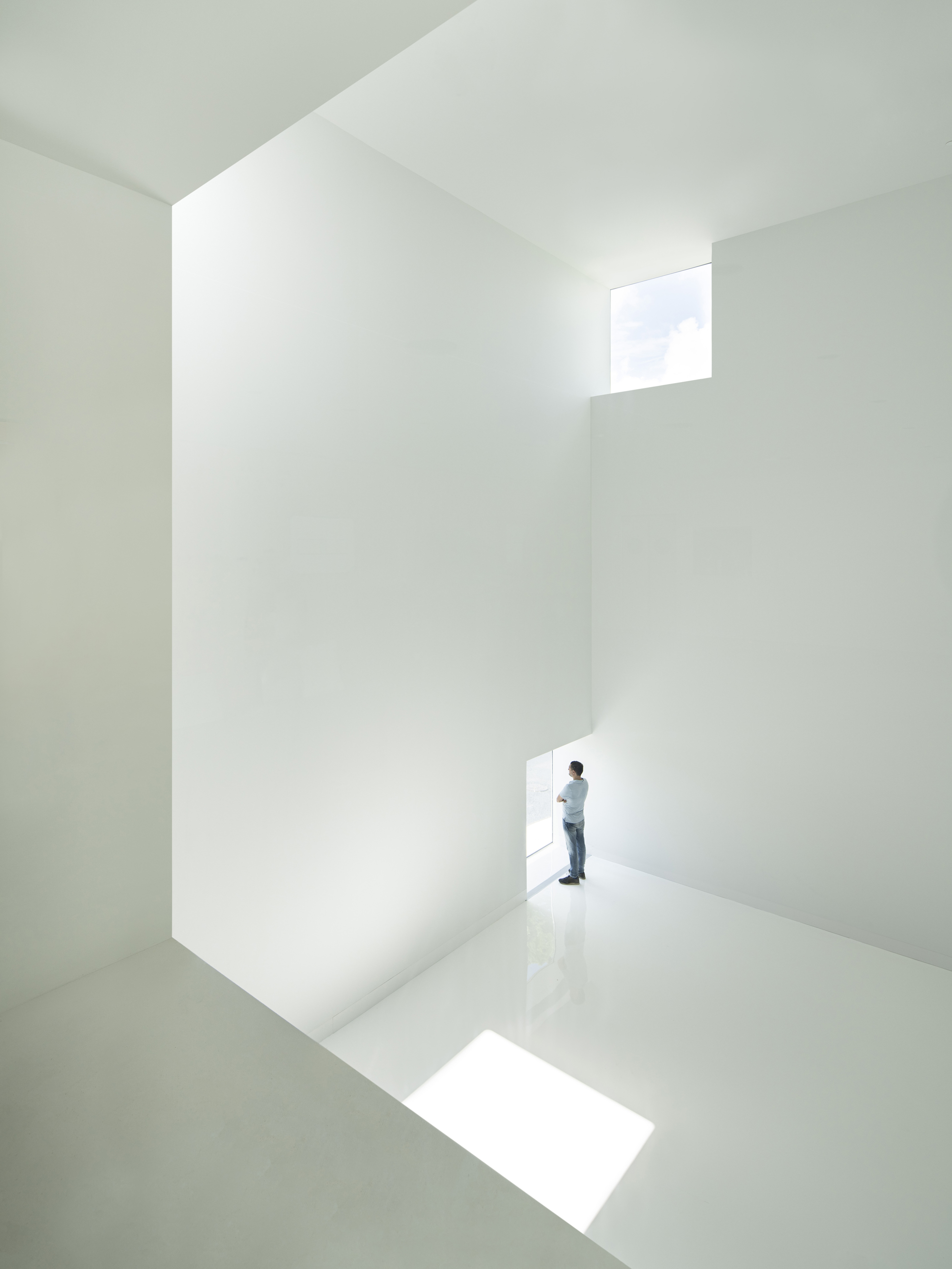
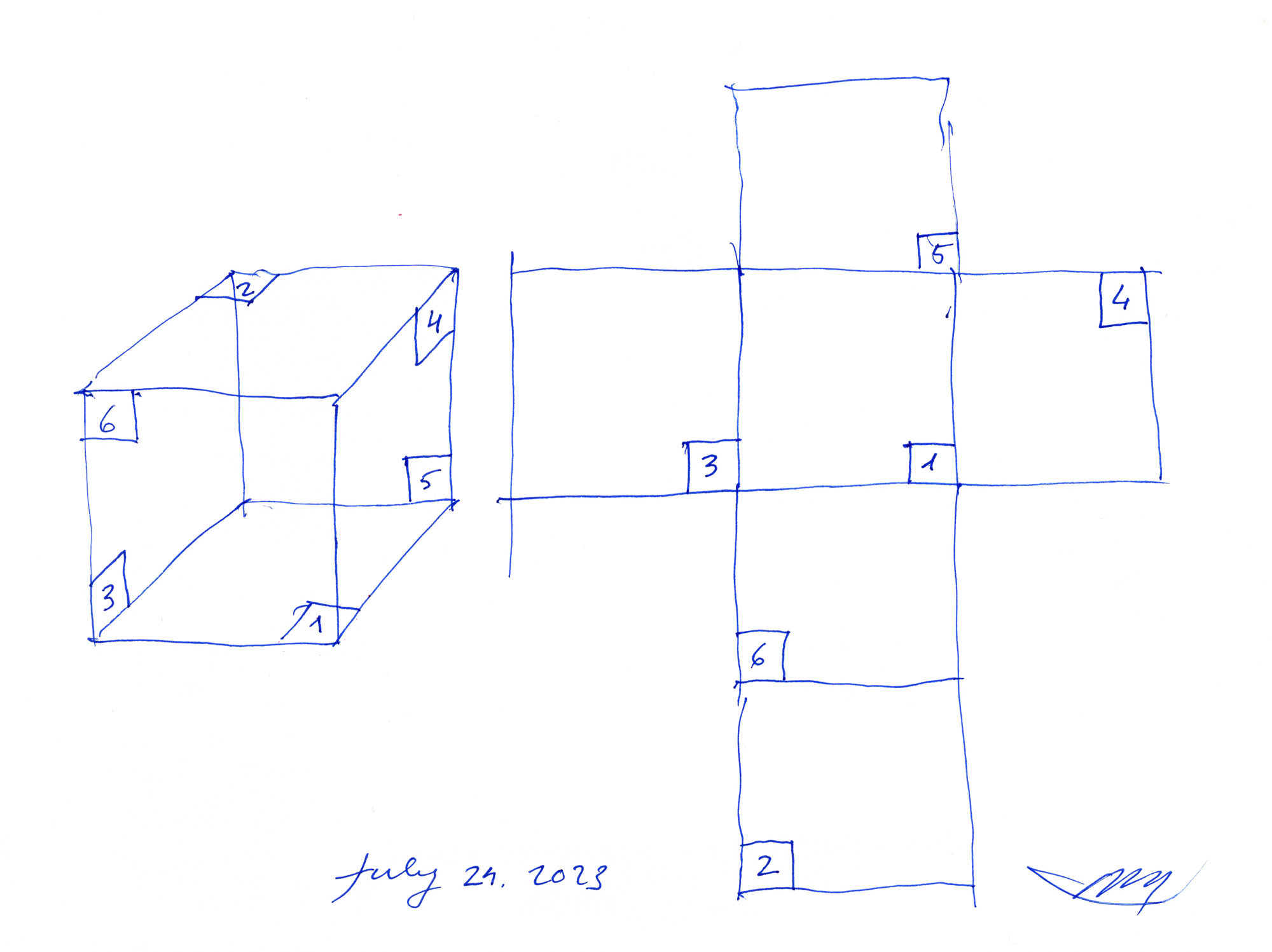
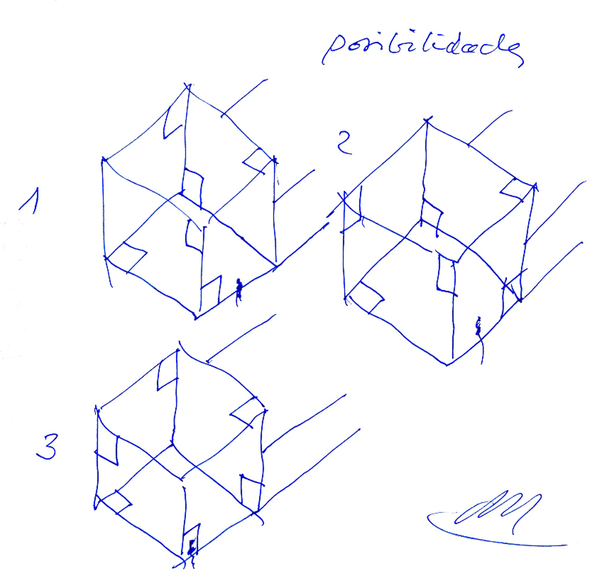
The main space is a white cube where the works of art will appear magnificent. Its isotropic design (with an opening in every corner) will allow for the sunlight to be present the whole day.
We are anxious for this day to come. It’s an amazing parallelism between human birth and building. The day of the delivery finally arrives and it brings joy to all if us. That is, ultimately, the purpose if Architecture.
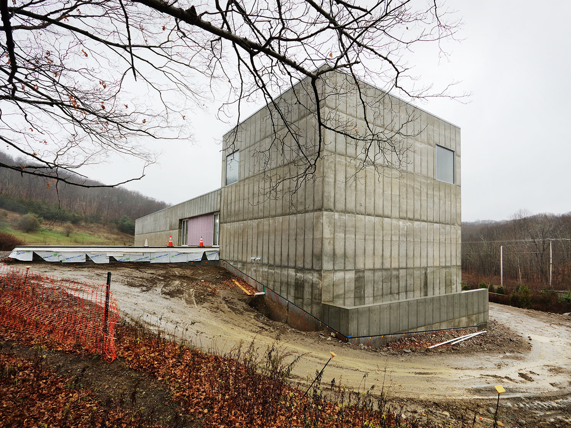
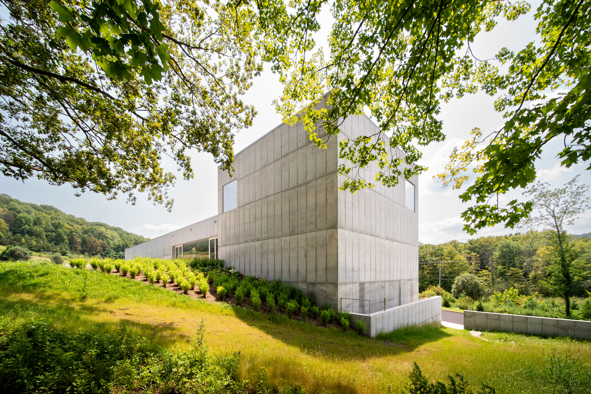
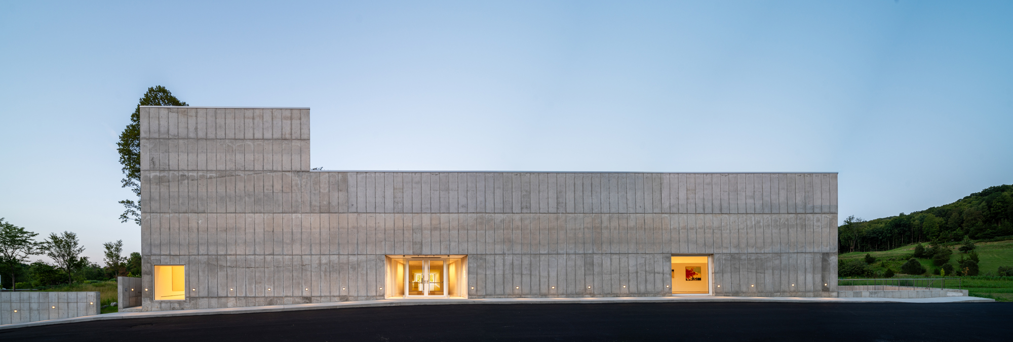
The Robert Olnick Pavilion designed by architects Alberto Campo Baeza and Miguel Quismondo is an extension of the MagaZZino Museum, Nancy Olnick and Giorgio Spanu’s Museum of Italian Arte Povera in Cold Spring, New York.
The current MagaZZino is a superb building, designed and built by Miguel Quismondo. It has proven to be so resoundingly successful that it has now outgrown its size, which is why the Olnick Spanu family asked us to build this extension.
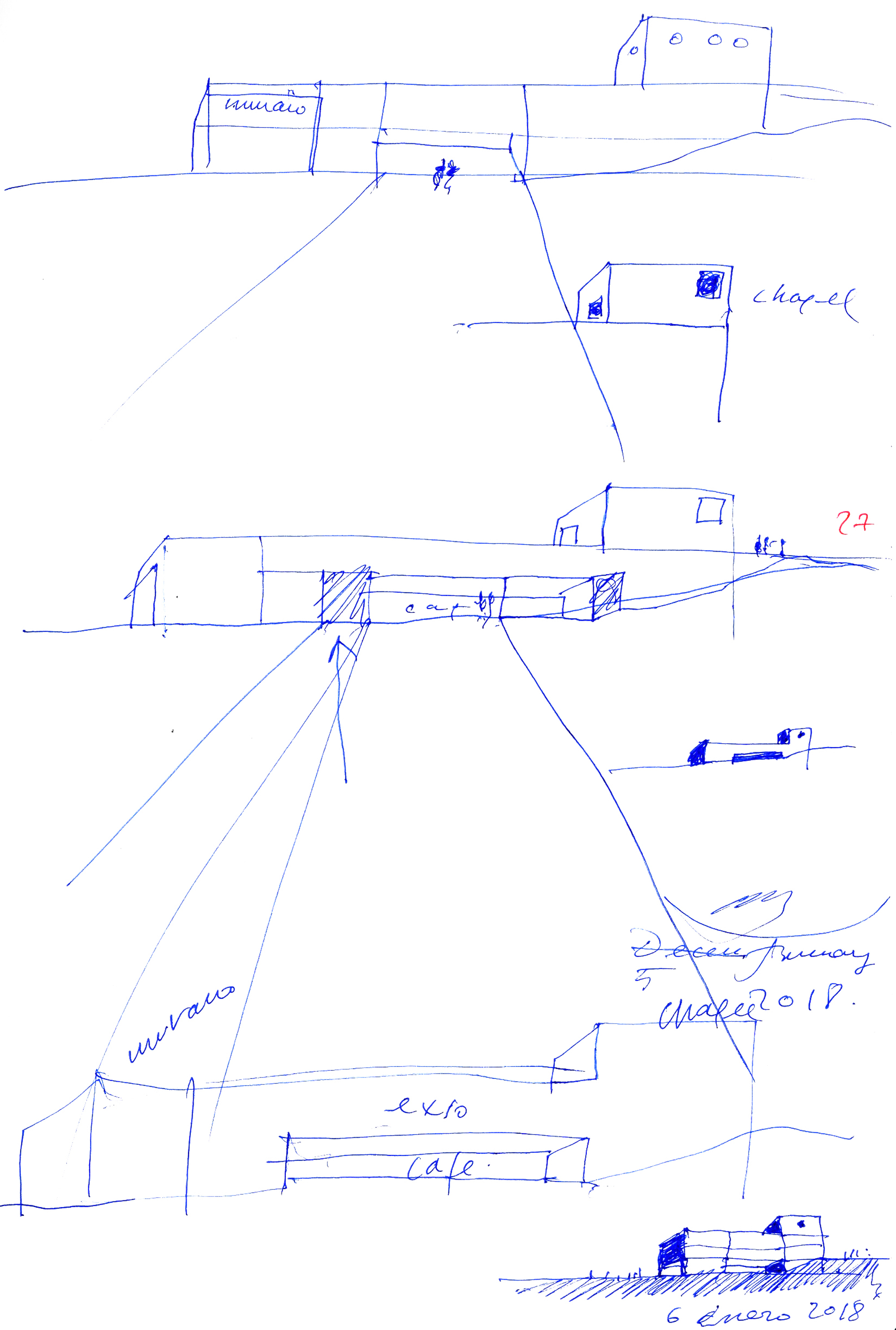
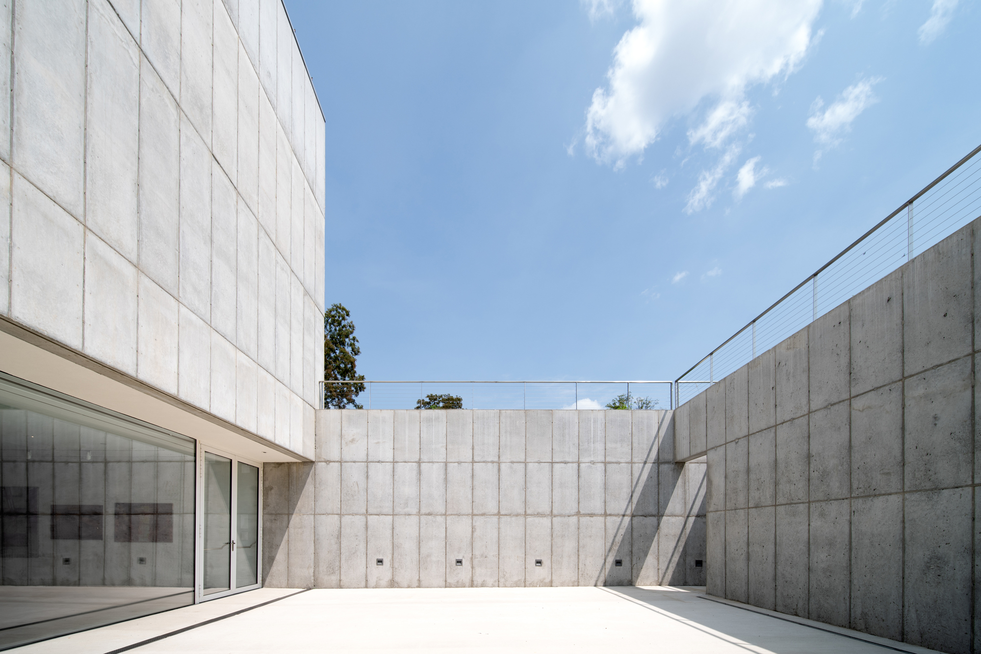
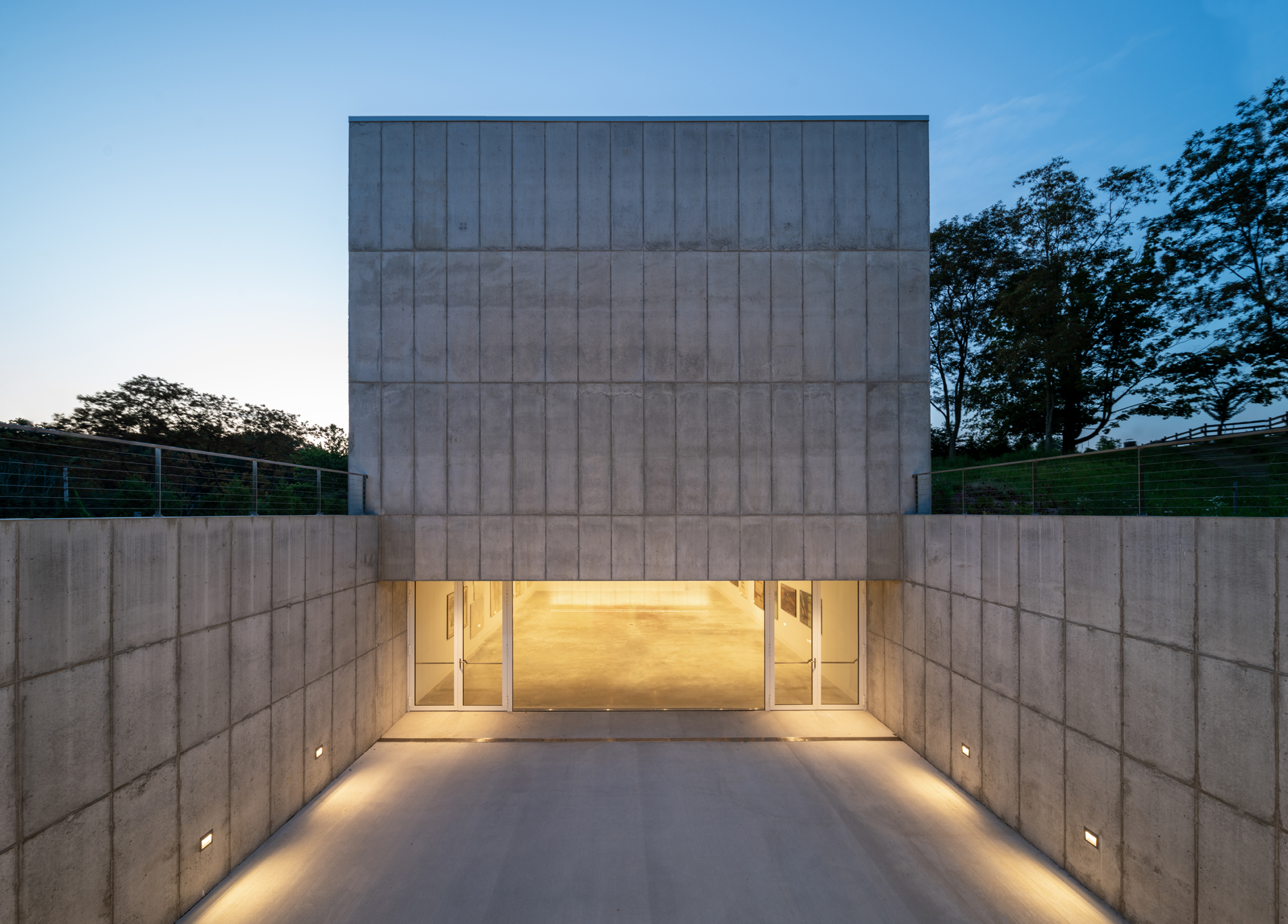
The new Pavilion has two floors and is a straight rectangular parallelepiped-shaped building of reinforced concrete, which will house the Murano glass collection, the cafeteria and more exhibition spaces.
Special emphasis is placed on the main exhibit area, which is a white, cubic, isotropic space that will house temporary exhibitions and serve as a focal point of the museum.
Isotropic space, as defined by the dictionary of the Royal Academy, has the same characteristics in all directions and from any point. If we could fly from the centre, the space would be identical in all directions.
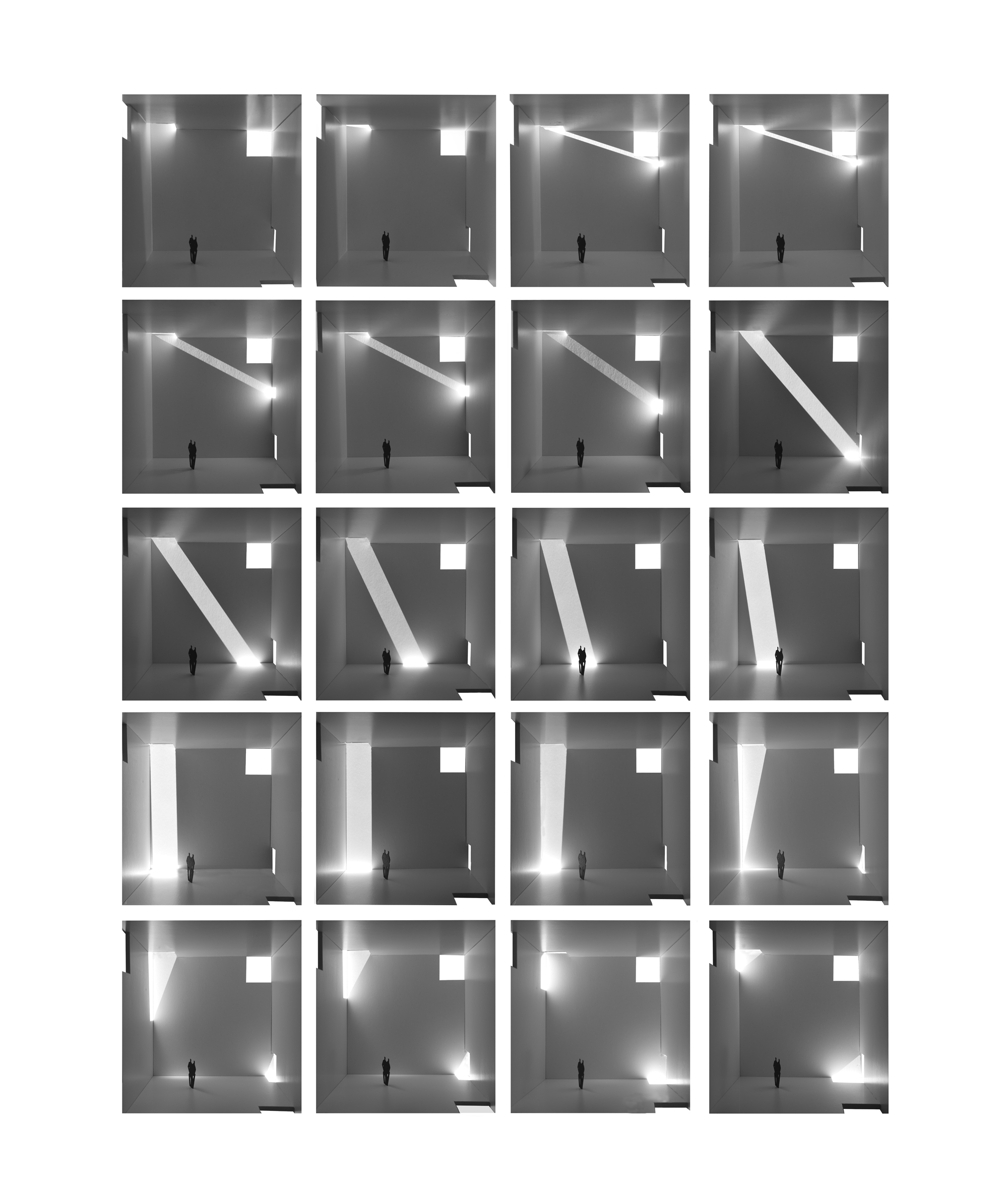
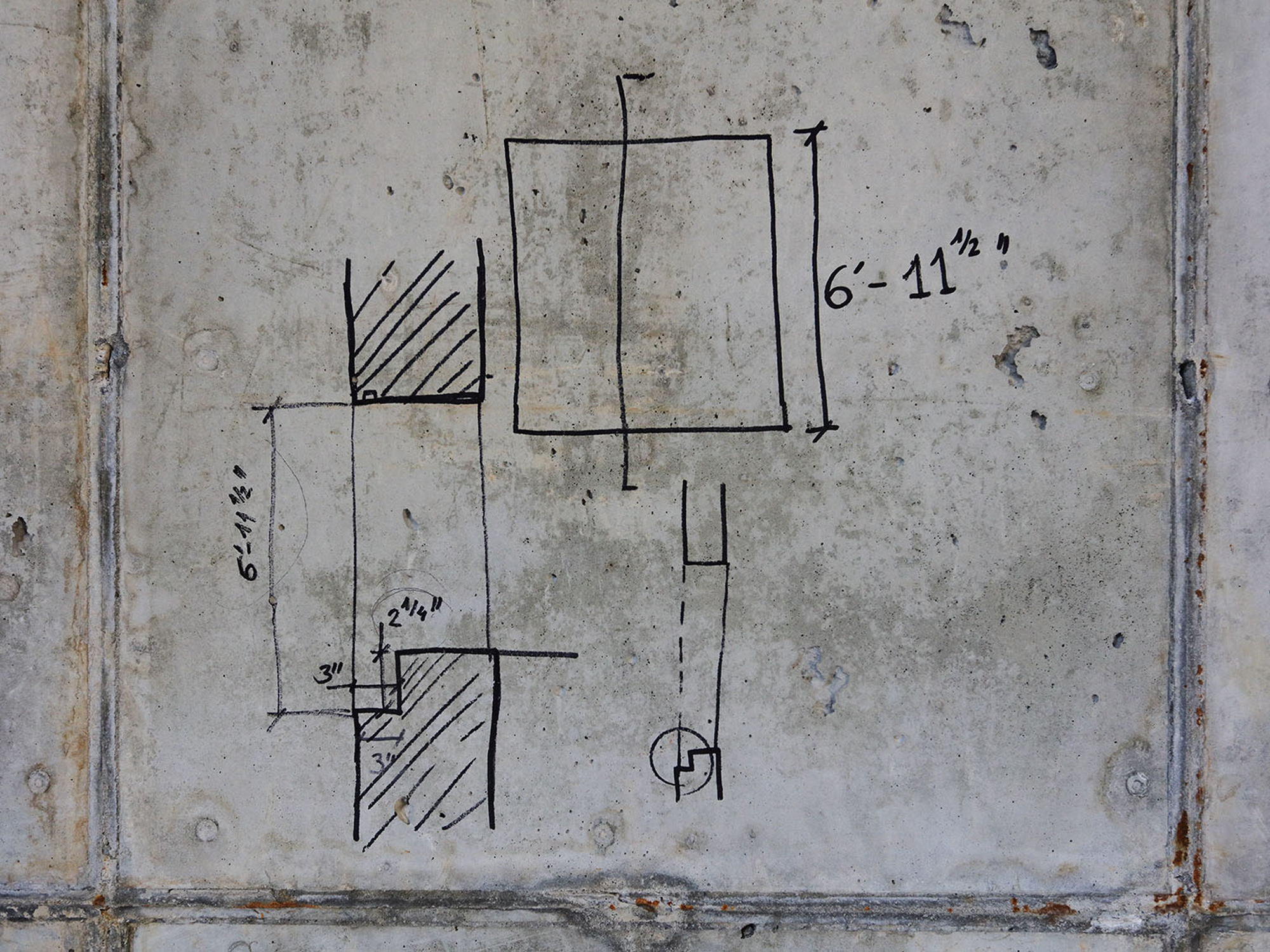
So in that cubic, white and isotropic space, 10x10x10m, at each corner, we made an opening of 2.10x 2.10 x 2.10 x 2.10 so that the sun can enter there at any time of the day. And the spatial effect will be wonderful, as can be seen in the images of the many models we have made.
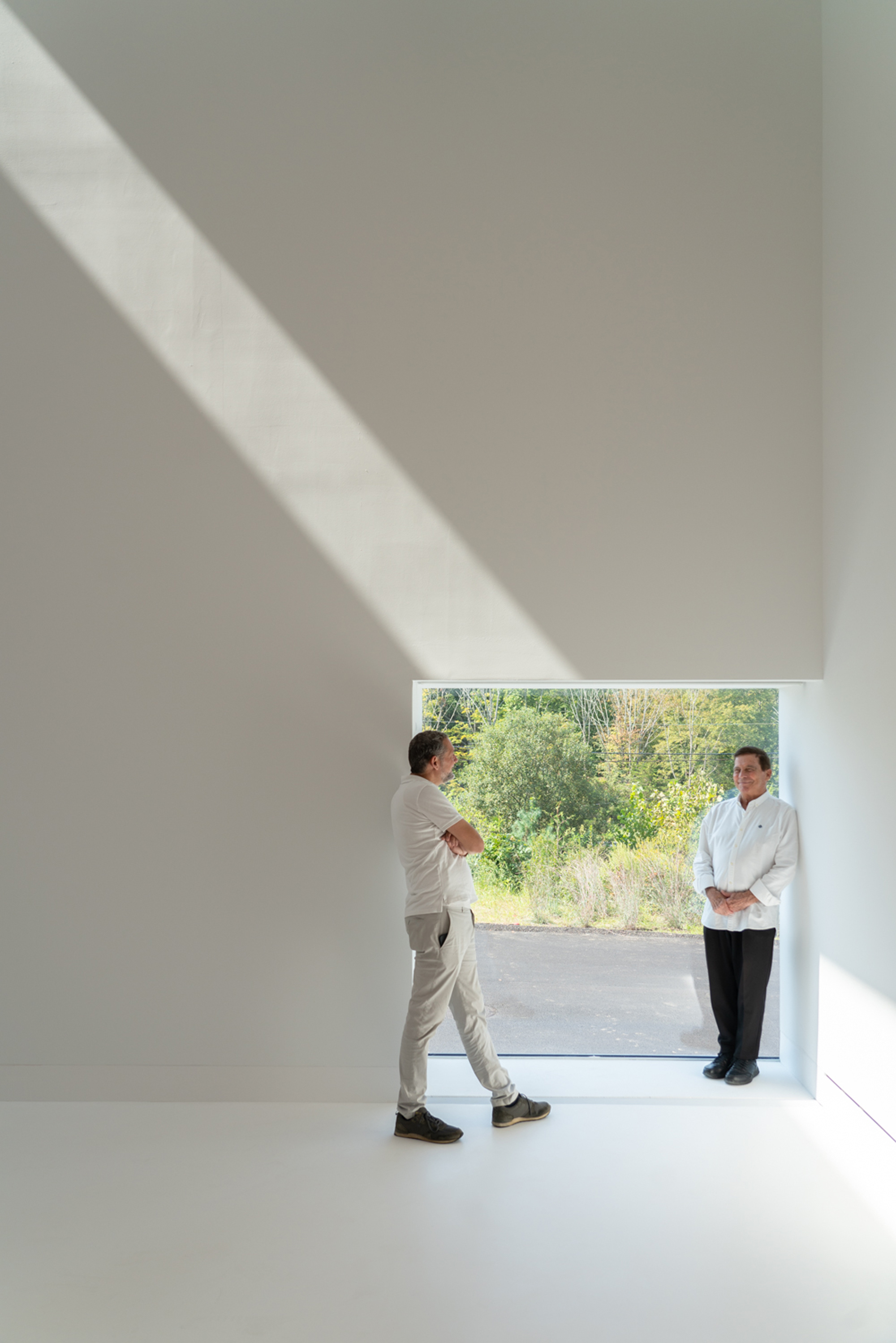
We have chosen 2.10 as the size of the opening so that, when located on walls that are in contact with the floor, they have suitable dimensions to serve as doorways. The two holes thus positioned, will be entrance doors to our white and luminous cubic enclosure. Furthermore it is of primary importance that these 2.10 x 2.10 holes are all very deep.
Following simple logic, we eliminated the opening corresponding to the floor plane.
In addition, we created a particularly interesting feature by drilling a 2.10 x 2.10 deep hole in the centre of the wall, so that the entire spatial operation can be understood at a glance.
We are very excited with the result.





1 Comment
¿Cuántas toneladas de hormigón son necesarias para confirmar que el brutalismo es horroroso y no se integra de ninguna manera en el paisaje?