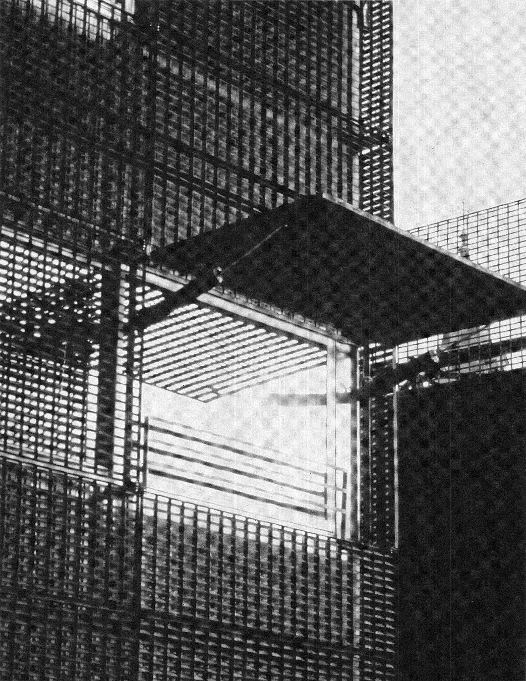
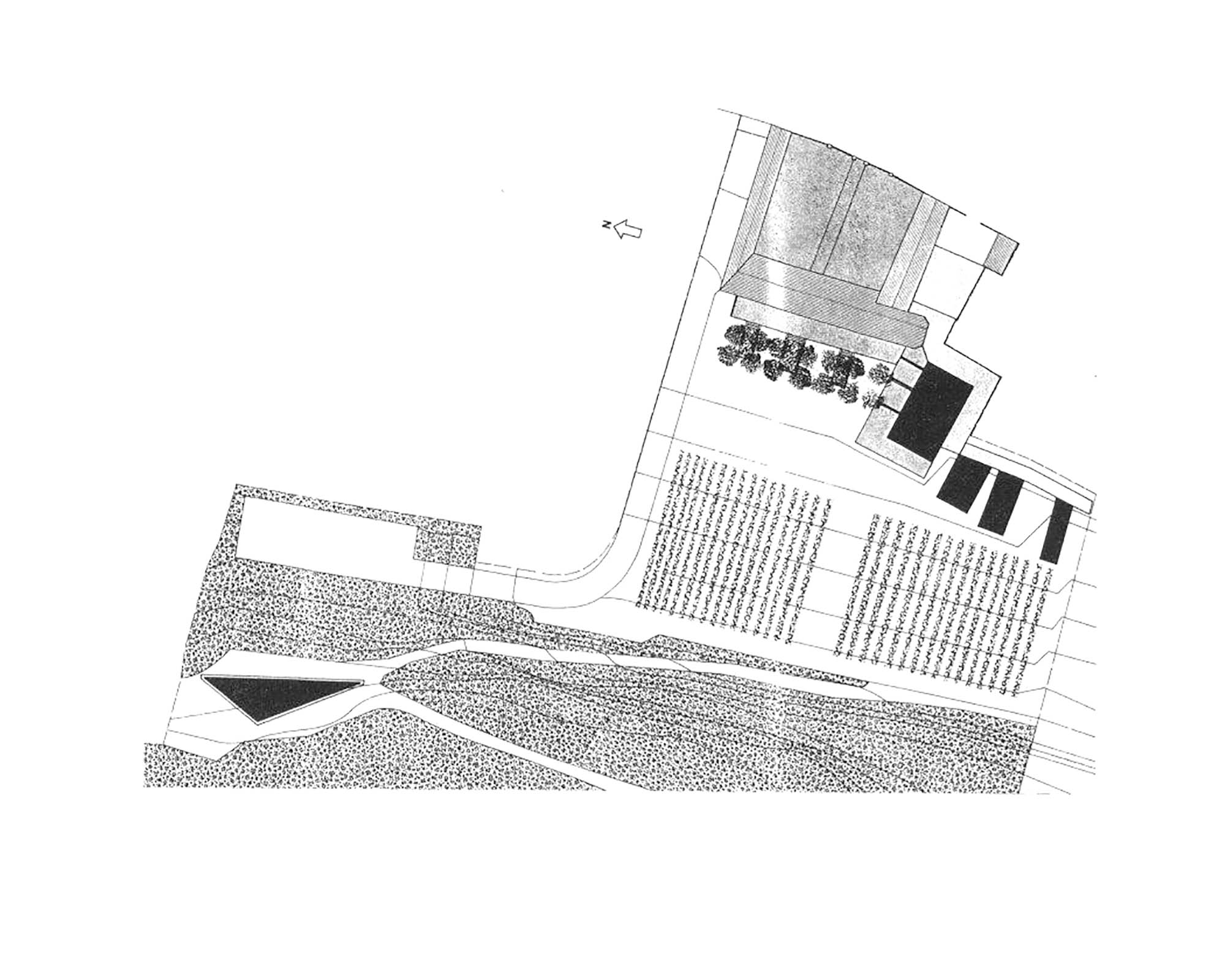
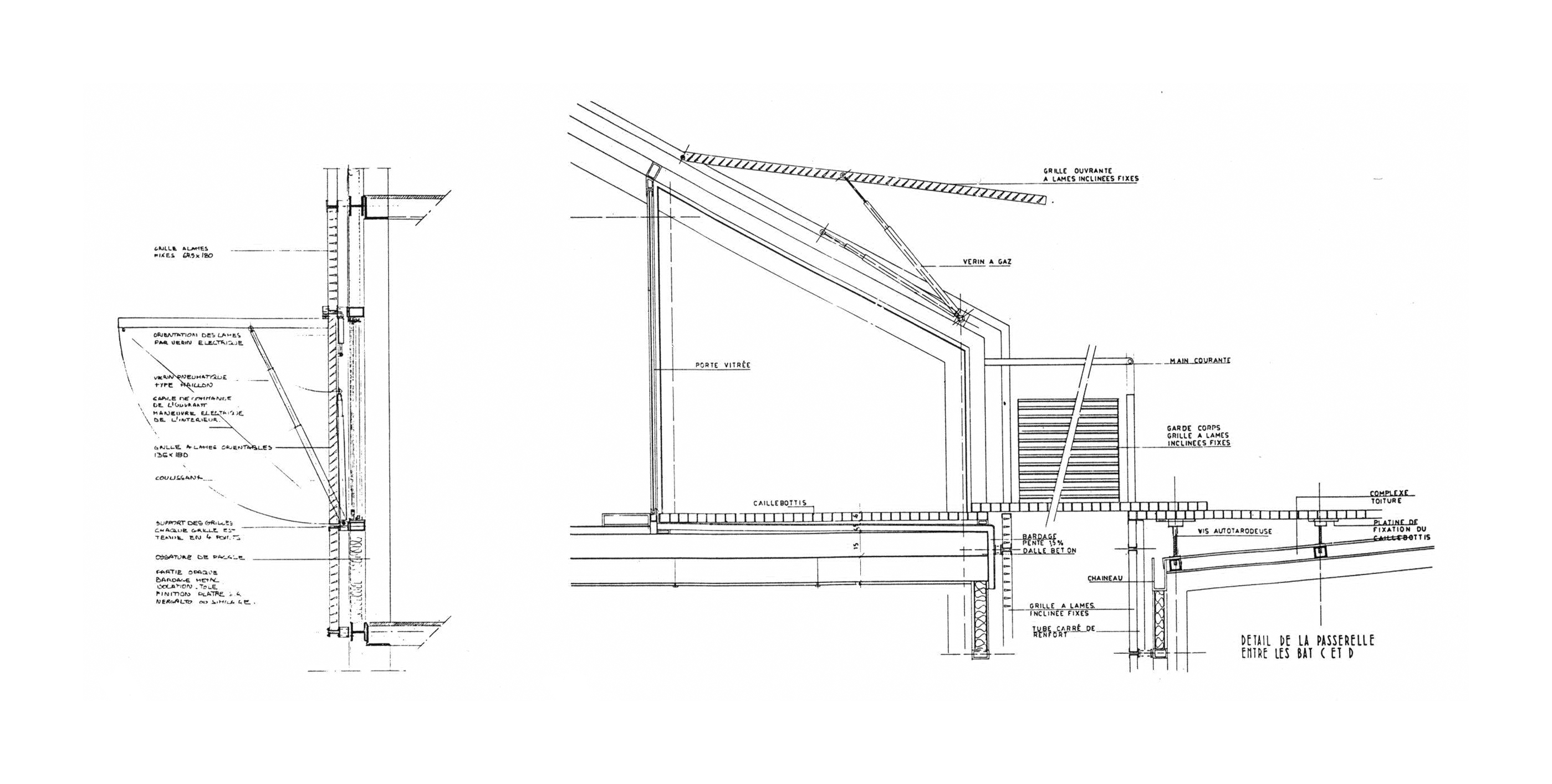
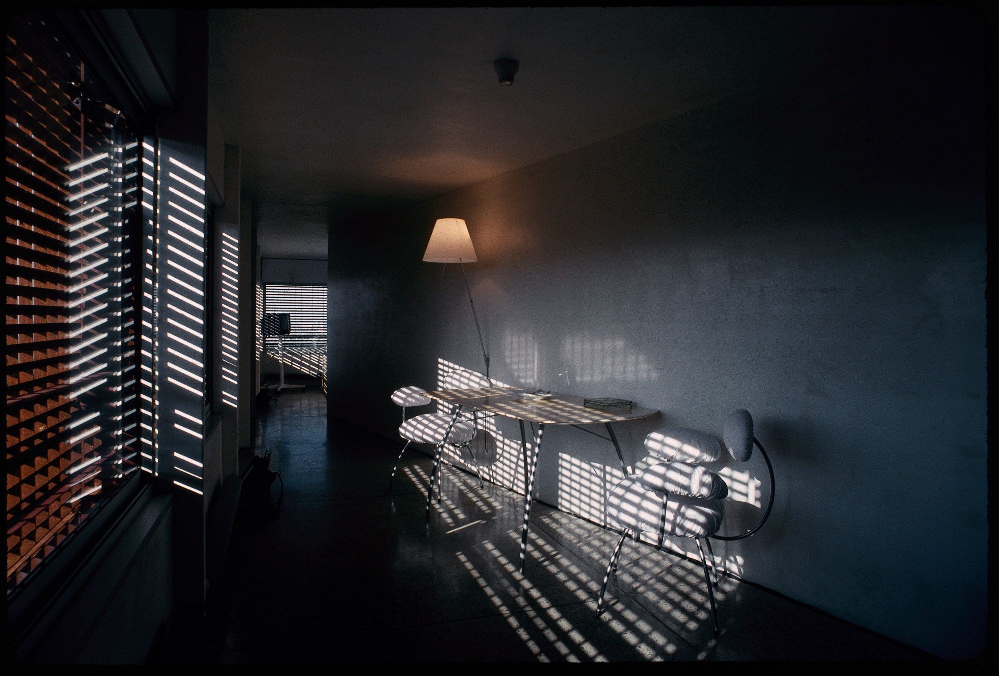
The hotel is in a tiny village, near a square-towered church, and looks out over the vineyards of the Garonne valley. The hotel consists of four small buildings, at most three stories high. The hotel St.James is a rarity among Nouvel’s projects, in that it is not placed in a dense urban setting. Instead the façades of the building create a density of their own. The interiors have plain concrete floors and waxed plaster walls: no moldings or decoration. No two room plans in the hotel are the same. The hotel rooms are sparse and simple, focusing attention on the delights of the landscape and food. In the bedrooms the beds are relatively high and subtly refer to the regional tradition of high country beds with adjustable headboards, giving a view through the windows. The ample windows are framed in grey metal, also used for cladding unwindowed areas. Beyond these are metal grilles, some fixed, some mobile, which can be raised or tilted to admit the light and the view. This layering is also appreciated from the exterior. The outer grilles have a deliberate rusted color (reminiscent of the tobacco-drying sheds found in the region) which is revealed beneath the texture and color of the grey cladding or glass giving onto the stripped interiors.
The exterior shapes of the buildings are traditional, comprising simple roofs without eaves, or in one case, a flat roof terrace. The original work on the hotel St.James, done between 1987 and 1989, included creation of the eighteen-bedroom hotel and redesign of the restaurant, and the design of the “bistroy” bistro, intended for a younger clientele and housed in the former cold store, a fact recorded in the decoration of the space. Since then, Nouvel has returned to design an outdoor eating area, the brasserie, and the swimming pool, which is black. Nouvel designed the chairs and tables for the hotel. From basic principles “what should a chair be? A seat and legs, a back and arms, is enough” – he created simple, round cushioned shapes mounted on chrome pipe work, with plain white covers, which could be removed easily for cleaning. The furniture looks slightly frail, but has an air of sophisticated simplicity that is in keeping with the building and its site. This simplicity is a way of creating a framework in which what is offered – the landscape and the menu – can be enjoyed calmly and without disruption.
