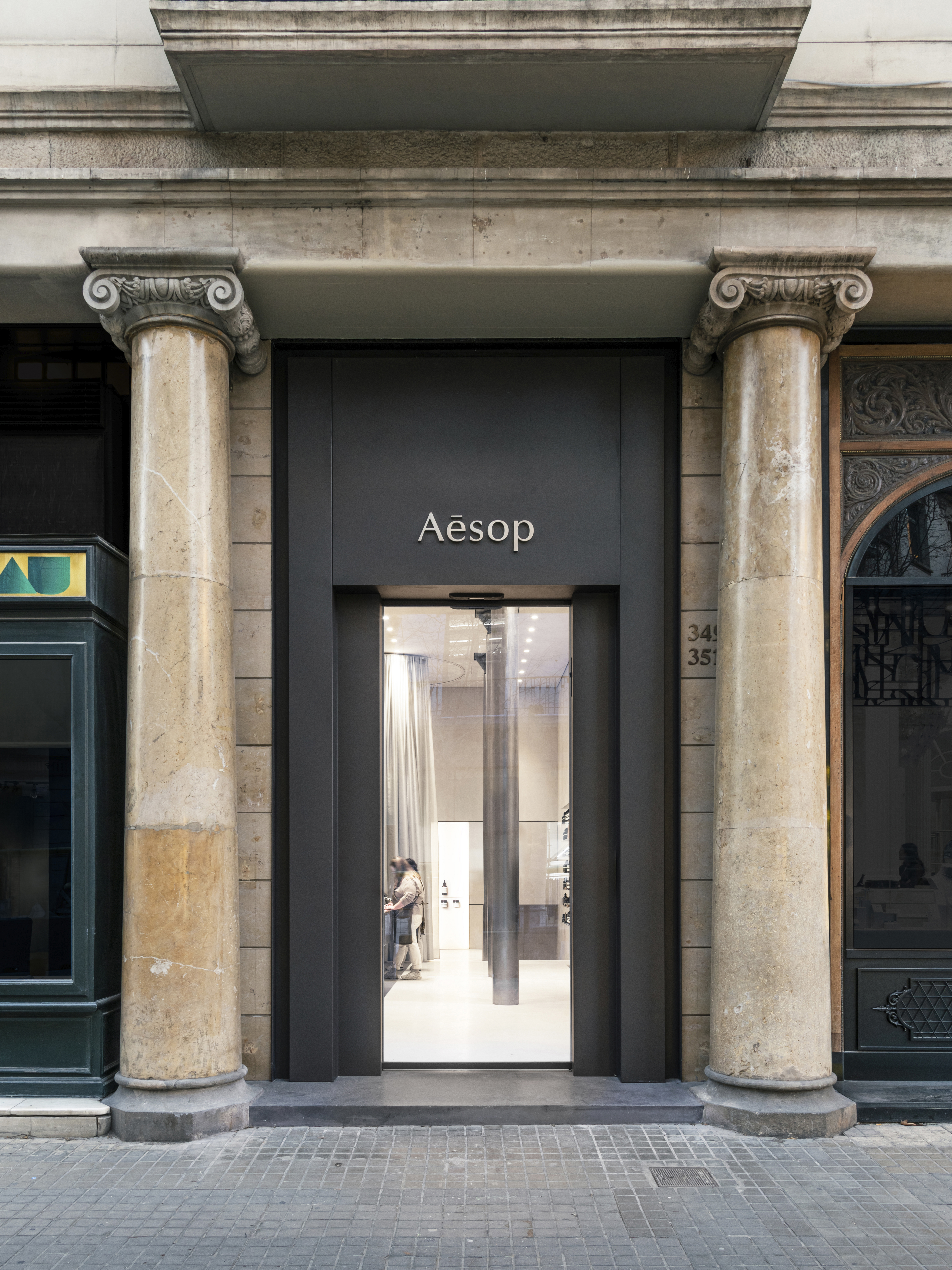
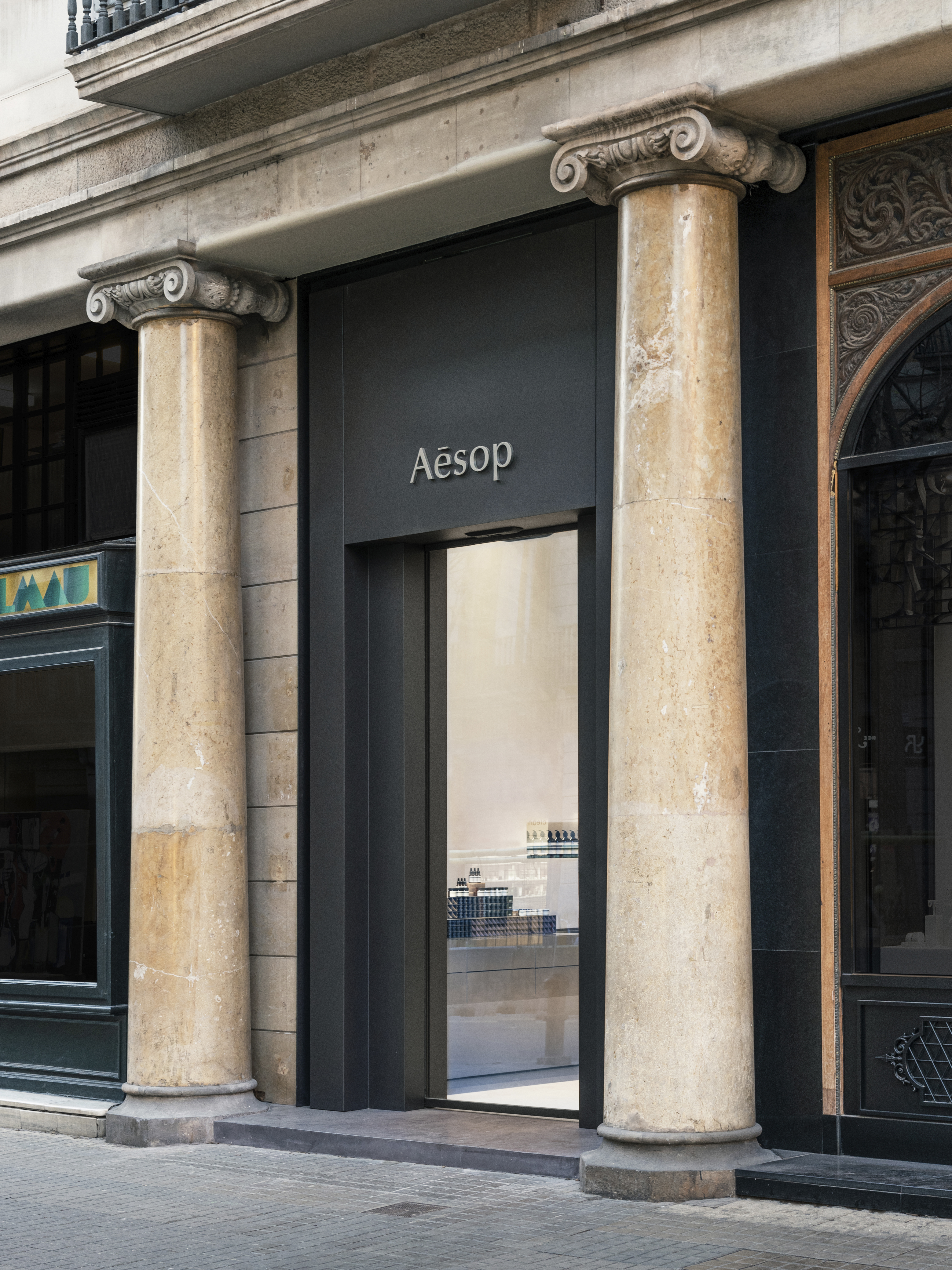
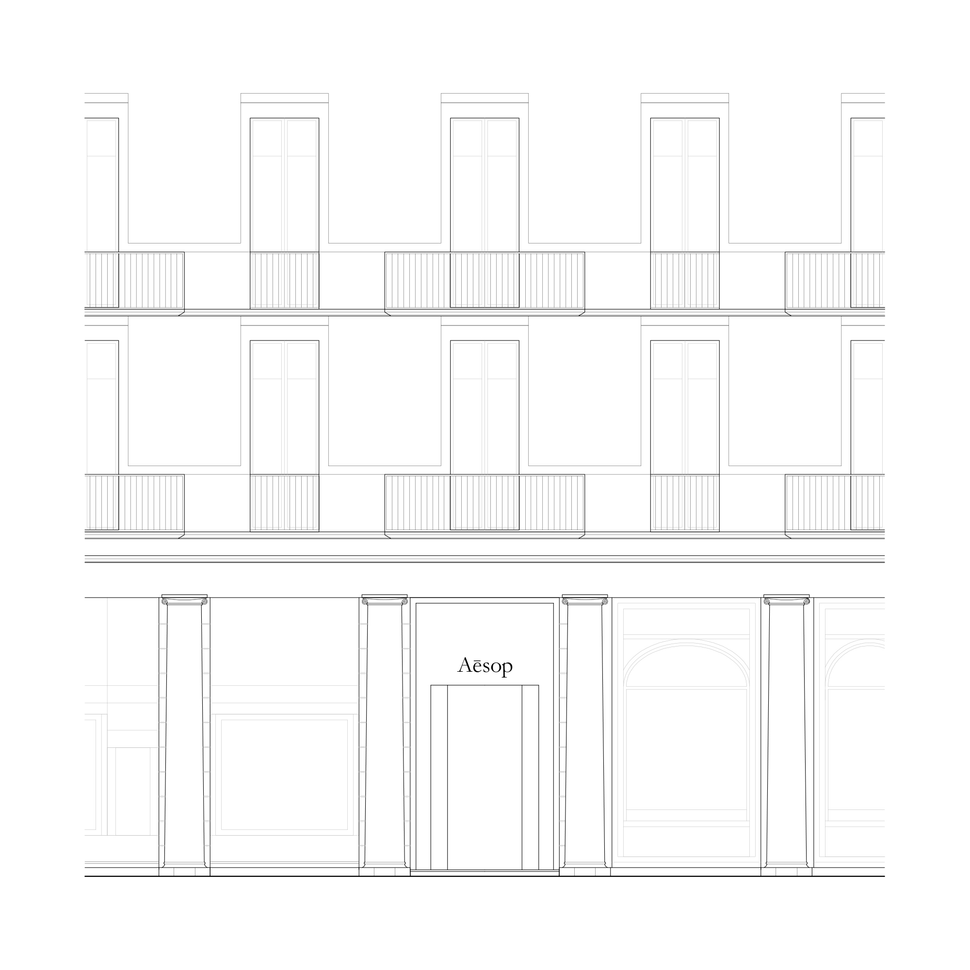
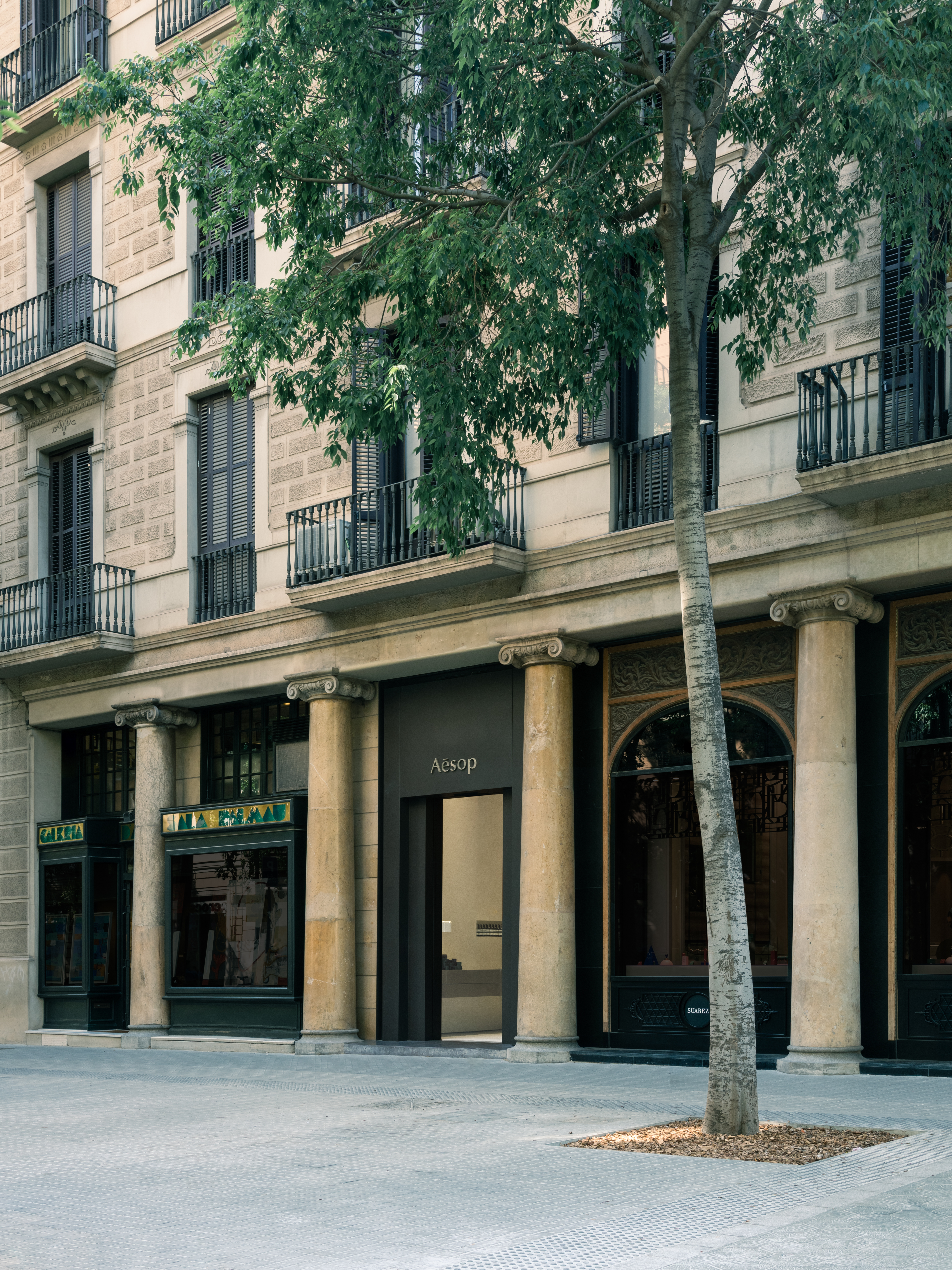
From the street, a dark metal monolith appears in an enigmatic way between two of the columns of the building in which the store is located. Familiar and alien at the same time, it is an element that gives continuity to what surrounds it but, at the same time, defines a singular moment in the whole, an entrance.
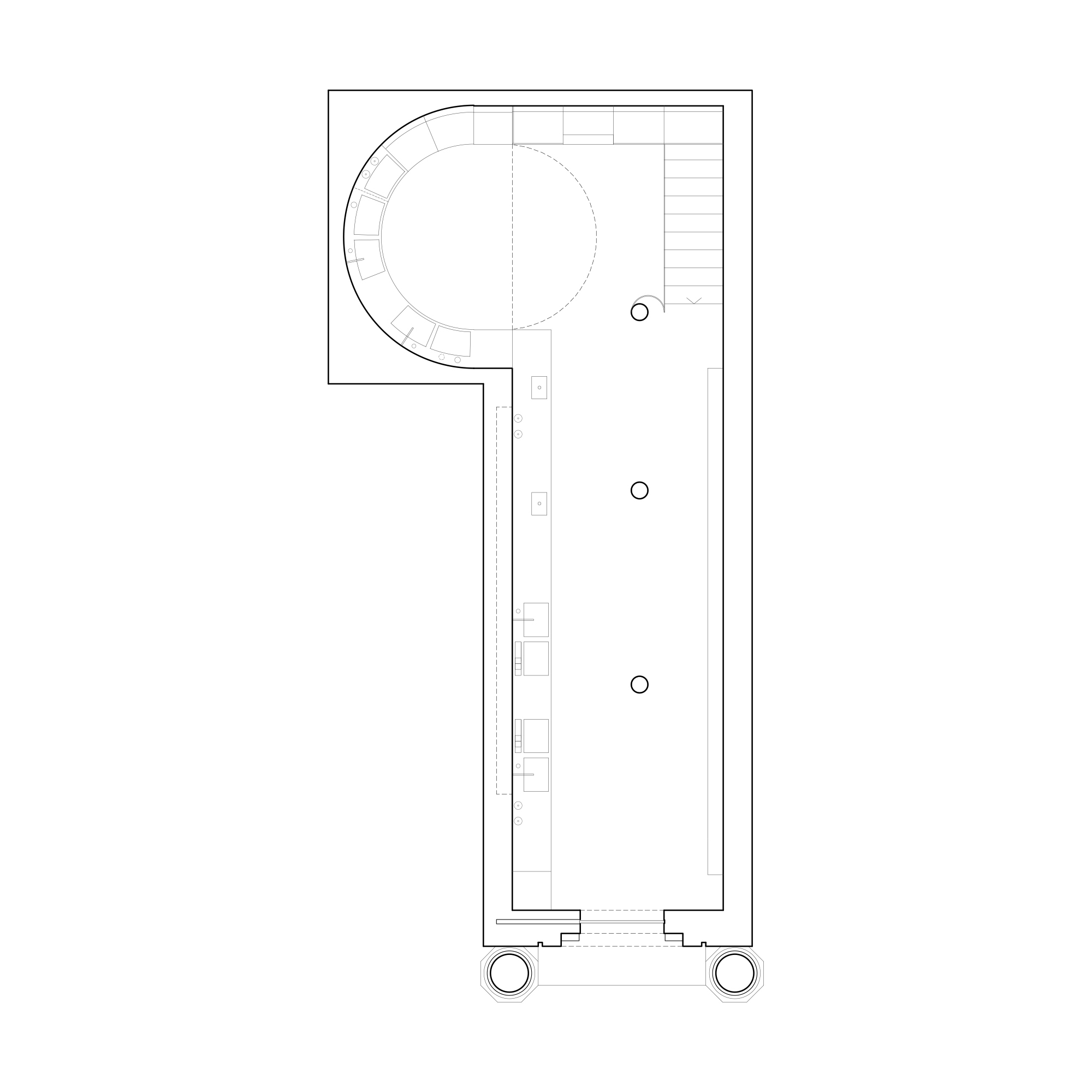
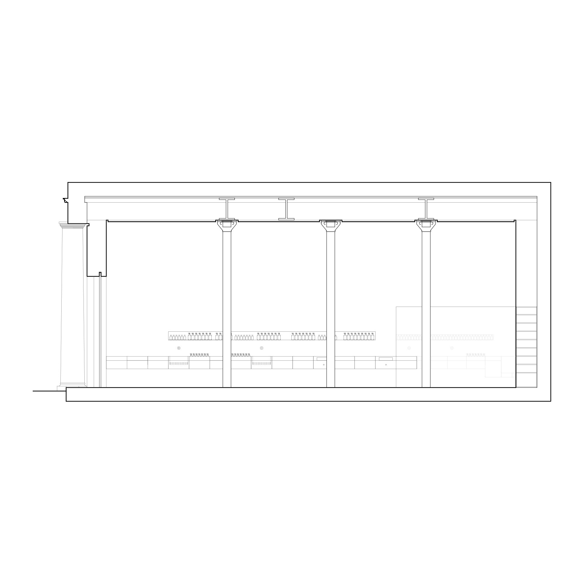
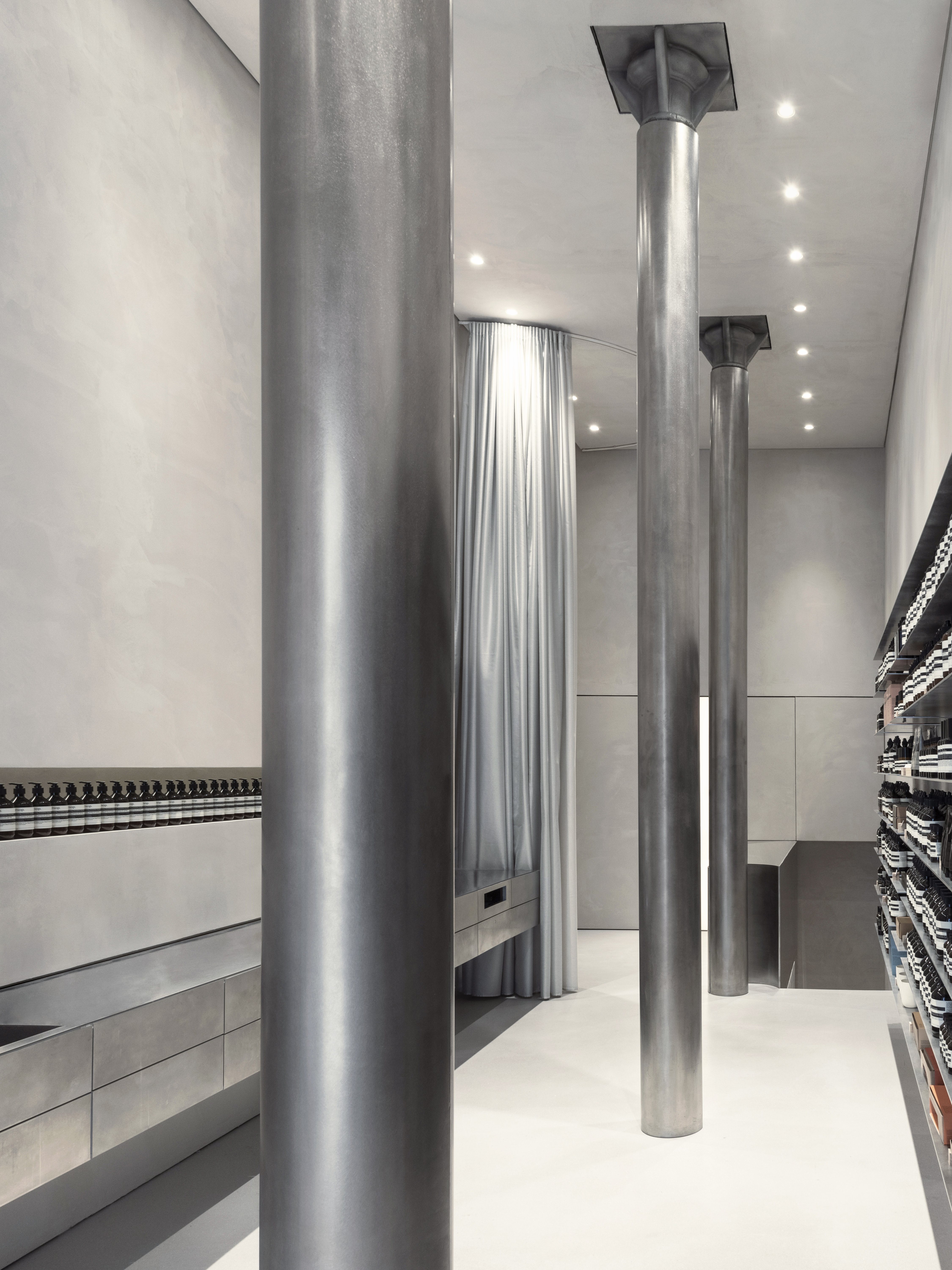
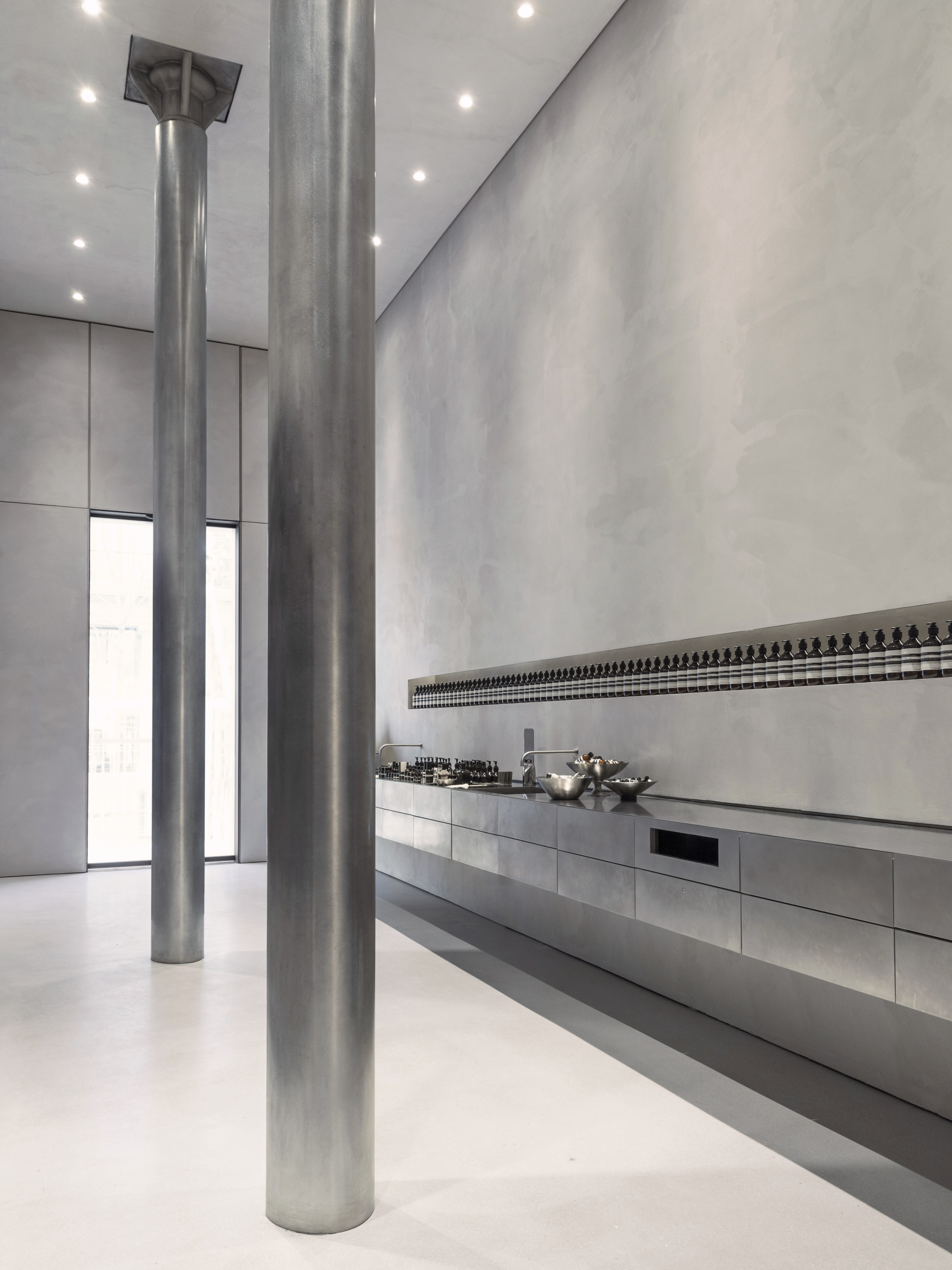
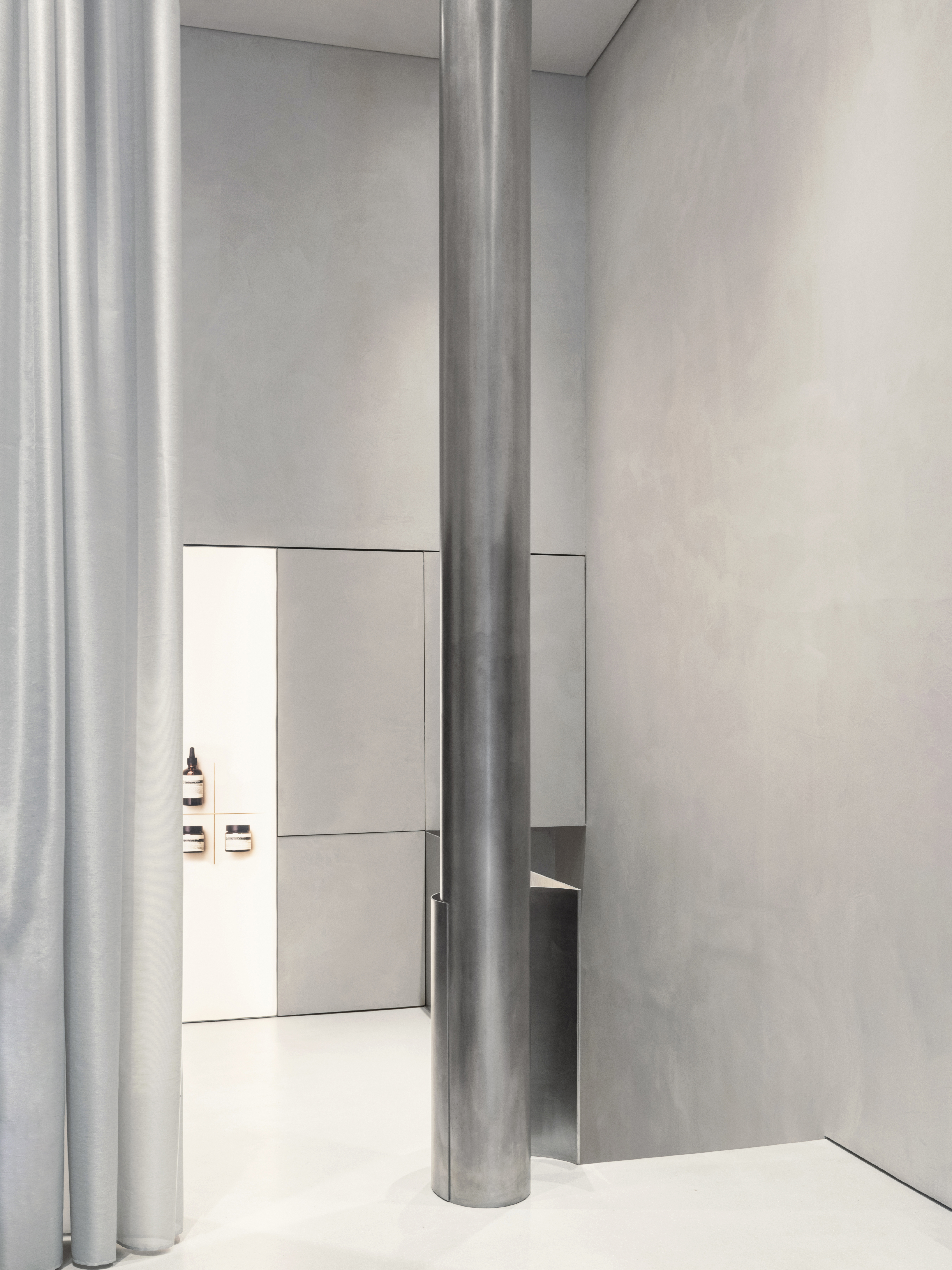
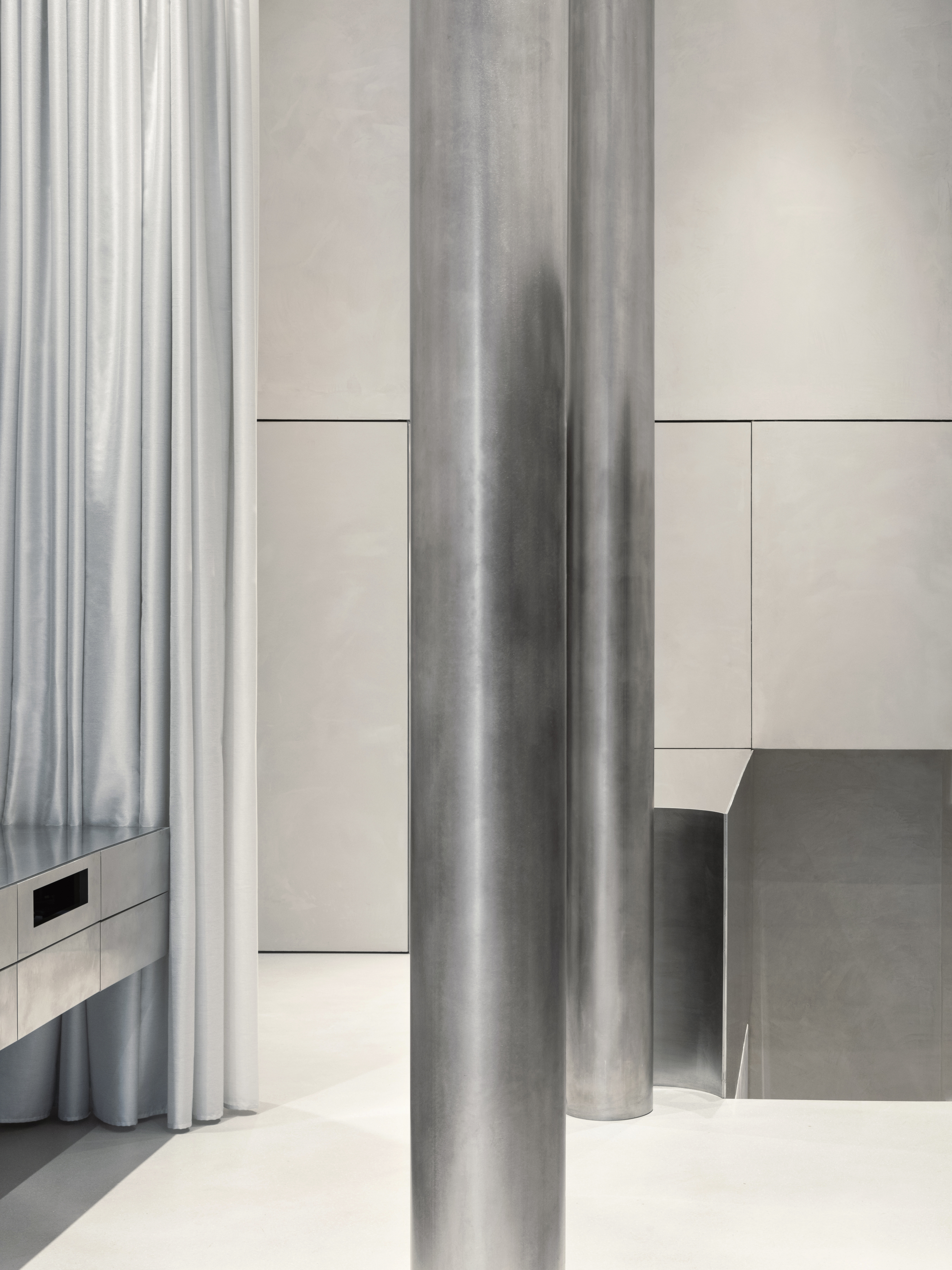
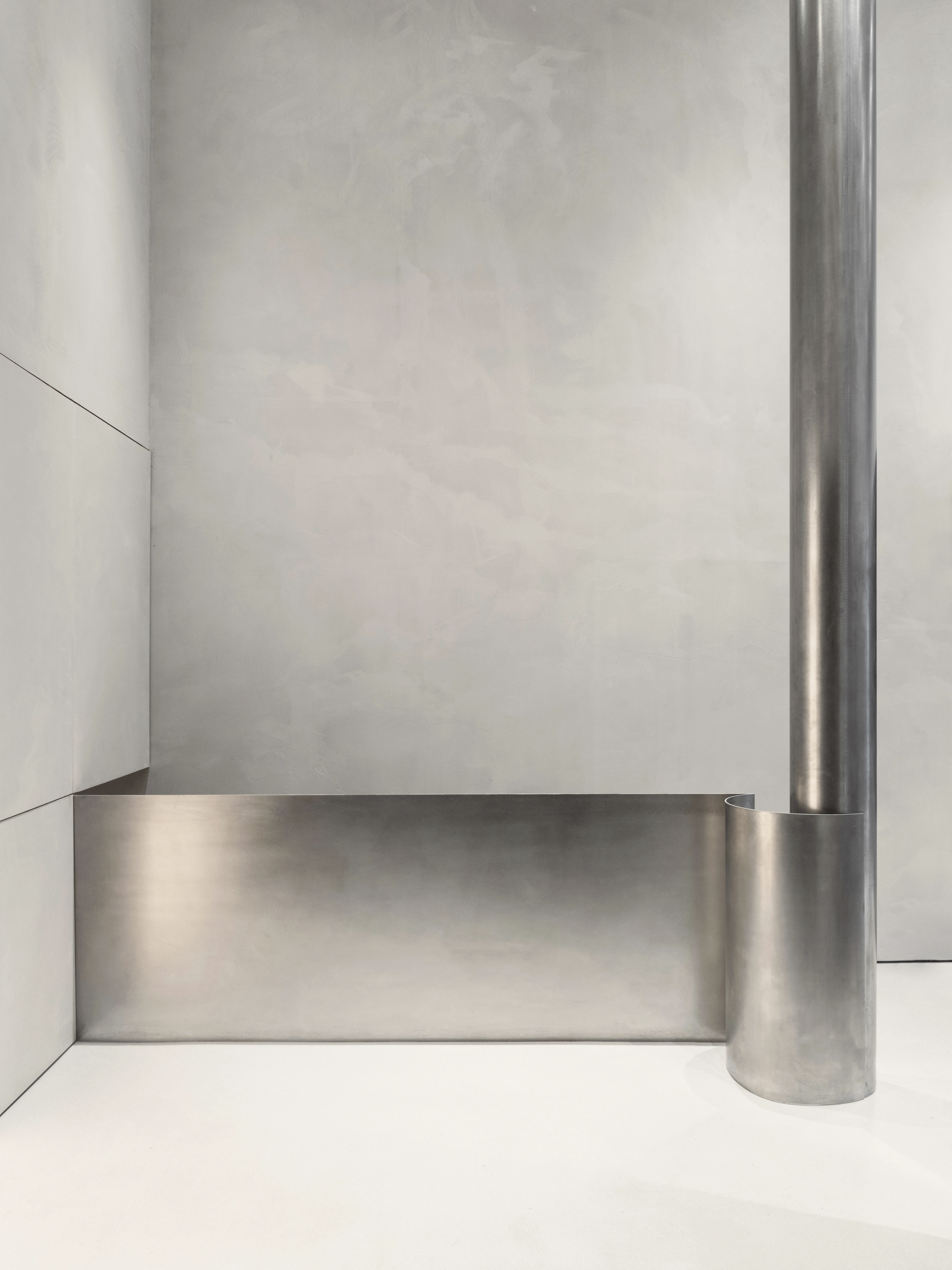
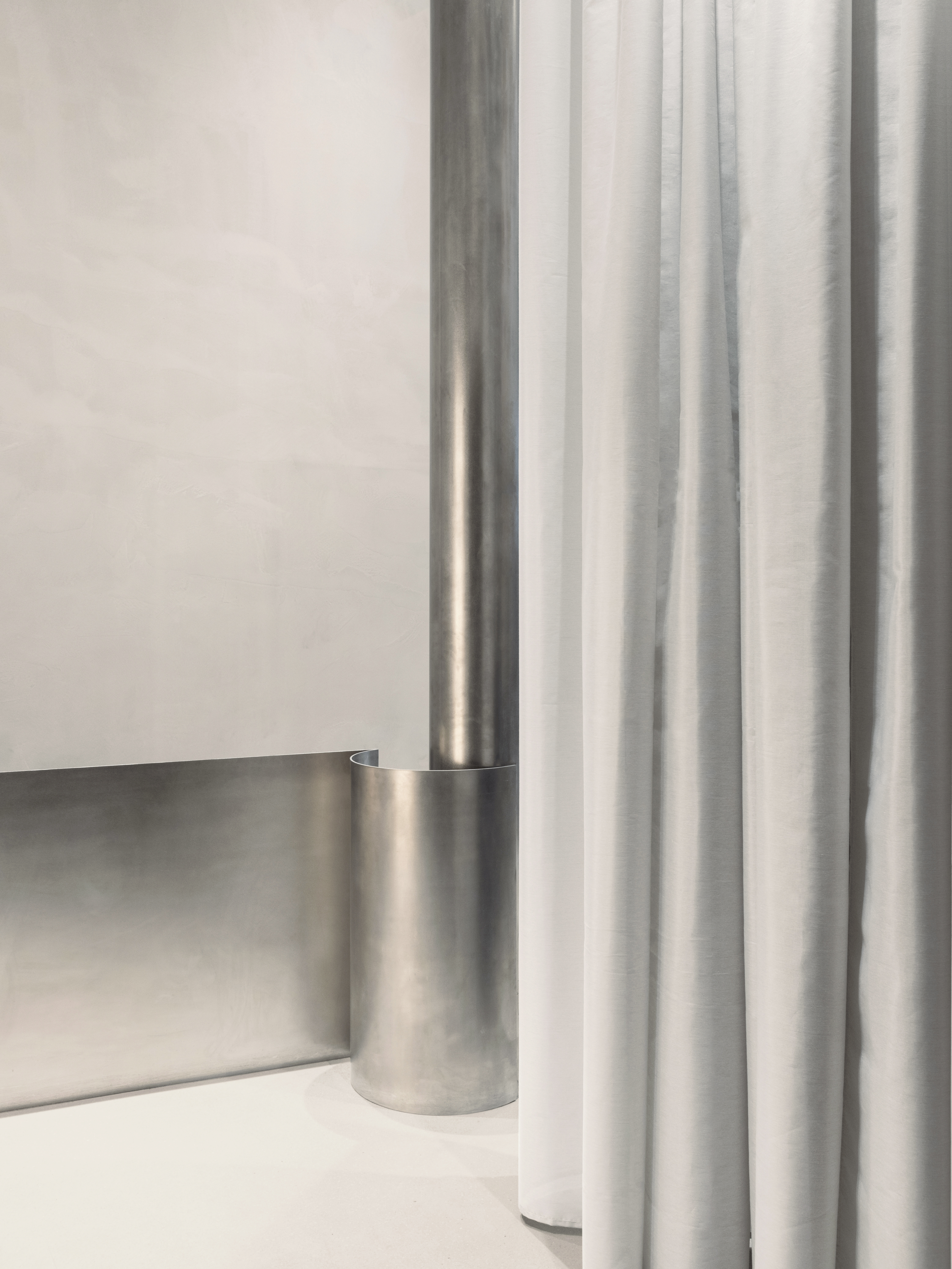
Upon crossing its threshold, the visitor discovers a space barely three and a half meters wide, twelve meters long, and five meters high. A rectangular space, simple, somewhat unexpected. Inside, three slender columns clad in burnished steel appear majestic. Their position is not perfect, and neither is the rhythm that orders them, but even so, they can define everything that happens around them, they have the strength of being the essence of the place.


The building in which the premises are located, Casa Mumbrú, is an original construction from 1882, corresponding to Pere Puig Poch. Between 1912 and 1919, one of the most renowned modernist architects of the time, Juli Maria Fossas, reformed part of it, giving it its most characteristic elements today.
Adjacent to the Lleó Morera house, it is in what is known as The Block of Discord, famous for housing some of the best buildings by architects such as Antonio Gaudí or Lluís Domenech i Montaner and Josep Puig i Cadafalch.
The premises in which the store is located, an old watch shop, was the result of the superimposition of a multitude of layers on the ground floor of the building, a true reflection of the multitude of transformations and interventions that the complex has undergone over the last 120 years.


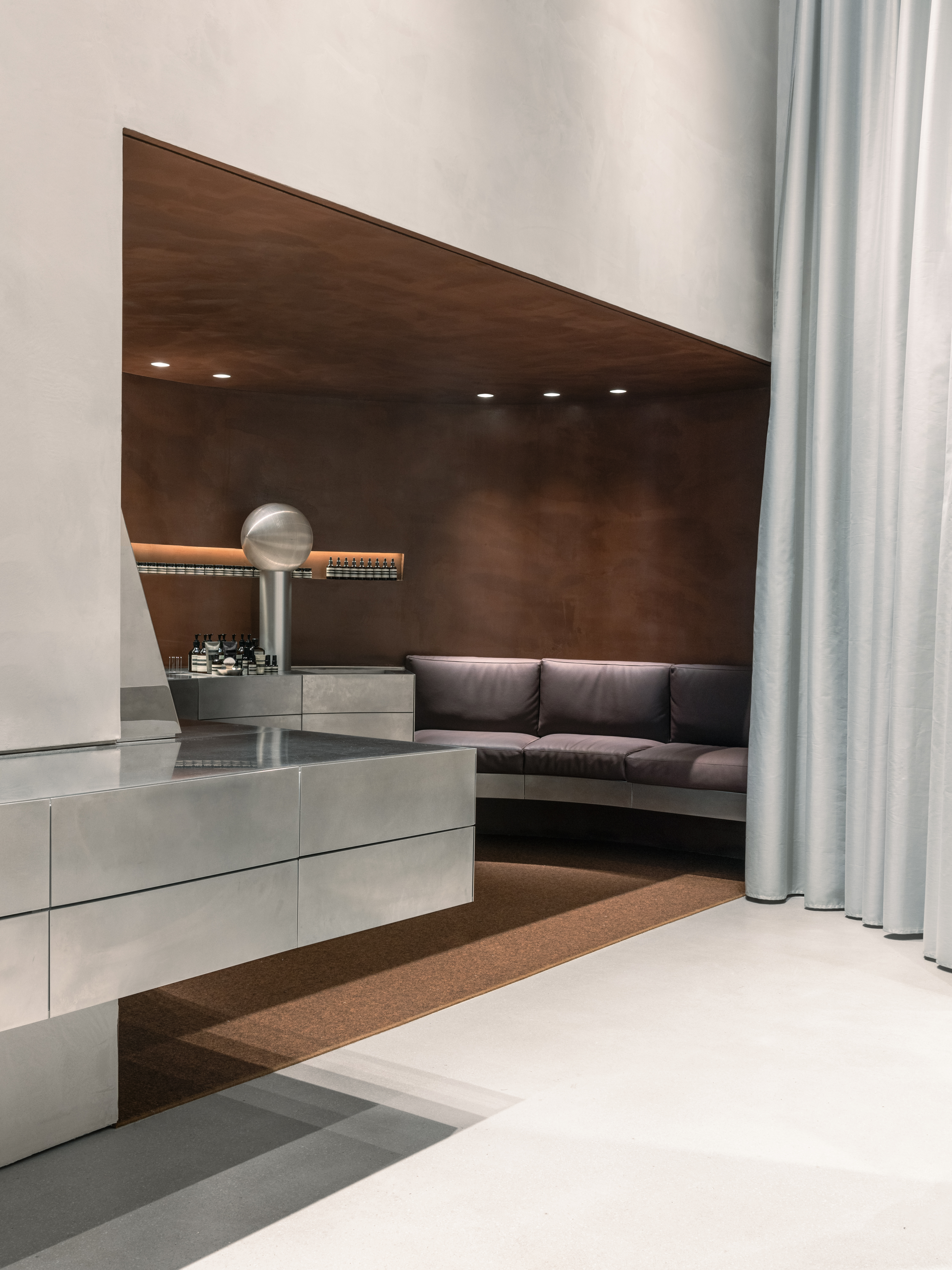
They are arranged asymmetrically within the space, and this allows finding an order in it; In the widest part of the store, facing the columns, there is a counter. Suspended from the wall, it extends throughout the space, disappearing into its depths. Like the columns, it is also made of burnished steel, slightly shiny, and worked by hand. The material allows the counter to be perceived as an abstract, light, apparently simple element.
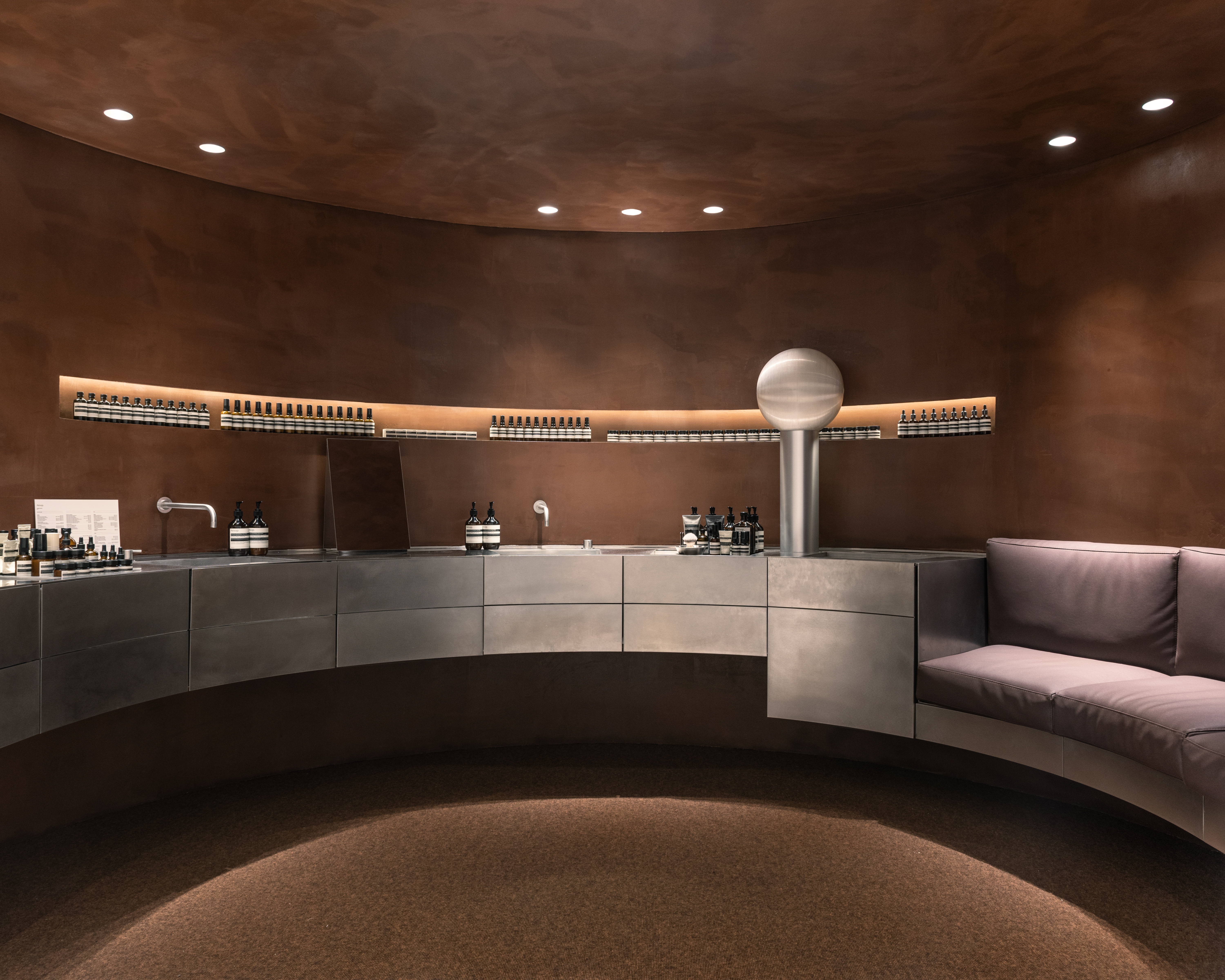
Its reason for being is to resolve the main functions of the store, the points of sale, the sinks, etc., and to do so by establishing a dialogue with the columns. The counter does not compete with them, it acts as a counterpoint to their verticality, and, in a certain sense, they complement each other. On the counter, a little higher, a horizontal cut appears as the only characteristic element. It is a small exhibitor, only 20 cm, but 6m long. An incision, an element that gives a different dimension to the entire bare wall, makes us think about the depth or weight of everything that surrounds us.


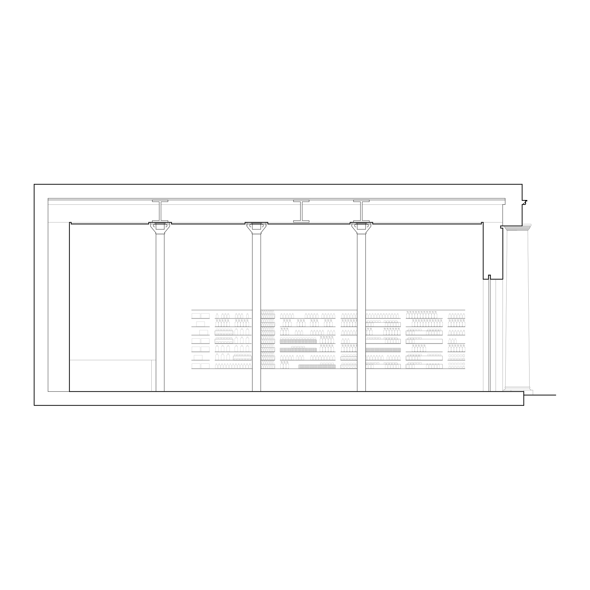
On the other side, eight trays, also made of steel, seven meters long, organize the exhibition of the Aesop universe. The trays float on the wall, the products too, and the whole makes up a canvas, which fills the space with a multitude of different containers, boxes, colours, and textures. This way the entire wall becomes a kind of art installation in itself, ephemeral and permanent at the same time.
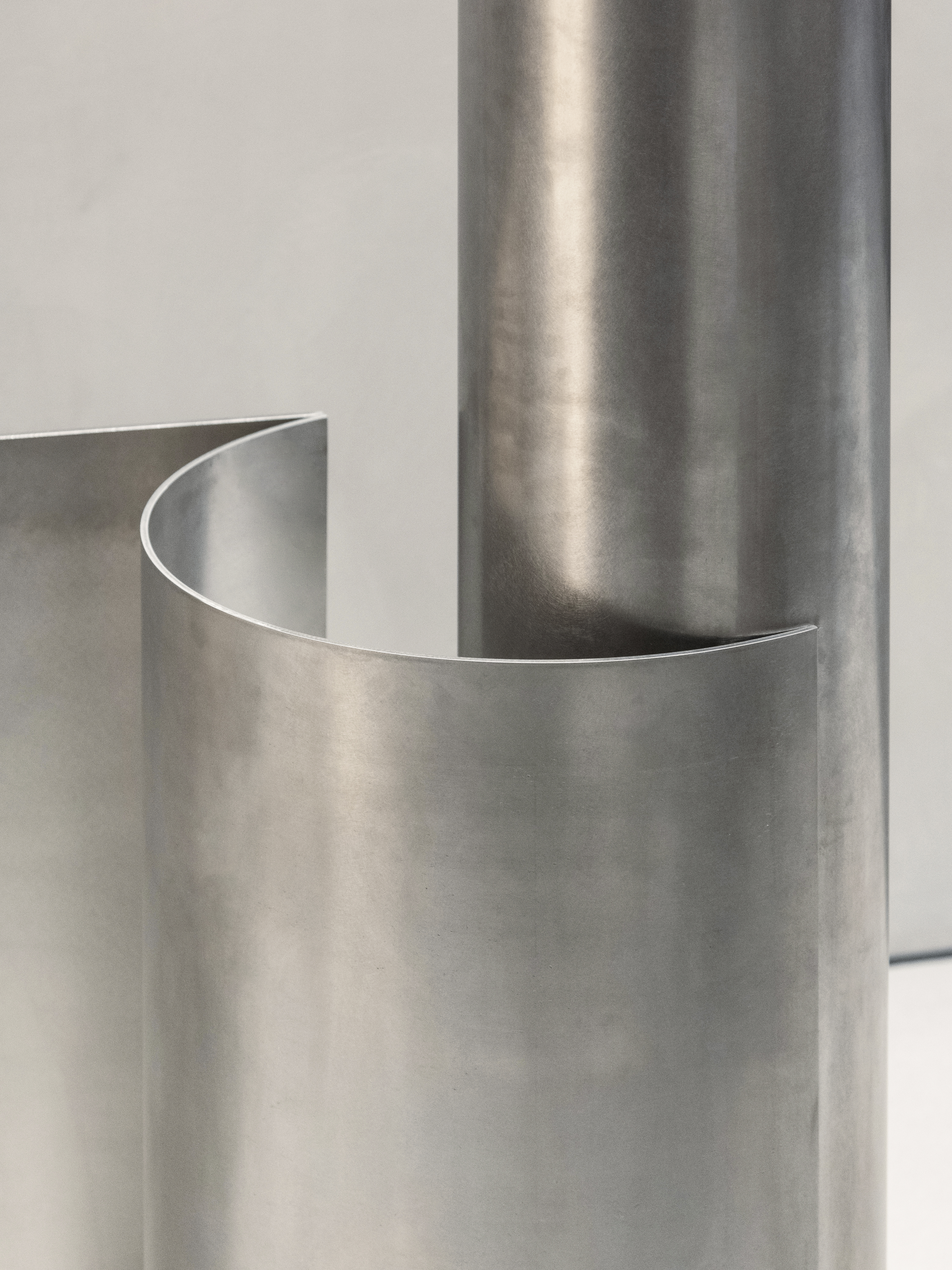
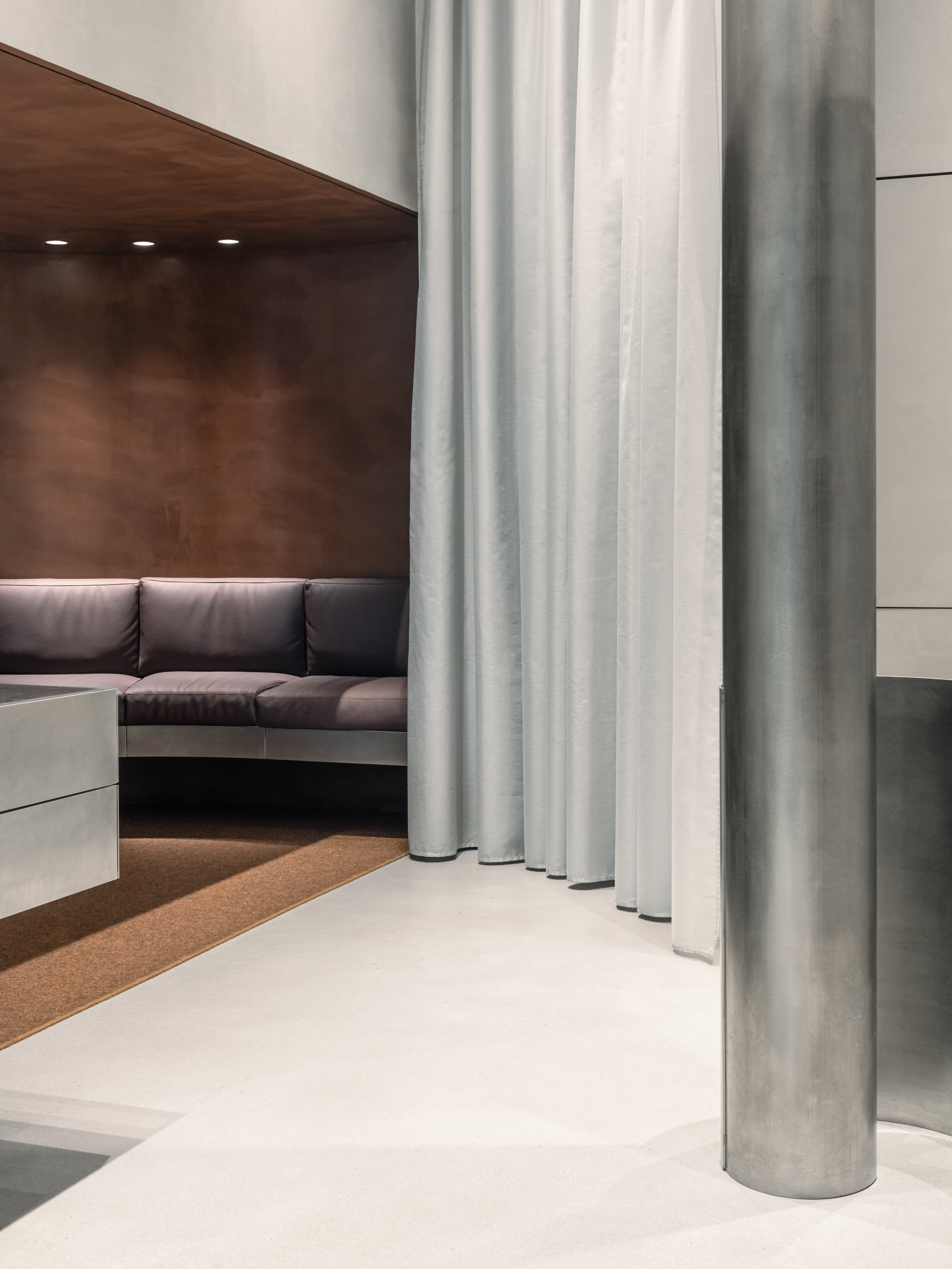
The columns, the trays, and the counter are placed inside the store looking for the visitor to be able to move freely, attracted by the way things happen. The three accompany the visitor throughout the store until discover that the counter turns on itself and forms a small semicircular room where everything changes. Inside it, the straight lines disappear, it’s an enveloping space, in which the height changes dramatically, and with it the light and the material that makes up the room. A sensual and intimate space where you can sit and have a close relationship with everything around you.


From the back of the store, the sequence repeats. Like a choreography, the play of the three elements that make up the store guides us toward the exit. The viewer discovers something different in the background. A curtain, like a large piece of cloth, unnoticed until this point, unfolds to its full height, wrapping and completing the small semicircular room. Suddenly, everything changes. Somehow, the rigor with which the store is organized is what also makes surprise, movement, and sensuality possible.
The project for the Aesop store on Consell de Cent Street has been a project of discovering and stripping the existing space to reveal its essence. To work with what we understood as fundamental to, from there, compose an atmosphere that reflected the character of Aesop. The store is made up of a few elements, expressive and precise in their position, and with three materials: stucco on the walls and ceilings, terrazzo on the floor, and burnished steel on the columns, the counter, and the display case. It is a simple and complex space at the same time, which aspires to be sophisticated and close, and in a certain way intimate and monumental.


Other projects by Barozzi Veiga
