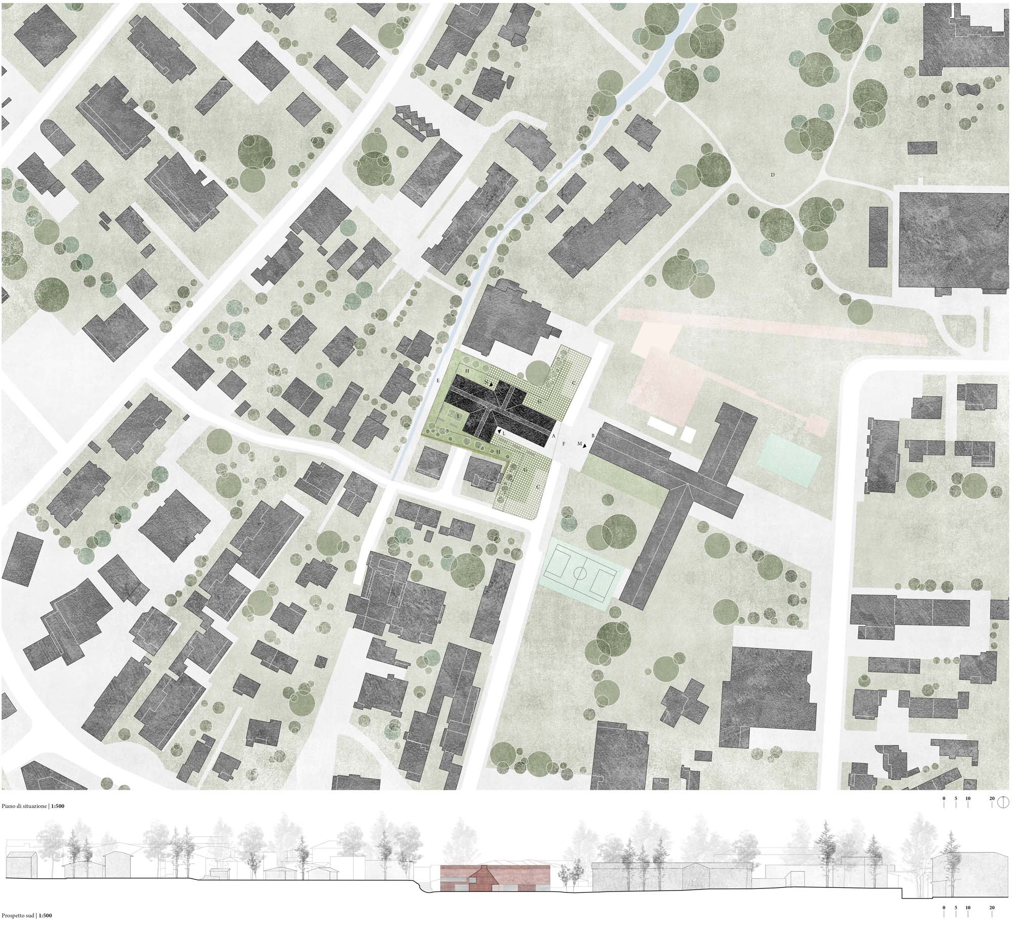
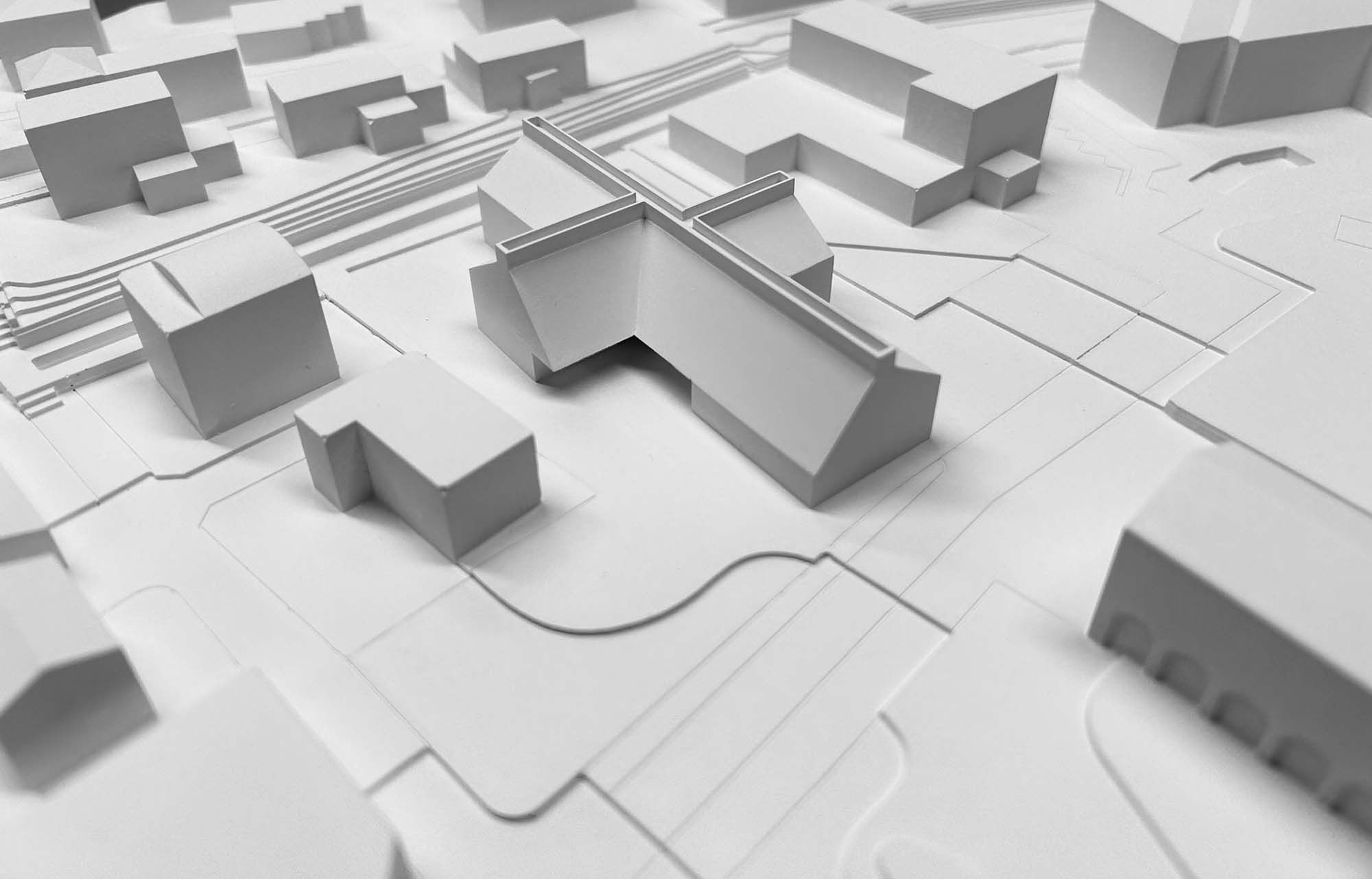
The chosen site is surrounded by residential buildings arranged in a regular pattern, forming a mosaic constructed with a certain randomness. The school stands out in this environment for its scale and size. The plot is therefore defined by a residential context of small gardens and bordered by the access road and the primary school. To the west flows the Riale Brima that connects the lot to the Parco dei Poeti. The canal creates a pleasant view and offers a connection with the green spaces of the school and the new multifunctional building, in harmony with the enhancement works of the Canton and the Confederation, in the context of the revitalisation of waterways. The demolition of the two existing wooden buildings will give the area a better breathing space and openness by enhancing the public buildings.
Vaillo + Irigaray Architects + Atelier Pevere Martinez Sala Polivalente Ascona
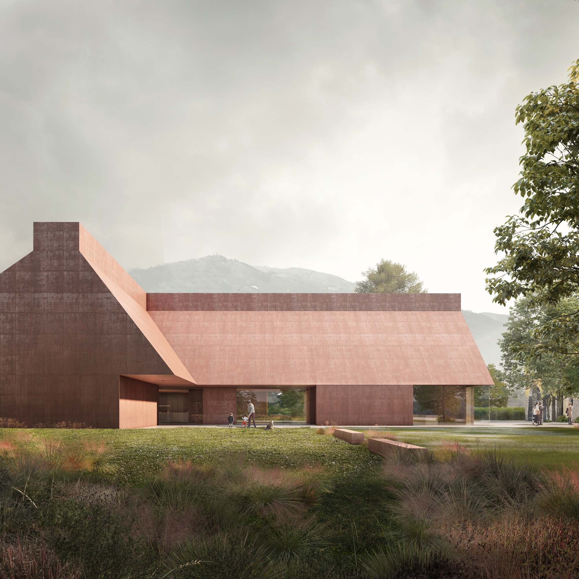
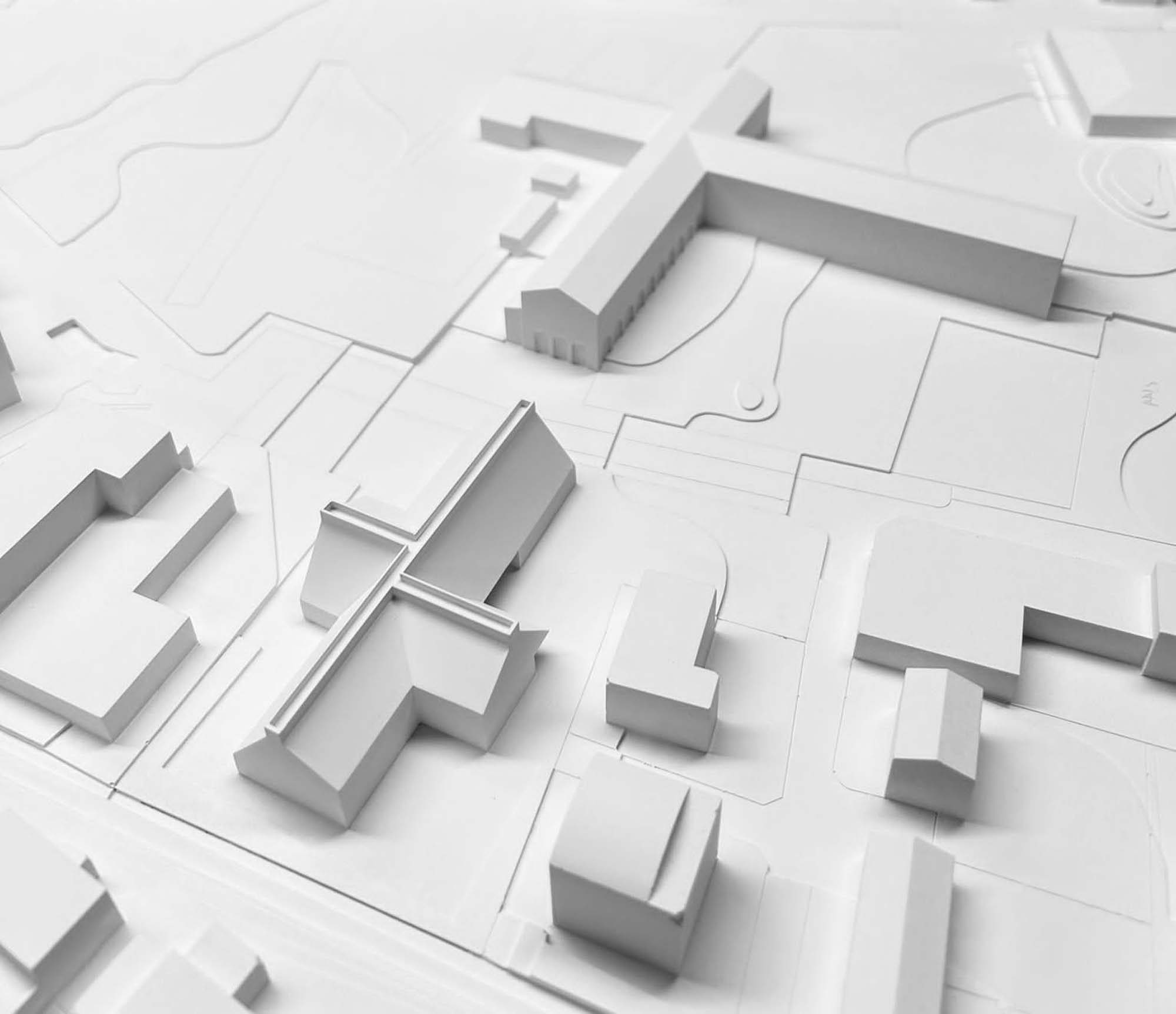
Relationship with the urban structur
In the urban fabric of this area of Ascona, the public school building stands out the most, marking the area of the intervention with its cruciform structure. the intervention area. The new building for the multi-purpose hall acts as a mediation between the volume of the school and those of the housing, creating a new configuration more suited to the surrounding programmes, with slow mobility extended to the entire area.
Implementation Strategy
Faced with this polarisation of dimensions of the new volume, the proposal opts for a dual strategy:
– on the one hand it uses a morphology that clearly expresses its content, making its internal functionality explicit;
– on the other hand it uses abstract forms referring to local housing.
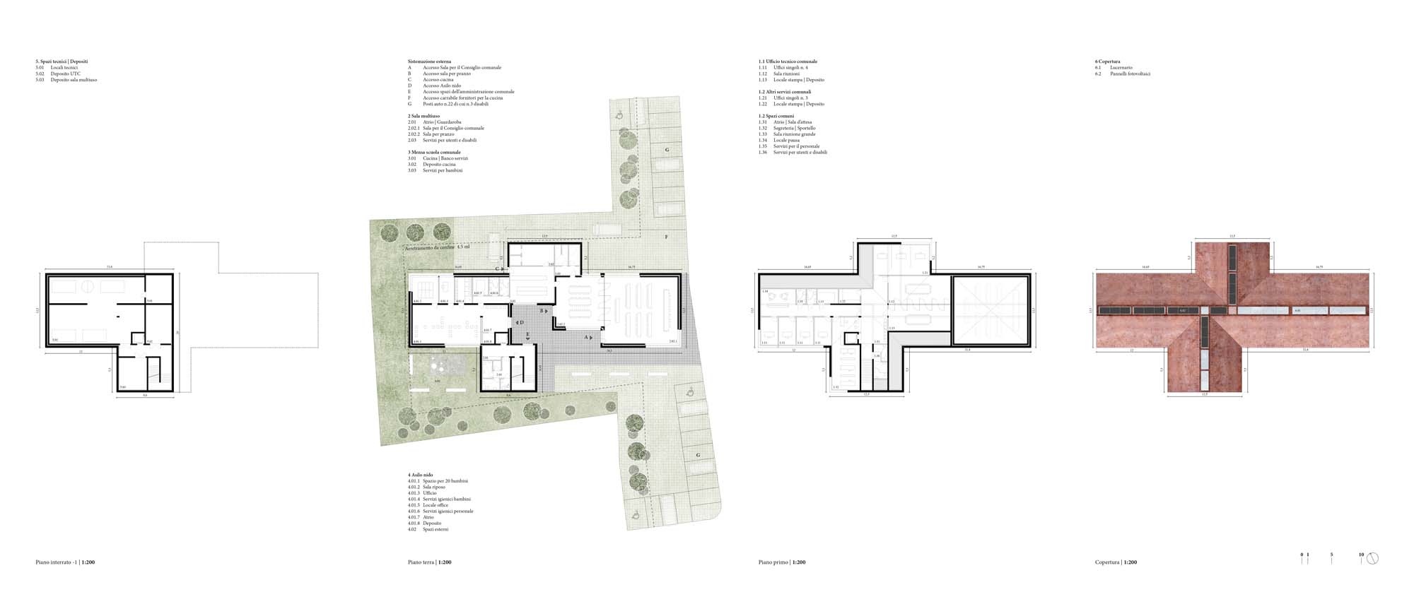
The four functions of the multi-purpose building (multi-purpose hall, crèche, canteen and administrative offices) suggest the cruciform plan that resolves and
explains the functional ‘node’ (crossroads) of the project.
Urban Insertion
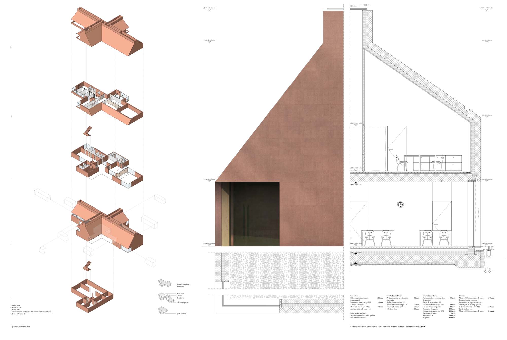
The very morphology of the building offers a dense geometry of choices understandable to the user. In fact, the access portico leading to the centre of the cross, is immediately perceived as the entrance to the different functions, and the large glazed holes differentiate the different internal areas. Similarly, in the volumetric geometry of the building, extrusions and perforations are produced that emphasise these choices on an urban scale: the of the cross itself generates four mirrored volumes, each with its own function; the asymmetrical roof folds in a welcoming gesture, creating a more human scale in the entrances; the chimney/shower expresses a function that transcends domestic use and offers spaces that are truly surprising for their
their richness and luminosity.
Volumetry as an expression of the programme
It is understood that a public building must offer simplified, comprehensible and coherent reading codes, so the project denotes a certain obsession in the
search for this clarity and hierarchisation of elements, evident in the entrances, the representative spaces and the communication core.
This desire to understand the project and the interpretation of the programmatic needs and functional logic of the individual parts result in a
single building articulated around the intersection of the 4 ends of the plan, with differentiated accesses for the individual programmes.
Design Criteria, the section as a condenser project
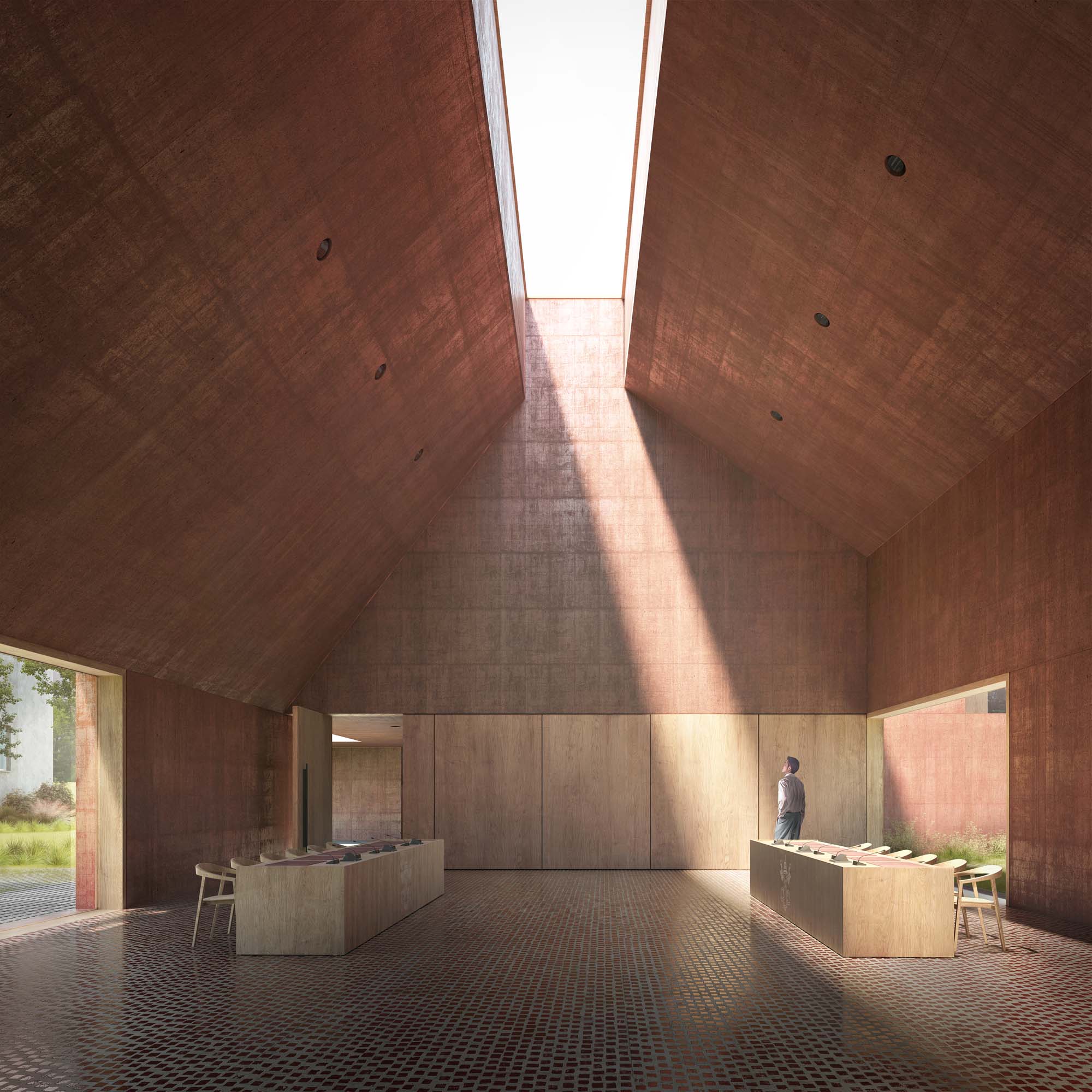
In section the building presents a pentagonal configuration that seeks a public scale without moving too far away from its surroundings; it also generates an interior space that can be compartmentalised both horizontally and vertically, offering great volumetric richness adaptable to the different functions required: kindergarten, in direct connection with the dedicated outdoor area; kitchen, articulated between the kindergarten and the refectory; Council Hall Council Chamber with double height and central zenithal ambient lighting, separated from the refectory by movable walls; and the access body on the first floor
with skylight above and municipal offices in the attic.
In summary, the extruded pentagon is sectioned, deformed and perforated at will, allowing each programme to be placed expressing an idea of unity without renouncing the specificity of each space. The sloping roof with central skylight generates spaces of great institutional relevance. It also allows the introduction of light from above that envelops the entire environment. The perception of being under sloping planes recalls traditional architecture, the idea of “refuge”, welcoming the user in an engaging way.


Other projects by Vaillo + Irigaray

