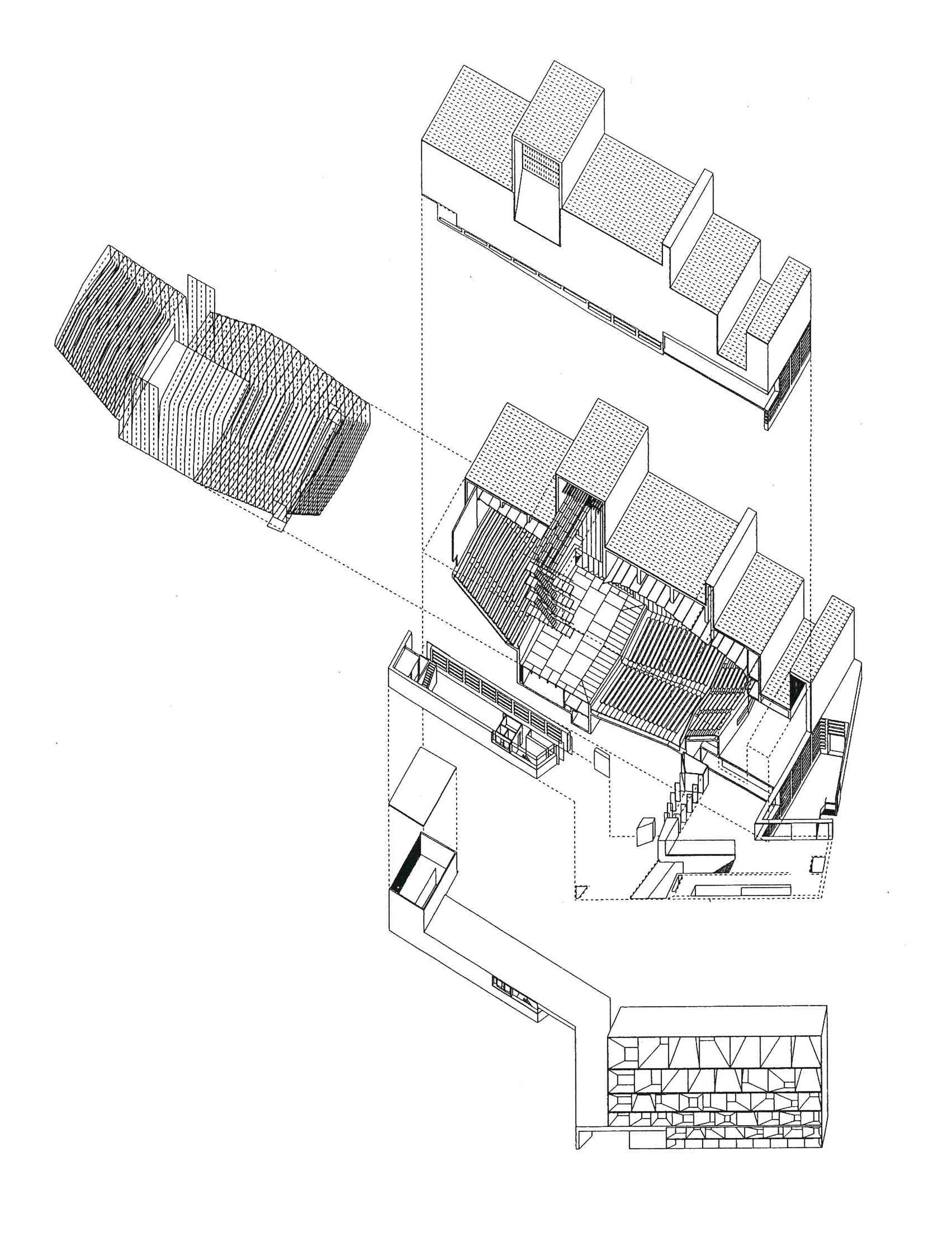
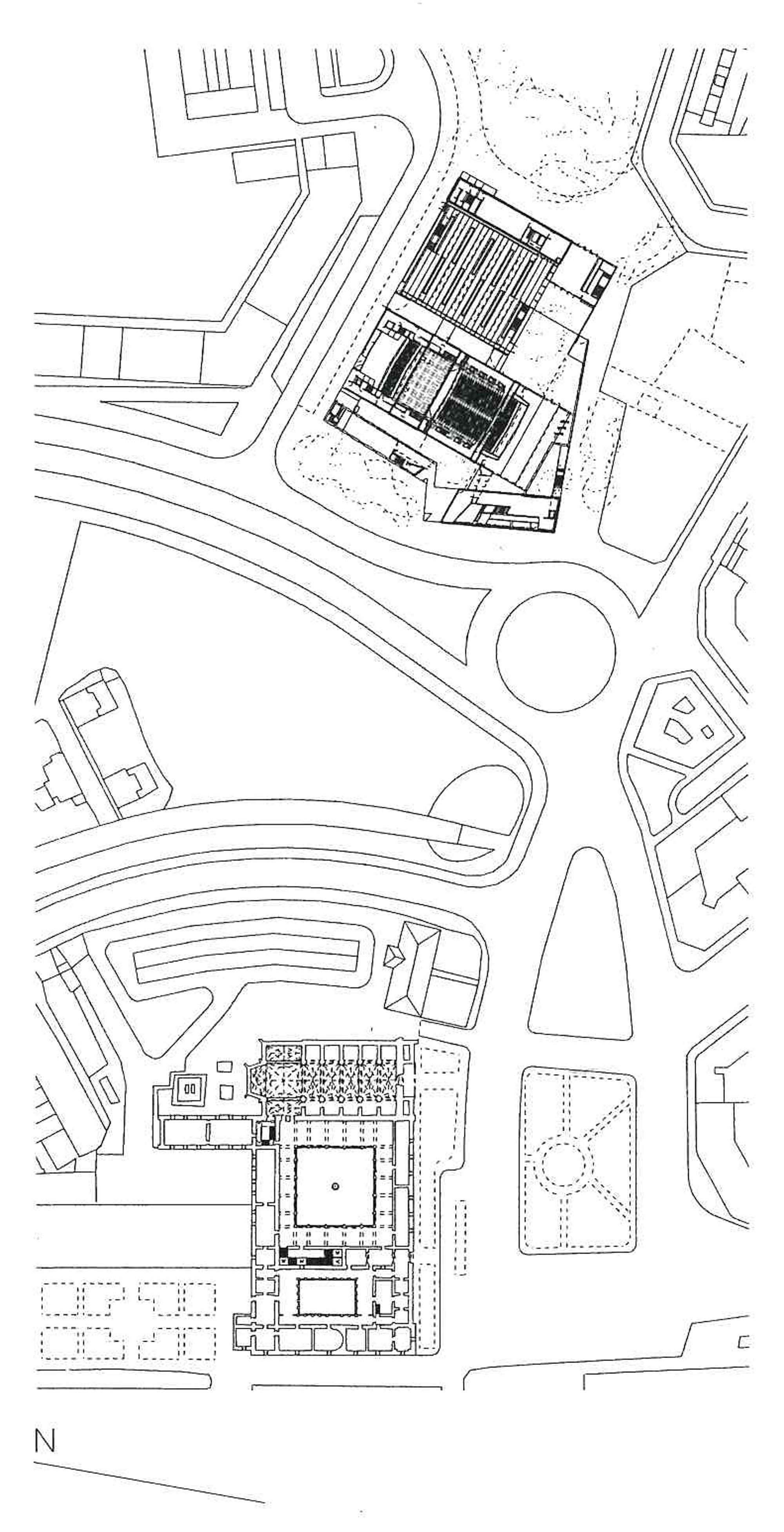
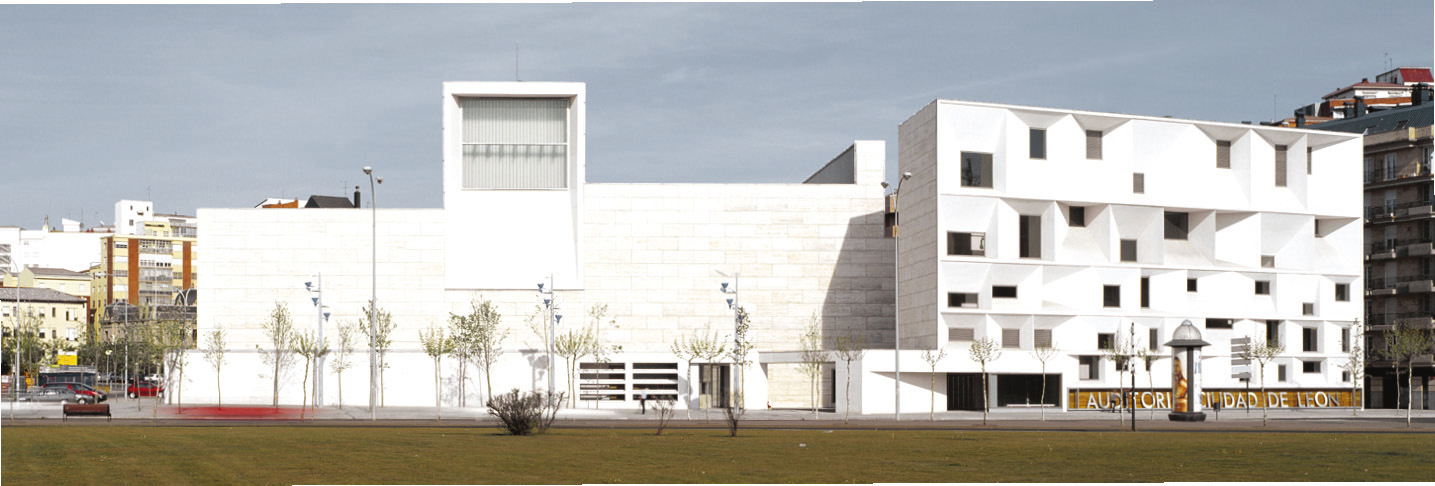
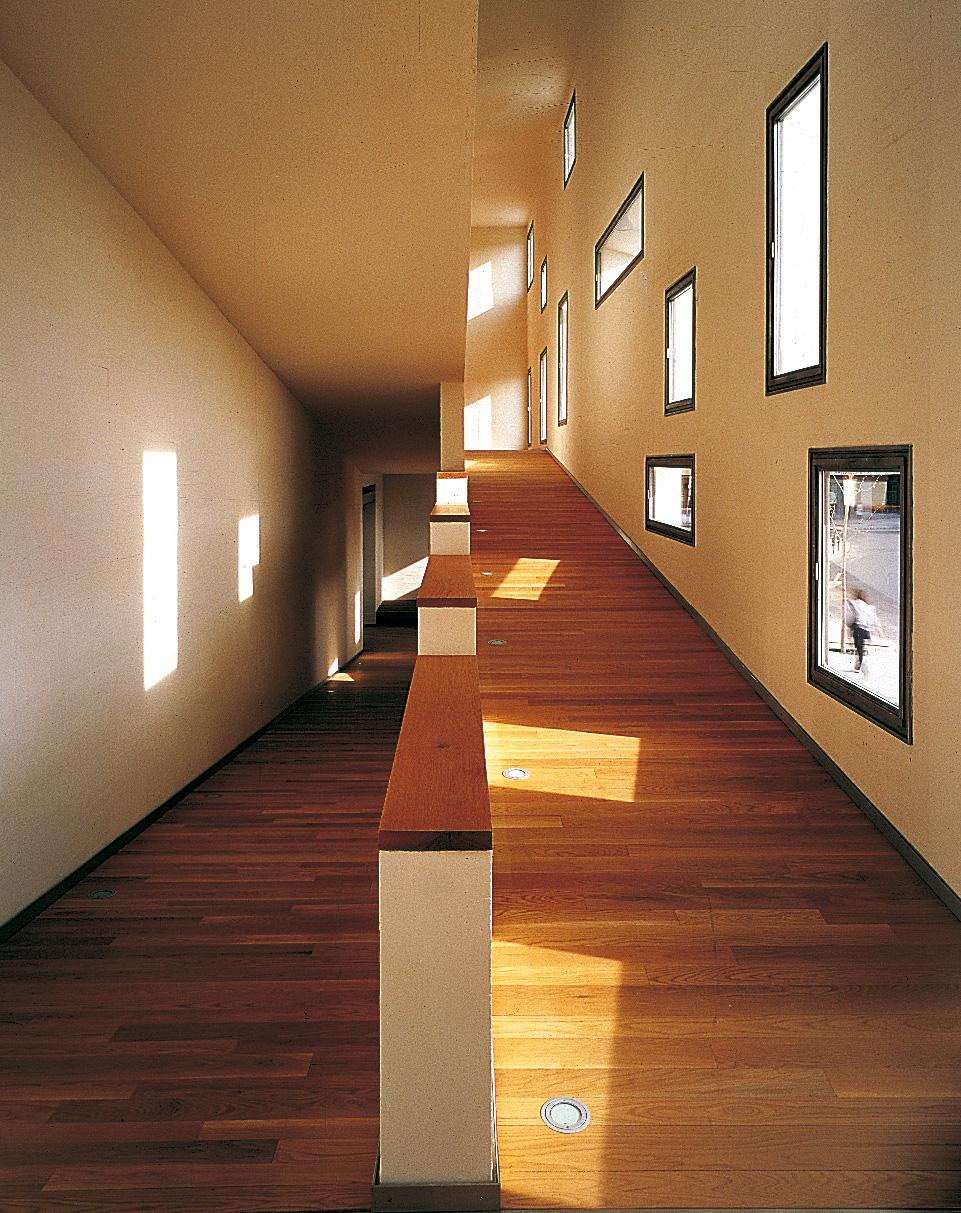
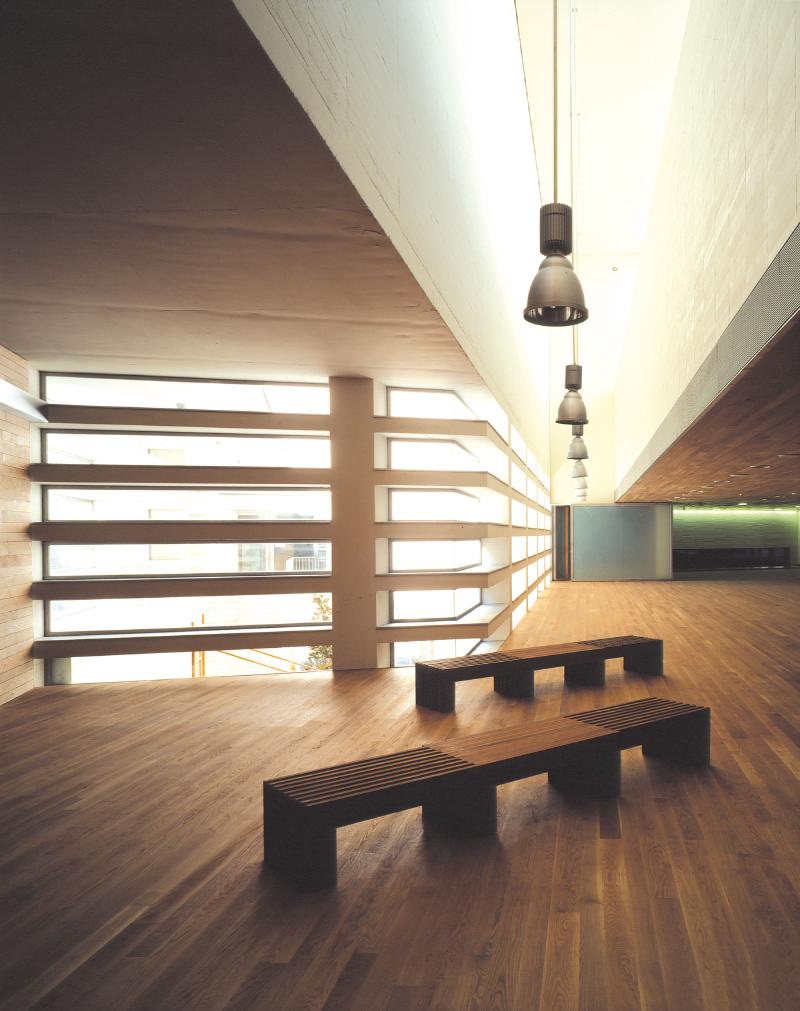
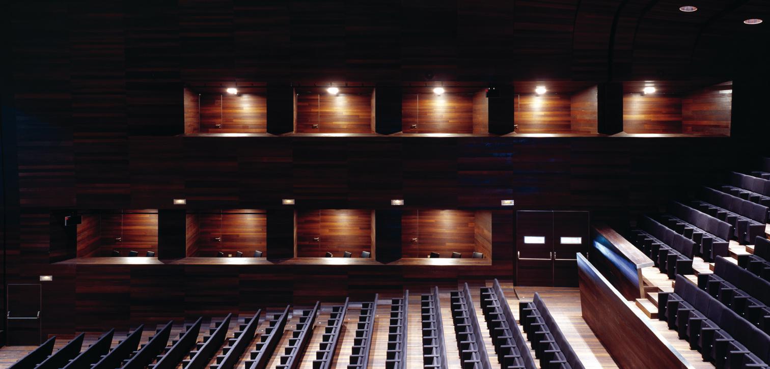
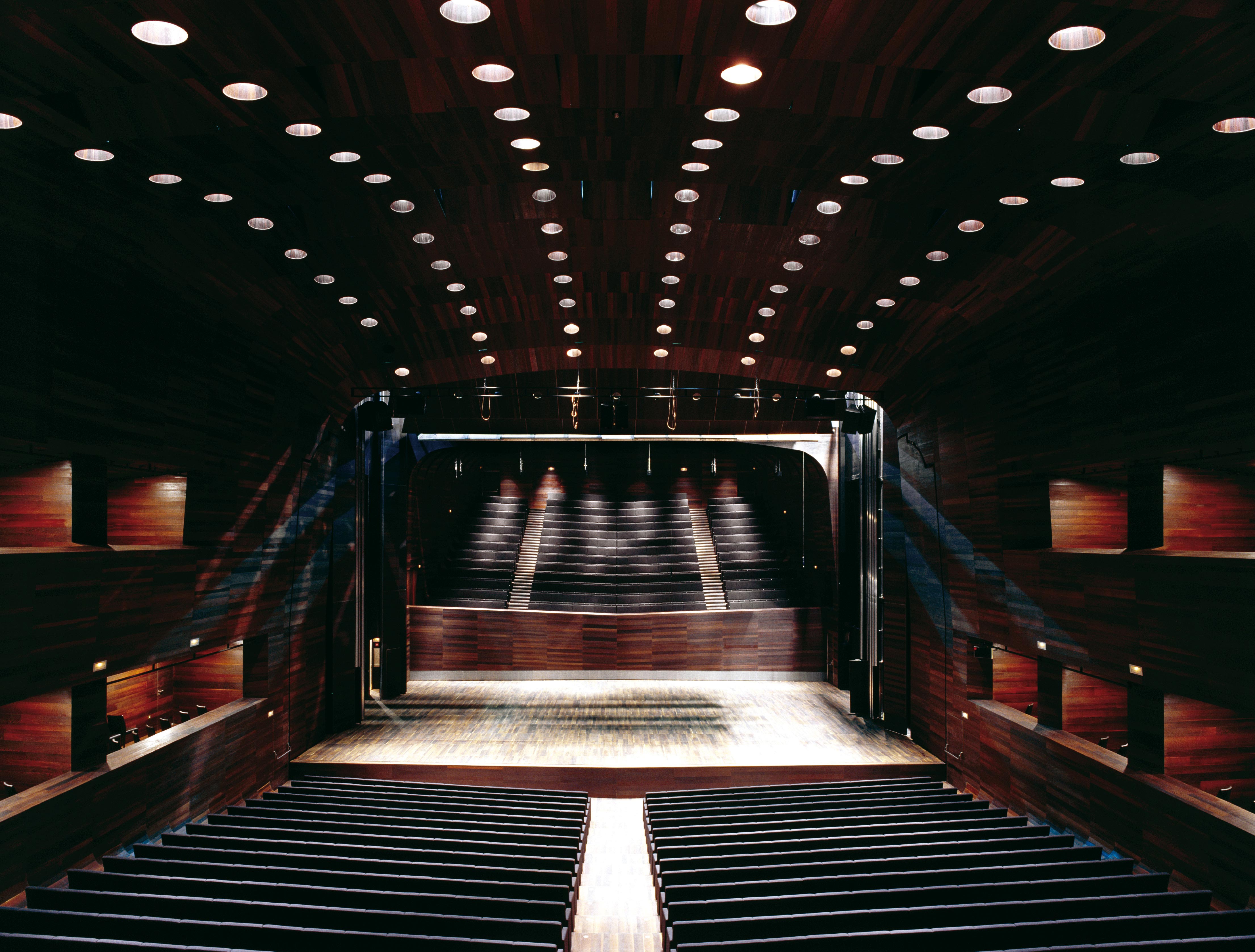
The Leon Auditorium pays homage to Ortega y Gasset’s concept of ‘seeing and being seen’, while responding to the model consolidated by the Manuel de Falla Auditorium in Granada. It is an exercise in realism, its small size guaranteeing a certain economy of means, and also reducing its presence in the city. It is precisely this small-scale perception that leads to the exhibition hall being conceived as a separate piece, allowing the building to simultaneously benefit from the historically established costume of small foregrounds while also orienting the building towards the San Marcos Hostal, and by this means outlining a new visual order on the existing platform.
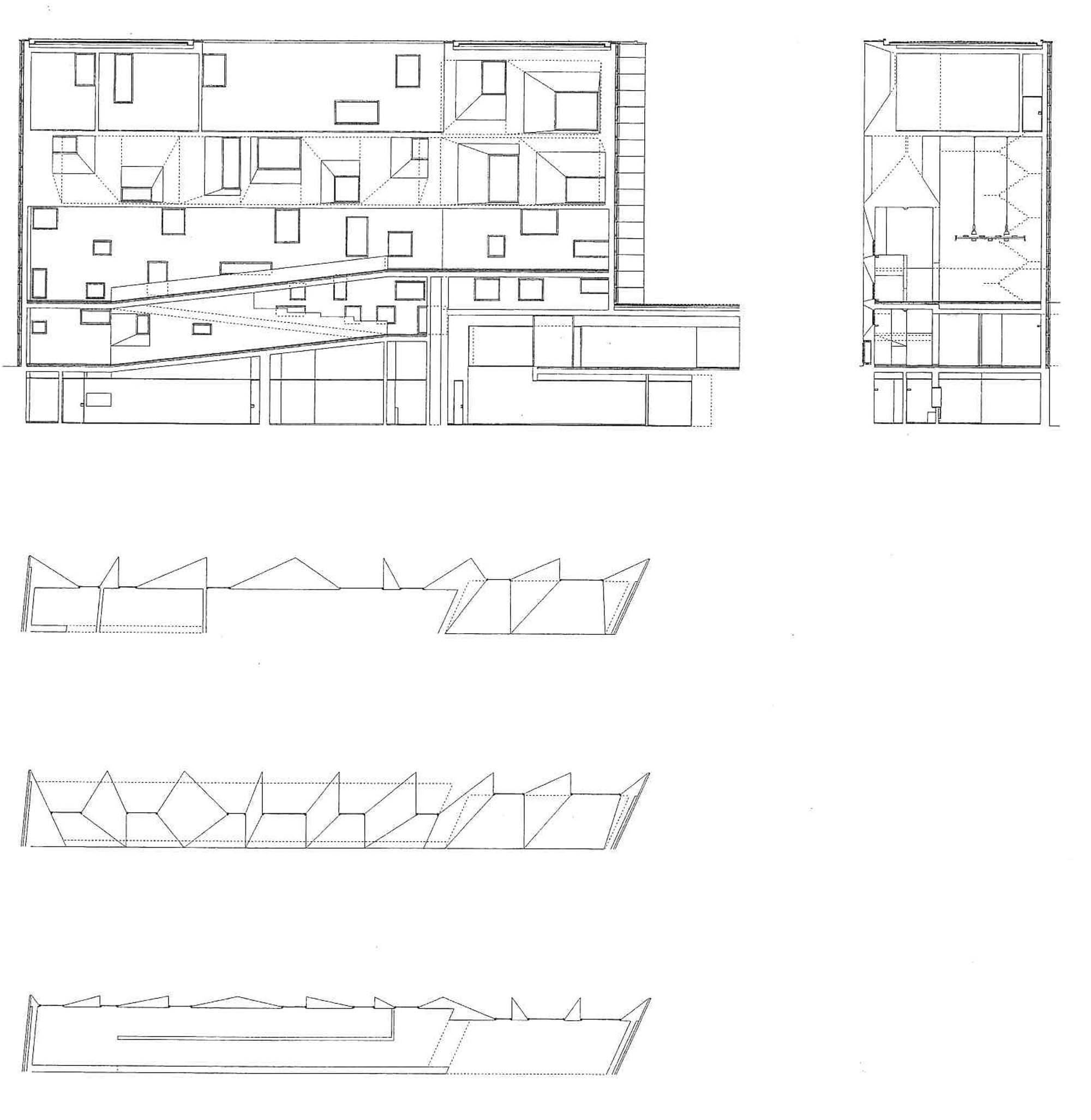
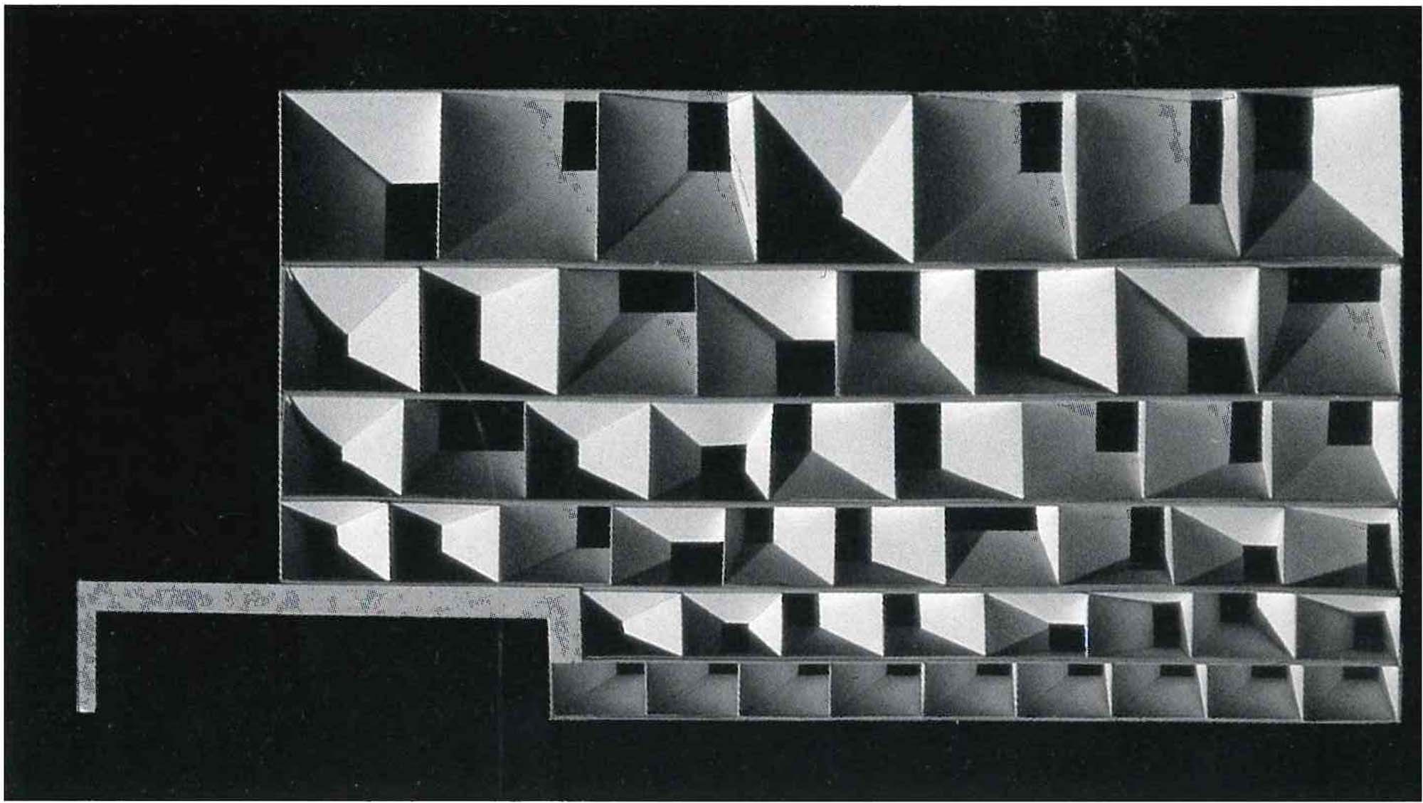
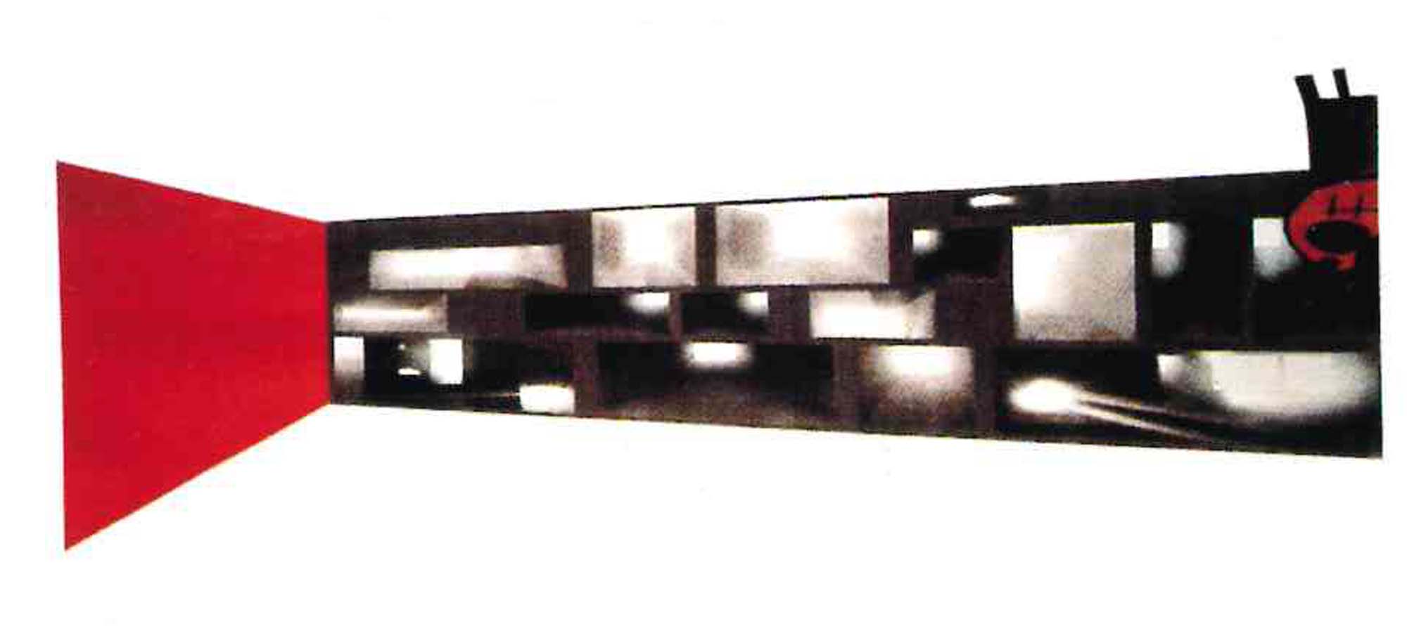
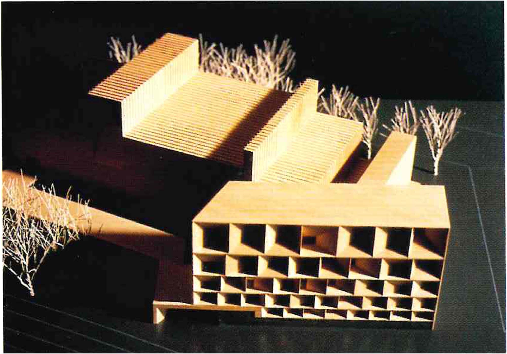
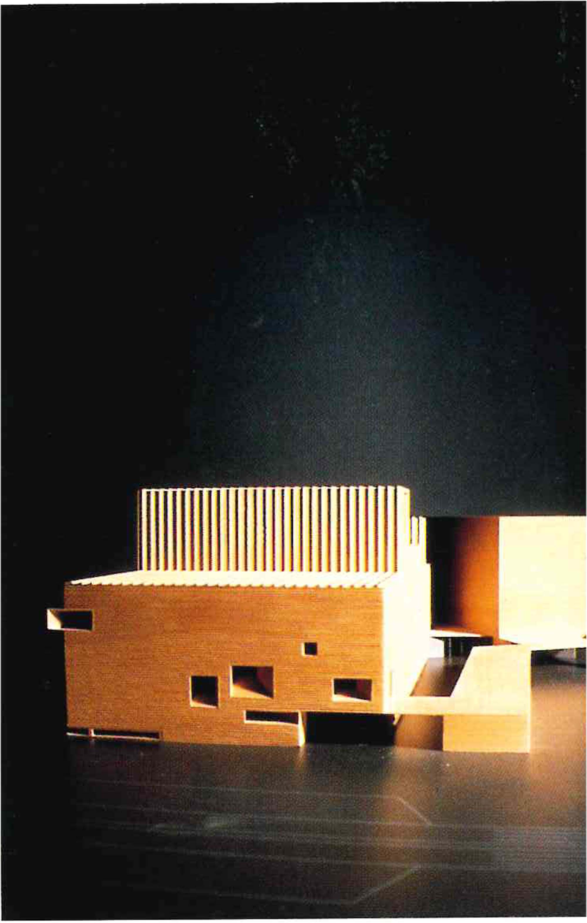
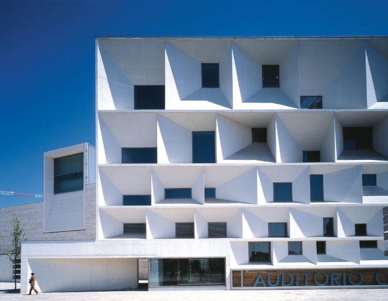
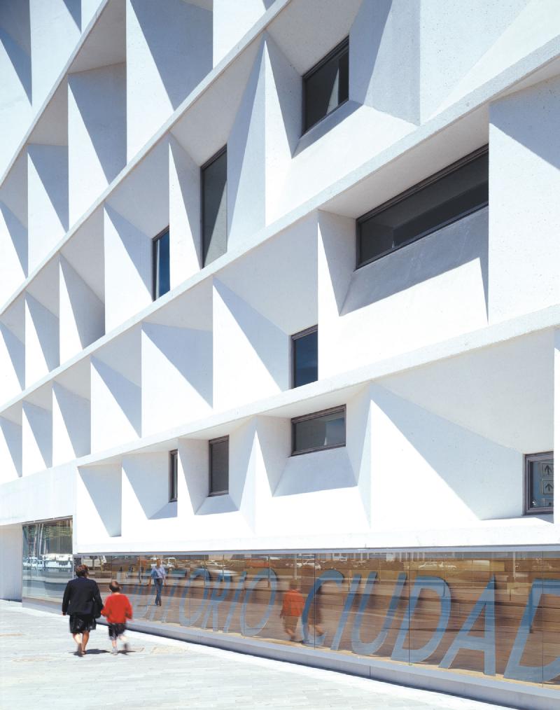
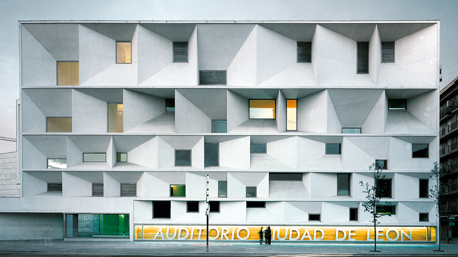
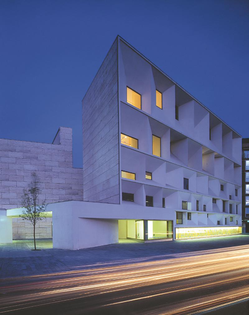
The auditorium thus turns its lion’s head in a plateresque echo of the San Marcos church, its face constructed as a stack of windows in which two diverse orders appear: the perimeter of the apertures that refer to the geometry of the construction, and the inner aperture of each window, fruit of the necessities of the interior. The constructed plane thus oscillates between a group of stacked windows that are equal in their being and different in their form of being. Additionally, the main volume of the building, relegated to the background, projects its section until it becomes an elevation; an extruded volume whose profile is lightened by placing more emphasis on the surface than in the mass.
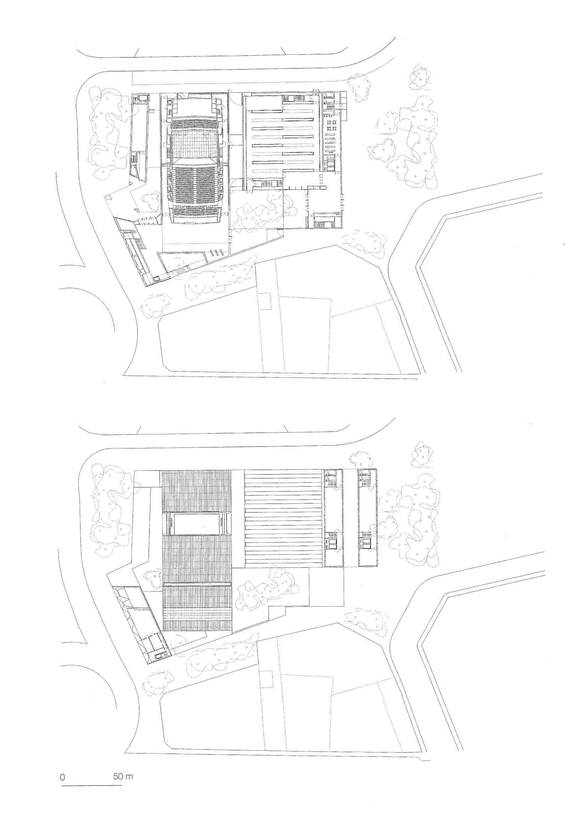
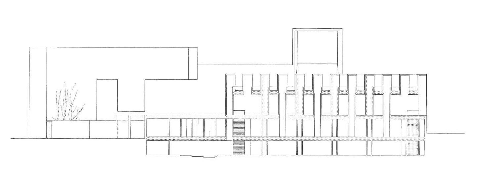
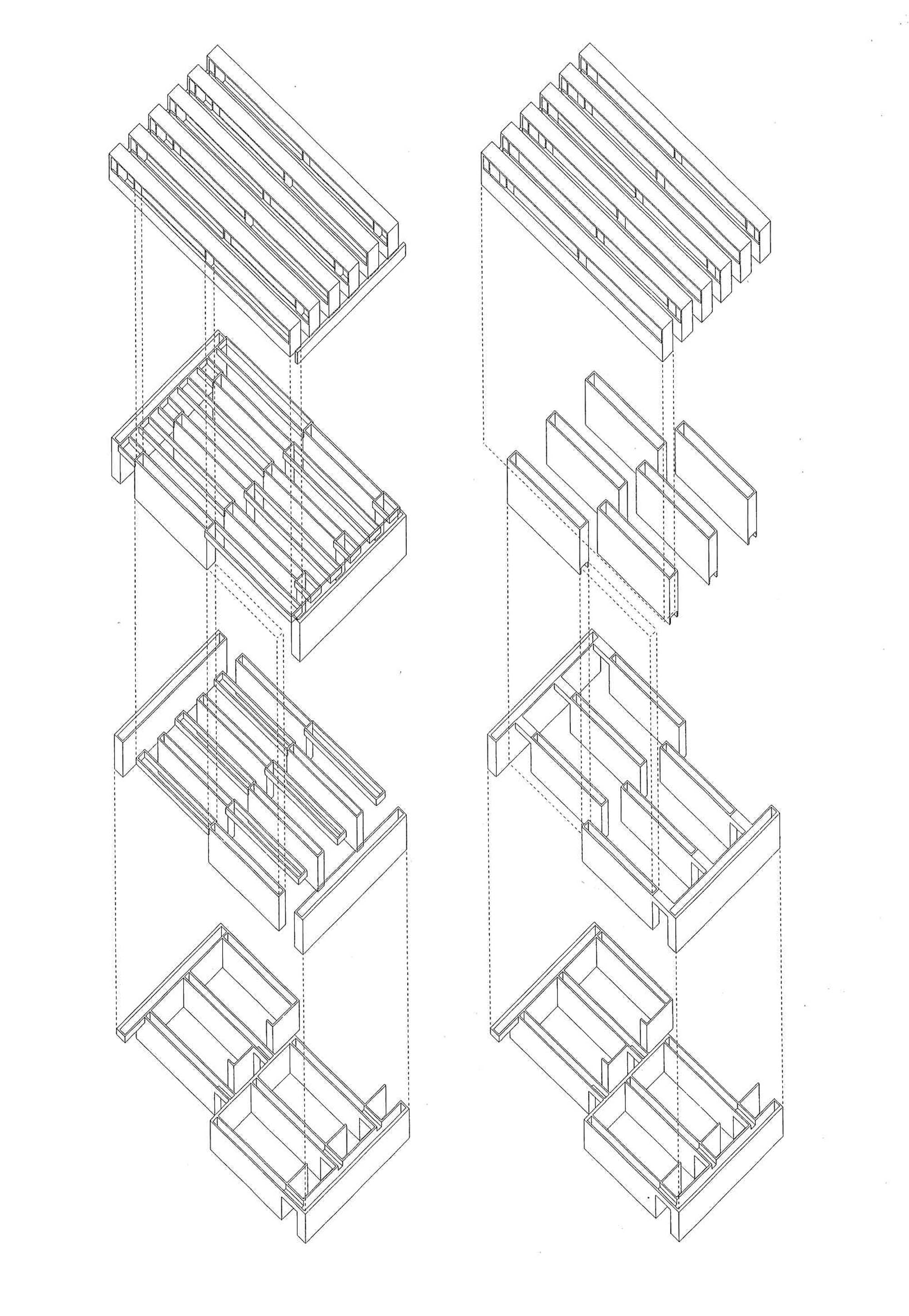
The project consists of three distinct parts: the entrance wing, the auditorium and the museum
Each part seems to be designed independently from the others, but their combination is con- trolled by a rigorous “logic of the graft”. This condition “in parts” gives to the project the identity of a small architectural landscape, more than a singular piece of architecture, in order to simulate a natural built up area, protracted in time.
The entrance wing is rotated towards a wide empty urban space, to function as a backdrop that limits the whole perspective (+). Like a Plateresque echo of the nearby church of San Marco, the screen has the character of a thick wall, excavated by two geometric orders of plastic holes, it has an external grid of horizontal strips, determined by the floors, and a superimposed system of irregular holes splayed towards the interior.
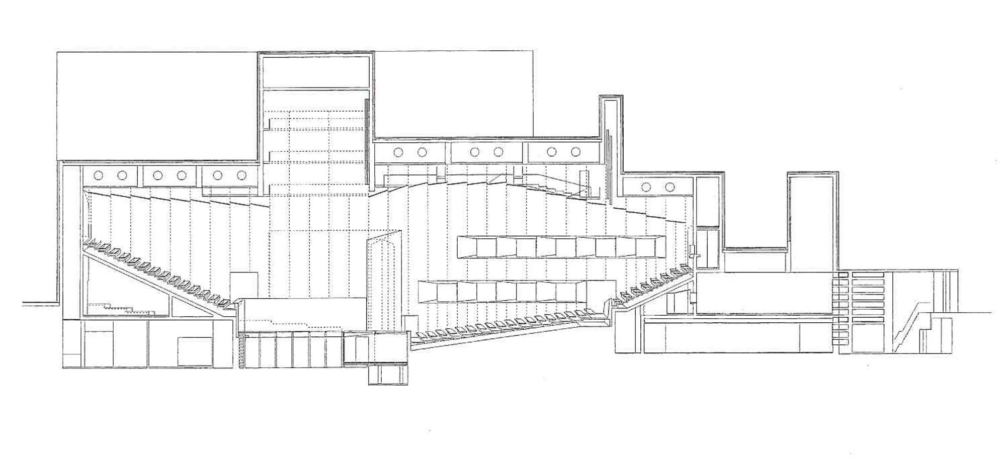
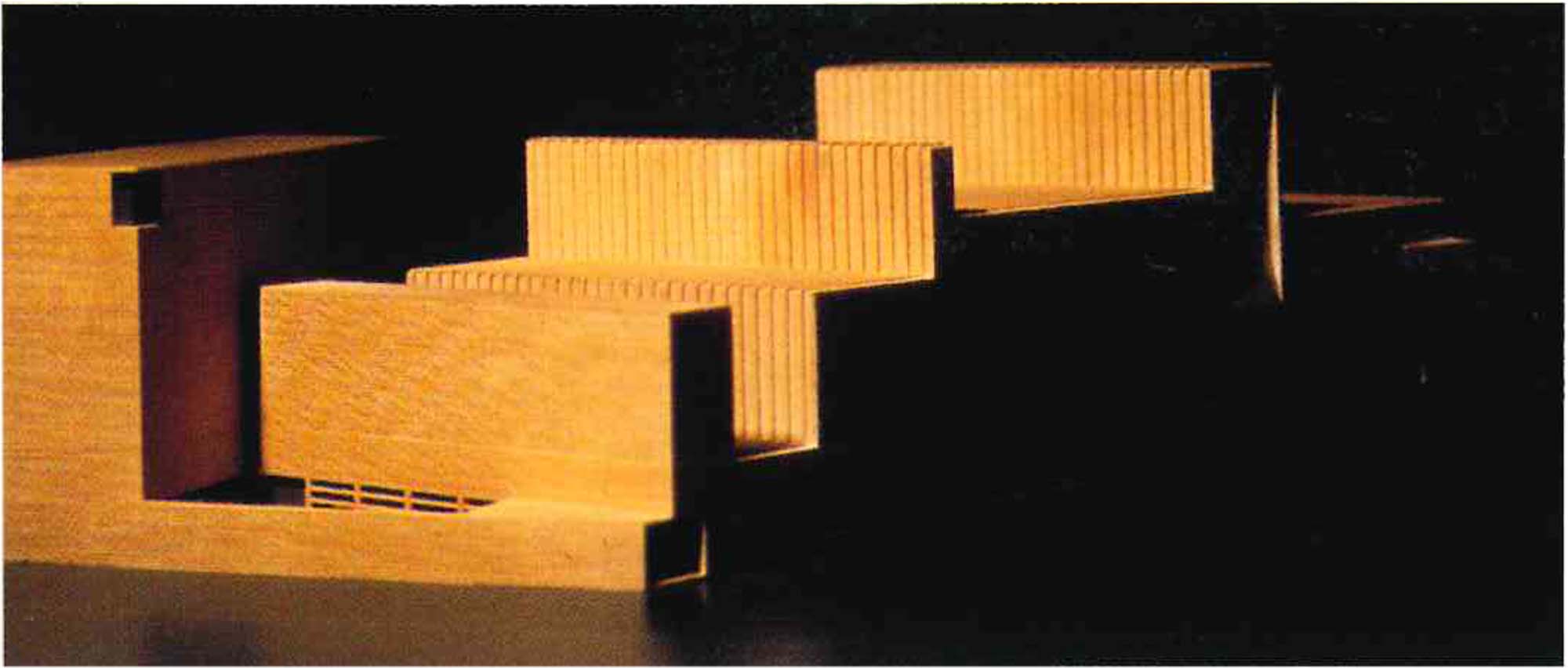
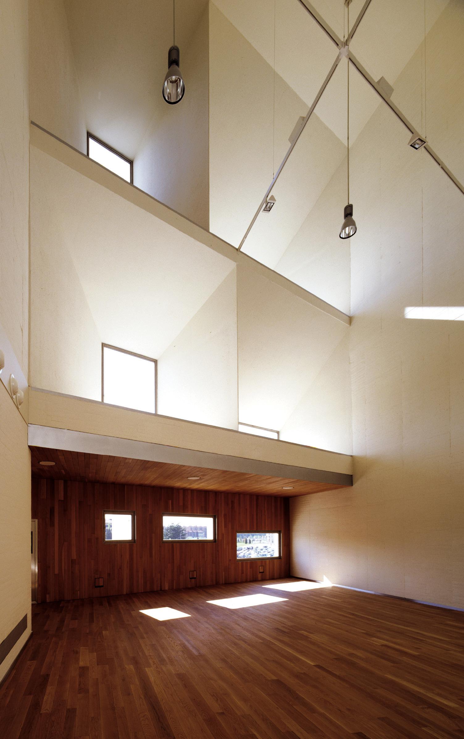
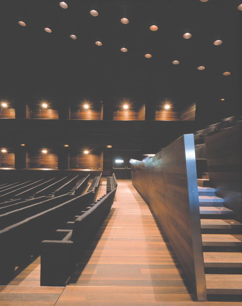
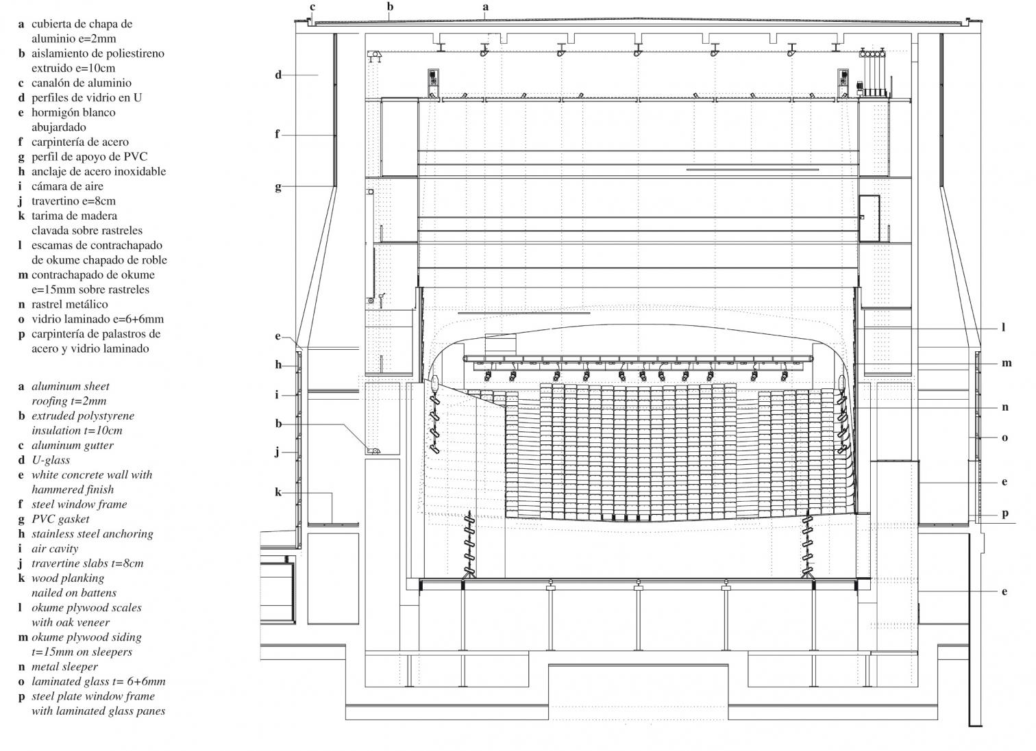
The auditorium is inspired by Manuel De Falla’s well-established model in Granada that has demonstrated itself to be very versatile over the course of time. Whether for large orchestras or small chamber groups, with large or small audiences, it has also shown a great economy of so- lutions, in order to avoid the useless repetition of services, accesses and checkpoints. The internal space of the auditorium is designed to be enlarged or reduced, by sliding screens, depending on the use, providing three different spatial conditions.
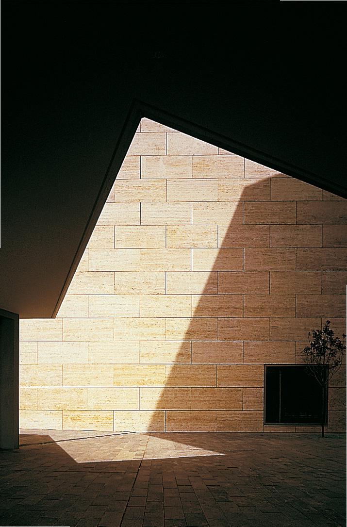
The overall form of the building is an extreme vertical section, the profile of which also becomes the elevation and attributes to the auditorium the image of an extruded volume.
Other projects by Mansilla + Tuñón

