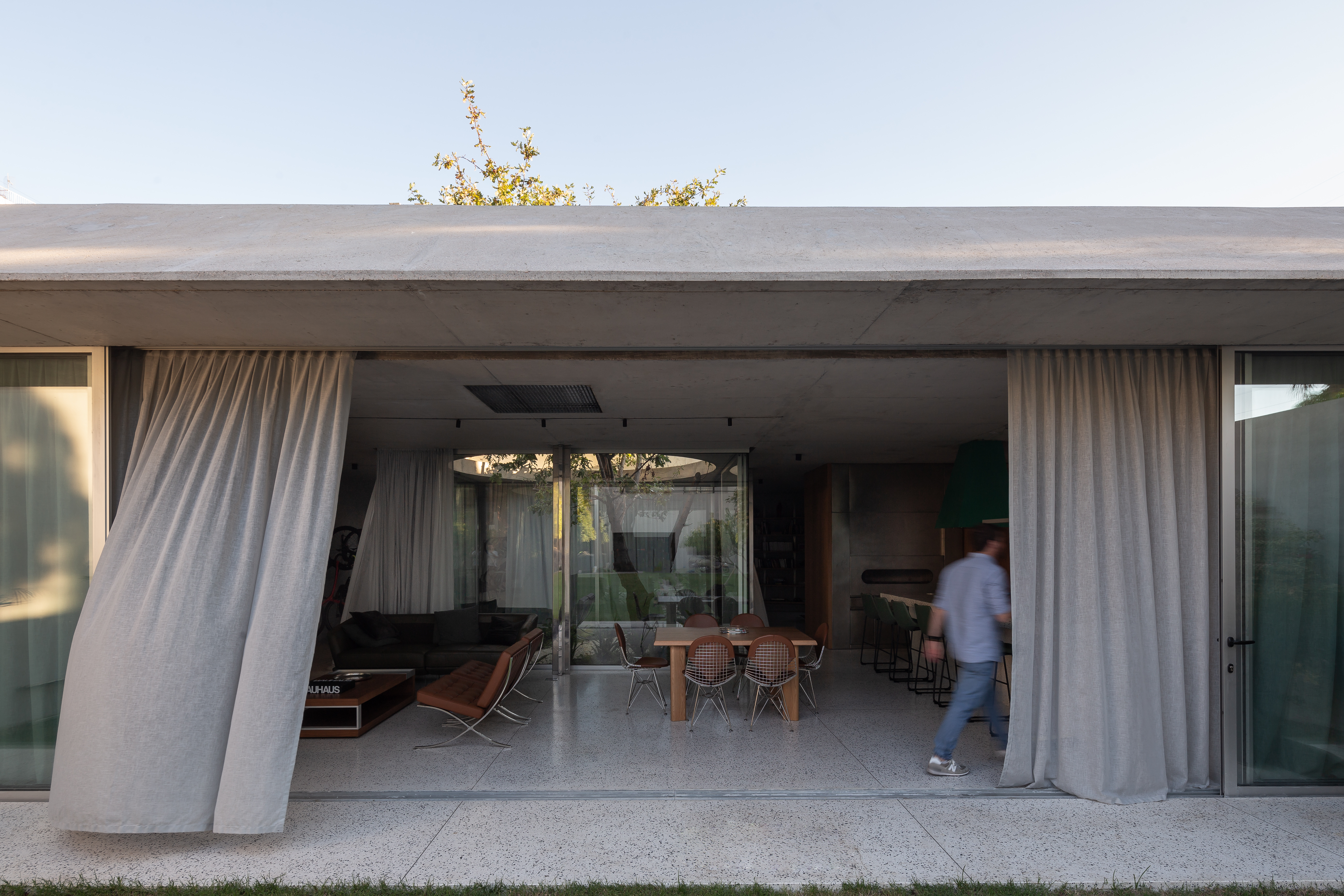
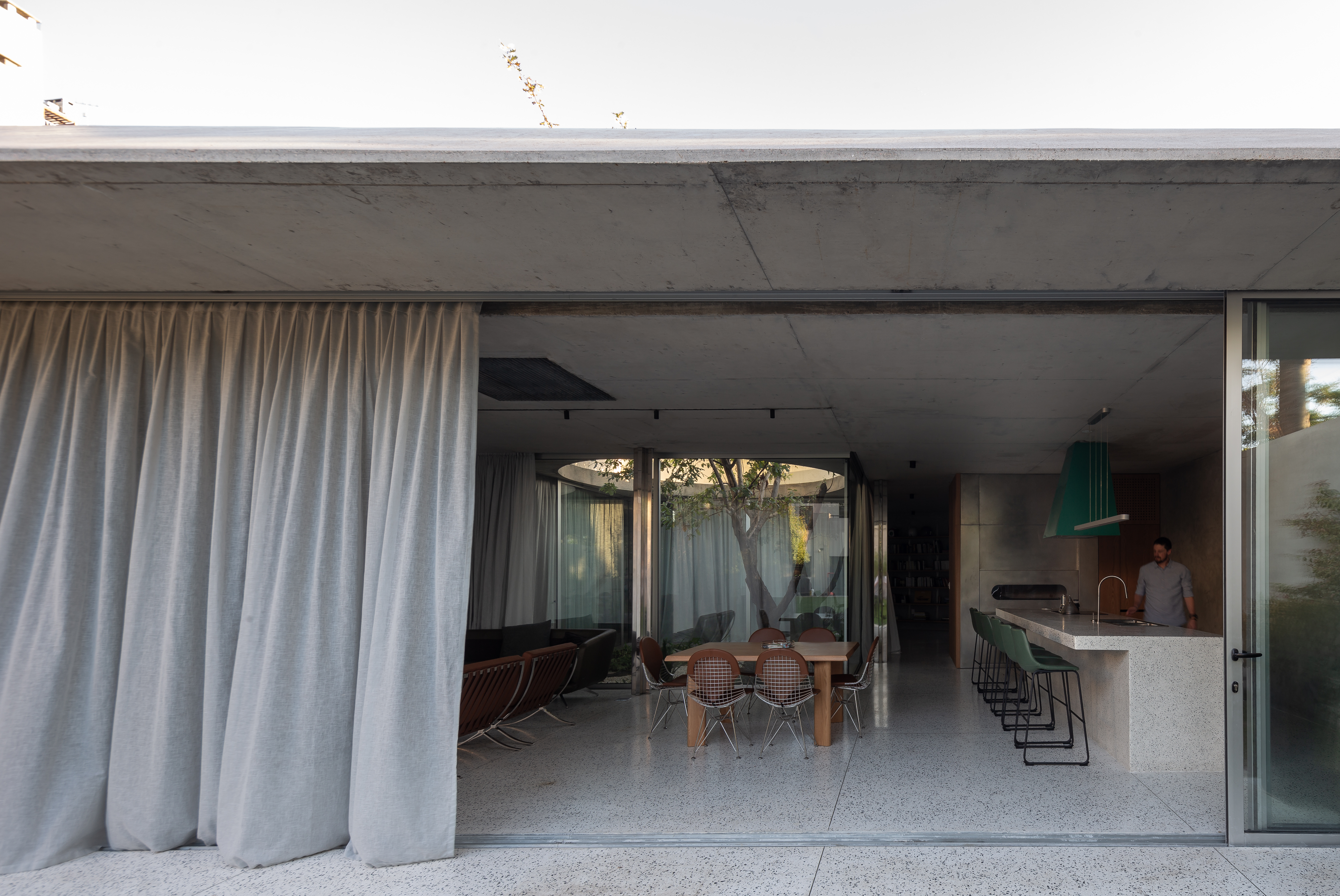
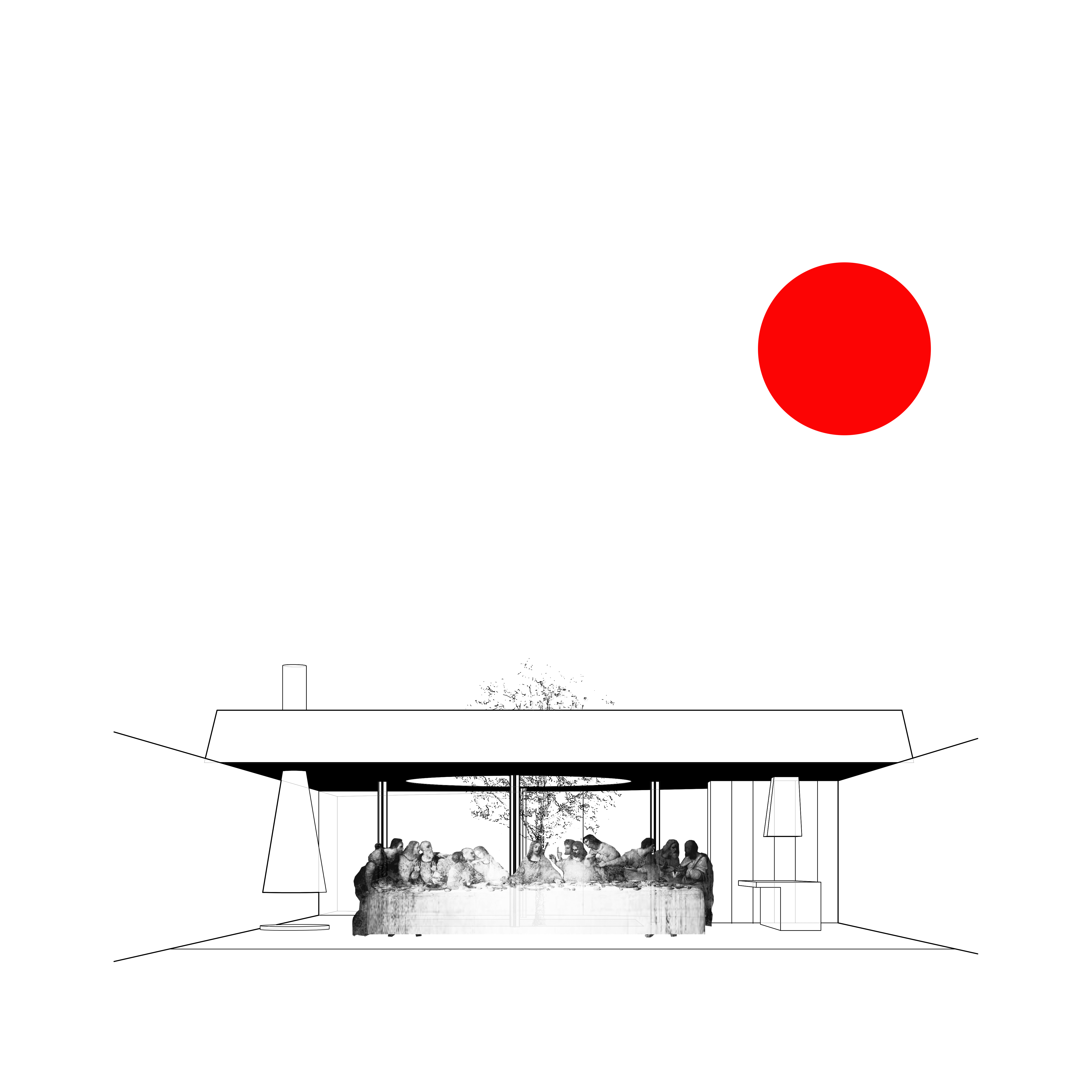
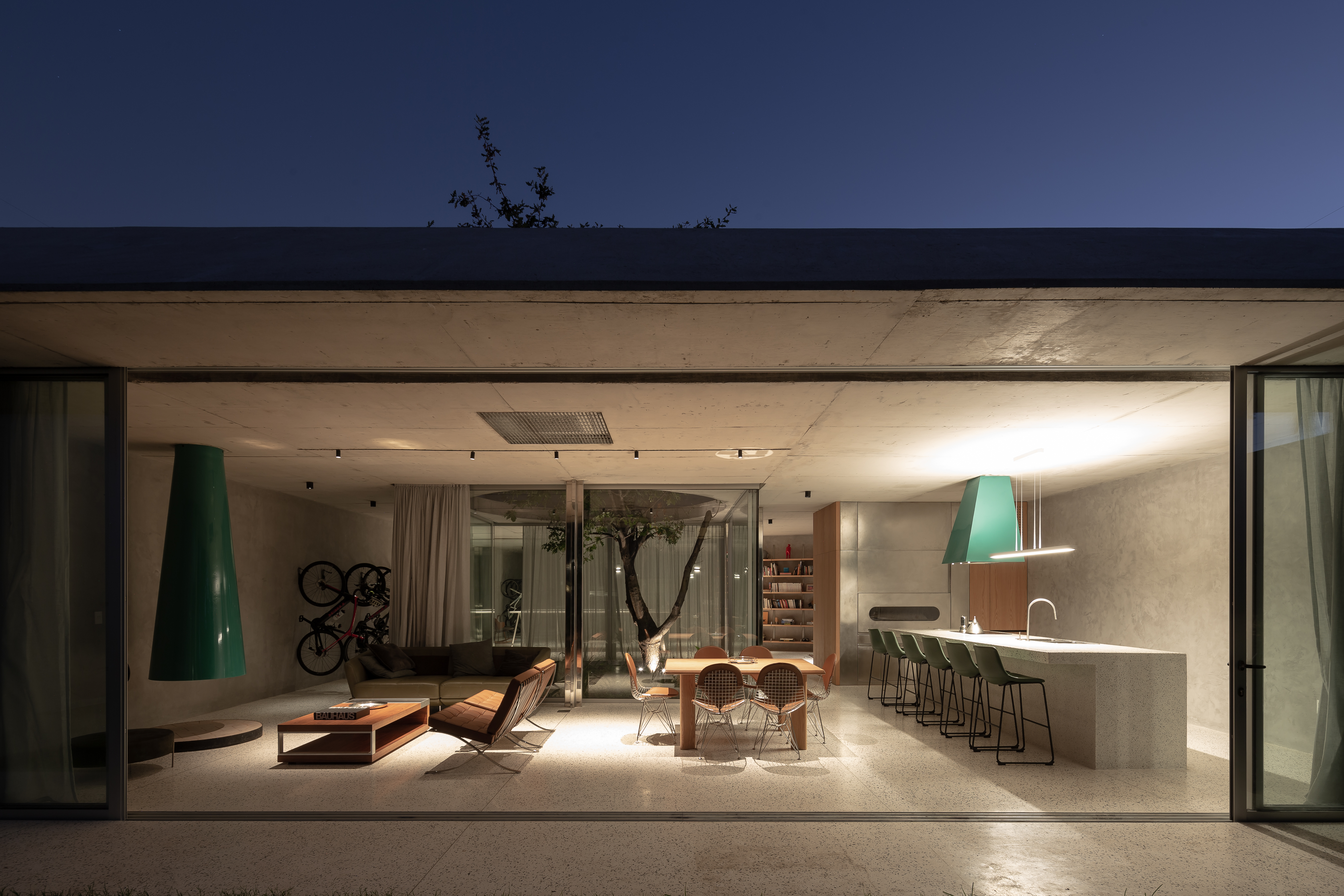
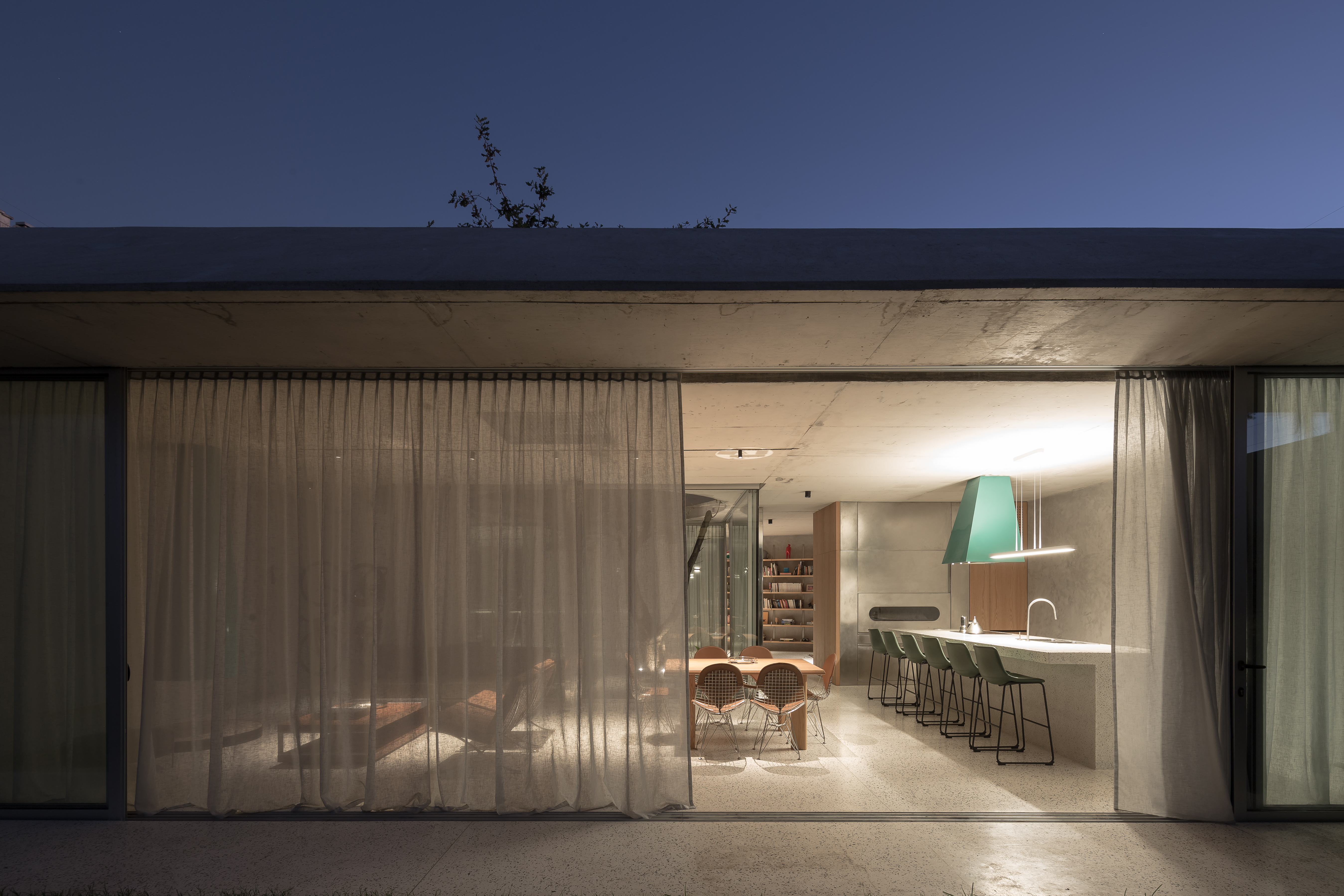
The commission, which had no other programmatic definition than of a livable space able to gather a big feast, is approached with the freedom of planning a pavilion.
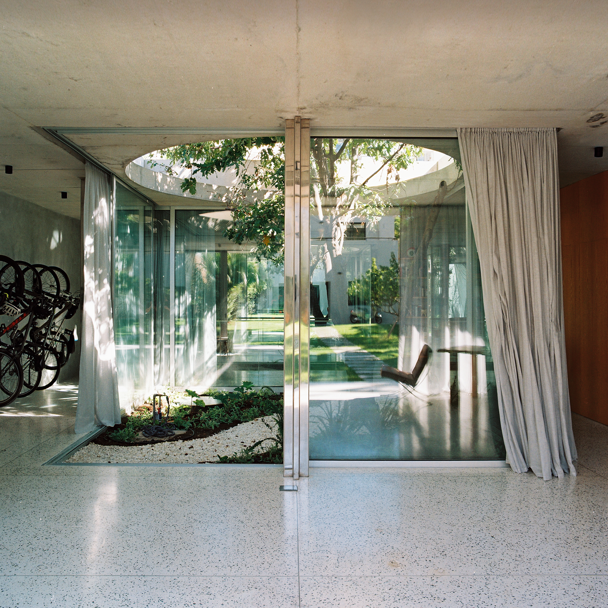
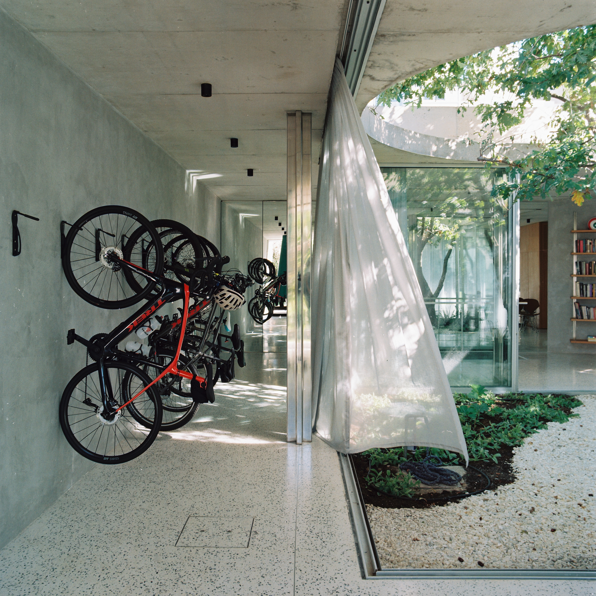
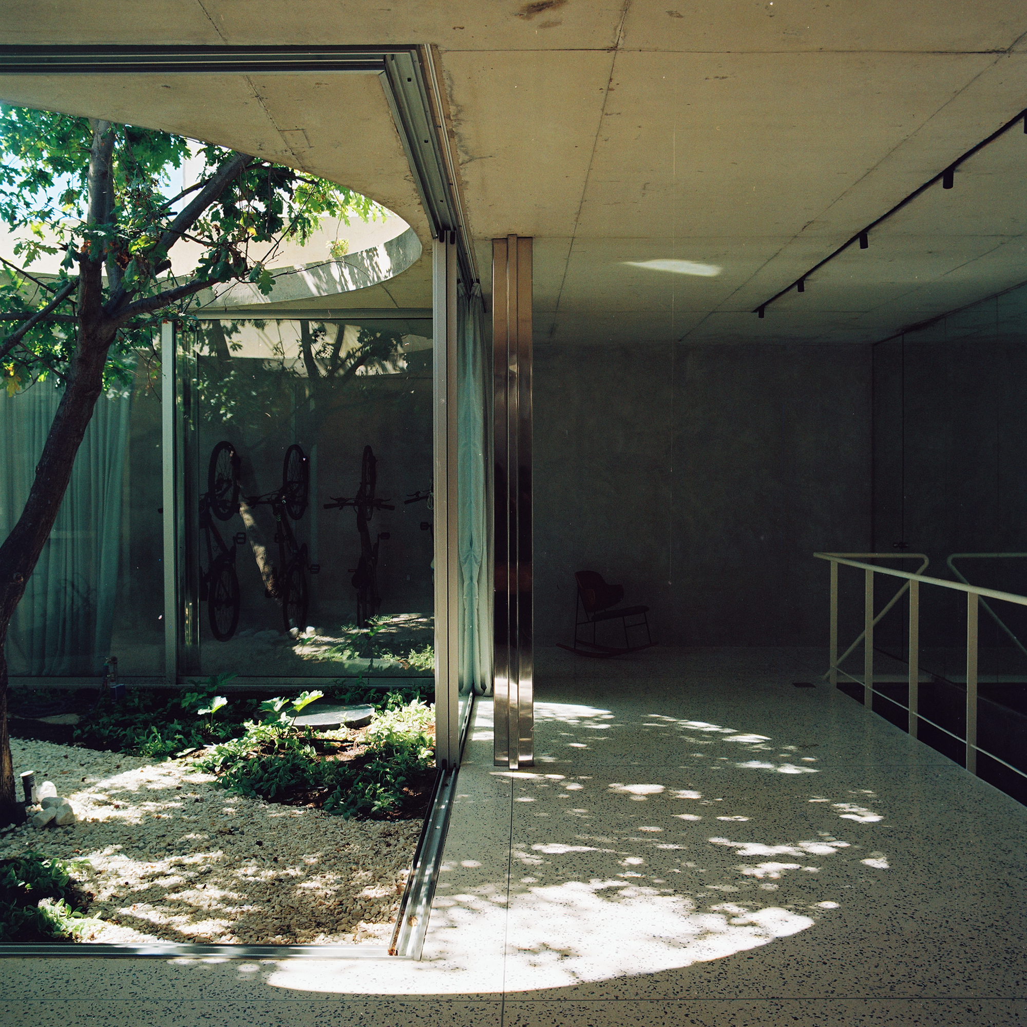
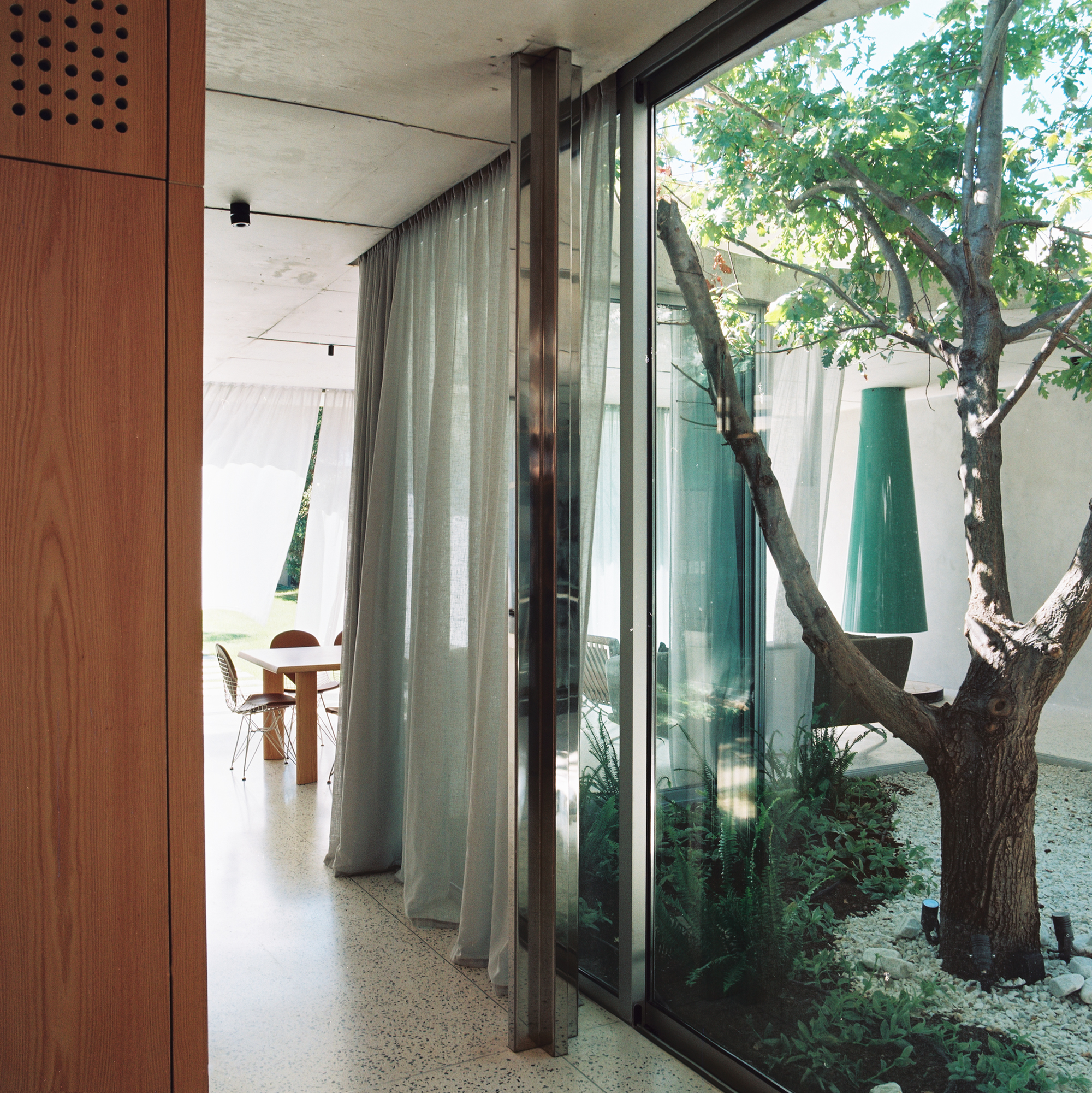
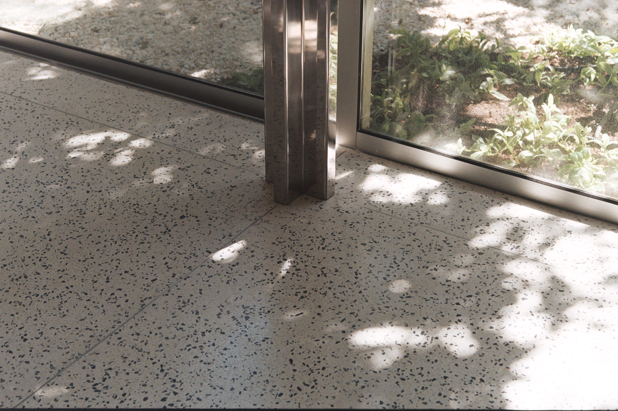
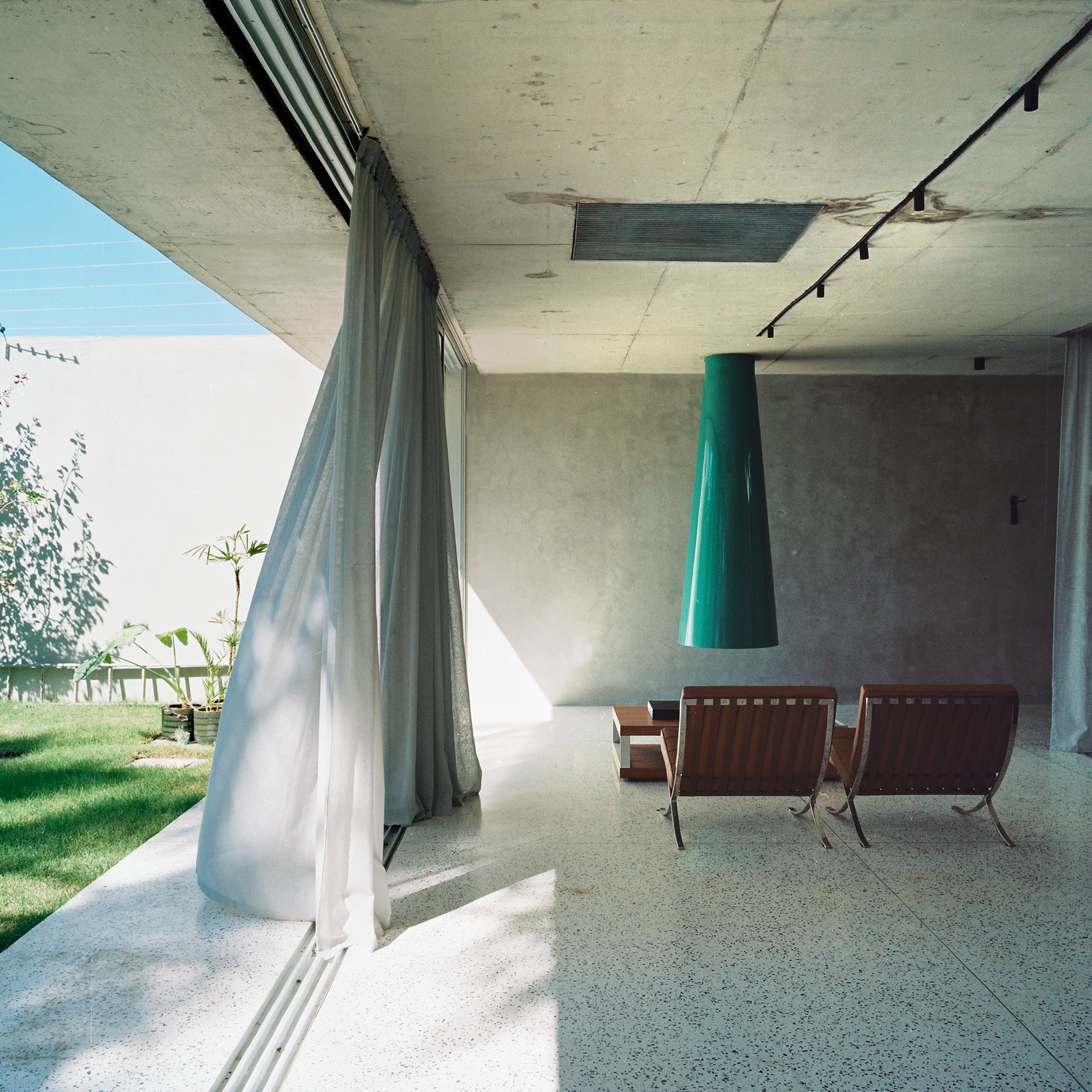
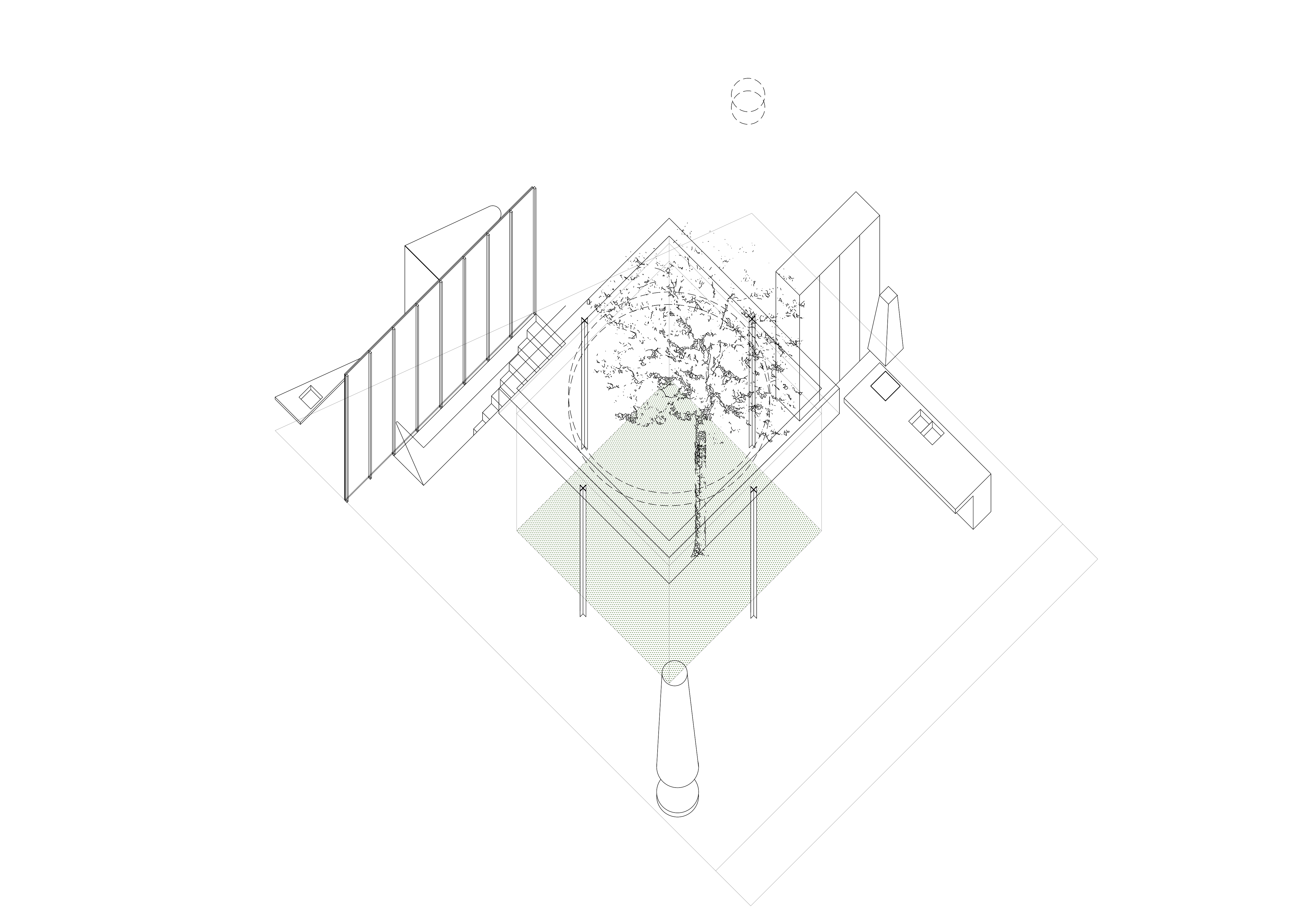
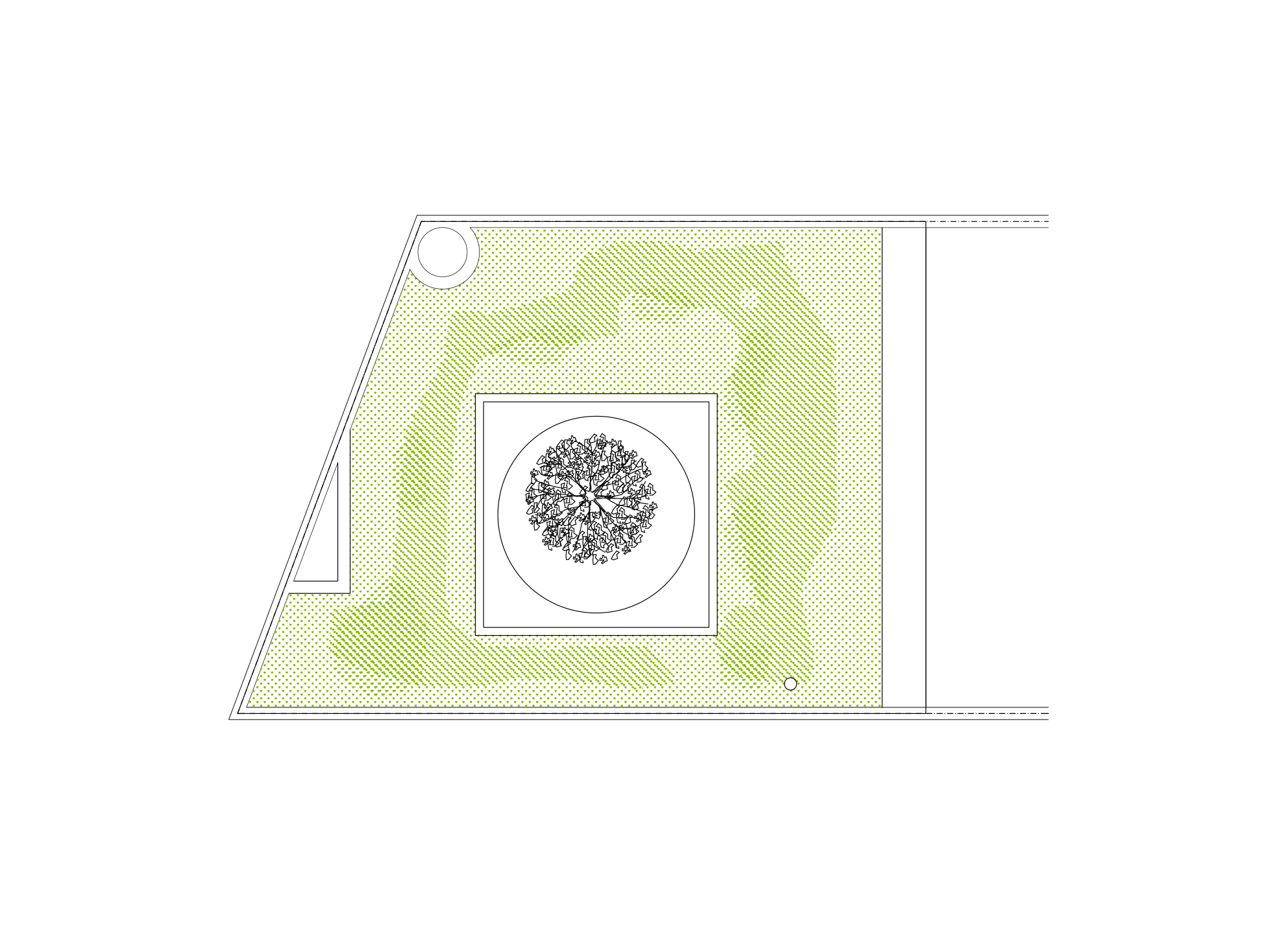
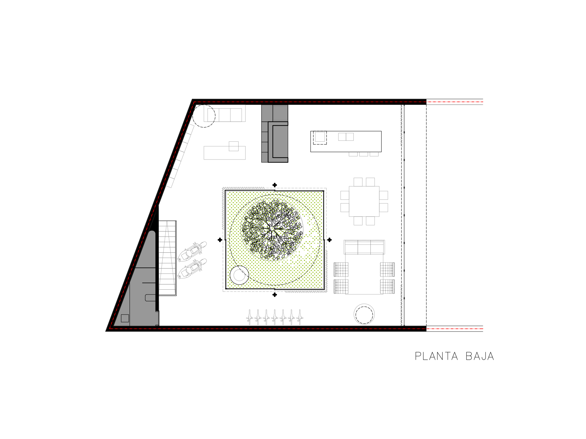
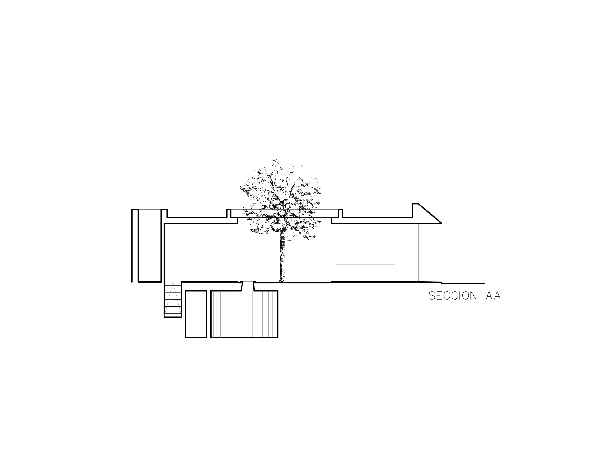
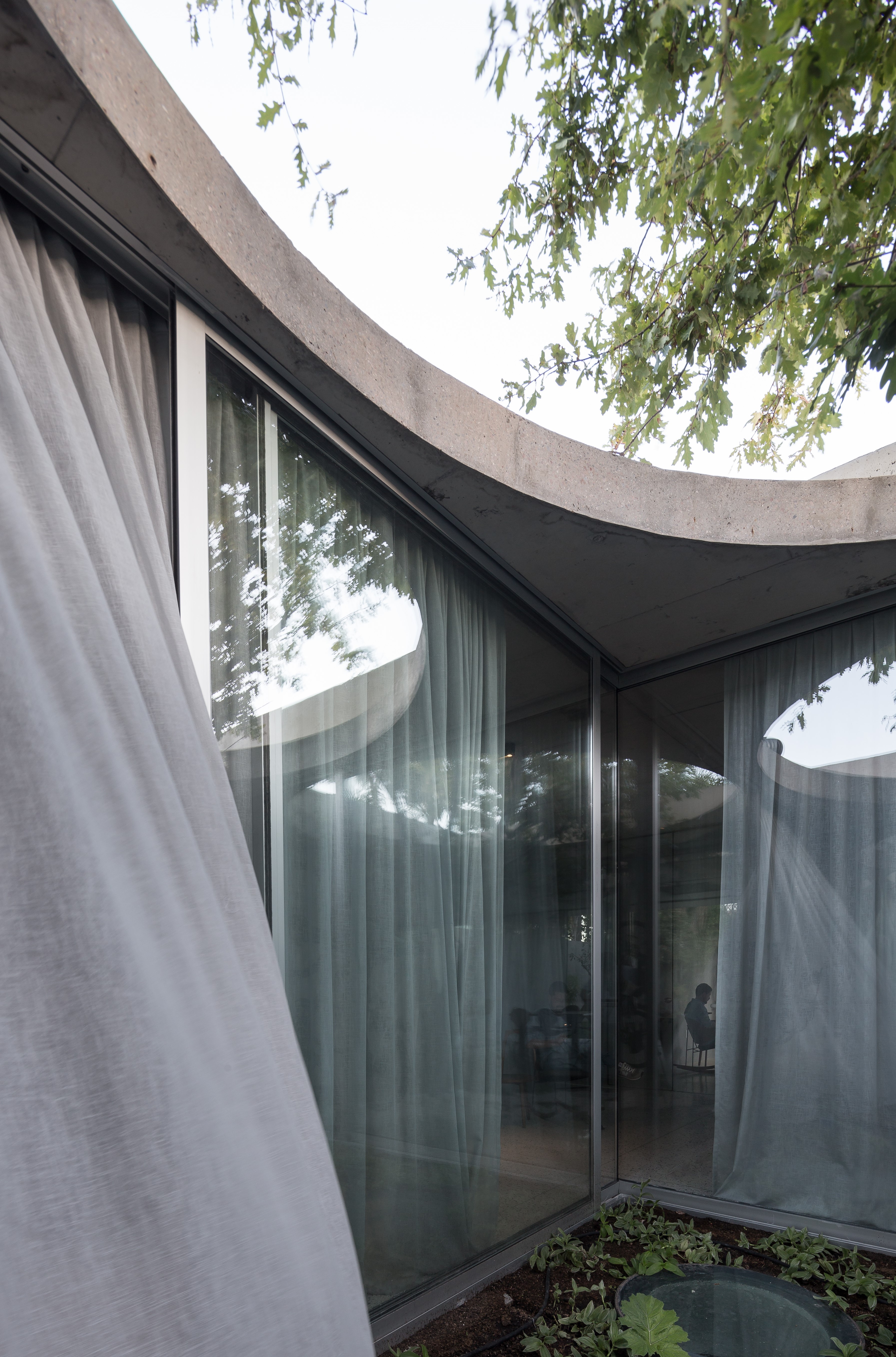
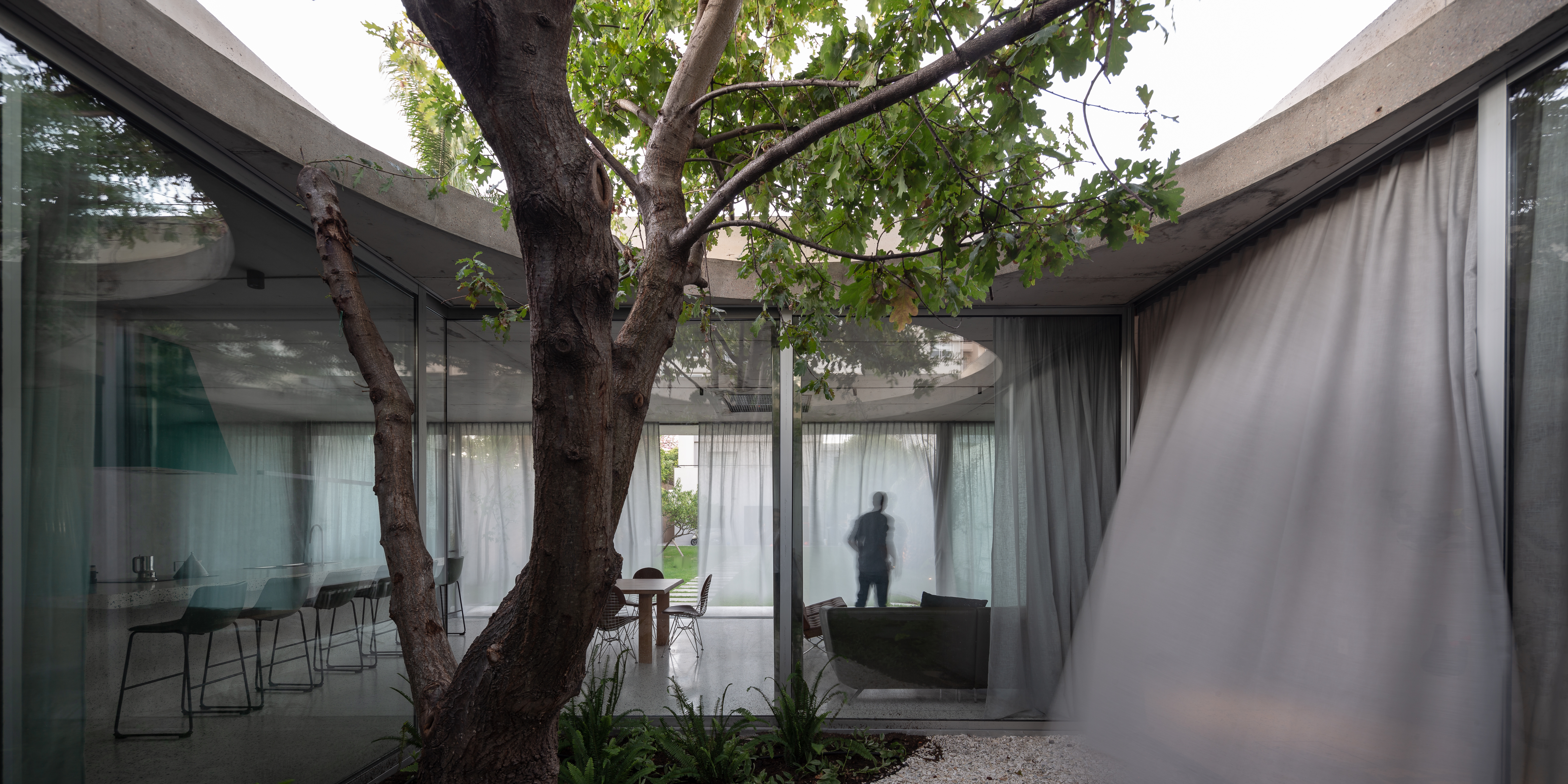
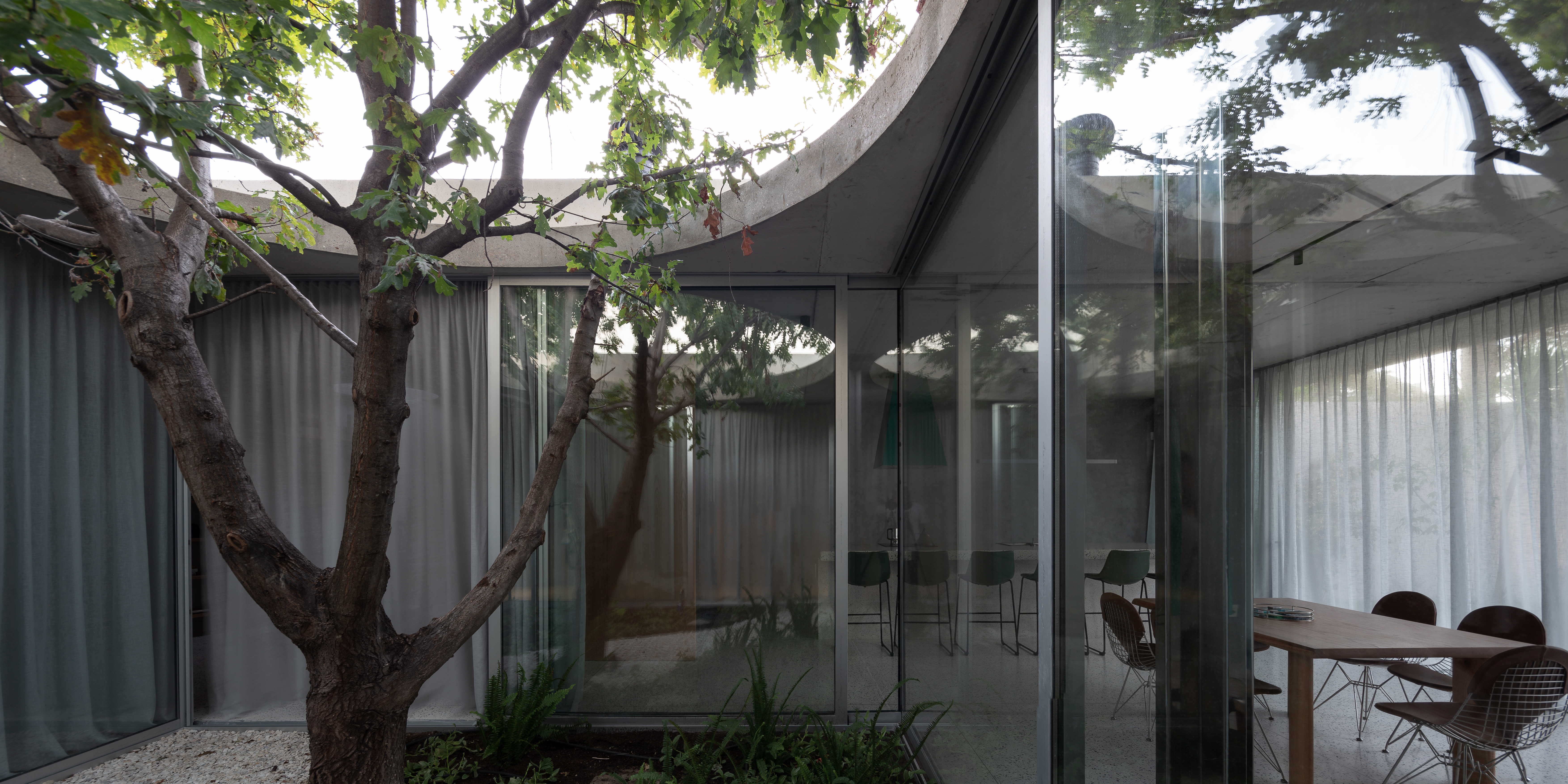
Everything revolves around a square-like patio that engulfs an existing oak tree. The patio serves as the rotatory center in which different elements are laid, drawing the activities and spaces. Inverting the square-circle relation of the Mantegna house, the square shape layout of the patio is framed by the circle opening towards the sky. The square emerges again on the roof defined by the beams that support it. In the middle of each side, square cruciform pillars, the same ones Mies will use in his Barcelona’s Pavilion, direct the loads towards the floor.
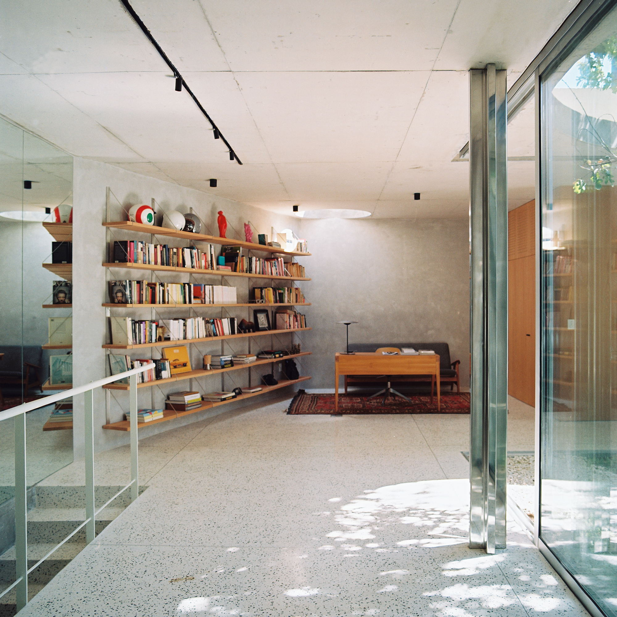
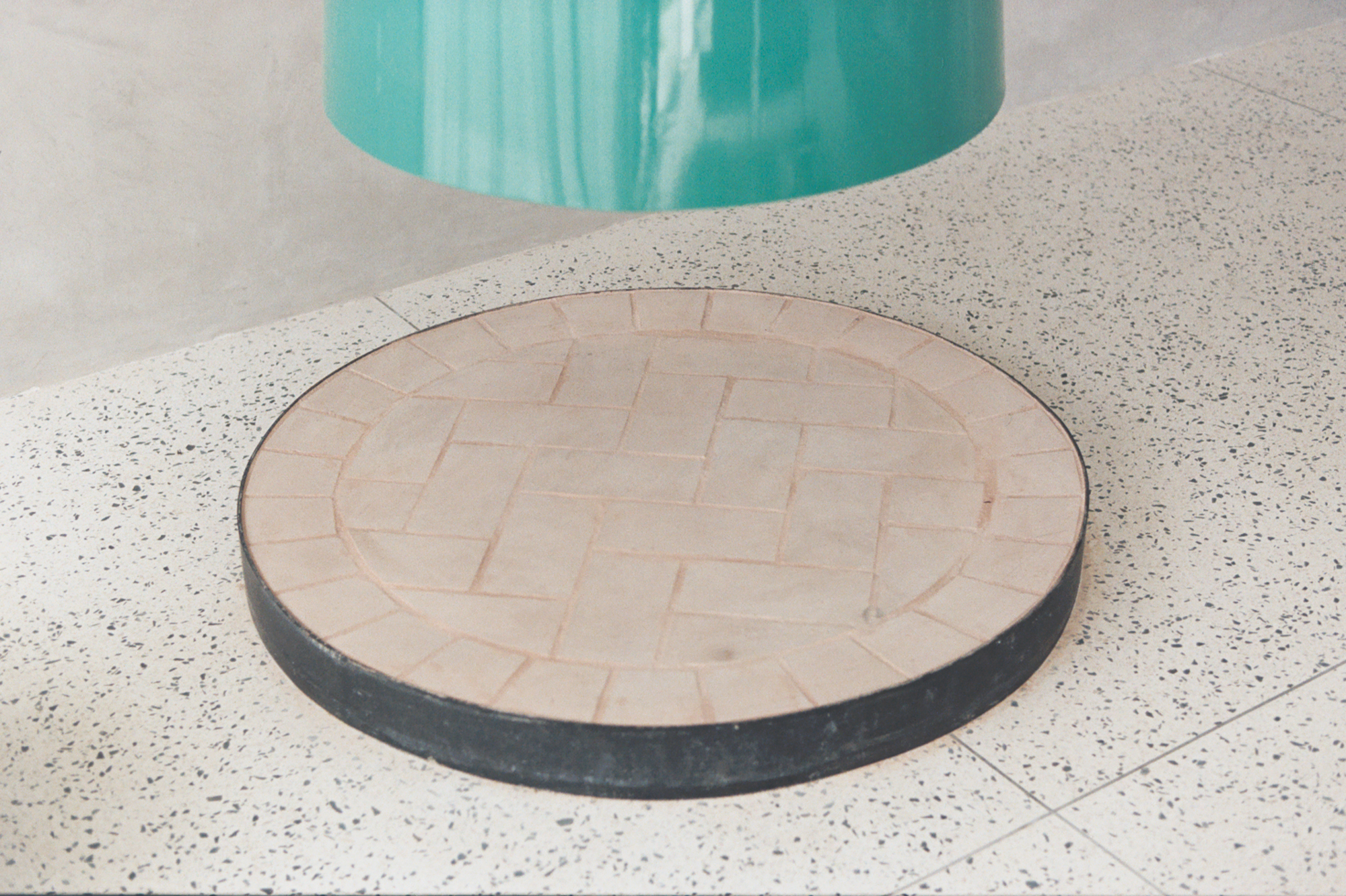
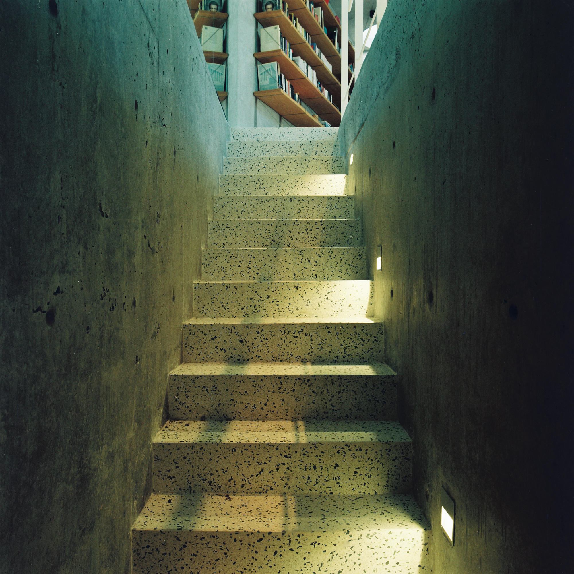
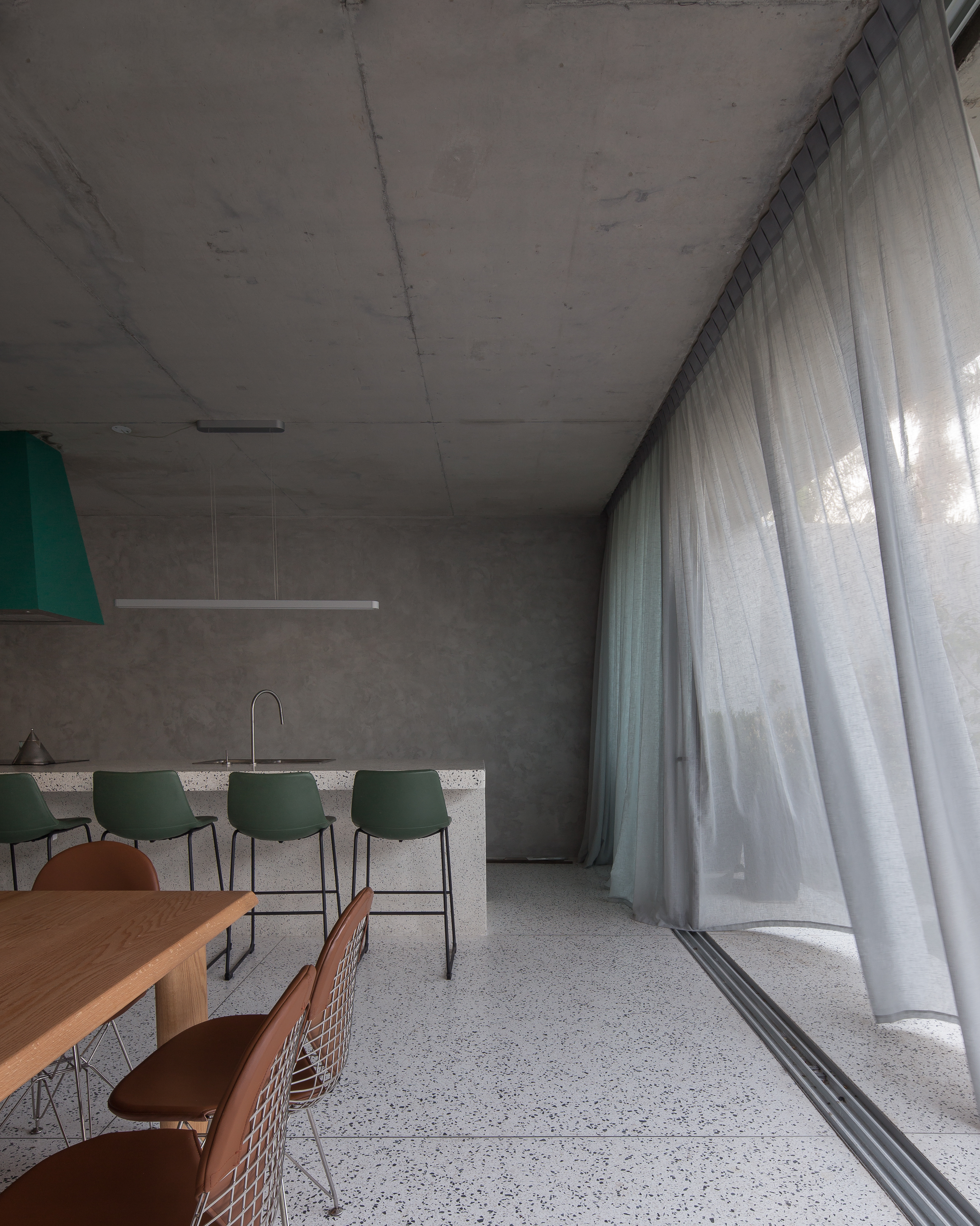
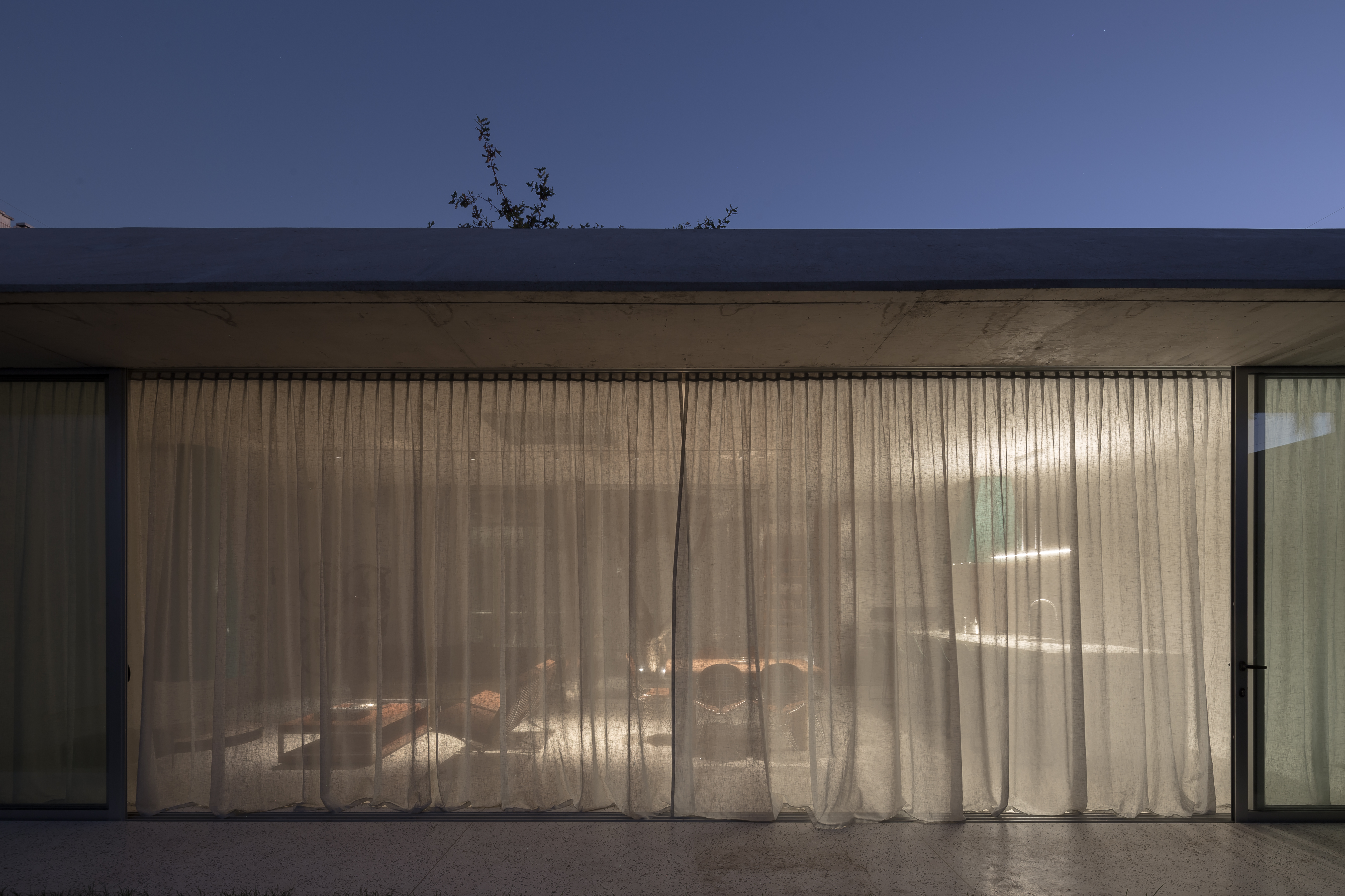
Walls and ceilings of concrete, polished monolithic floors, define a monomaterial and neutral condition of space. As a counterpoint, color is introduced as singular green elements that talk with the enclosed nature. The green is taken from Le Corbusier’s Pantone. A sequence of reflections on the polished surfaces aims to psych out the relationship between the inside and the outside.
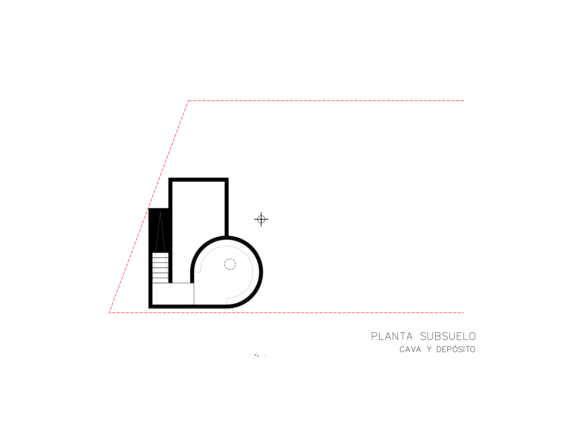
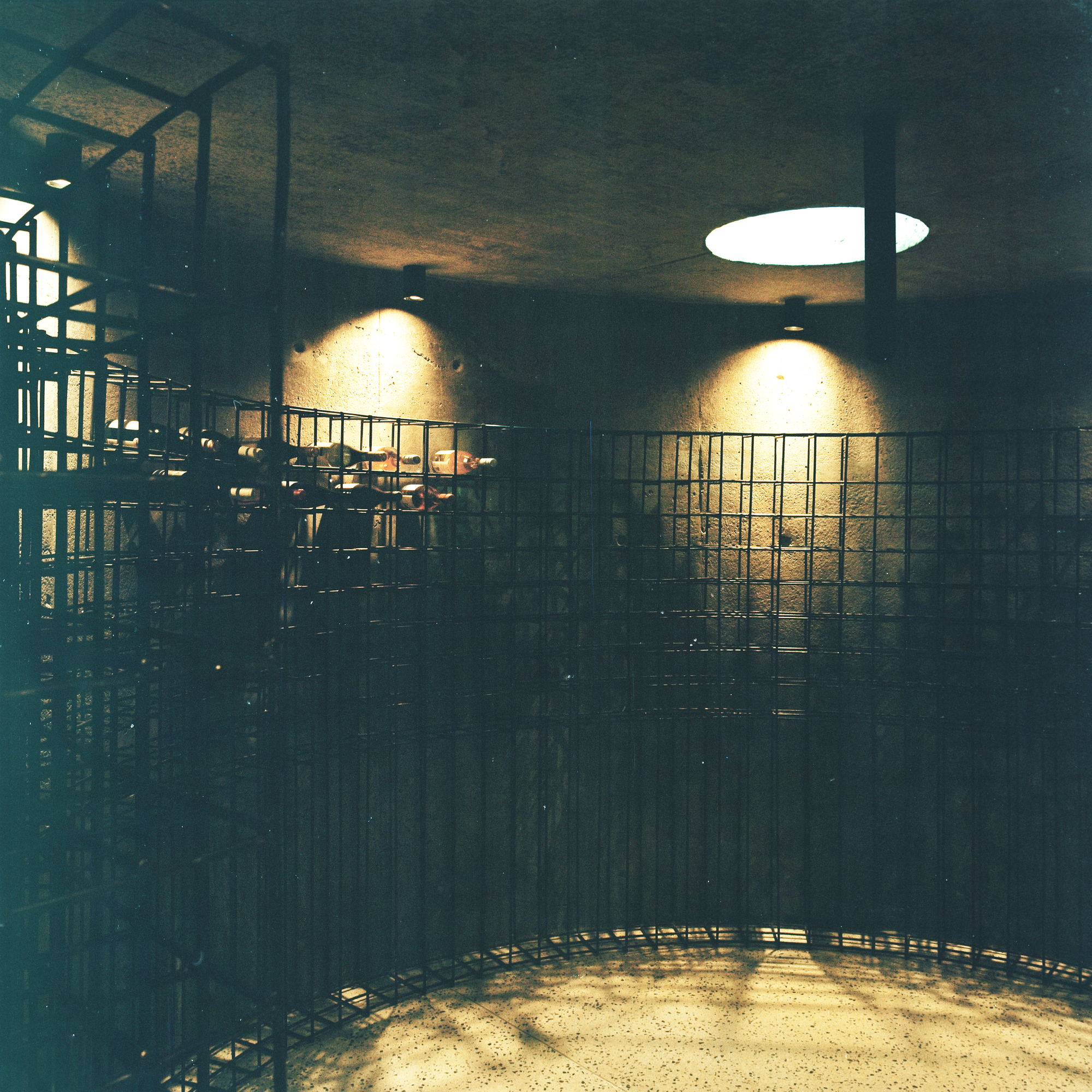
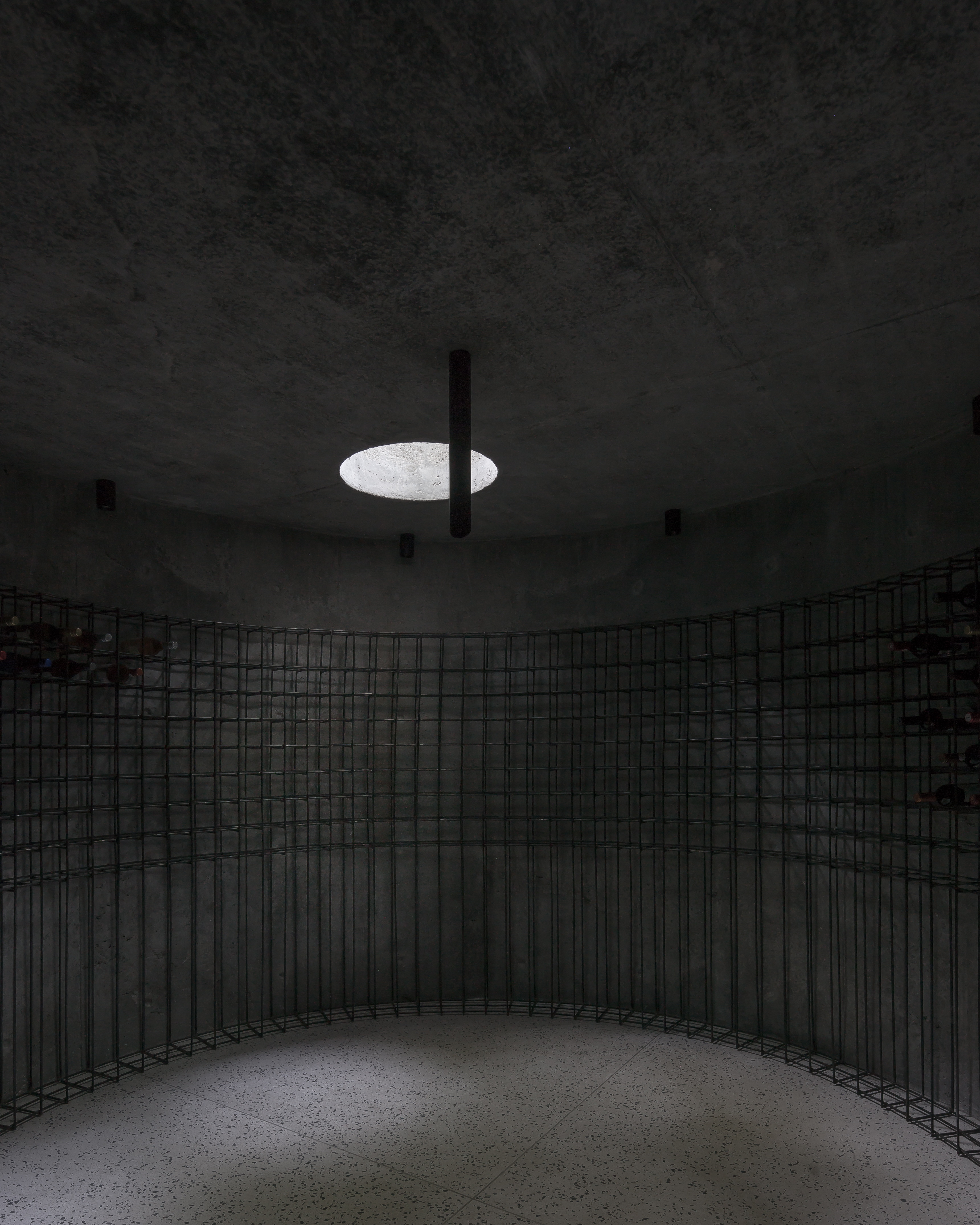
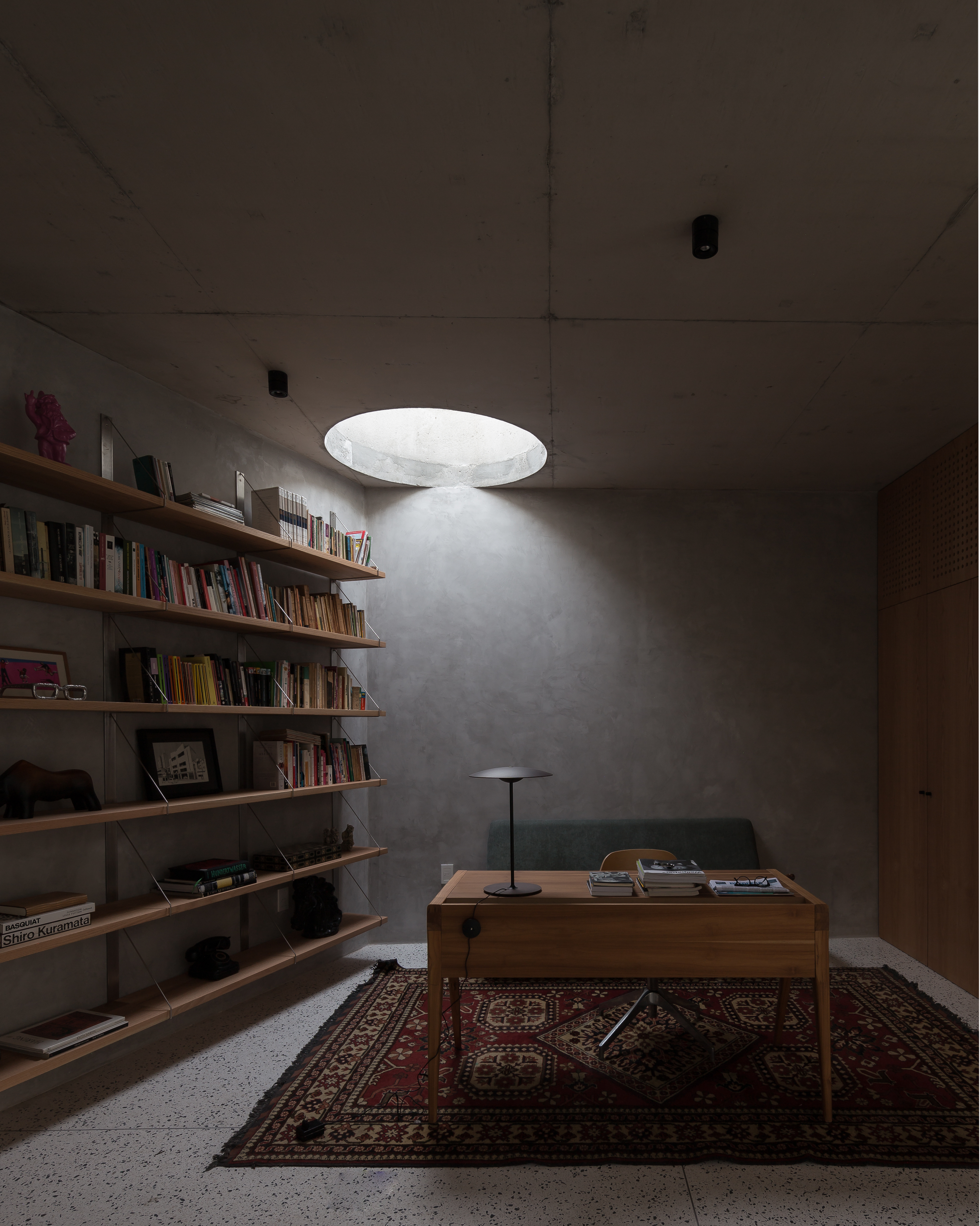
Opposed to the diaphanous noble floor, the basement holds a storeroom and a wine cellar, meant to feel like a dimly lit concrete cave. The wine cellar has a circle shape plan, with an oculus in its ceiling which embeds the space in a zenithal dim light, reminisce on the humility of Dieste’s baptistery that he will project for the “Cristo Obrero” church in Atlantida.
