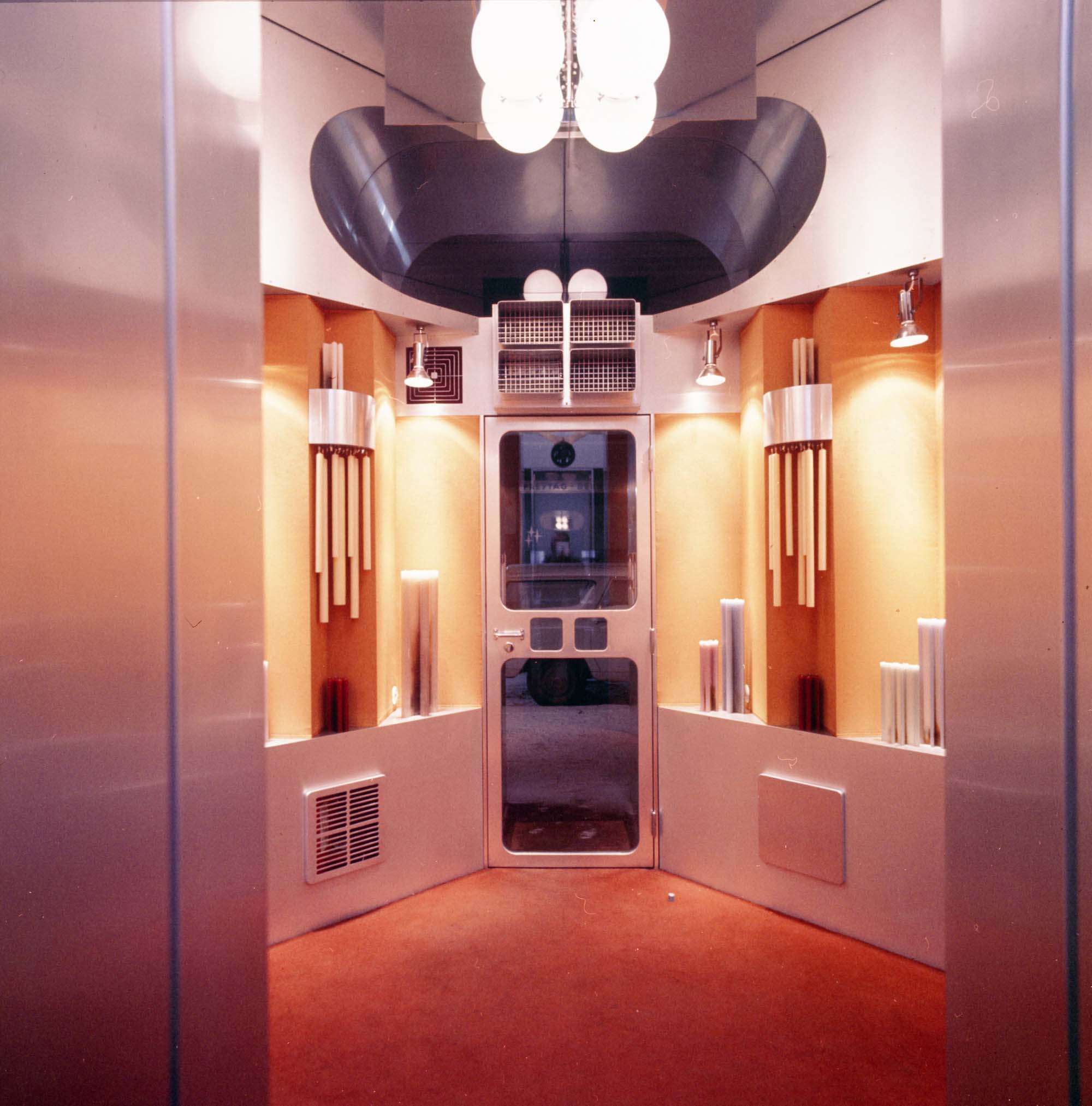
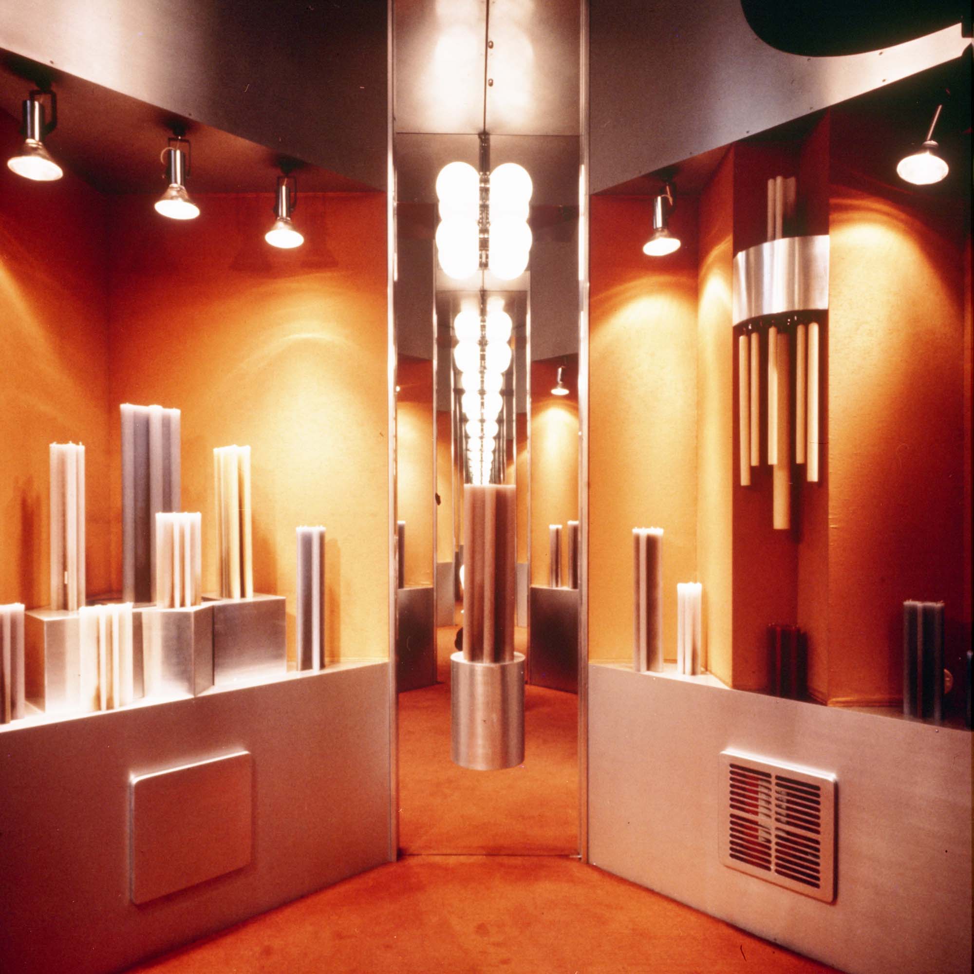
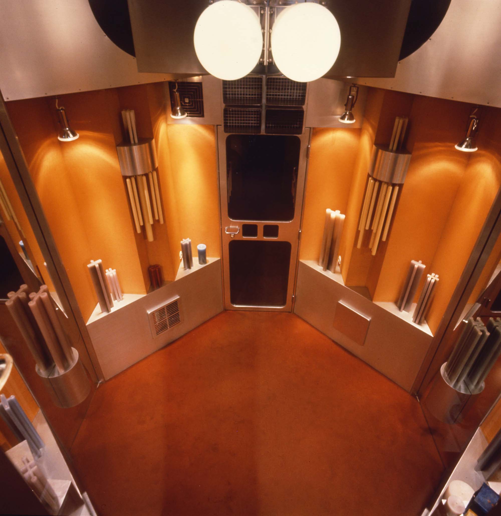
The shop is located in the most exclusive shopping street in the center of Vienna. The whole character and attitude had to consider its distinguished location, its limited size and its use. It was to be a true product of our age of technology, meet all the functional requirements and provide a maximum of economy of space; but its character was not to be strictly utilitarian. Attention is not drawn to the shop by gaudy neon signs or large, stuffed full shop windows but through its architecture and a few specially displayed items. Psychological reactions, such as curiosity, were put to use. The outside space was to continue into the inside in one spatial flow with no change of the main material.
Hans Hollein Retti Candle Shop
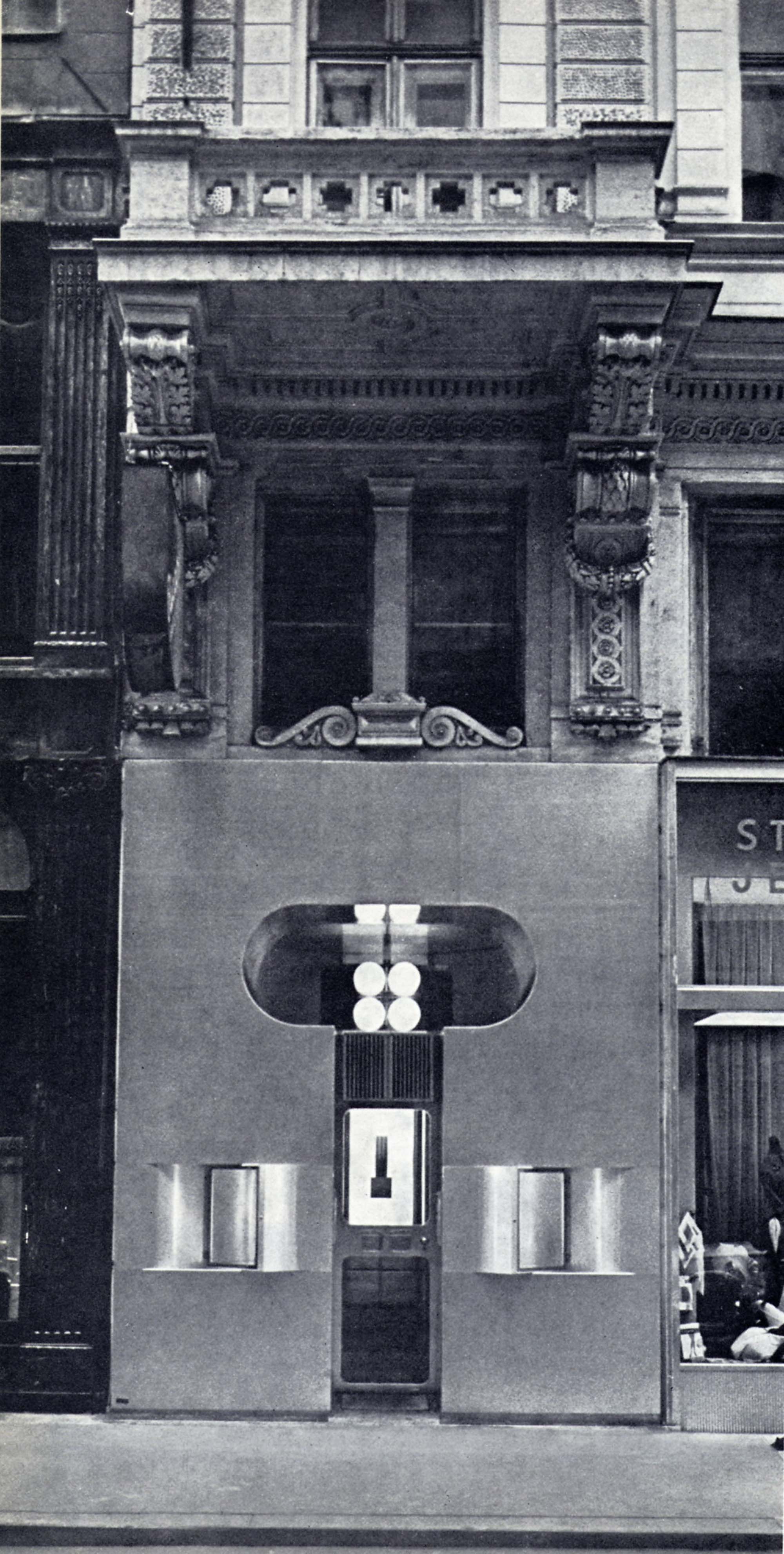
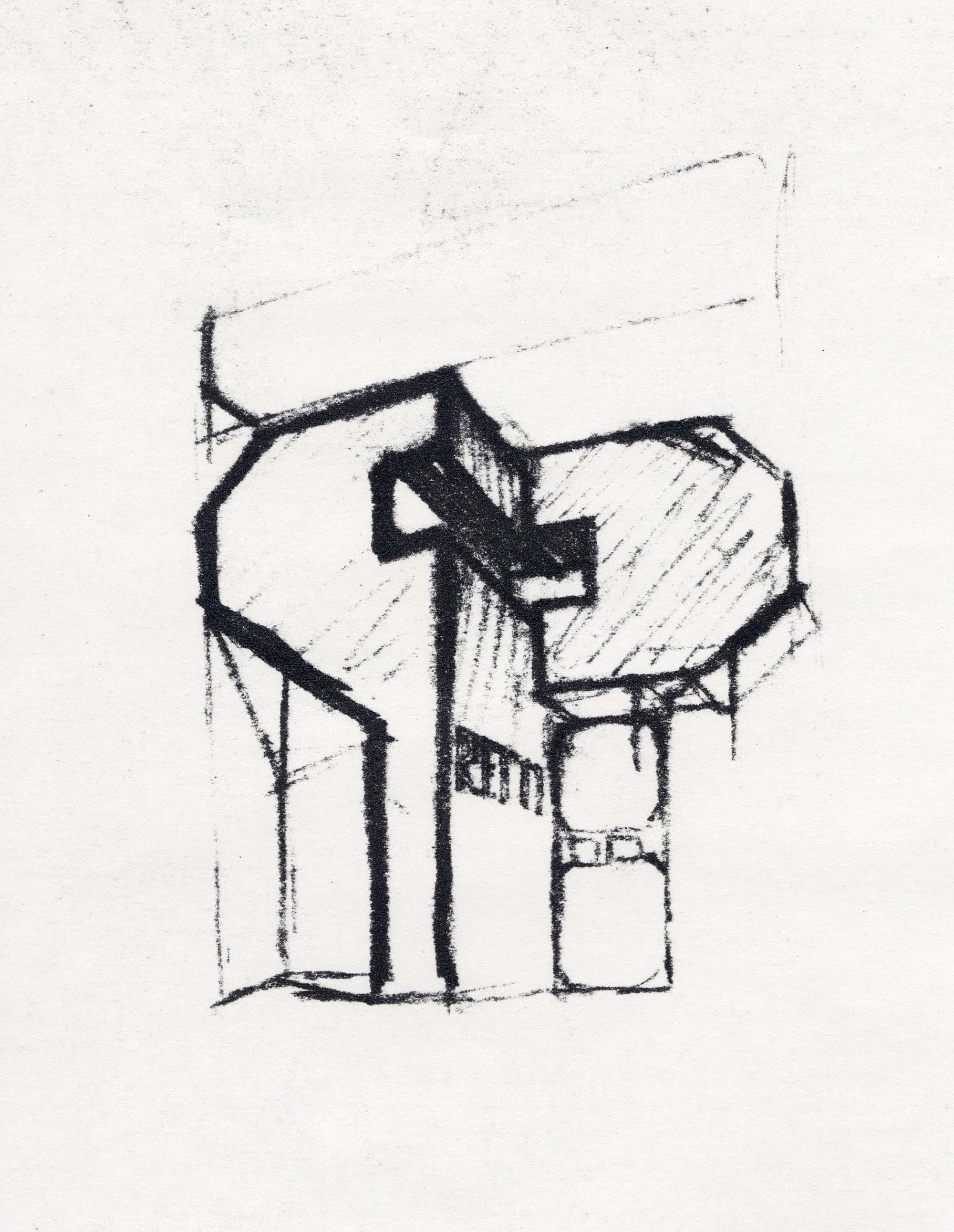
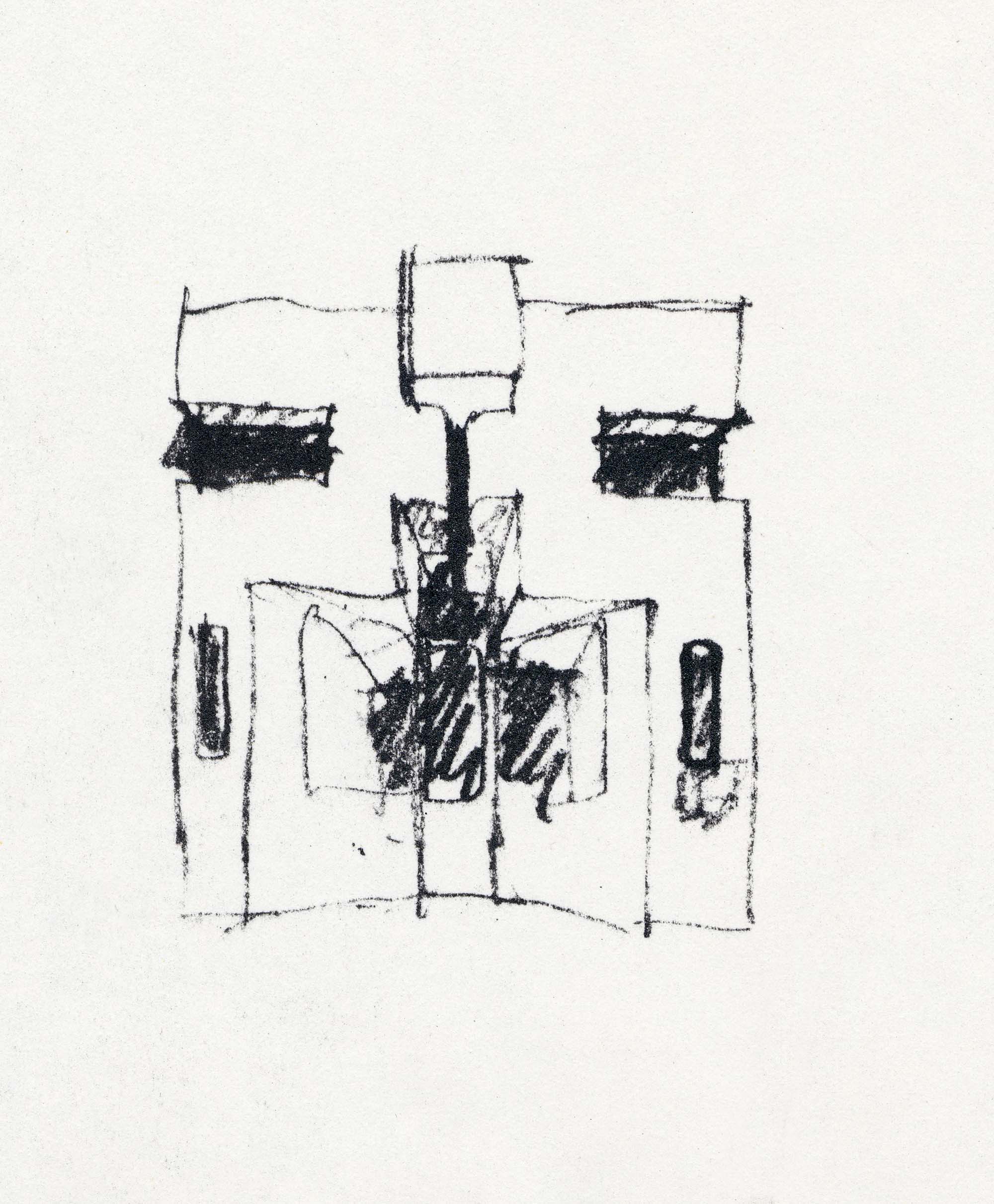
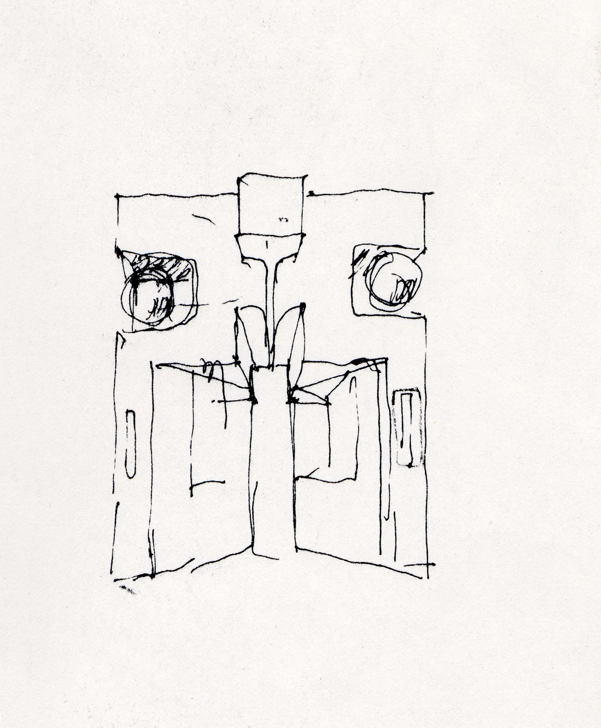
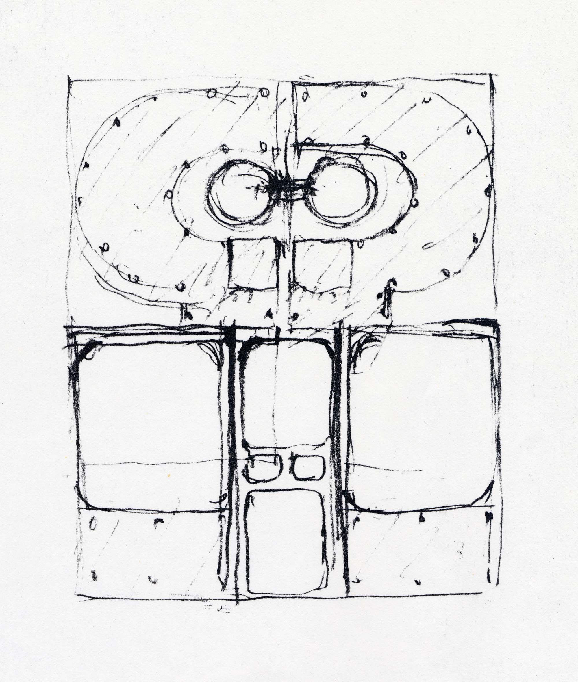
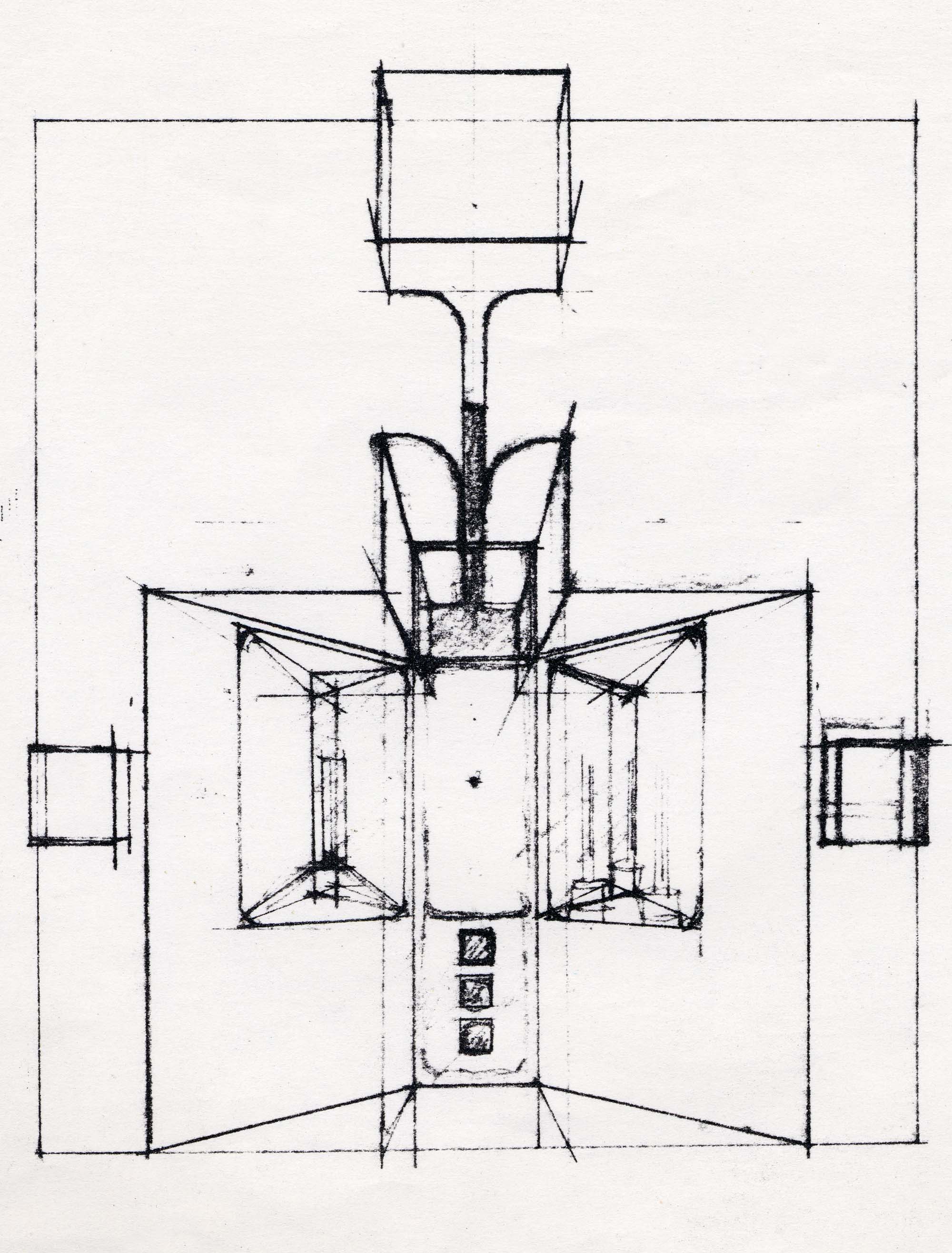
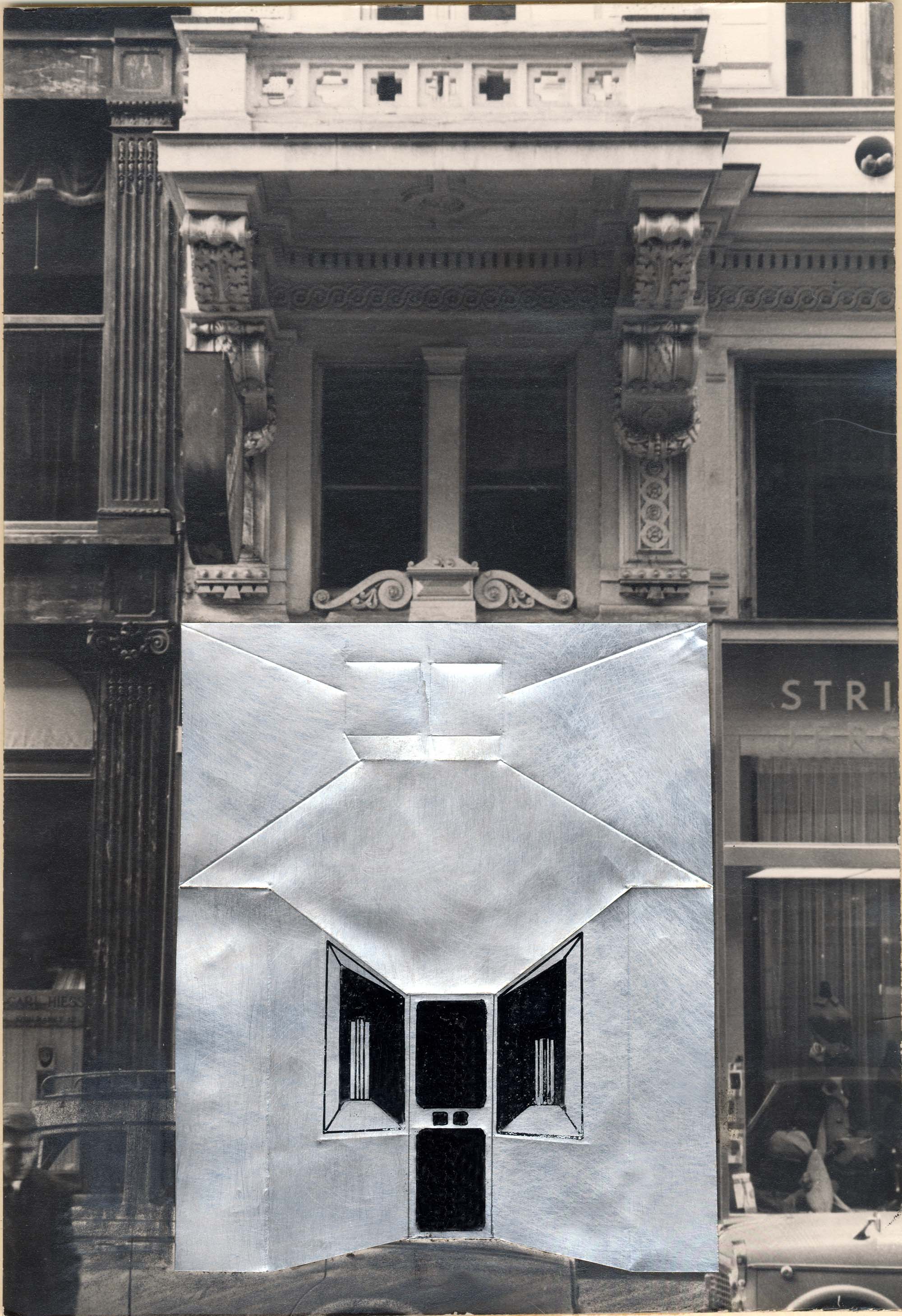
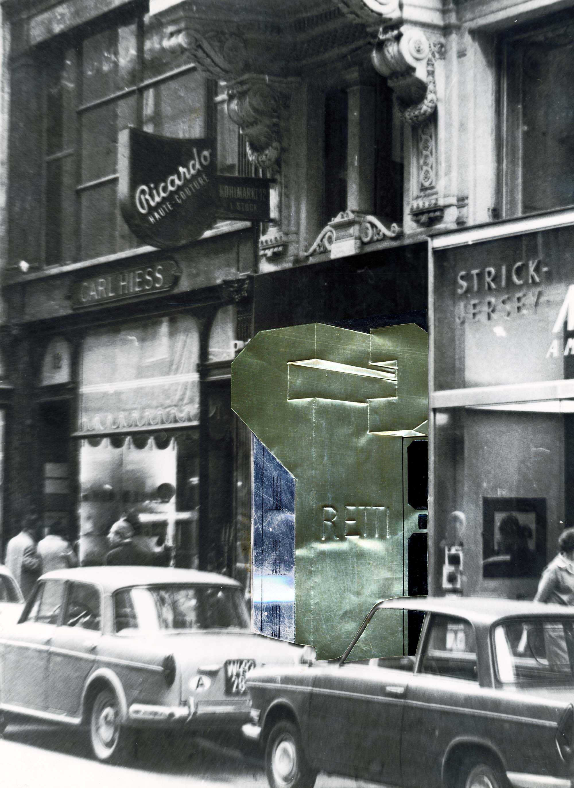
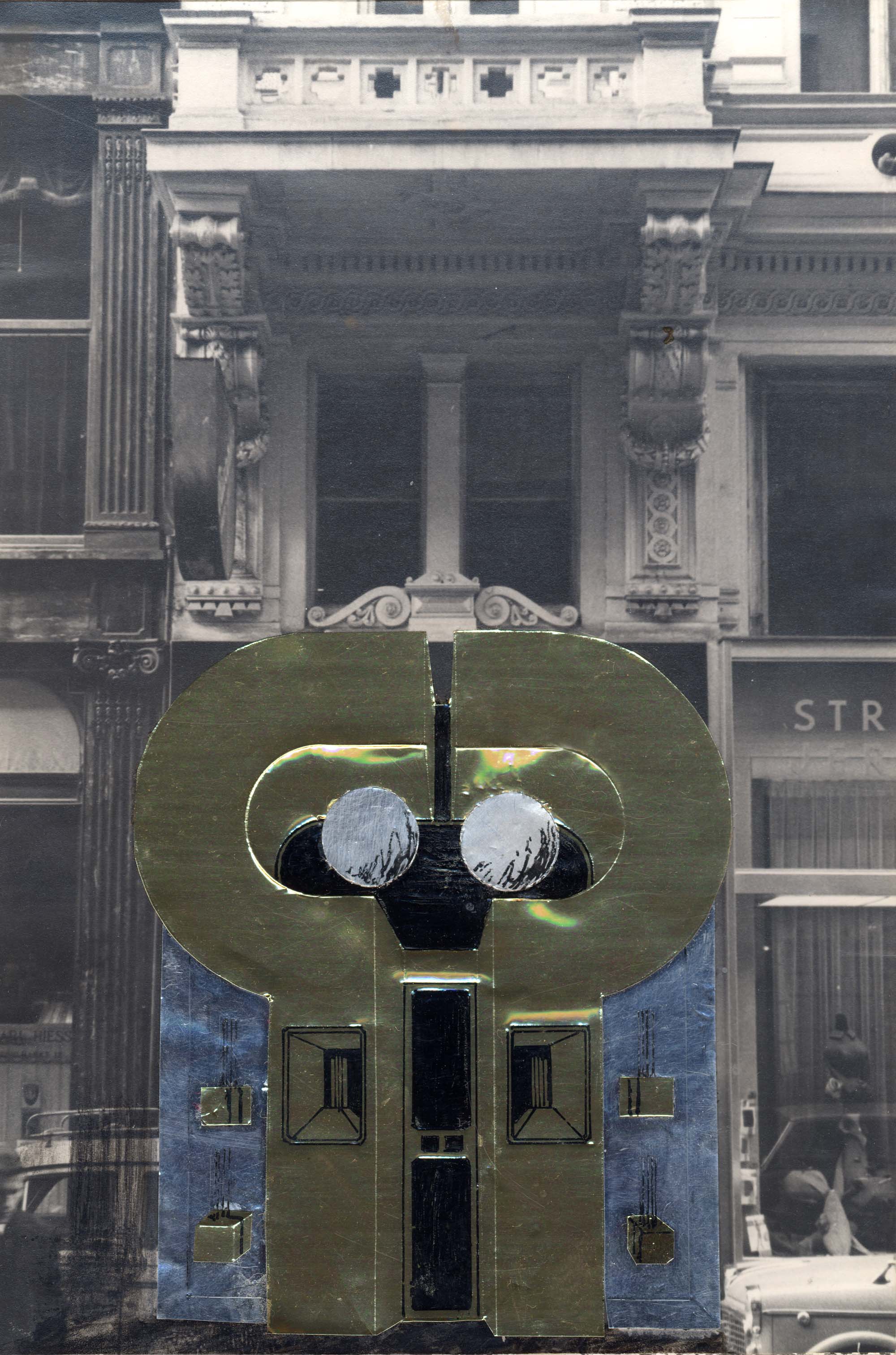
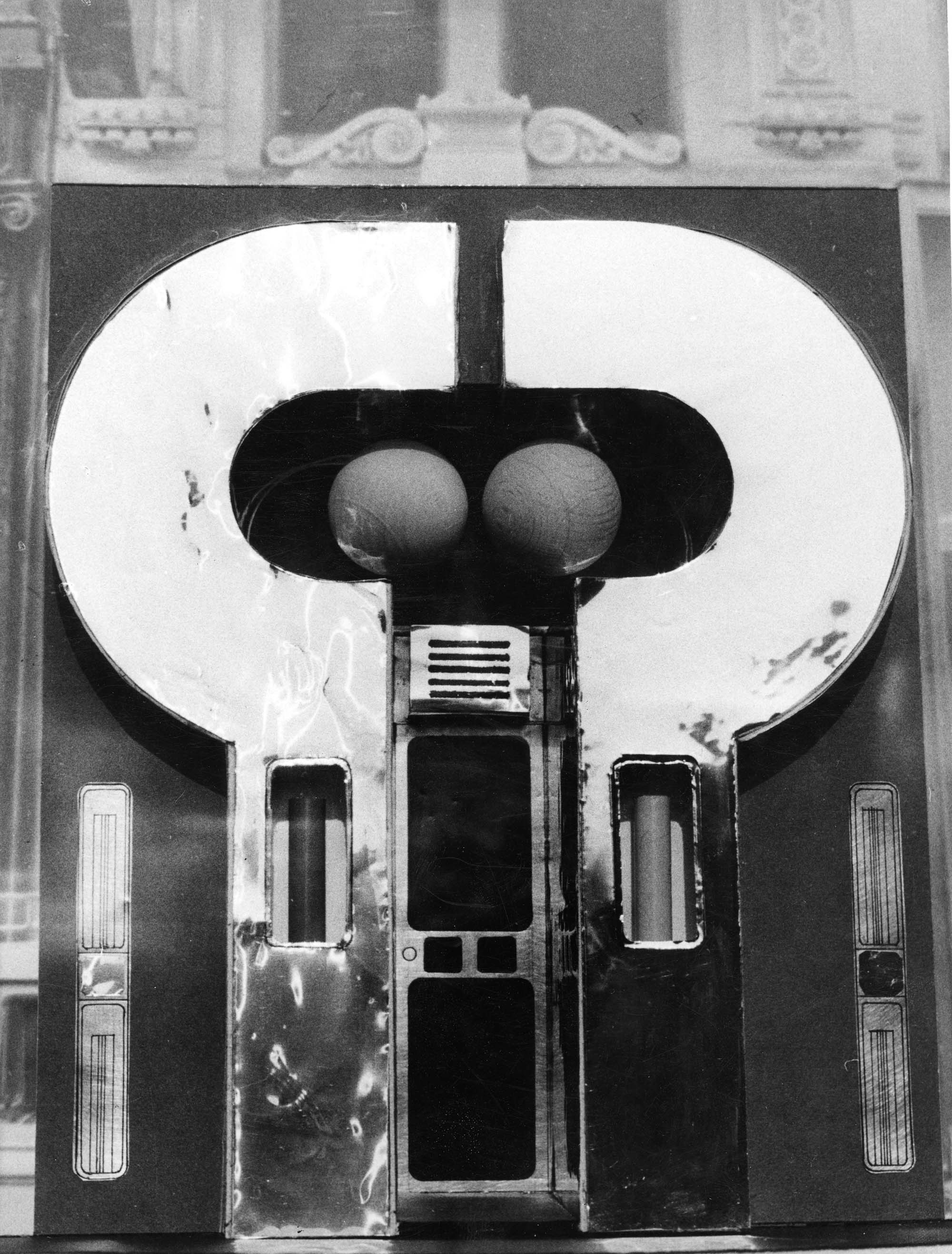
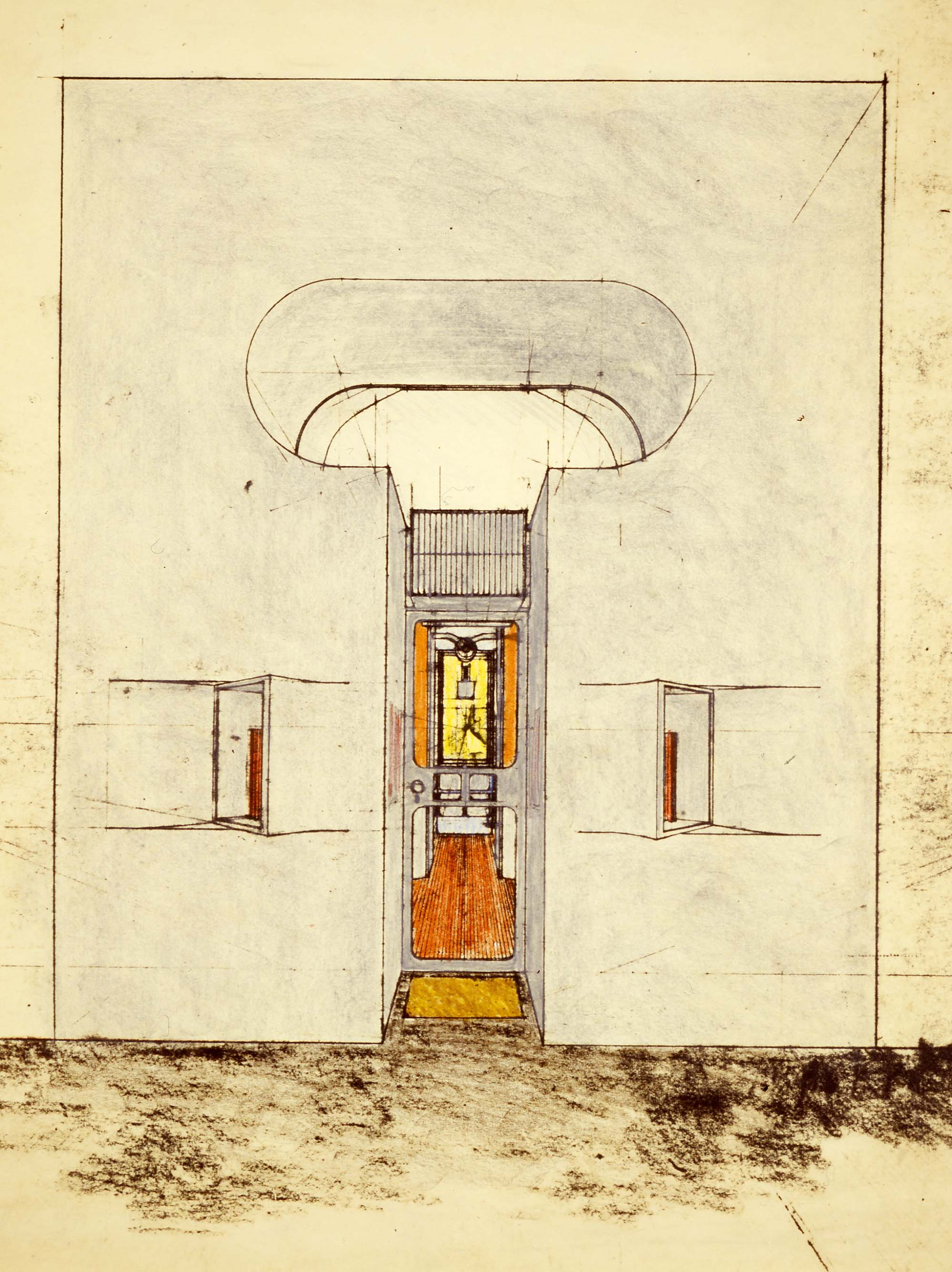
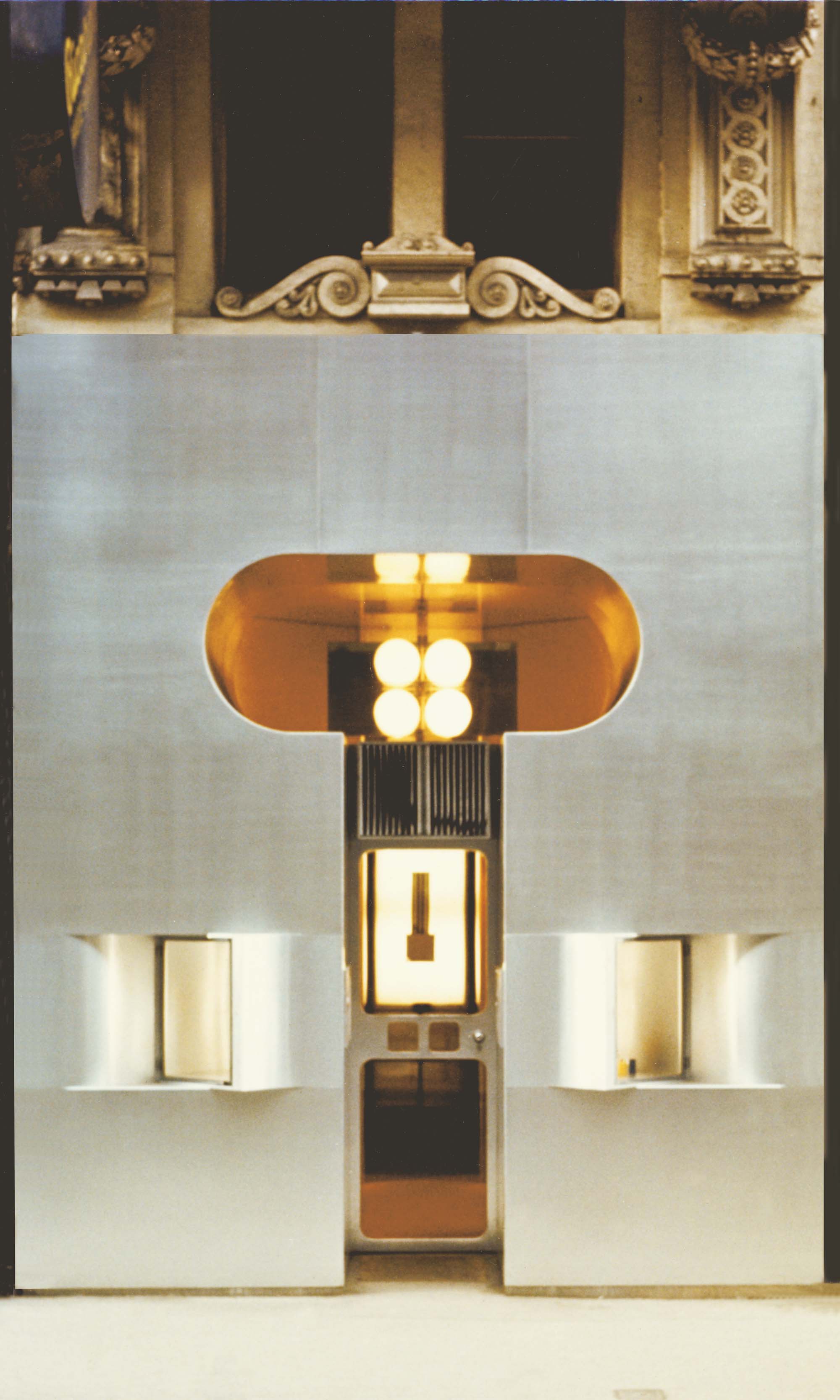
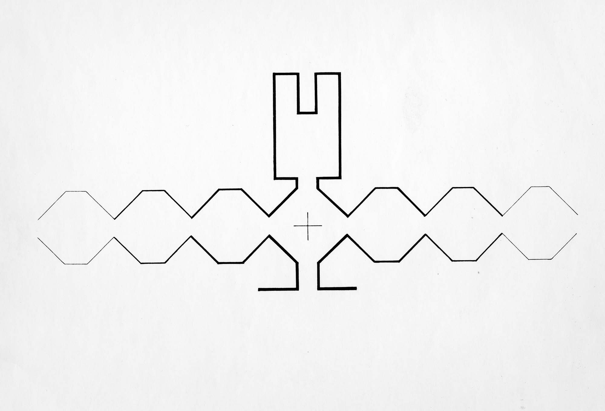
The great spatial differentiations narrow passages, enclosing spaces, openings into the indefinite, etc. and the somewhat processional concept create a feeling of size and movement, a sensation of “pulsation” of space which overcomes the limited size. Mechanical equipment and fixtures, while retaining their individuality of form and function, are an integral part of the spatial concept; the shop is plastically a whole. Within a dominating order a multitude of variations is possible. The concept of the shop is also the concept of the city. The customer is confronted directly with the products for sale, there are no counters acting as barriers. After passing through the showroom he enters the storage room, which also is the sales area.
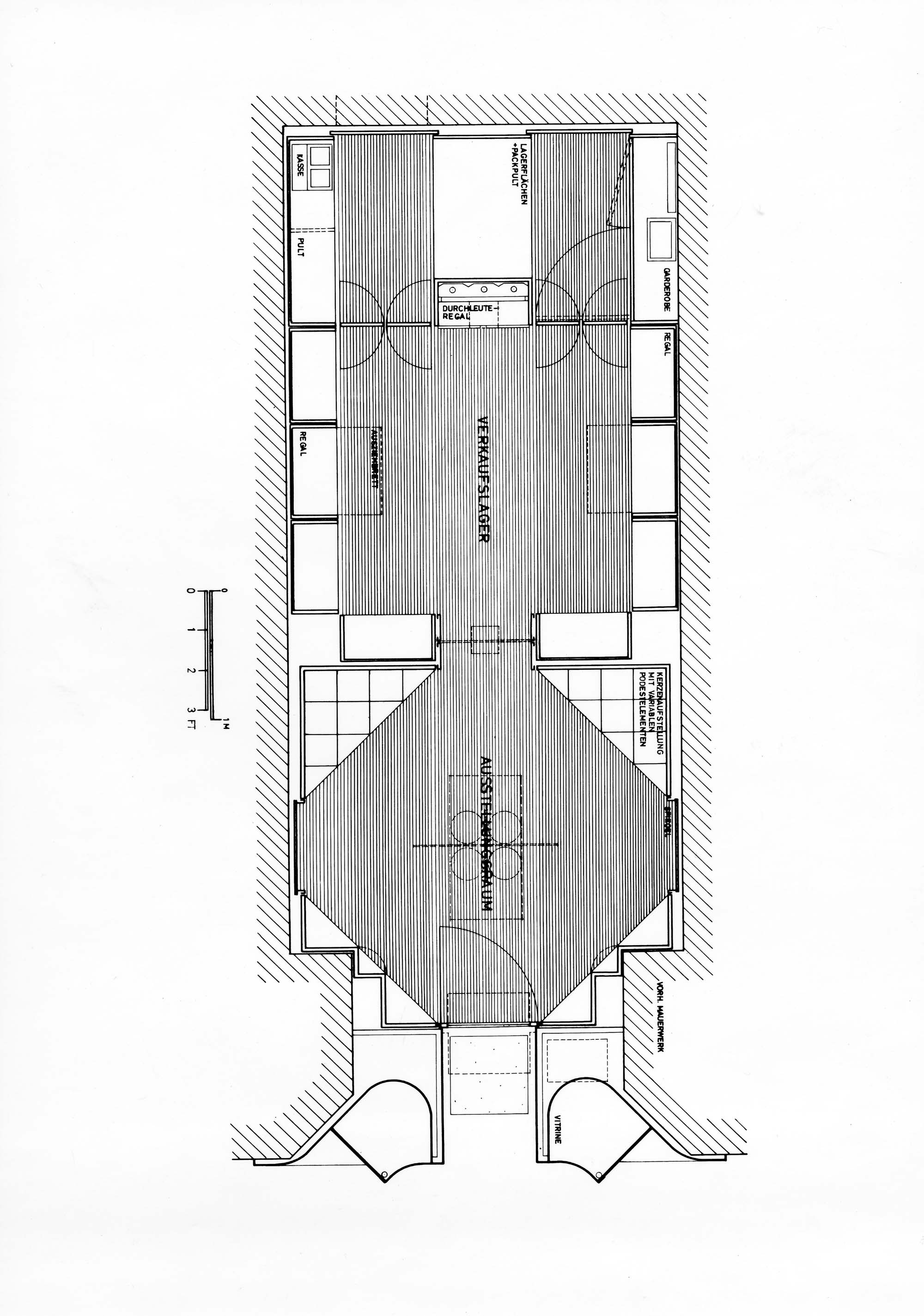
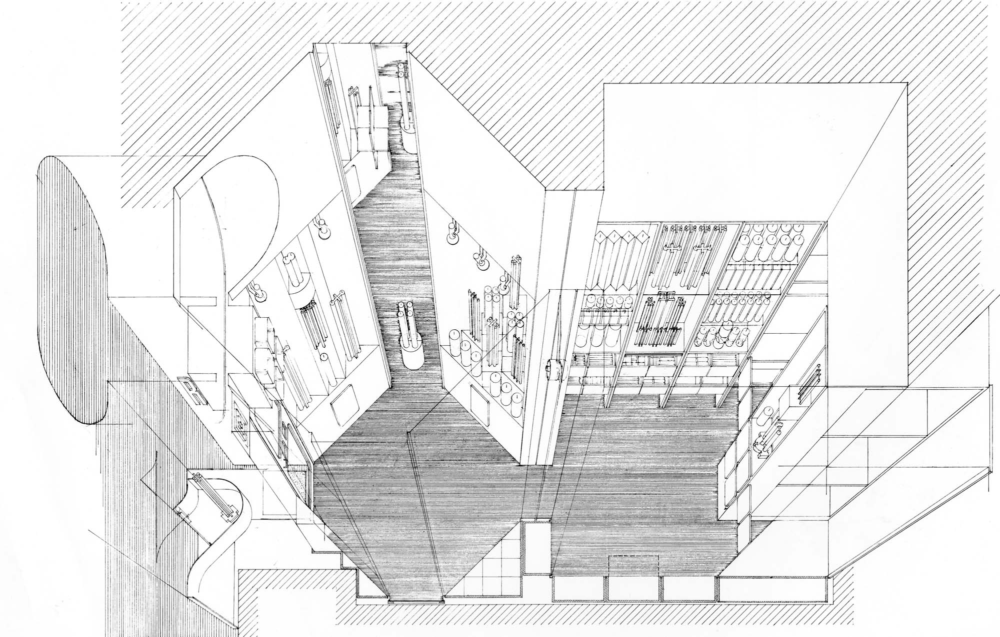
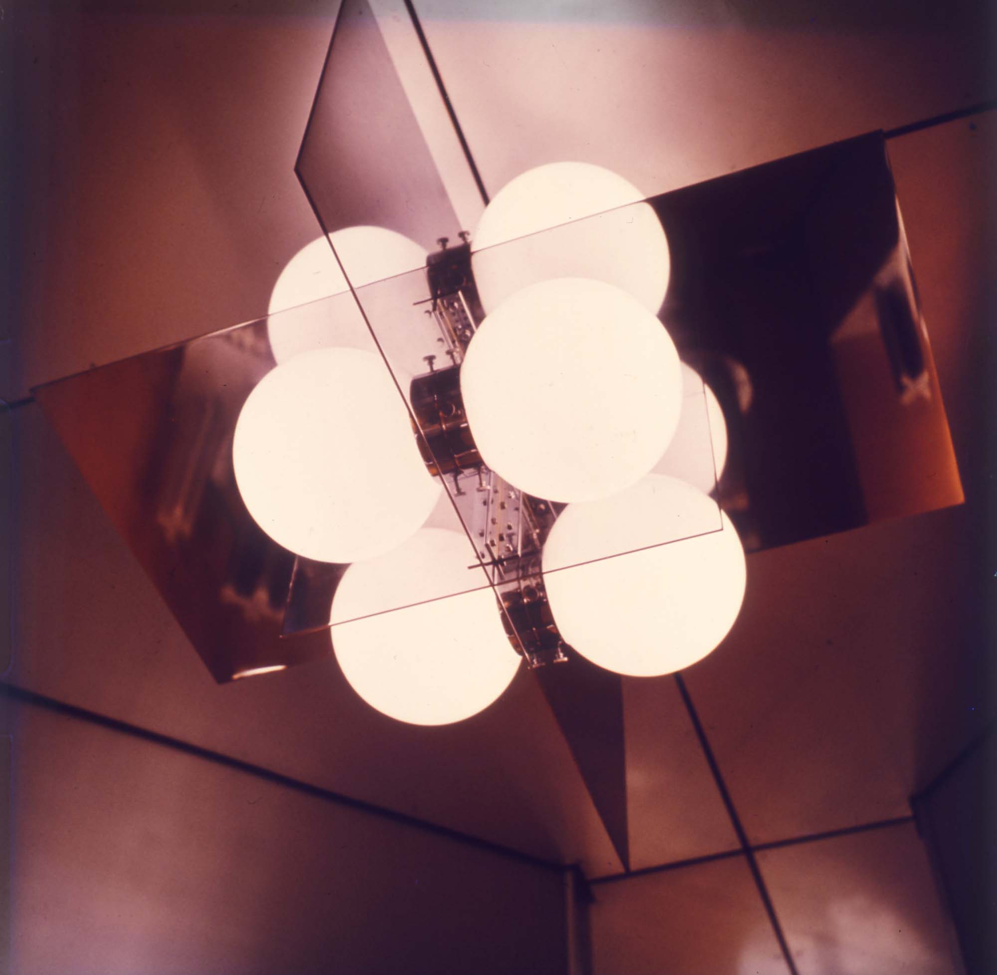
Aluminium is used as main material throughout the outside and interior. It is used in the form of structural sections and sheets handled in various ways. All surfaces are polished and anodized. The natural color of the material is preserved. To a great extent, connections and joints are glued with epoxy resin. Due to low temperatures during construction on the site or the need of later removal, some connections are screened. Aluminium is used as the primary material because it is a true material of our century, it is easy to form and work with, the lightness of material allowed assembling of large parts already in the workshop and their easy transport to site, the surface met the functional and aesthetical requirements. The elegance and nobility of the material was in keeping with the desired character and was used as the main theme of design, its silver hue providing the “image,” of the shop in advertising and packaging. Silver shopping bags and wrapping paper tie the total concept together. Practically every part, down to the hinges and the packaging, is designed by the architect. March 10, 1966

Other projects by Hans Hollein

