lt is from this accumulated secular experience that l started on both the present and the previous church (‘The Wheels of Heaven’), confident that specific paradoxes appertaining to the subject could still be translated into architecture.
Far from wishing to secularize (i.e. neutralize or banalize) what for others is sacred, I have in both cases tried, as an outsider, to mitigate the outworn hierarchy’s irreversibility; persuading it to become hence more reversible- relative. Only the mild gears of reciprocity I thought could help me here.
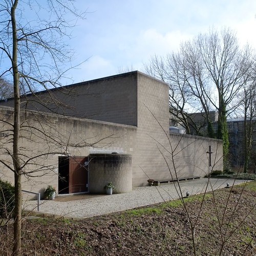
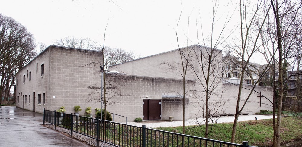
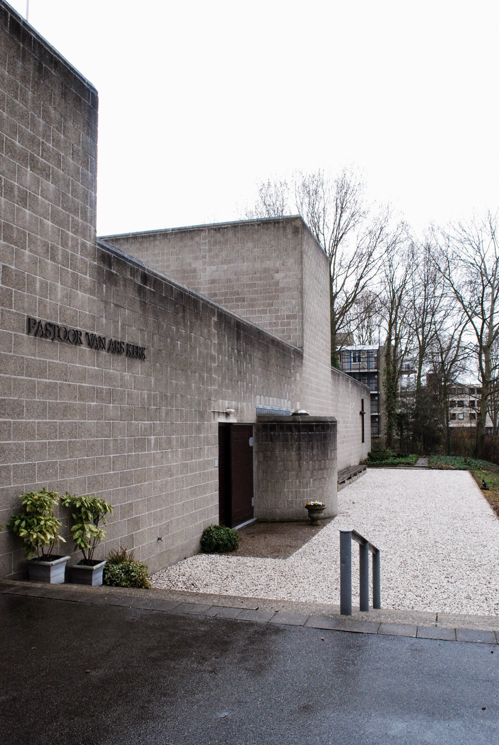
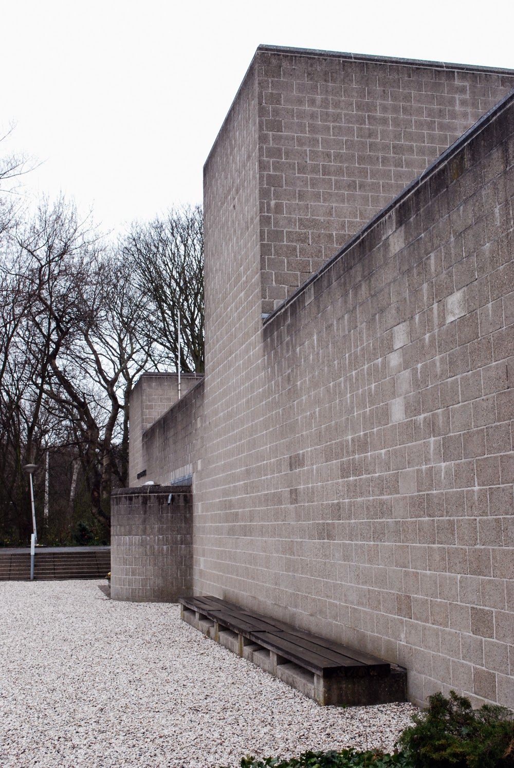
The available rectangular site was prohibitively small, so I decided to limit the overall plan of the church to a single rectangle, thus giving up the idea of gradual entry that a complex periphery allows. This time entry is so sudden that only the church doors become the sole representation of that idea. Having descended towards the entry from street level, one slips in from the side one by one through the narrow door which opens inwards and leaves with others after mass through the wide one which opens outwards. Light enters sideways through tiny square panes where the two doors overlap. ‘Entry’ starts, as. it were, once one is inside! An unavoidable limitation but at any rate architecturally resolved in the details of the doors .
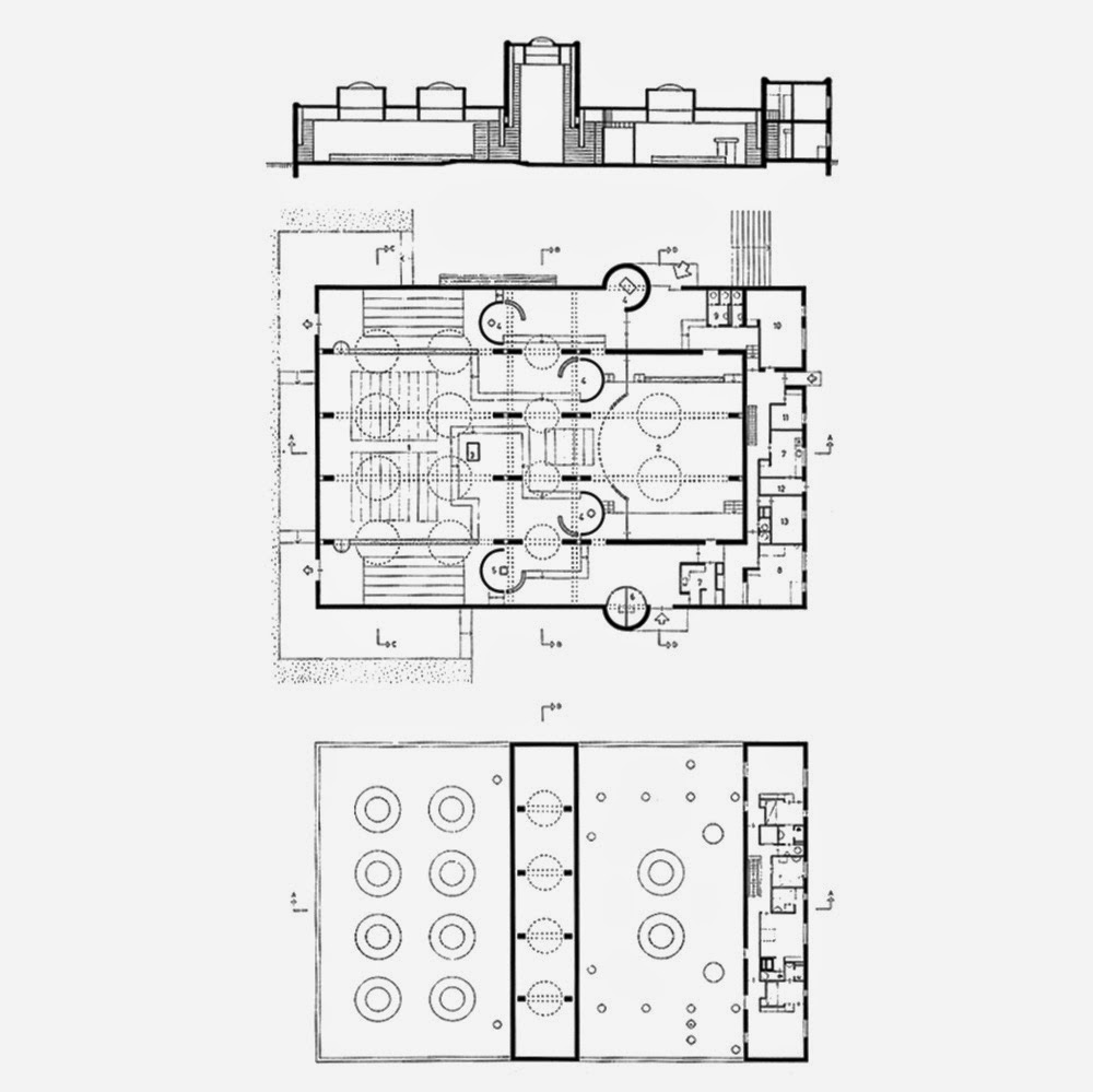
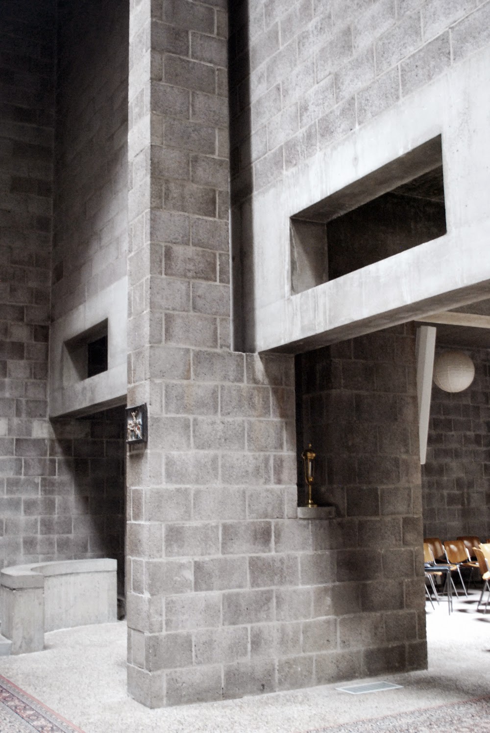
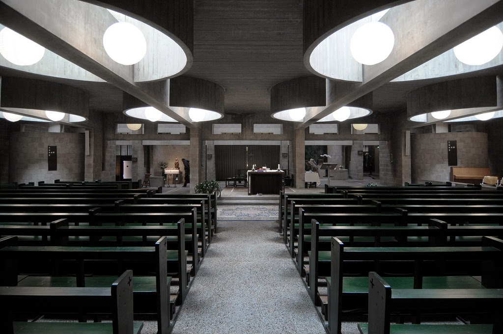
As to the interior of the church, I wished to combine the quality of a low crypt-like space with that of a tall gothic-like one. Low when seated during mass; tall when walking (after entry and befare leaving).
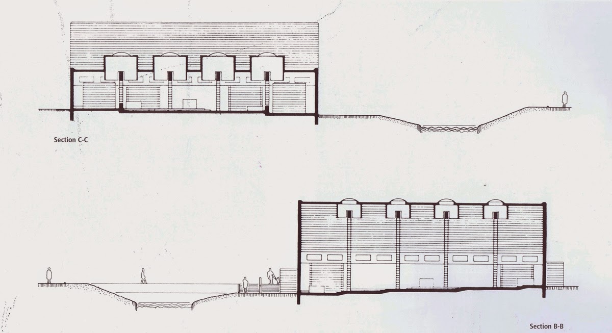
Because it was so narrow- only 3.40 m between the columns- 11 m seemed high enough for the tall space, and 2.50 to 3.50 not too low for the low one, if sufficiently articulated horizontally, and – this in particular- also vertically; for, generally speaking, the articulation of height is still a neglected facet of contemporary architecture. There has been little sense of right-height in today’s buildings since the minds of 20th-century architects began to function only laterally!
What my wife once called the interior horizon of space is nowadays sadly missing.
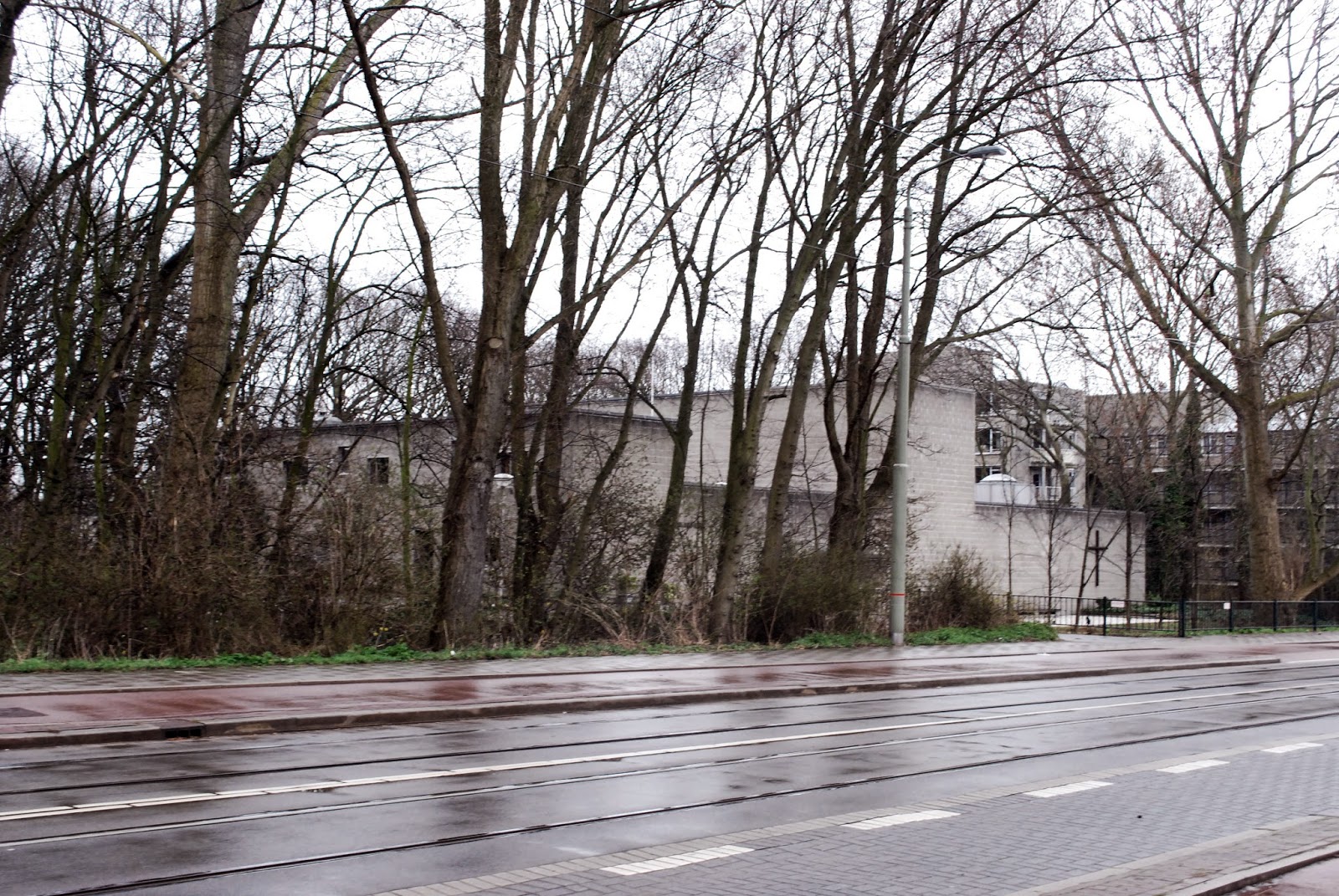
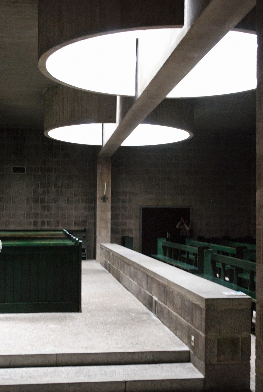
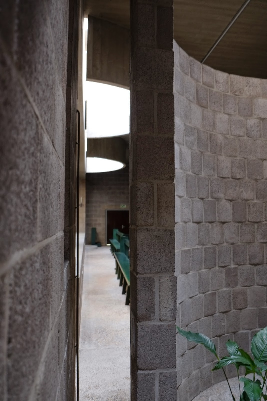
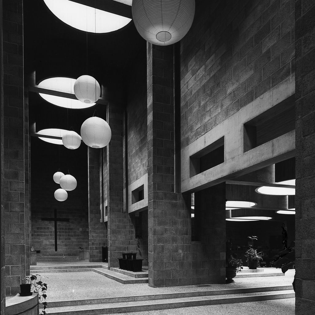
The tall space – neither narthex nor nave, but something of both – beca me a kind of interior street with the divers sacred places strung along it. People filter out of and into it from end to end between the semicircular chapels, piers and outer walls. All three spaces open upwards into spacious circular drums above, through which light fa lis onto altar and people alike. In front, the church is situated 1 m below the original street’level, thus reducing its bu lk as well as the depth of the canal. This artificial difference in level between the entries on either side made it possible to incline the floor of all three church spaces at a right angle to the axis of the altar. Thus the tilt, for once, became a counter tilt!
There are three levels for the low part and five for the tall part, between the two entries. So one either ascends or descends, depending on which entry is used. The altar stands halfway down the middle level. For those passing it in either direction up or down the ‘sacred way’ it is a mild and.relative place, I thought. However for those seated in the low crypt-like space during mass, no arbitrary tampering with the altar’s place on the lateral axis- as so often occurs todays- is allowed to disturb the significant equipoise that the traditional place ensures. Except for the altar, which I designed, all the ecdesiastical objects were introduced by those who believe in them. l just provided the places to receive them. There are also no built-in sacred signs or symbols of any kind anywhere, nor any church bells to alarm people still asleep.
lf the space is experienced by many as a sacred one after all, that may, I hope, be due to the way matters not specifically sacred were handled architecturally. Reima Pietila’s observation in this respect is intriguing.
Post religious space
In the tall space there is a definite Catholic air, whilst in the low one, where people are seated, there is another feeling – another reality from that which belongs to the western concept of religious experience. As daylight cascades from above through huge drums there is a direct presence of the external cosmos.
These skylights materialize daylight in a way that keeps people in union with their own real world As the Christian ceremony proceeds they remain in their normal reality aware that what takes place befare their eyes is an event of the past. ls my impression of atmospheric duality in Aldo’s church a subjective one or is this church a postreligious work of architecture? The interior of a church expressing the basic oneness of cults now belongs to the history of mankind Religion can no longer influence people’s minds without restricting. So the architect installs countermeasures and designs a building for the era of post-religious culture.








7 Comments
Cuándo dejaremos los arquitectos de llamar proyectos a las obras de arquitectura y de diseño?
nice building – amazing sketches!
Hacía mucho tiempo que no veía unas secciones tan potentes.
Recuerda al pabellón de esculturas en el maravilloso museo Kroller-Muller, construido por Aldo van Eyck en la misma época, hacia 1965. Unos simples muros paralelos de bloque de hormigón con concavidades y convexidades alternadas. Mientras las primeras te amplían el espacio sorpresivamente, las segundas te obligan, para poder pasar, a rozar sus paredes…
Os recomiendo que lo vayais a visitar si teneis ocasión. Se mantiene igual de potente.
Toda una reflexión sobre la escala humana (esos lucernarios que bajan y te acarician la cabeza) y la luz natural. Una presencia material impresionante.
Toda la razón te doy Teillu, maravillosos proyectos que han quedado entre nosotros entre nuestras mentes, proyectos realizados con conciencia y honestidad. Proyectos como muy bien tu dices y muchas veces redibujo con la mente y redibujo a mano alzada, descubriendo que has encontrado la paz y el placer interno.
¡Qué maravilla! ¿En qué preciso momento perdimos esta arquitectura? Proyectos con una idea tan potente que puedes verlos una vez, volver a casa, y redibujarlos mentalmente para poder explicárselos a alguien.