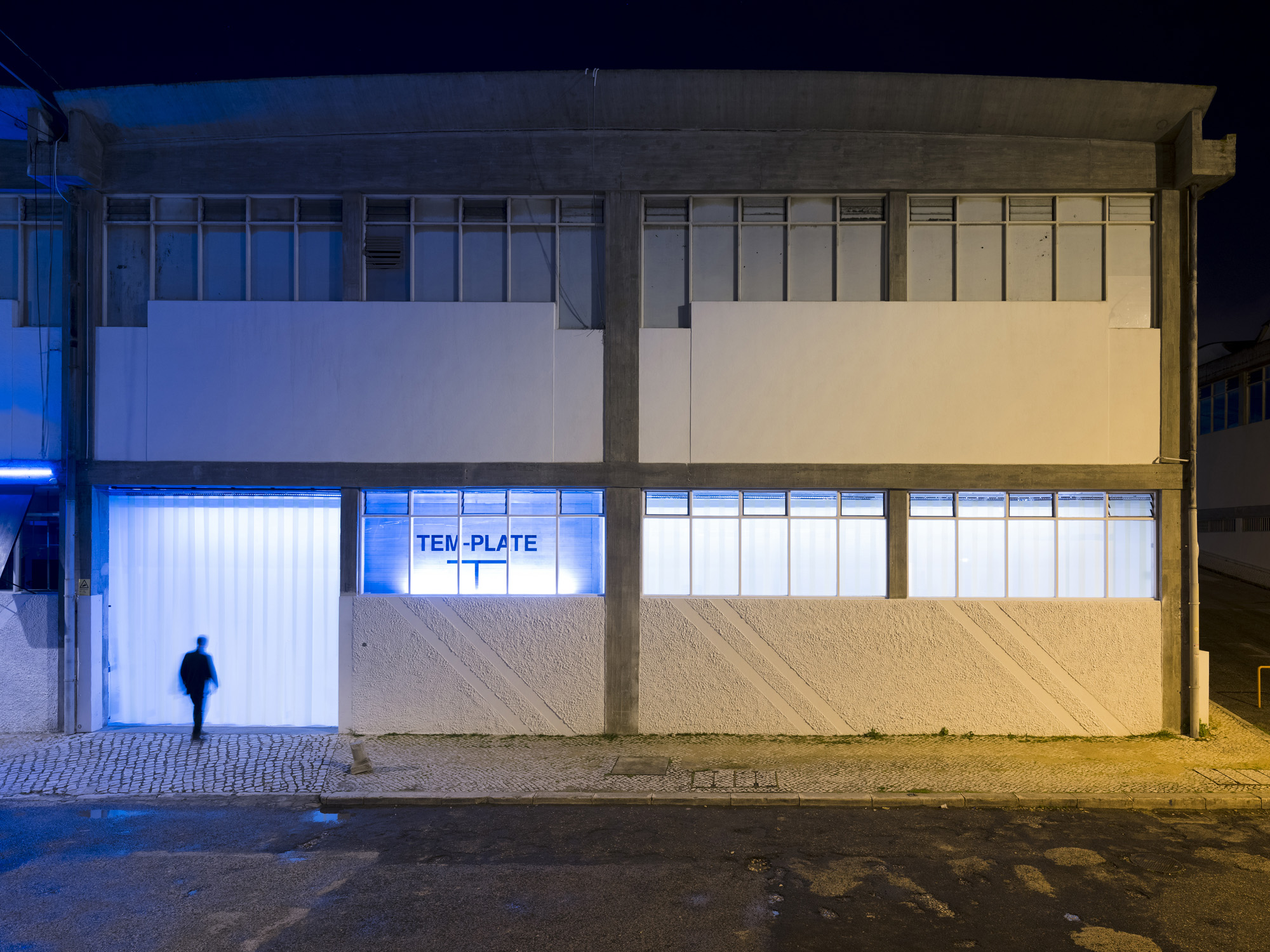
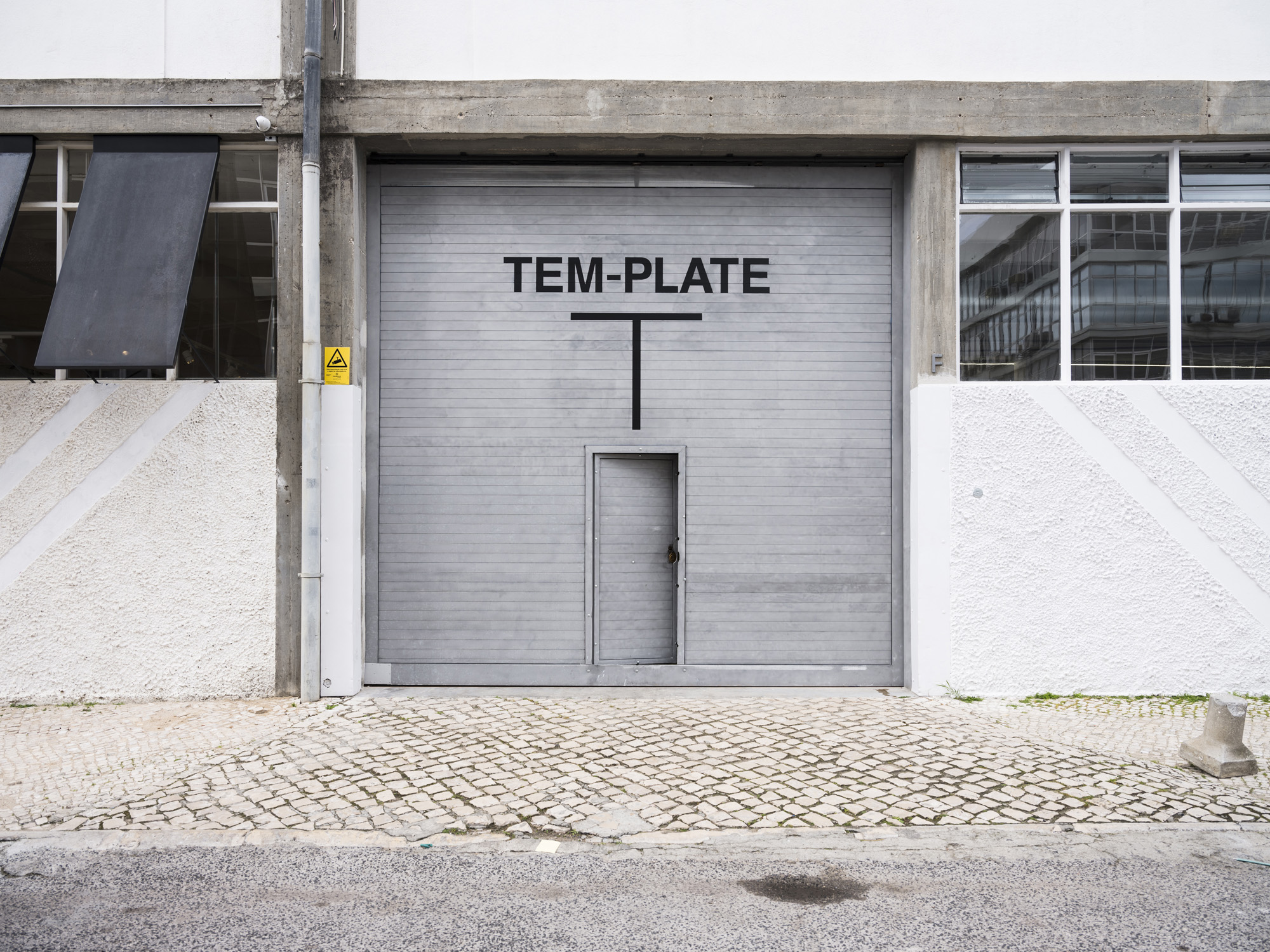
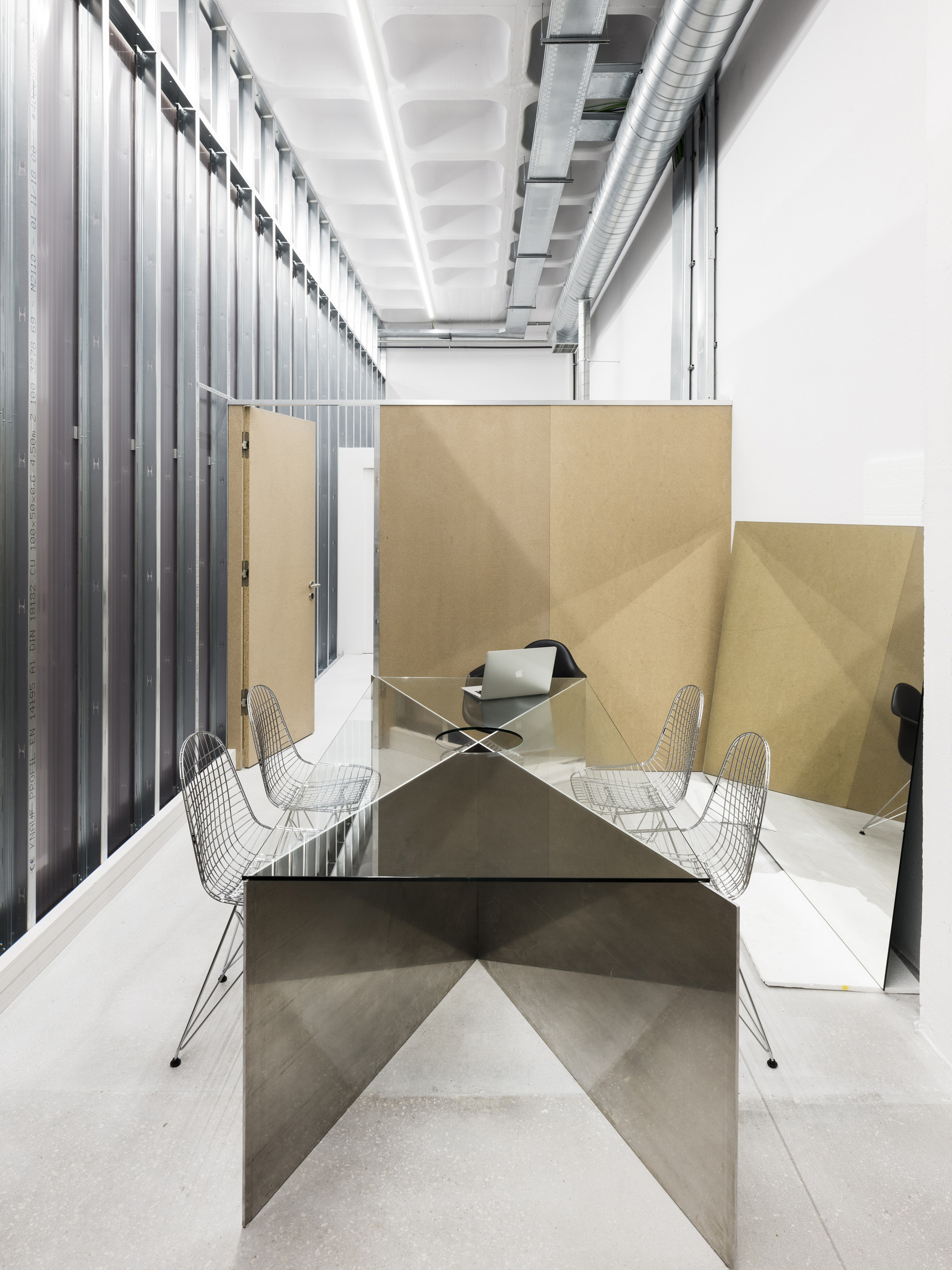
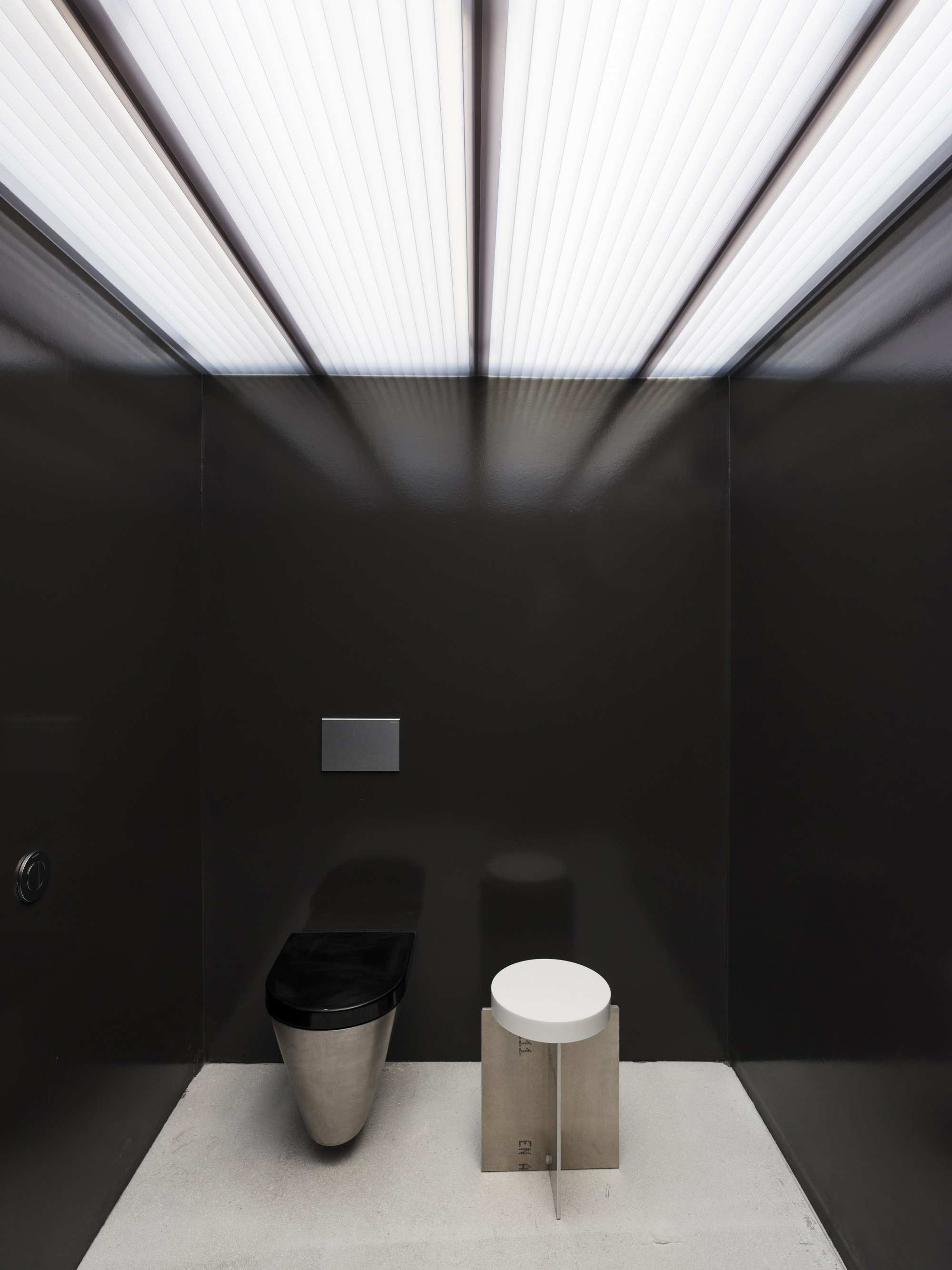
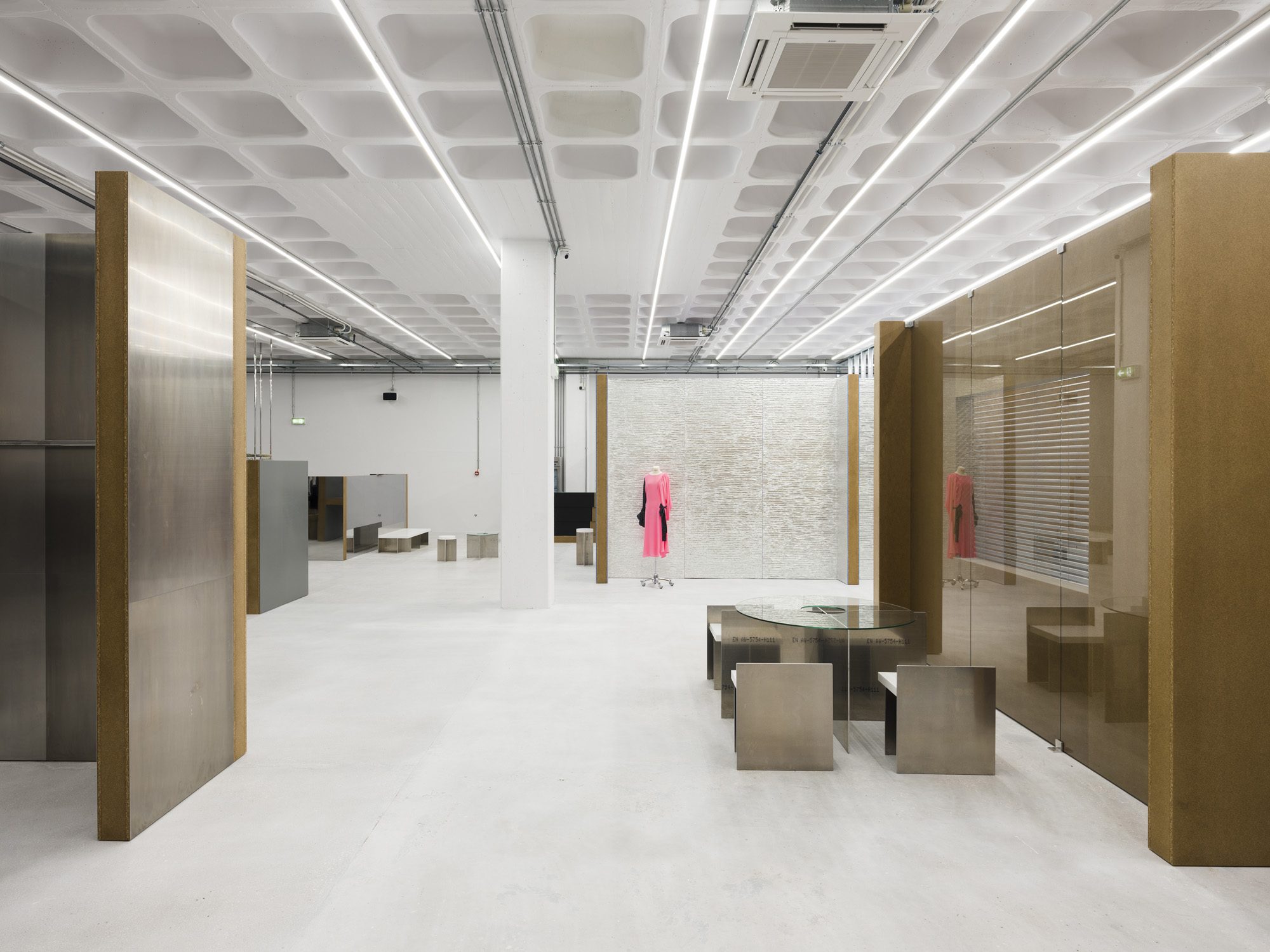
The space is an old Warehouse in between Lisbon city centre and the site of Expo 98, just a few metres from the river Tagus.
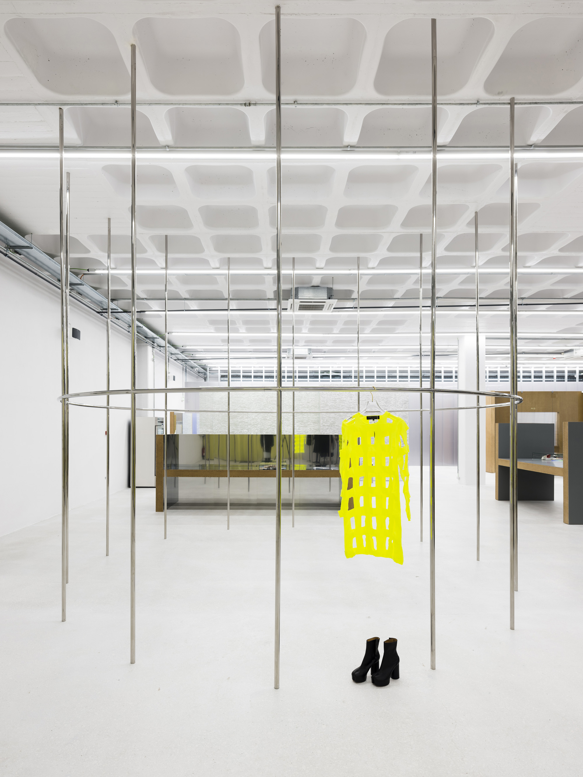
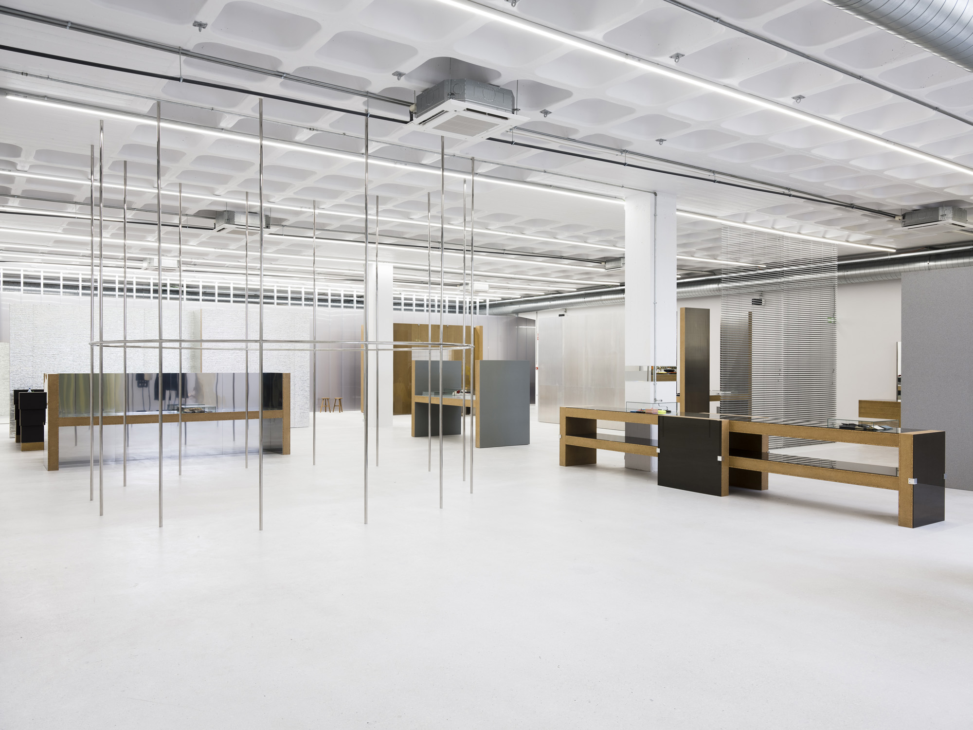
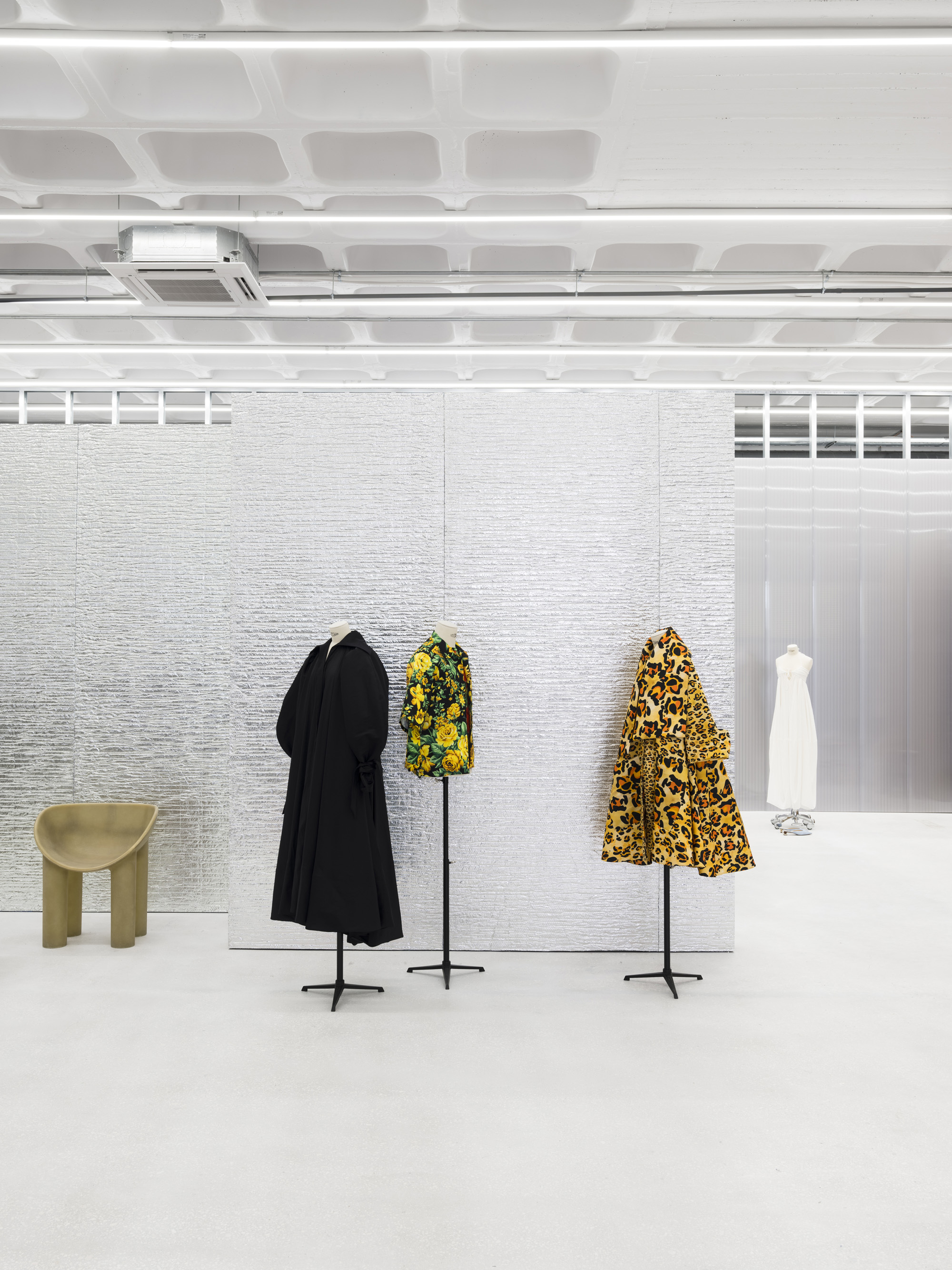
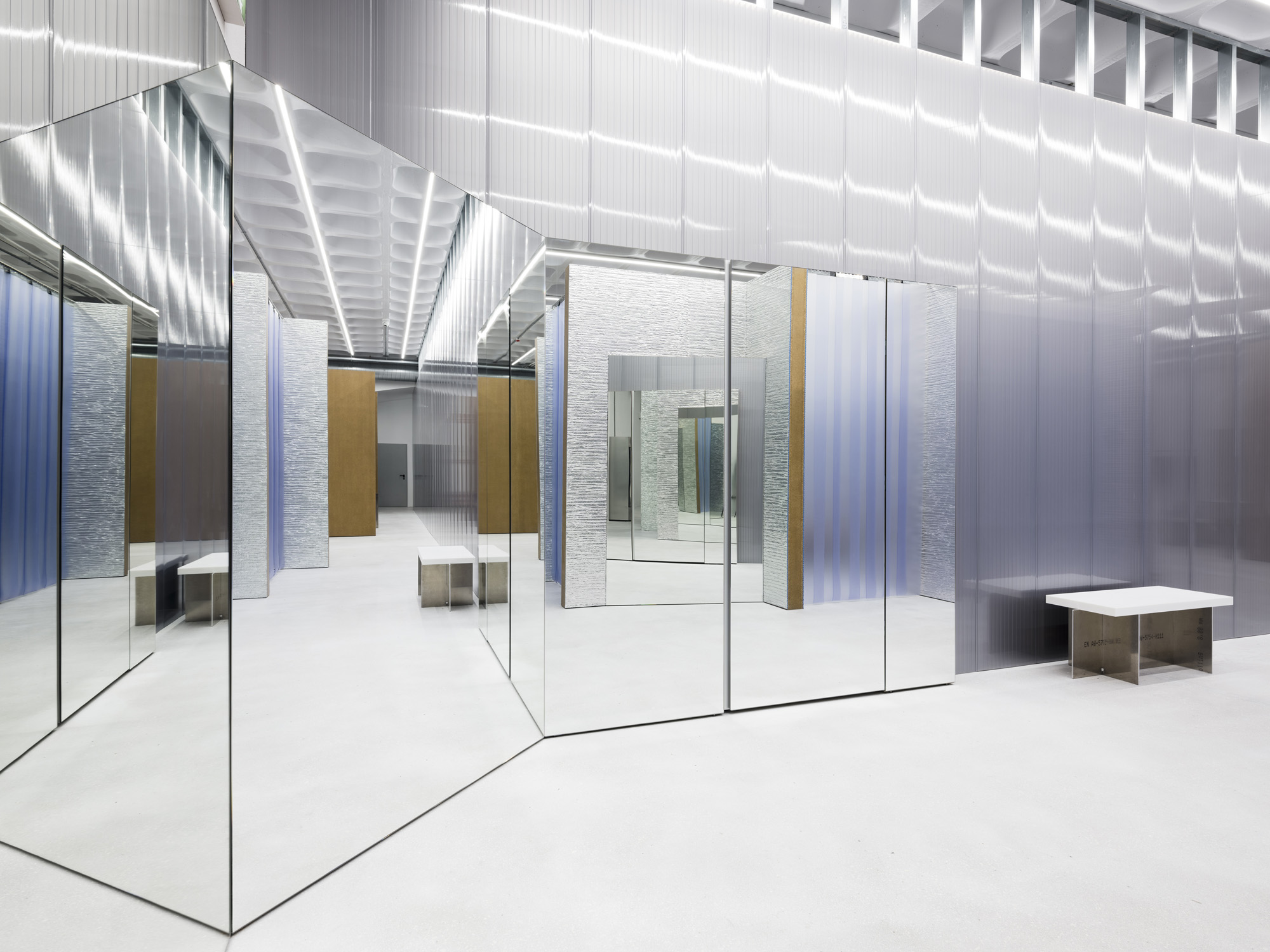
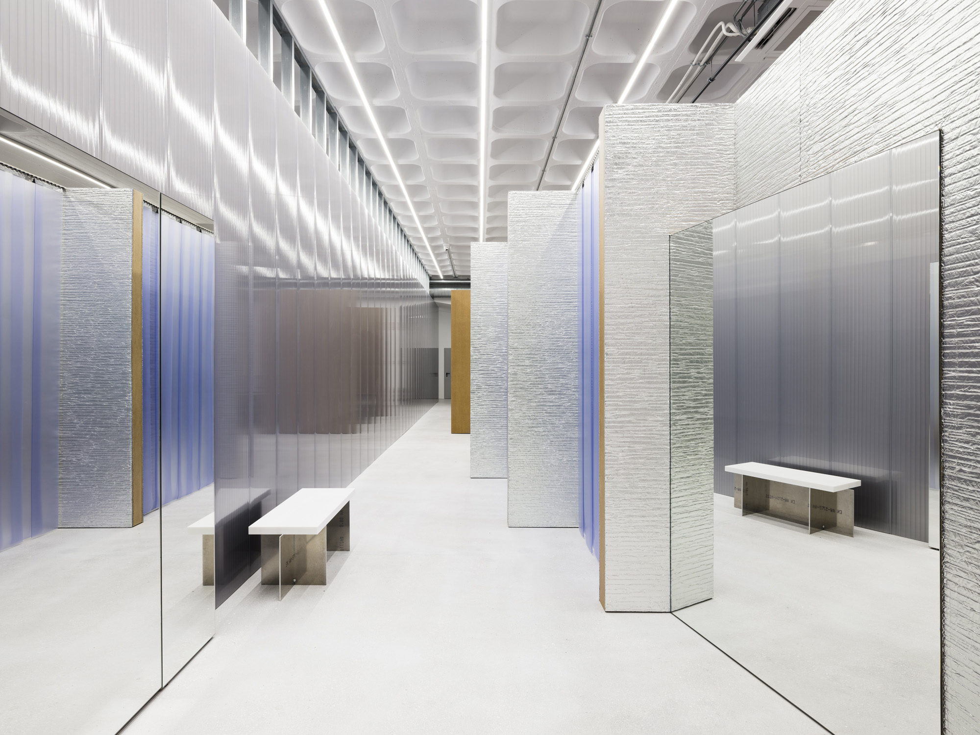
Lighting is the dominant feature of the design that covers the whole space without exception, enabling the space to remain totally open.
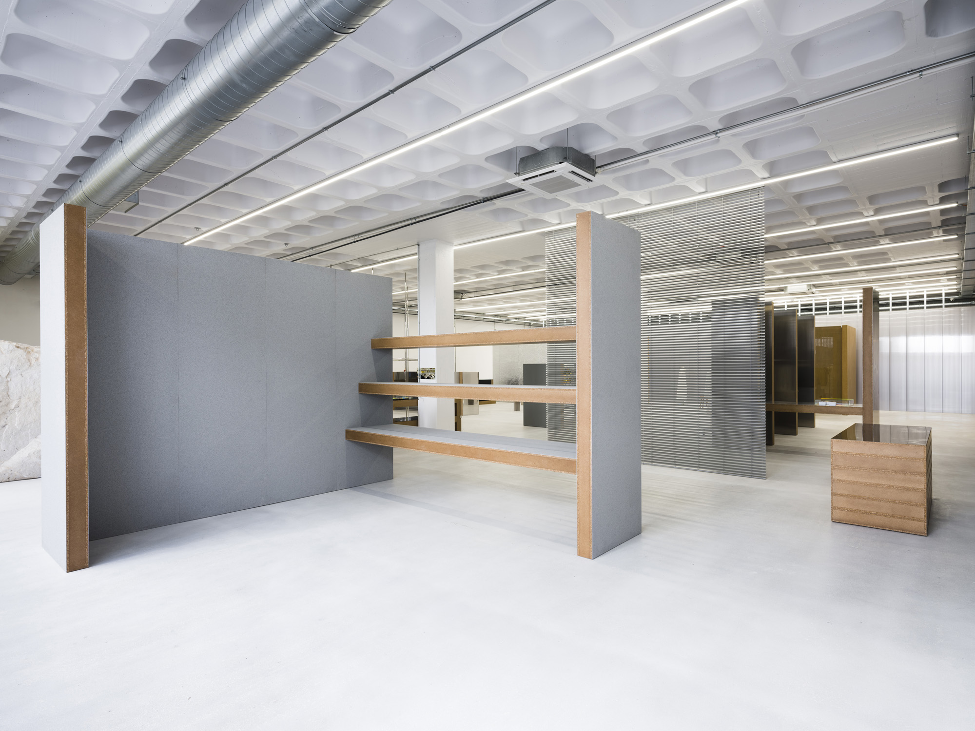
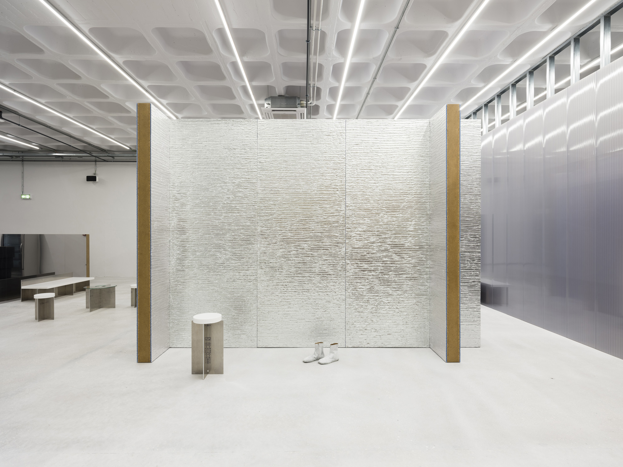
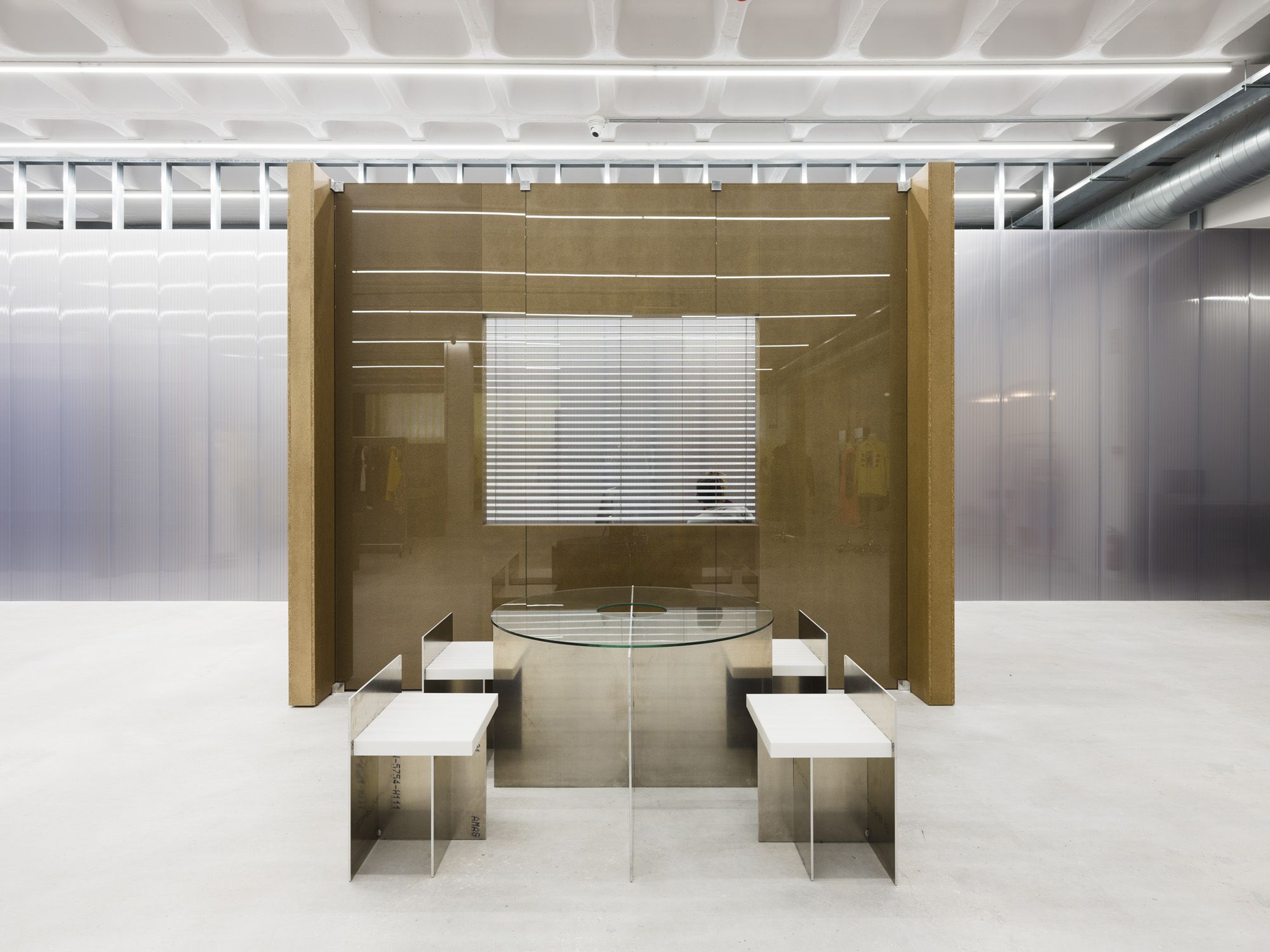
The artificial lighting, at first glance seems to be a purely functional element to light the whole space in a homogeneous way as you might find in warehouses or supermarkets, though on closer observation one can see that the spacing between each lighting line, installed parallel to the facade, becomes more dense as you move into the depth of the space.
The system has been designed to dominate the powerful sunlight coming through the only open facade. The distance between the line of lights close to the facade starts with 4 metres and progressively gets closer, with less than 1 metre in between each line at the back of the space.
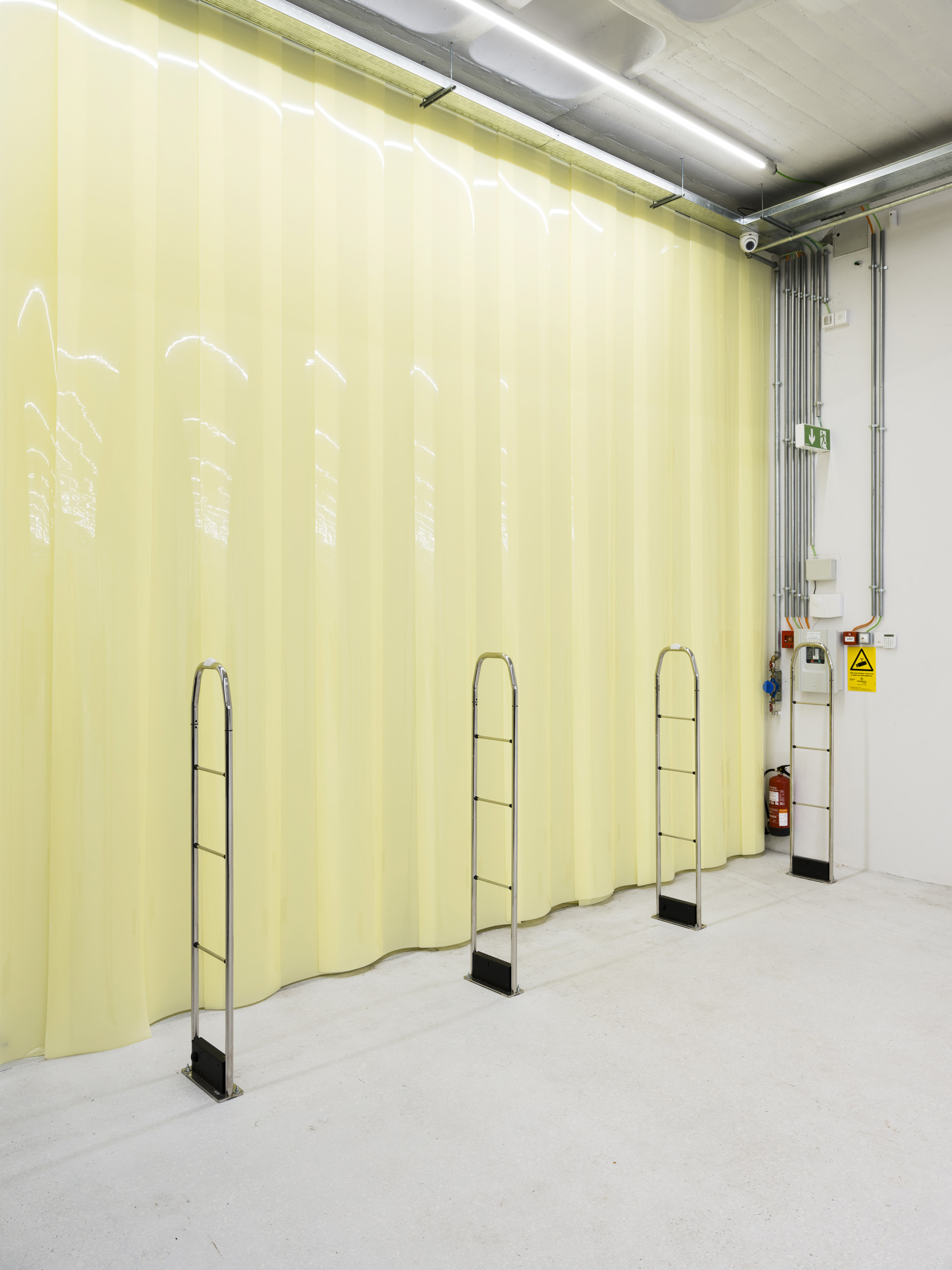
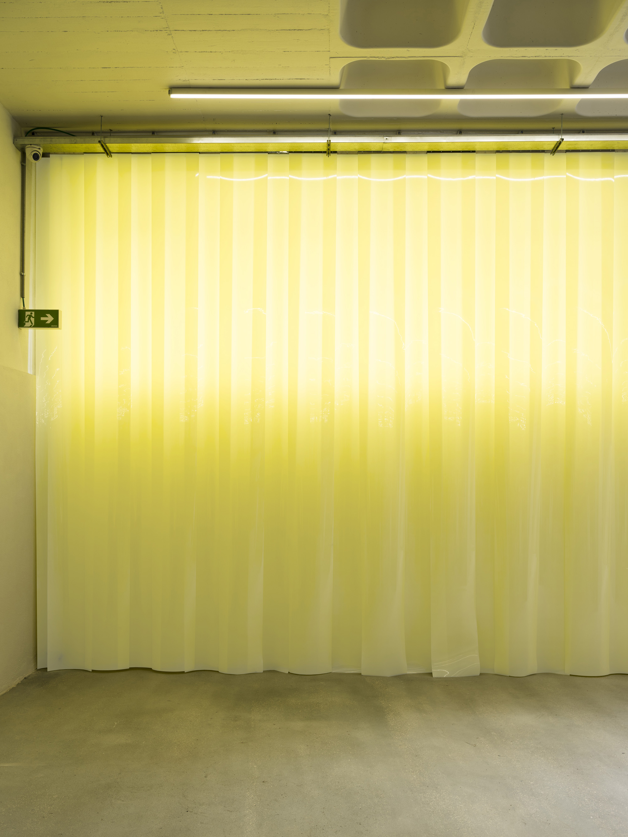
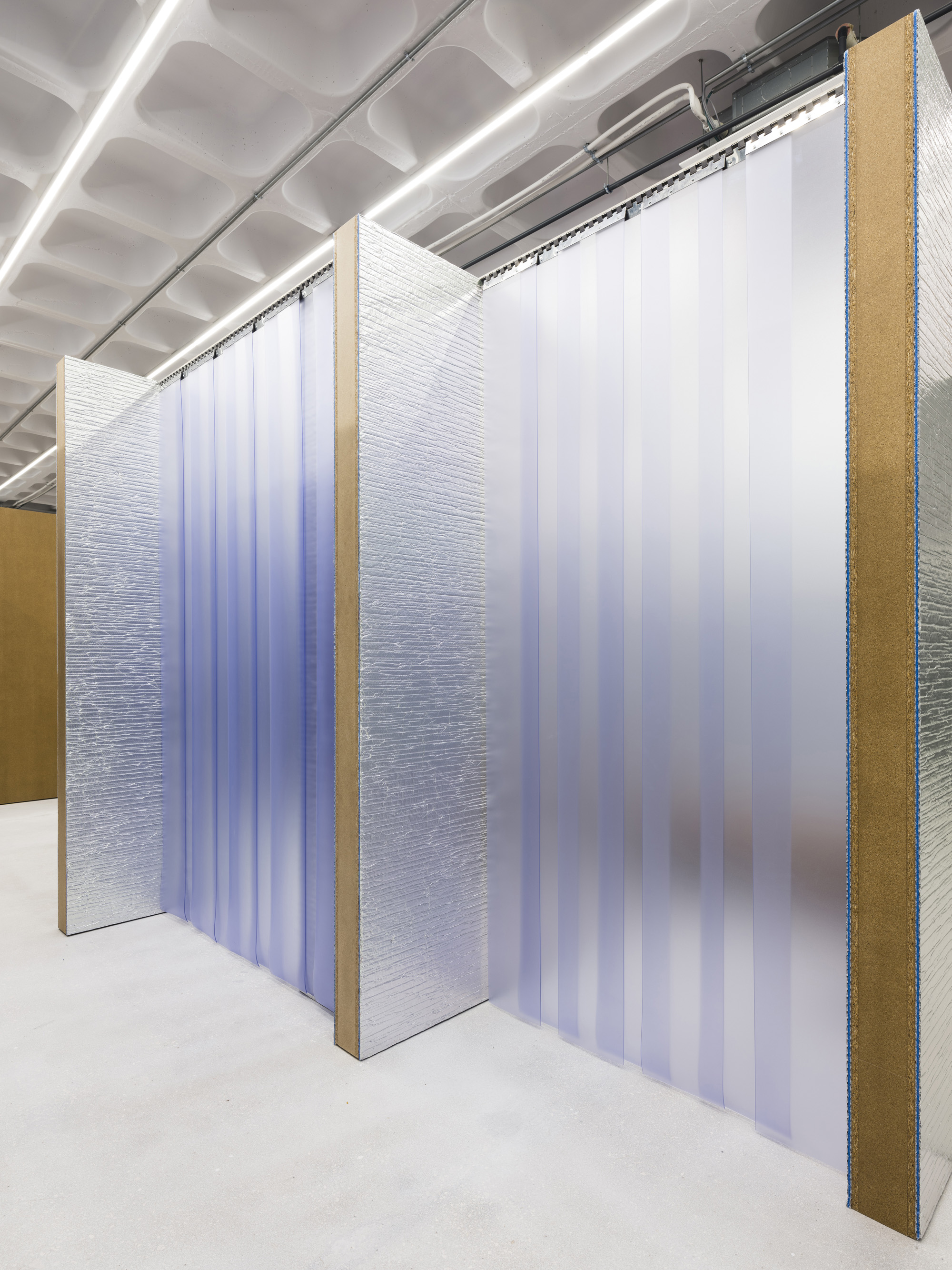
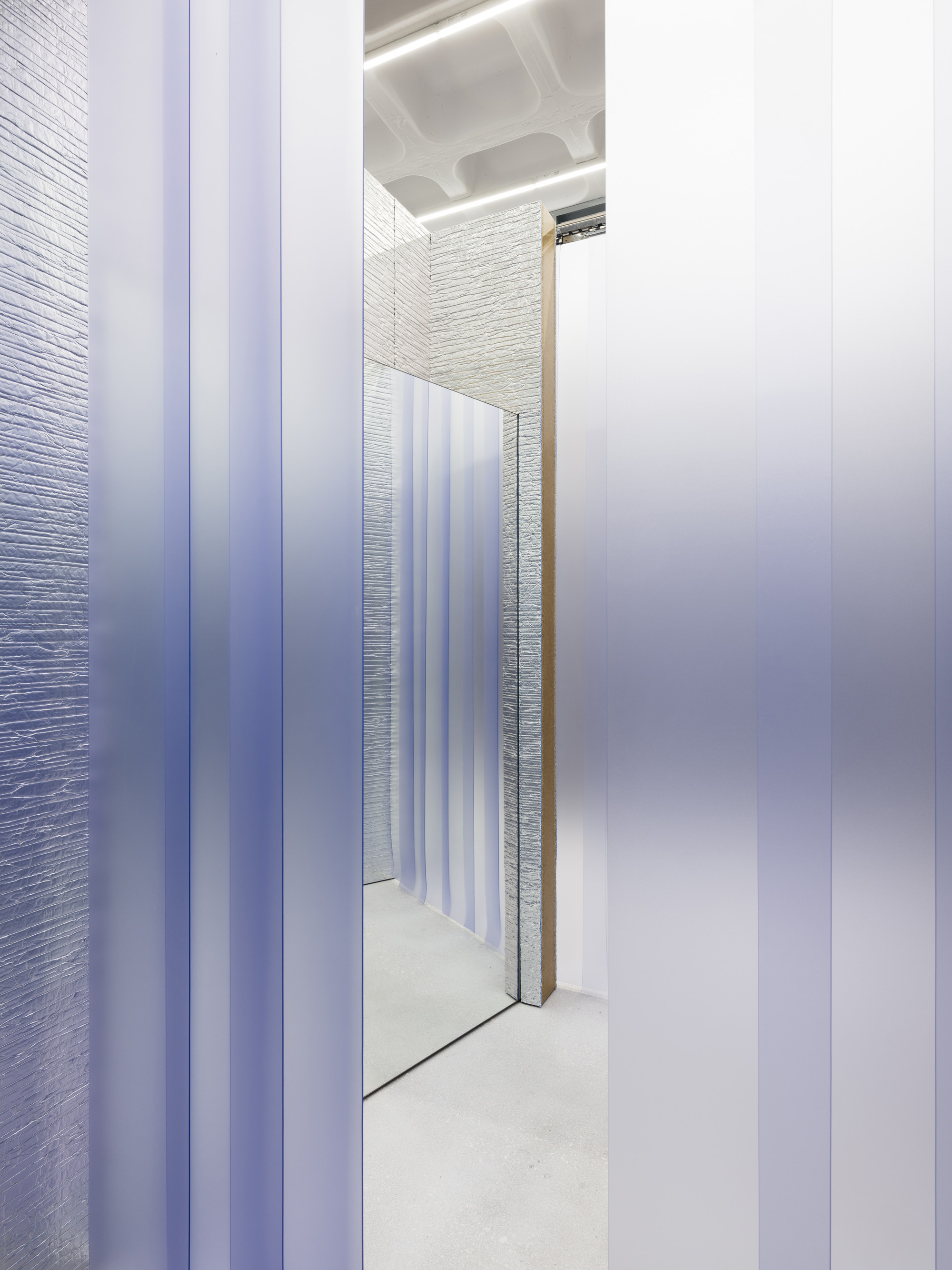
In addition to the lighting layer, the entrance is defined by a massive PVC curtain that is a pale hue of yellow that covers the whole of the long internal facade that the visitors come through when they enter the store. The curtain functions as a natural climatic layer that manages to cut the sun coming through the facade, reducing the heat in summer and the cold in winter – moderating the internal climate.
Parallel to this main facade curtain, another curtain wall is built at the back of the space with a layer of silver grey polycarbonate to create a separate space with all back of house services.
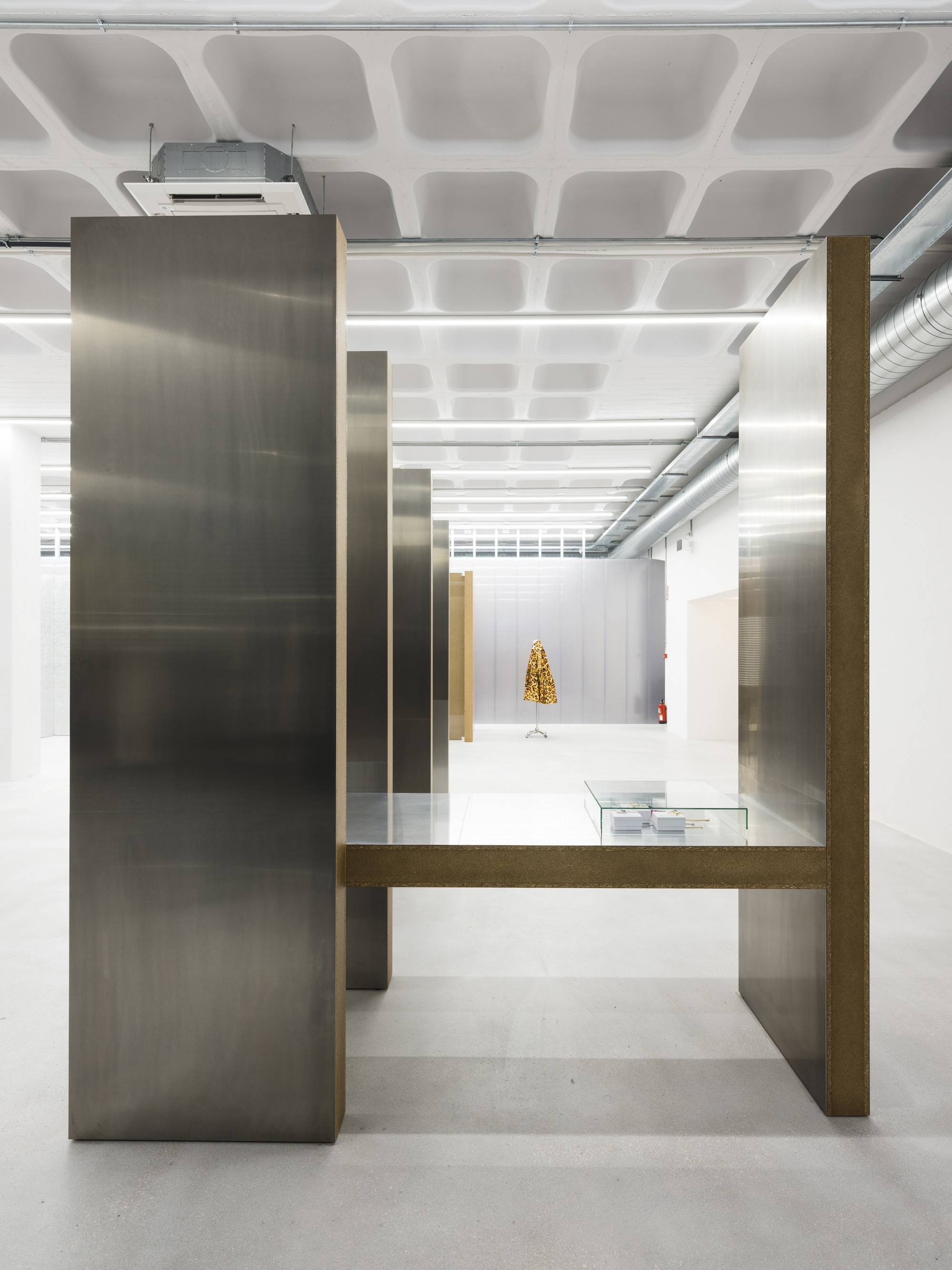
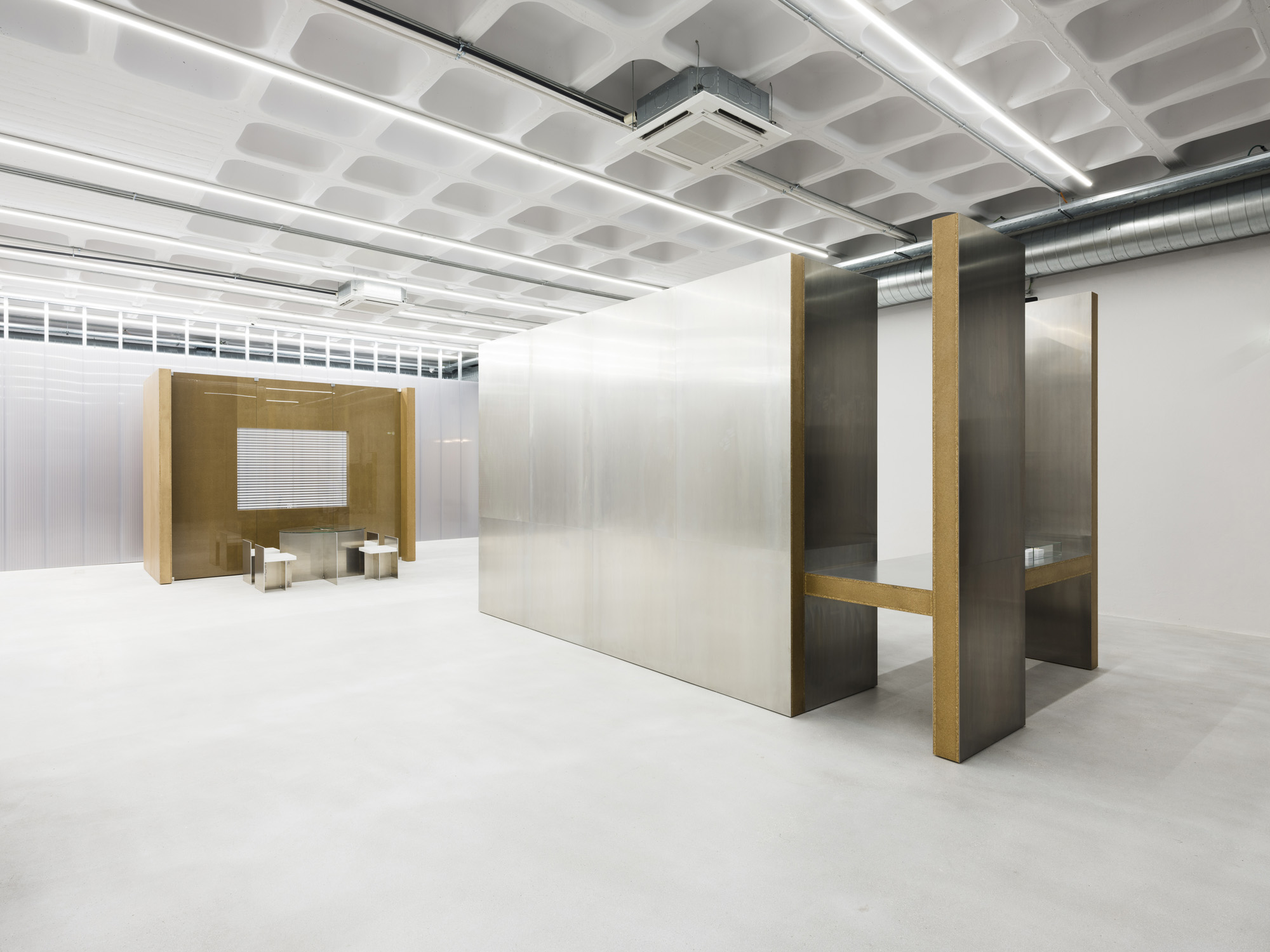
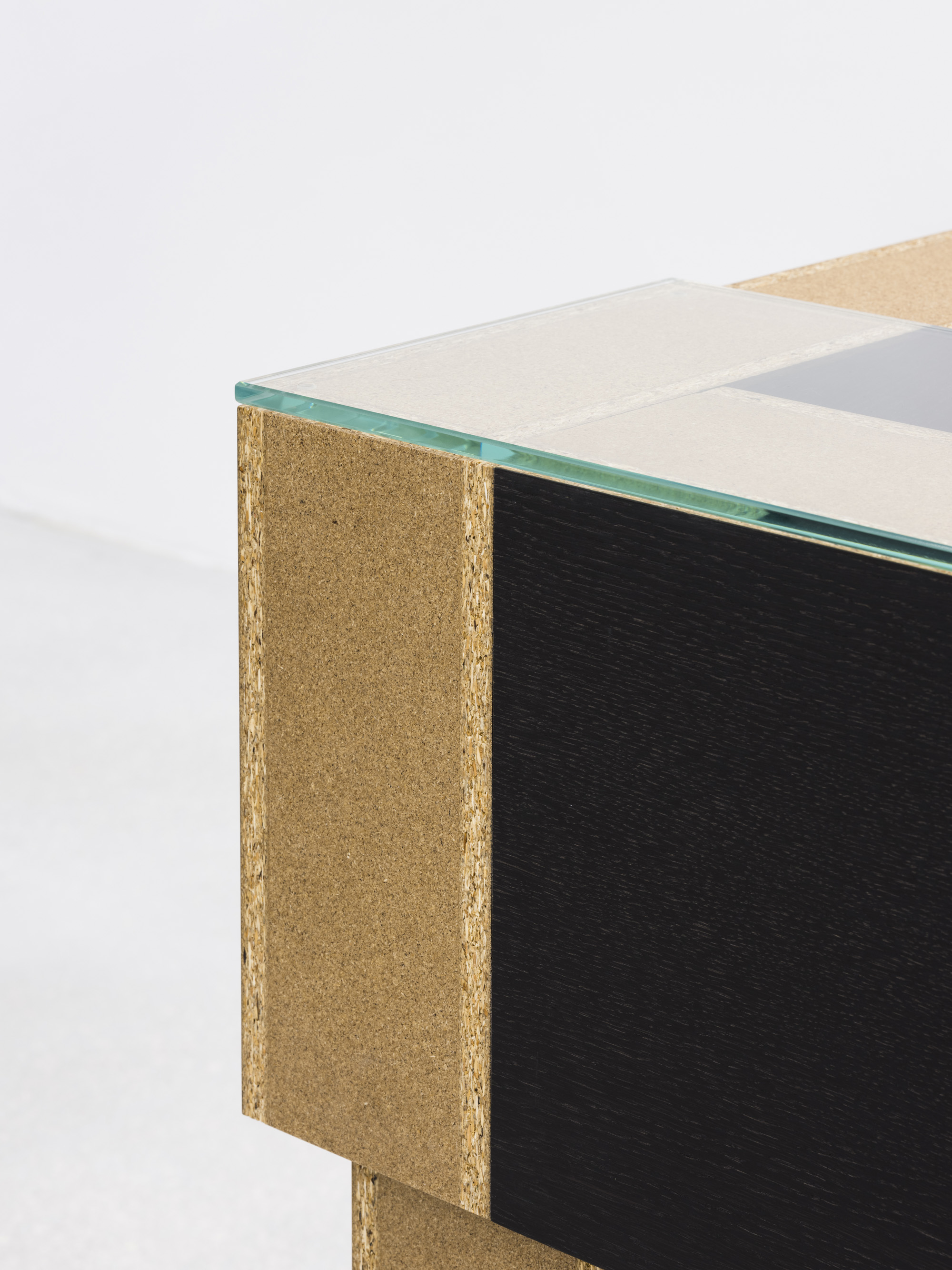
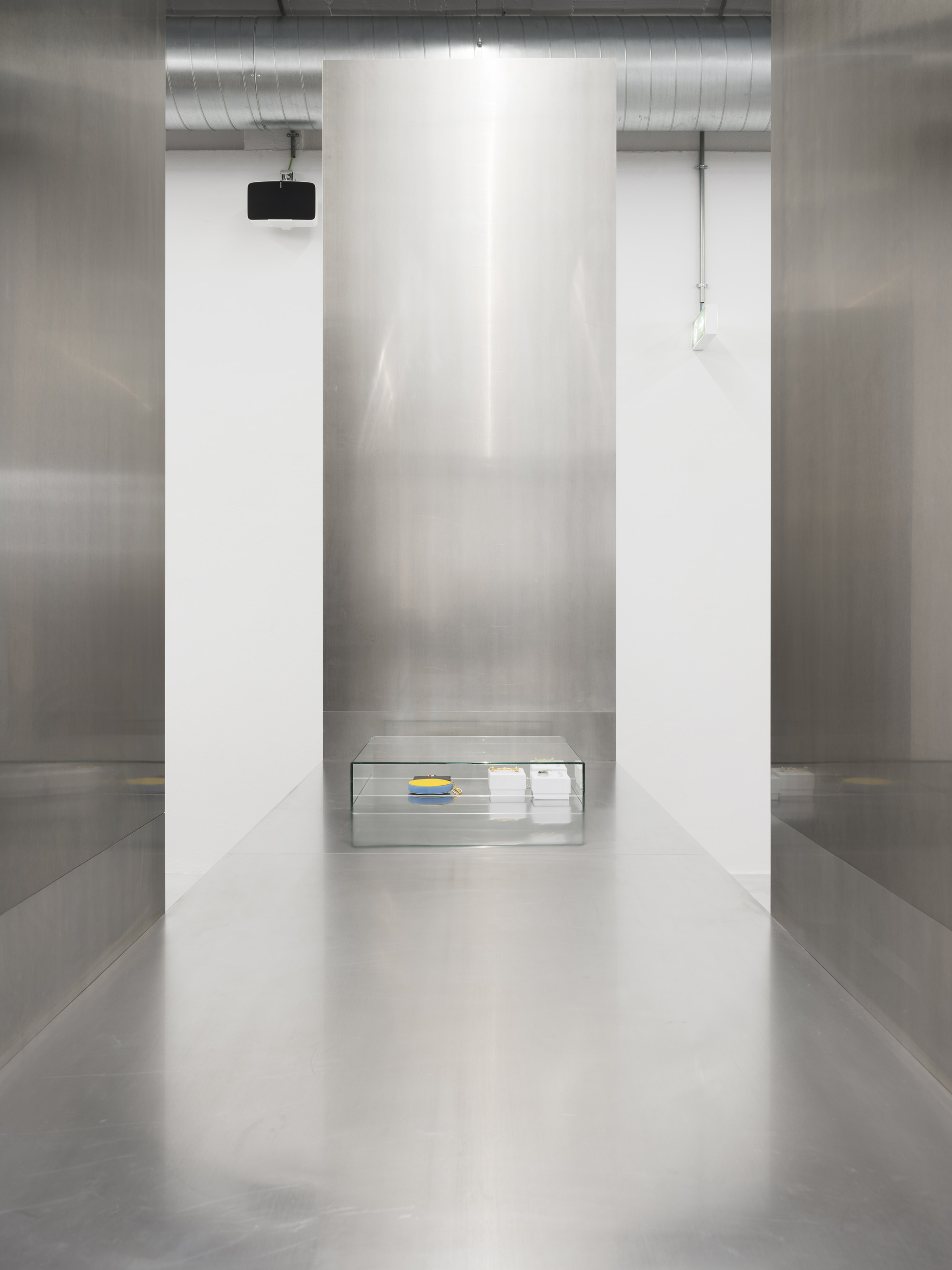
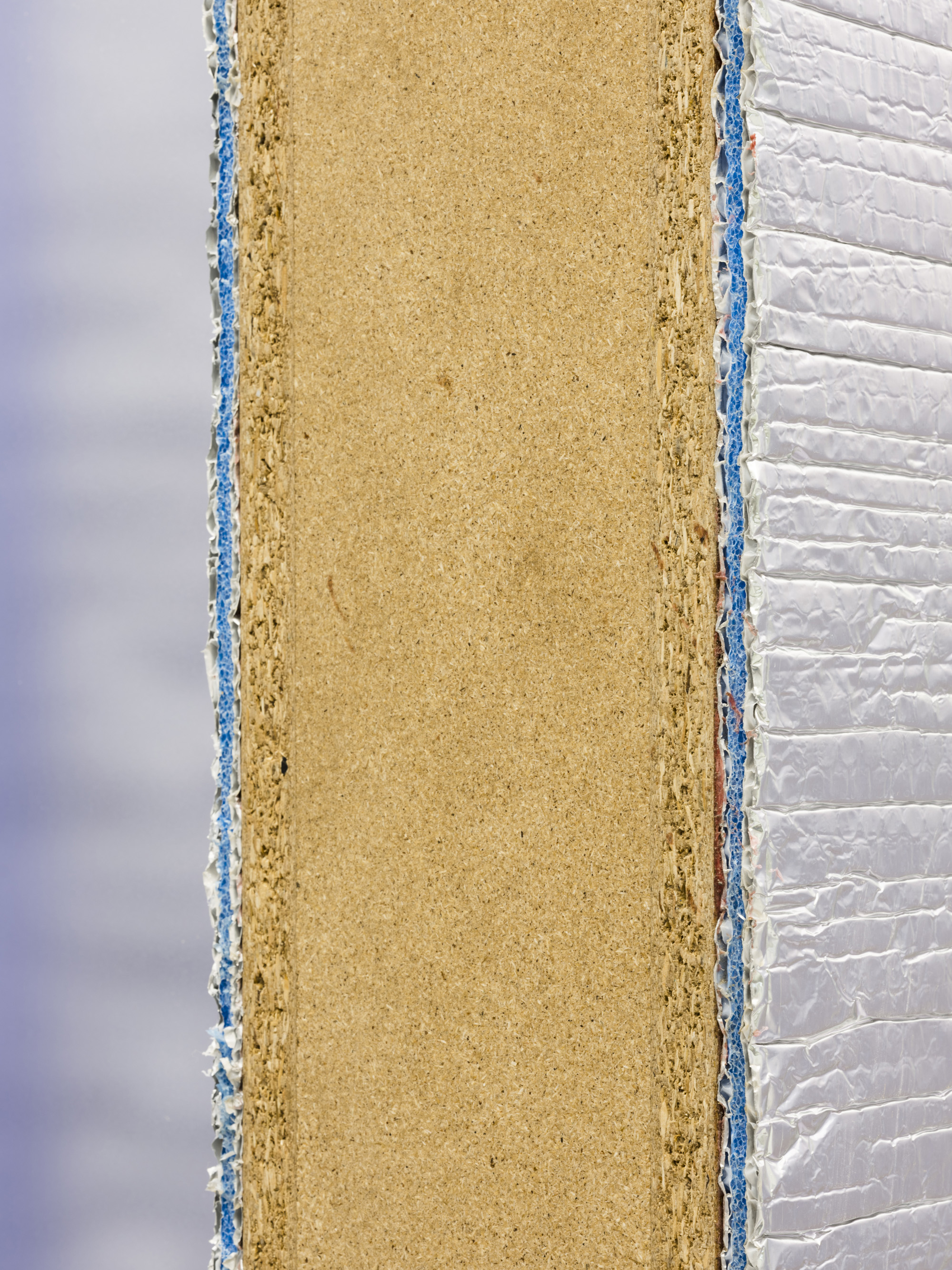
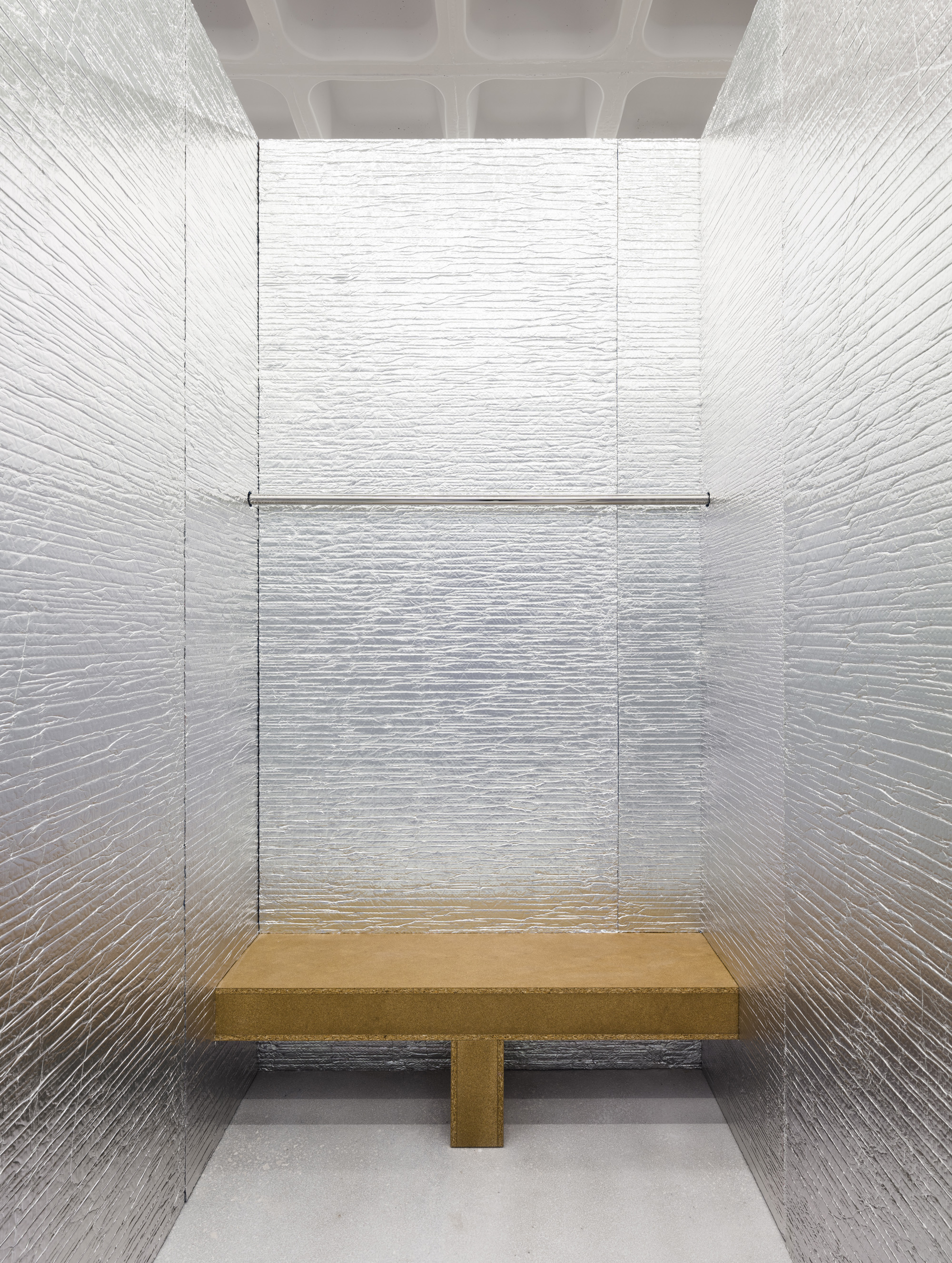
For furniture, using visible chipboard panels, covered by untreated grey or silver materials, the pieces are monumental, resembling fragments of architecture. Using extremely basic forms the pieces build up the stores’ radicality and are designed for the needs of each department – playing with what is visible or purposefully obstructed, forcing visitors to explore the space.
The floor is the original one from the warehouse that has been deeply sanded to expose the bigger stones inside the concrete and whitened with a matt protection.
