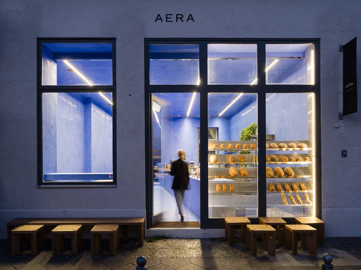
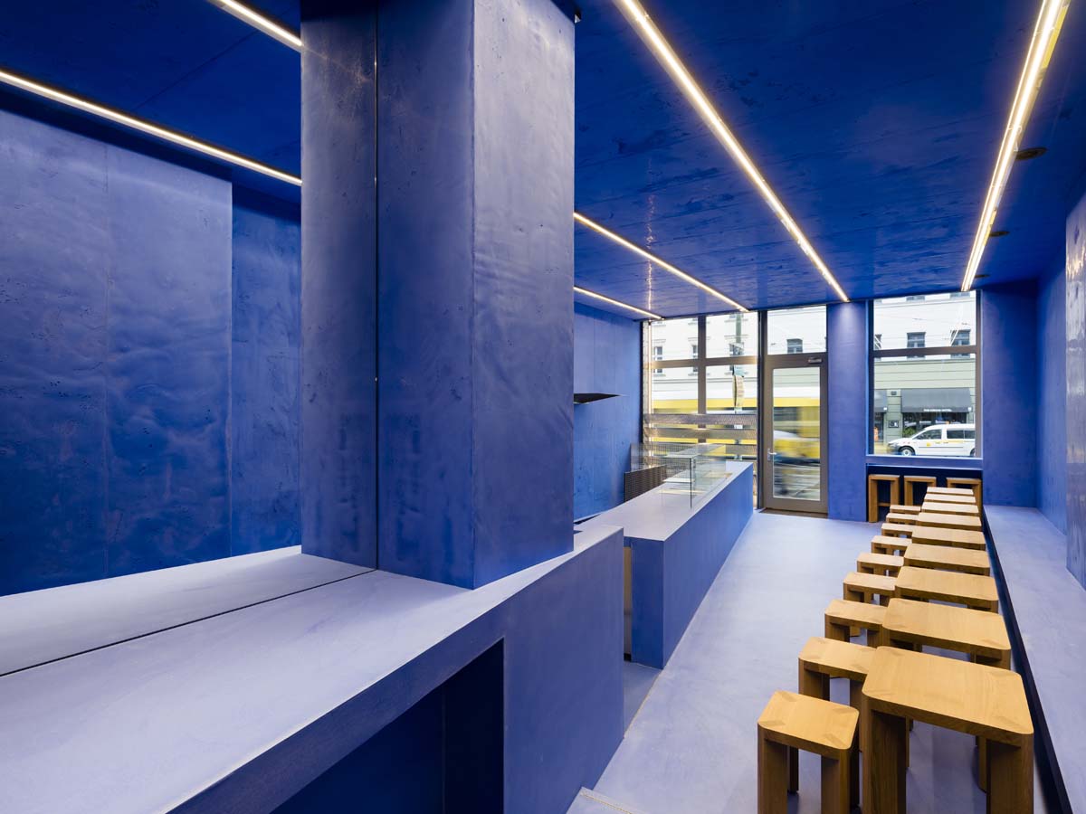
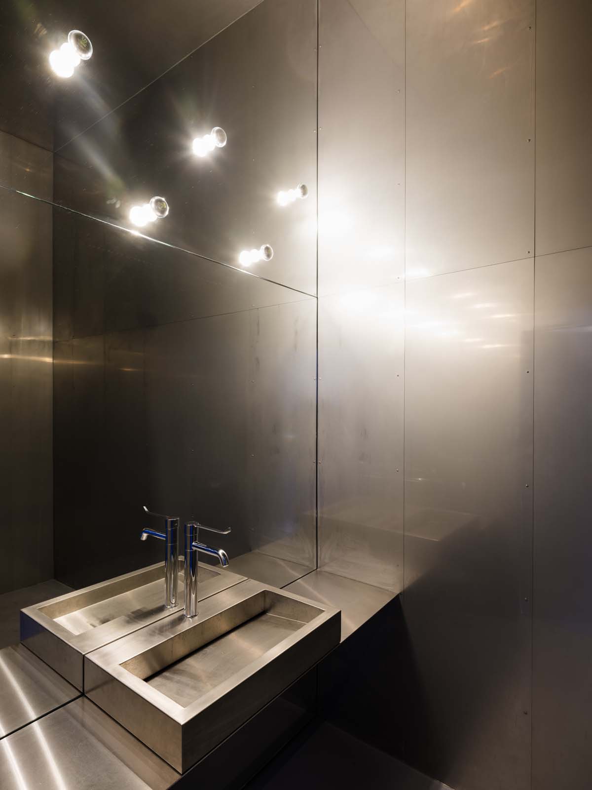
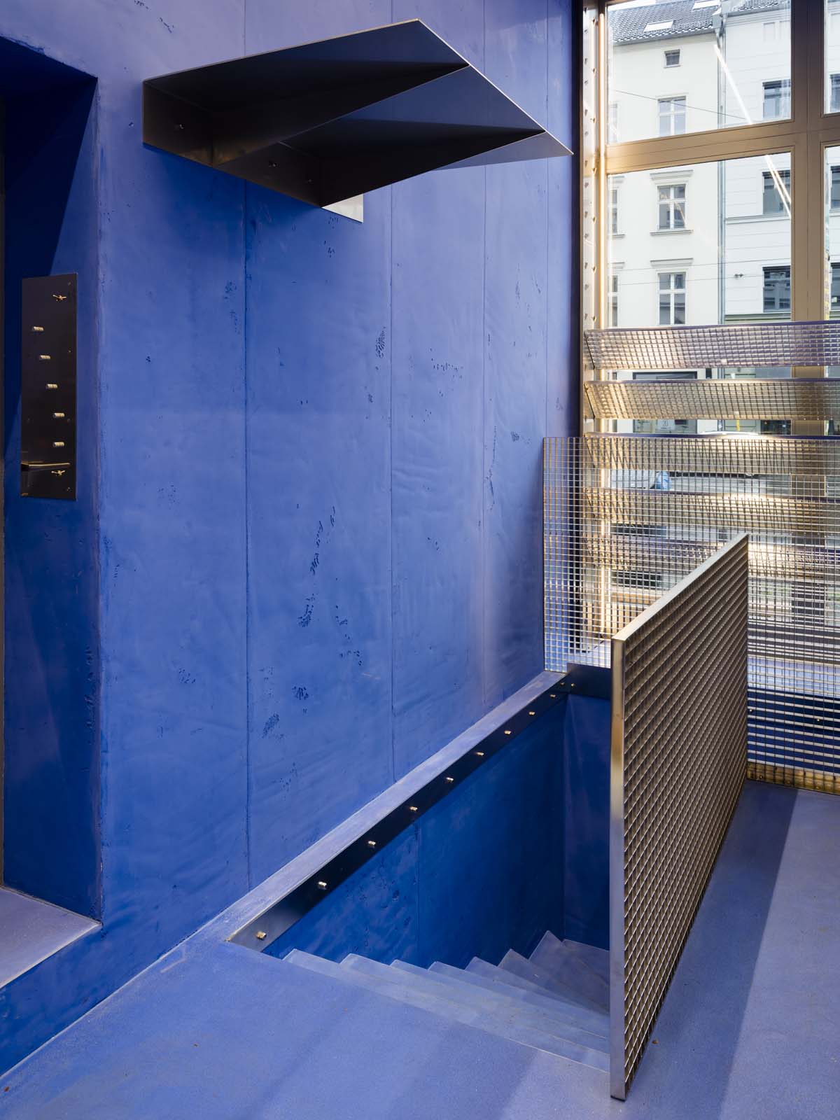
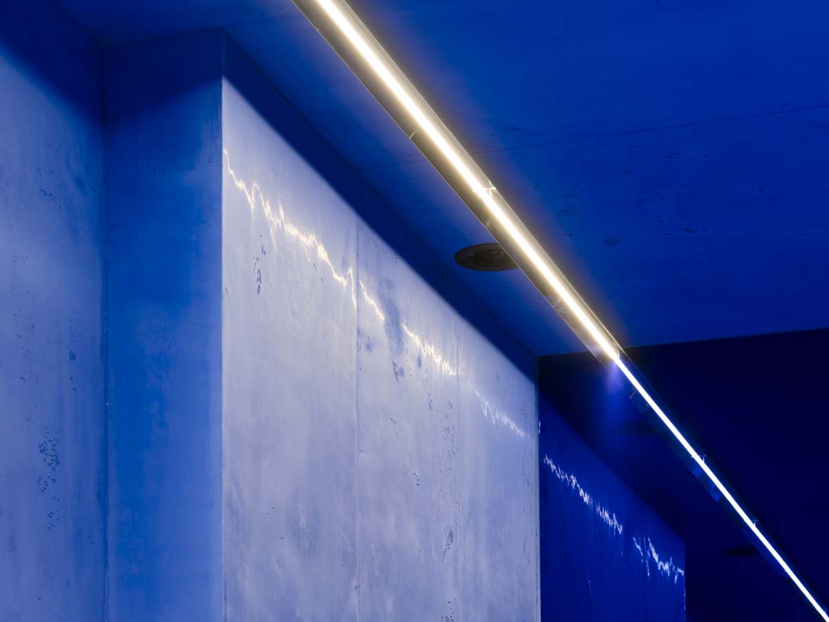
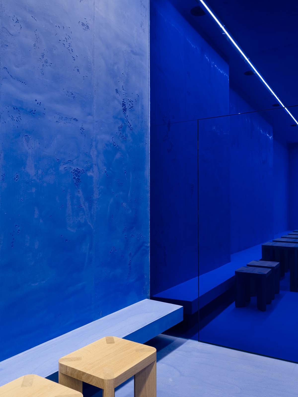
For the second Berlin branch of Aera – a gluten-free bread manufacturer and café located at Rosenthaler Platz – the architecture duo Gonzalez Haase AAS designed a space that takes full advantage of its prominent location by being impossible to overlook. The entire depth of the new store is made visible through a large storefront window, allowing its rich Lapis Lazuli blue interior to take centre stage.
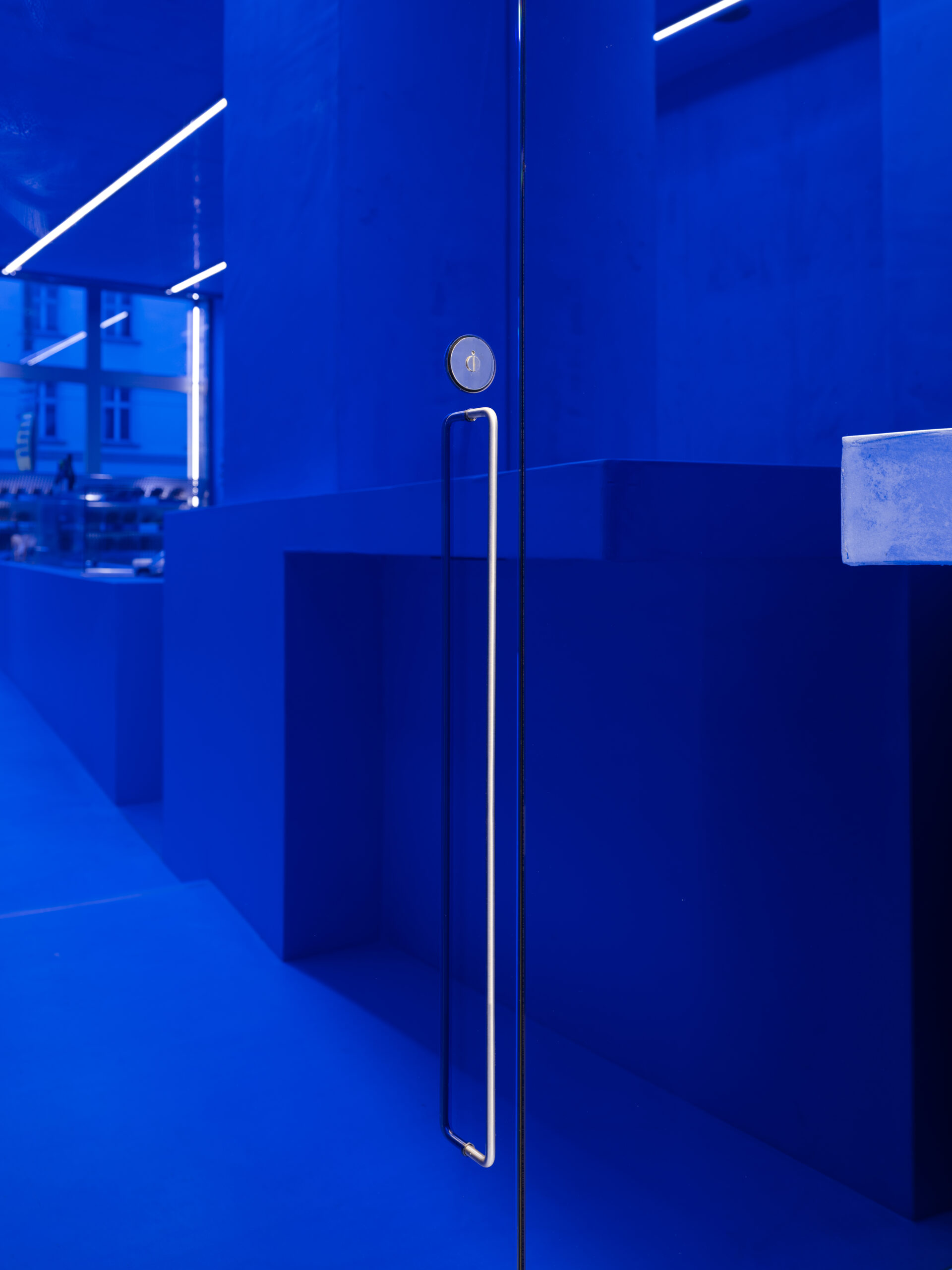
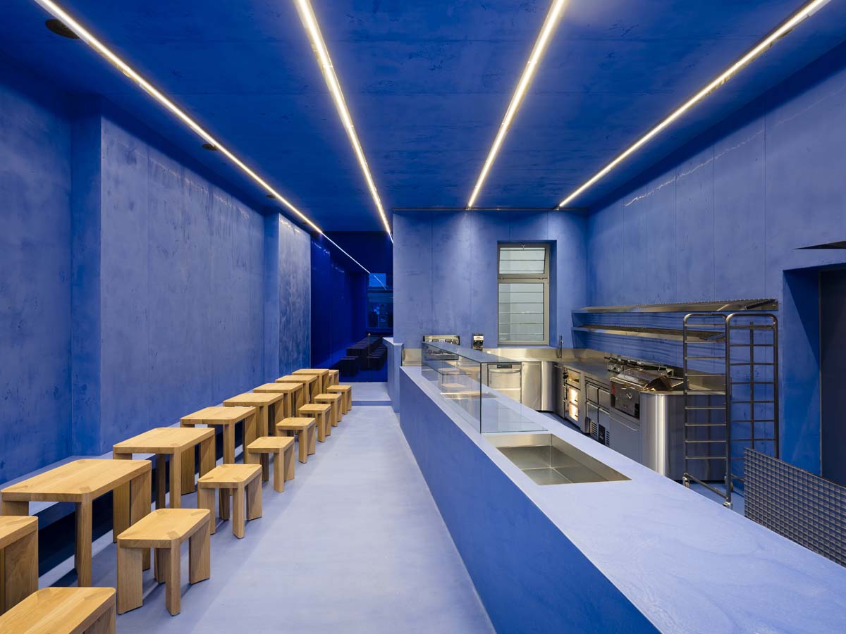
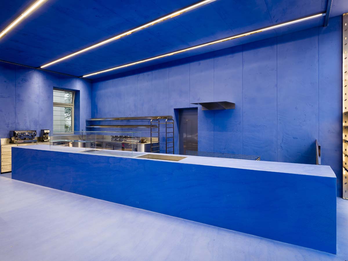
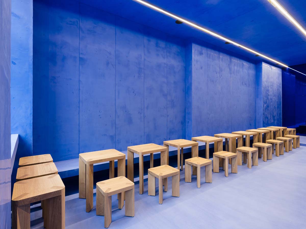
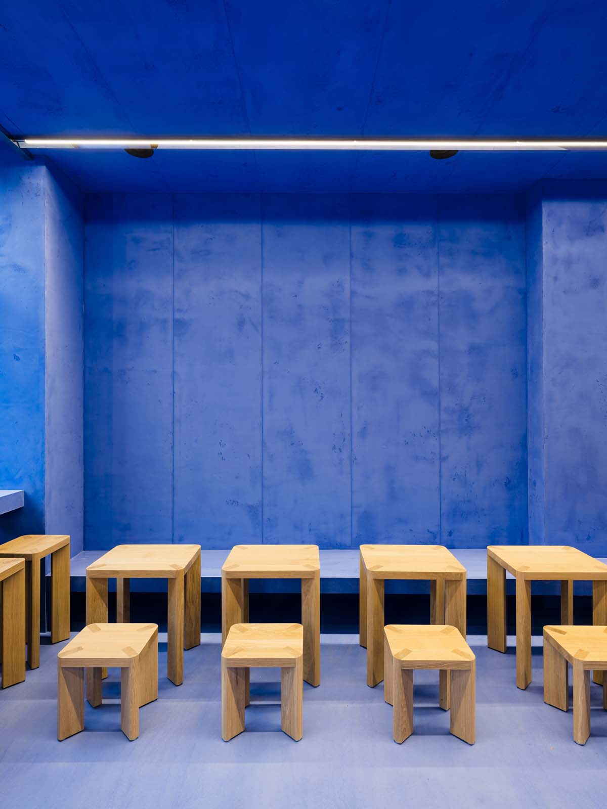
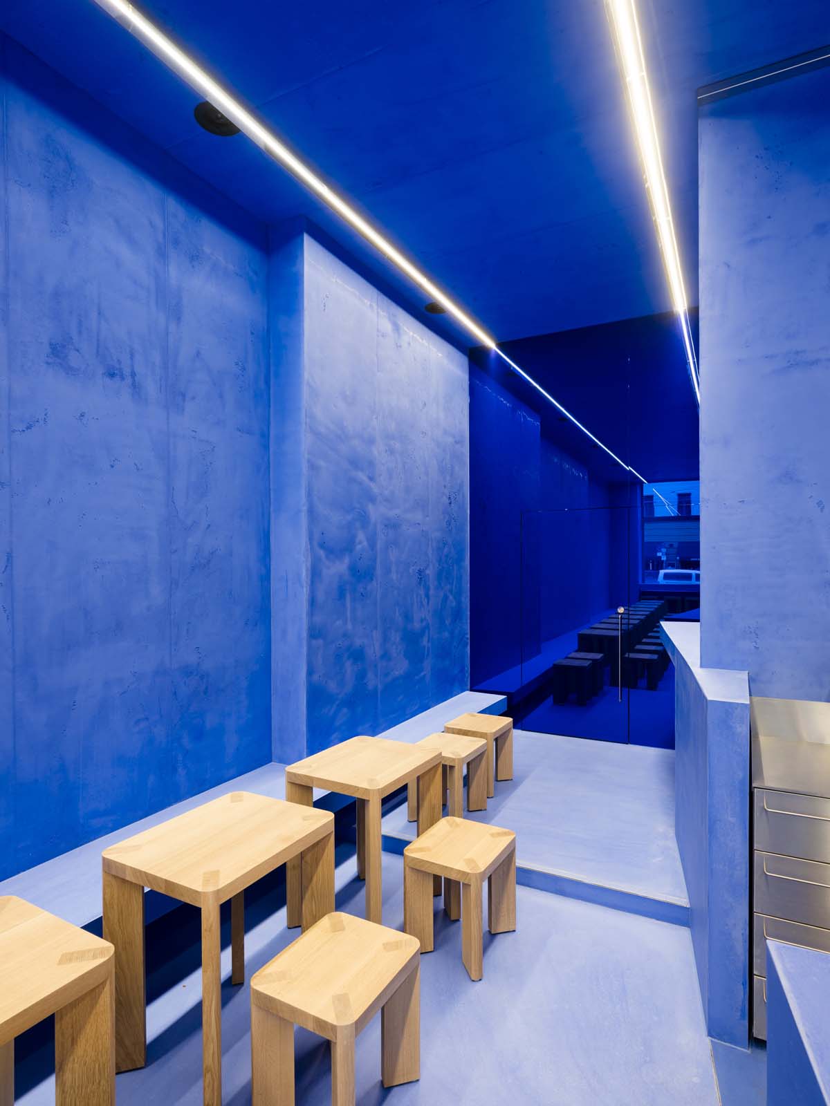
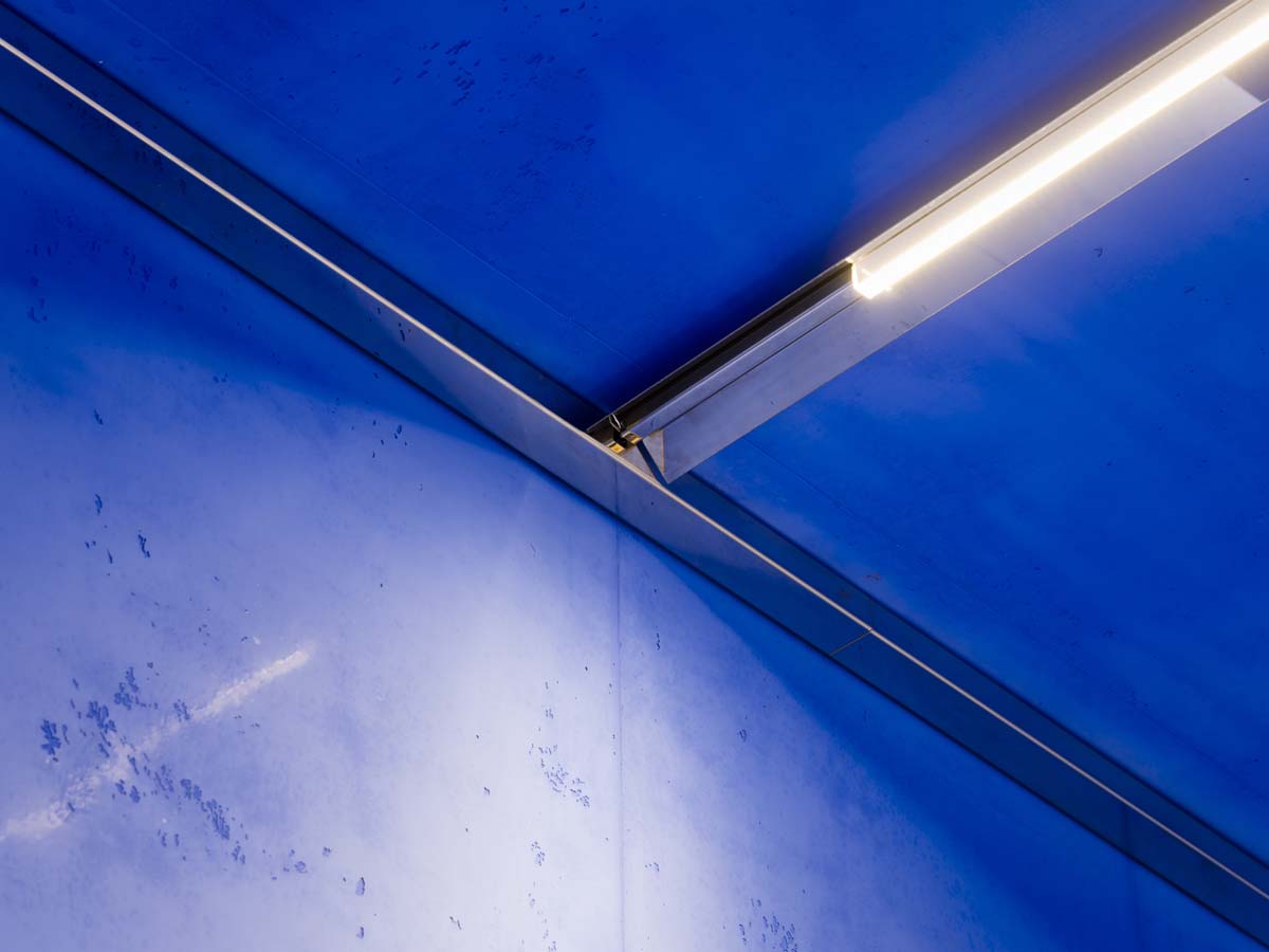
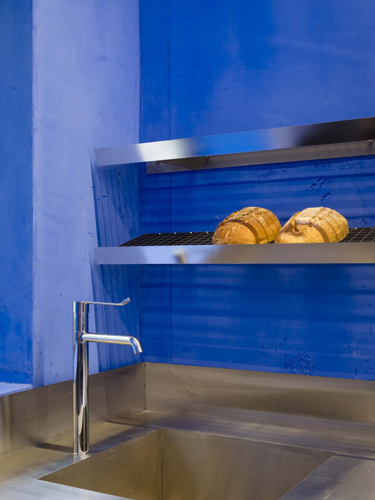
Freeing the 70 SQM space from the layers of the past revealed a ceiling of 3.8 m in height and allowed the length of the space to be viewed in its entirety from the front of the 13m long wall. No inlaid walls or edges were used. A diagonal counter, which runs from the entrance to the end of the shop, divides the space into two functional areas and guides the visitor along the length of the store from entering to placing and then receiving their order. Uniform in texture and colour, this long concrete counter visually merges with both floor and wall surfaces, becoming an organic part of the room due to its proportions and size. Monotone concrete was applied evenly in 80cm strips in an intense Lapis Lazuli blue colour embedded so consistently throughout the space that the room as a whole becomes a spatial sculpture, inseparable from its bold colour. The furniture designed by Gonzalez Haase AAS for the space is of solid oak while the shelving for baked goods is made of electropolished stainless steel. The incoming natural light alters the intensity of the blue and the surfaces from glossy to matt depending on the time of day, the weather and the position of the observer. Sometimes more light than dark and others rather brilliant and intense.
