Sonsbeek Exhibition, Arnhem 1965-66
Rietveld, who made the previous pavilion on the same spot, must have approached the problem quite differently, judging from the structure which stood there – frail and weightless – twelve years ago. It was a beautiful thing in an uncontroversial way and widely appreciated for it; a fairy tale that cannot be retold – though it was rebuilt on another site as a tribute to the architect.
An extraordinary sense of continuity prevailed – the trees had their way. Nothingwas essentially interrupted, though much was quietly articulated. Park and pavilion were in accord and so, it seemed, were the people. Nor did the exhibited sculpture challenge this unity – such was the nature of the choice made. Rietveld’s disarming mischievousness – no work of his is without it – made it easier to accept such equipoise on a summer’s day in the park.
Although the immediate requirements were the same this time – to accommodate those objects which because of small size, material, fragility or value could not be exhibited along the lanes in the parks – I thought the time had come to reconsider the whole question of contemplating sculpture out of doors, since this still presupposes fields and trees and sunshine, a very obstinate misunderstanding – as though art has more to say (or says it more gently) when mother nature is around (here in the guise of a Victorian park). But Caras, Kings and Turnbulls do very well without her special grace, for art today is singularly autonomous. It is, moreover, distinctly urban in spirit – often perplexing and provocative. If it relates to the physical world of nature at all it is through metamorphosis, but primarily it relates to itself. The ‘landscapes’ that are disclosed are those of the mind. And like the mind, the dream and the city, they are kaleidoscopic and labyrinthine.
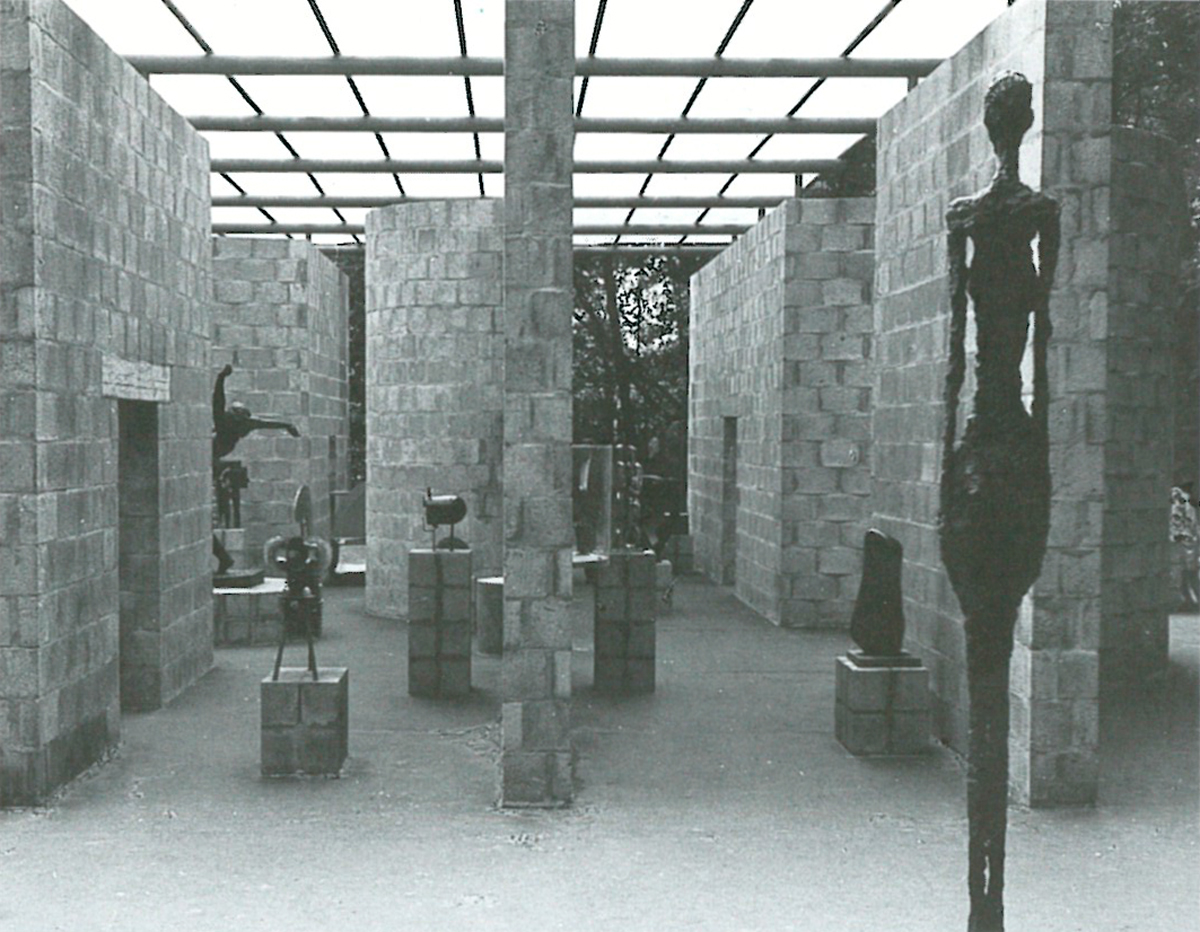
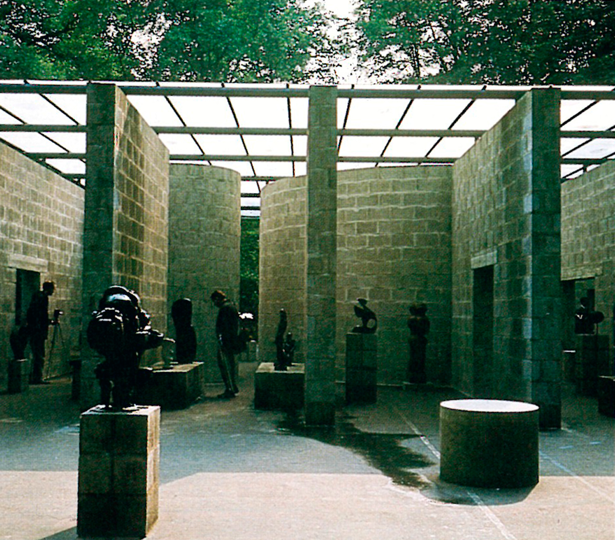
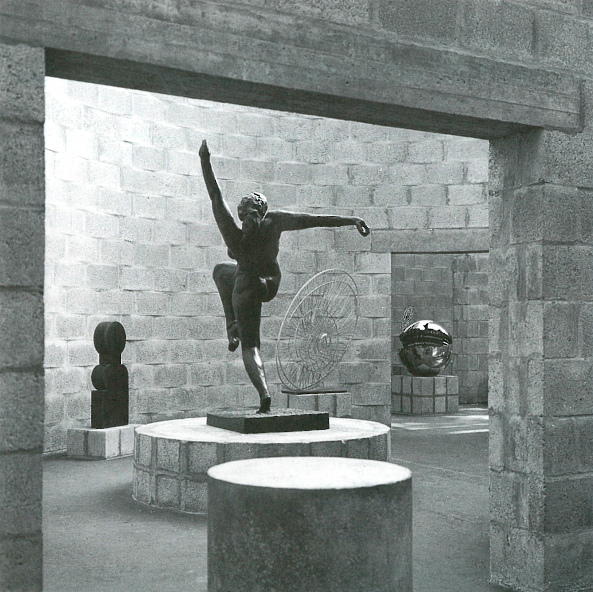
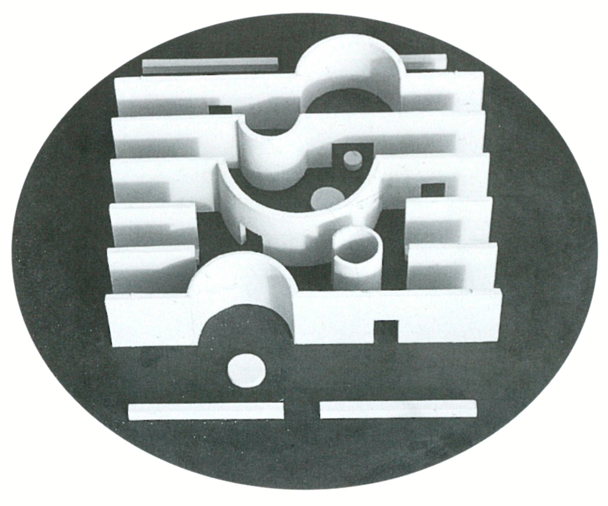
I therefore decided that the new pavilion should possess something of the closeness, density and intricacy of things urban – that it should in fact be city-like, in the sense that people and artifacts meet, converge and clash there inevitably. Central to my idea was that the structure should not reveal what happens inside until one gets quite close, approaching it from the ends. Seen from the sides, it appears closed and massive – guarding secrets. The four doorways (one has a seat) open the walls sideways and diagonally, but only at close range. A huge black circle encompasses the pavilion. Its counterform – the square round it – was, like the walls, meant to be painted dull aluminium to give the place a more autonomous quality – disconnect it from the trees – but this was never carried out.
Distance and a slow impression-sequence in the park; proximity and a rapid impression-sequence in and around the pavilion. Affected harmony – lawns, trees and sky; next to intrinsic controversy – a stony place, thick walls and a translucent roof.
About light: I wanted it to be diffused, falling on the sculpture equally from all sides rather than striking it from one side. Furthermore, I find that the reduction of light intensifies tactile values and increases an object’s presence. Seen in twilight especially, hollows remain hollows and sculpture in general invites the touch. Hence the translucent roof (flexible nylon stretched over steel tubes). The circular slabs and low walls were for people as well as sculpture; the smaller cylinders just for people.
Arp, Brancusi, Pevsner, Gaudier Brzeska, Gonzales, Hepworth, Giacometti, Richier, Ernst, Matta, Noguchi, Tajiri, Caro, Turnbull, Constant, Wouters, Pomodoro, Paolozzi – small. large, thin, squat, wood, stone, metal, dark, light, heavy, wiry, solid, polished, precise, rough – all within a single structure. And people – many, too many or hardly any- passing in and out, round, between and through the walls (running if they happened to be children). As rain poured down from day to day, some of the things I wanted were curiously emphasized.









2 Comments
Obra mestra!
M A S T E R P I E C E