Over the River Scheldt, west of the trading city of Antwerp’s historic centre, the district of Linkeroever cuts a very different figure to its affluent neighbour. Barely a kilometre from the city centre, its winding chocolate box streets are supplanted by an urban district that from 1929 was laid out according to a masterplan which Le Corbusier no less, advised on. Built out in the 1970s, those modernist principles resulted in Europark – the familiar orthogonal grid of 18 huge slim slab blocks overlooking vast tracts of pointless flat grassed areas. In time-honoured fashion this rapidly began to fall short of its original utopian ideals. By the end of the 1990s the area, with more than 15,000 increasingly transient residents, had degenerated into a sink estate and become the concern of the City government, who in 2005 committed resources to a regeneration plan to reverse its downward spiral.
In the public consciousness, at 27 storeys and housing nearly 220 families, the largest of the Europark’s 18 slabs, the Chicago Block, was synonymous with the area’s decline – becoming as notorious for what got thrown from its heights as the height itself. But with the fridges and TVs cleared, there now sits at the foot of the tower something that on the face of it is just as confronting. Architect De Vylder Vinck Taillieu’s €7.5m assisted housing and community centre is one part of the wider, ongoing, IGLO (Inter Generational Linkeroever) initiative. This attempts to reclaim the dead interstitial areas between blocks and convert them to community use: open heart surgery of elderly housing, kindergartens and shops – an effort to stitch the fragmented Europark back together.
The firm’s approach might at first look as shocking as the environment in which it is placed. Facing the newly created road through the estate, the ‘IGLO Straat’, you might expect the architect to have tried to hide the most problematic block and create a distinct identity for the new street. You might also expect to find that the language for the new development is the polar opposite to that of the original, failed scheme. But not at all – here, by its own admission, the architect is fighting fire with fire.
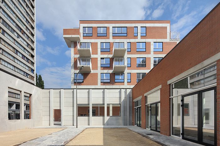
The first thing that strikes you is the massing – a scooped-out evolution of the 64-unit, four-storey long block that was originally proposed. Jan De Vylder, it turns out, could not turn his back on the great modernist hulk in whose shadow the new building sits. Whatever anyone thought of it, he didn’t want to lose the connection and involvement of the old slab. Instead he moved the central flats into two six-storey blocks to the east and west, leaving the community centre and petanque courtyard on a single level in the middle of the plot. And to the east he created a wide alley connecting the Chicago block to the new IGLO Straat. The overwhelming scale of the original tower is unchallenged; from the south, the new blocks consciously frame it, rereading it and making it part of the landscape of the new additions.
Just as conscious is the unapologetically austere concrete and brick facade of the housing and community centre. For inspiration, De Vylder looked no further than the estate itself. He wanted to use brick as a warm material, but to give it a contextual specificity by framing it in the all-pervasive concrete – giving the facade what he calls a ‘graphic quality’. He uses the word specifically, as this is not a matter of form follows function. The concrete frame holds the inner skin of the building and behaves as it needs to, carrying loads to ground, and has a fully insulated interstitial cavity. The outer loadbearing skin however, works to its own rules. Wandering around the building, De Vylder confesses that while the exterior grid can follow column positions behind, it doesn’t always.
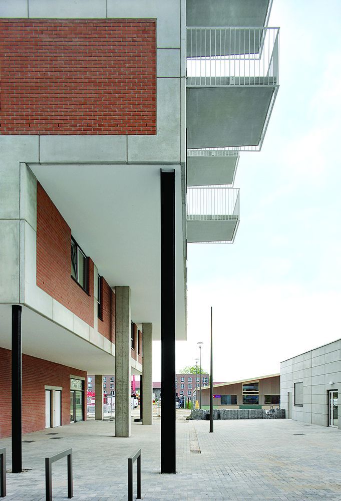
He’s quite clear that he didn’t want to be dictated to by structural logic, which accounts for the seemingly random shifts that occur at the upper levels. It also leads to interesting details – the colonnade on the east block’s south face makes evident the game of two skins – both visibly running in parallel to ground. Yet on the west face, the cantilevered structure behaves in an altogether more mannerist way – the lower ‘beams’ of cladding merely hanging off hooks mounted to the concrete structure behind. Parapets, meanwhile, are a few courses of brick popping above the final concrete ‘beams’ – a detail of strange fragility emphasising the grid all the more. The notional etched joints of the concrete merit scrutiny – made of numerous tessellated panels combined in different ways, they give the frame additional layers of richness.
The architect also claimed back exposed concrete columns from the engineers, insisting on two ‘fetishised’ black-painted Miesian steel columns to pin the cantilevers at one end. Serving a partially structural purpose, the real reason to use them was to define space beneath, says De Vylder, without closing it down in the way the larger concrete columns that were originally specified would have done. Such was his preoccupation that he even wanted one of the alley’s street lights moved offline and set in line with his steel columns to kiss the soffit of the cantilever – an architectural conceit pointing to the facade games going on elsewhere.
De Vylder says the 7000m2 commission involved a lot of value engineering – amazingly it came in at just over €1000/m2 – but that this limitation also yielded solutions. When the architect was told the cost plan meant only 40% of the windows could be in the specified anodised gold and black, he made the call to concentrate them on the most visible ‘internal’ faces of the blocks, with cheaper silver anodised frames moving to the outer faces. And in a move that initially dismayed the client, all rainwater drainage, co-ordinated, designed and in black metal, was exposed on the outside face. Adding another layer to the facade, and perhaps most subtle of all the moves, steel fixing plates to the edges of the deep balconies were dispensed with for point-fixed simple white-painted steel balustrades dropping down past the barely sloped concrete soffit. The disparity between this and the lower balustrade rail might at first look like a mistake – but it makes the nature of both elements far clearer – all part of the architects’ argument that details should reward repeat viewings for the residents.
The community centre at ground level is also implicated in the material plays. De Vylder defends his use of concrete walls here as the Belgian material of choice to separate domestic gardens from each other. And the ideas are the same, creating semi-private courtyard spaces – one of them for petanque at the community centre – but far from closing down their views there’s a palpable permeability. Here, the building protects without being defensive. There are no prison-like bars filling the large openings into the courtyards; instead, Chicago block’s passing residents look past gold framed windows that only partially fill the opening, in a canny play-off of security and trust. Views into and through spaces are many and complex, some vaguely abstracted as columns or colonnades framed in the walls’ picture windows. It might be a community centre in a tough place, but it protects without being defensive and in the sophistication of the internal and external plays with views, there’s as much going on here as at Scamozzi’s stage scenery at Vicenza’s Teatro Olimpico.
Some might doubt the appropriateness of such severity in a damaged location like this, but De Vylder’s strange interplay of facade grids, their offsetting and material and volumetric layering is in reality extremely complex and nuanced. And while it seems on the surface to echo the early conceptual work of Peter Eisenmann, with a similar sense of abstraction, the building is actually firmly rooted in and of its context. In exposing and deferring to the ugliness of the Chicago block, the new IGLO building goes some way to ennobling both it and itself.
‘The City of Antwerp saw it and thought the new one looked like the ugly old one,’ says an unconcerned De Vylder. ‘We weren’t offended by that idea, but it all depends what you mean by ugly – we think of it more as an aberration of the block.’ And if that’s what it is, it’s a very considered one.


