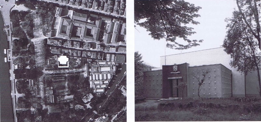
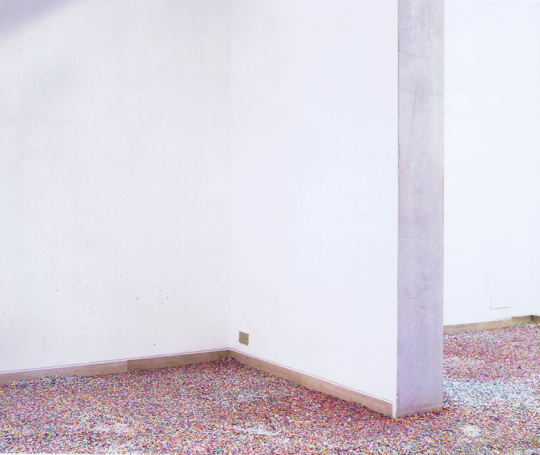
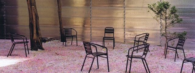
In the Belgian pavilion for the 2008 Venice architecture biennale the existing pavilion building is enclosed by a seven-meter high wall—composed of standard Italian scaffolding that was rethought and redesigned—and thus separated from the predominant context of the architecture biennale. The floor of both the existing pavilion and the new “garden” is covered with a layer of confetti that is both pragmatic and symbolic. Chairs are spread here and there around the new pavilion to allow for moments of rest from the chaos of biennales past and present.
The existing awning under the skylights of the pavilion was removed so that sunlight streams directly in. Visitors walk through between the two layers of the outer wall and enter the original pavilion through a side entrance, disorienting them before their experience of a new aggregate of spaces. In the new walled garden of the pavilion one can sit in the sun or under the shadow of trees. The new Belgian pavilion frames and displays the existing pavilion, a piece of architecture that has been constantly adapted and transformed over the years.


2 Comments
Quite strange to publish now a 2008 Venice Biennale Pavilion when the current 2014 Biennale just started, no?
Actually, the current Belgian Pavilion is an interesting one.
Opportunism by the authors?
Slow day at HIC?
Very clean and opened-space. We love it, thanks for sharing.