KUU Minus K House
Fuente: World Architects
Fotografía: Jeremy San
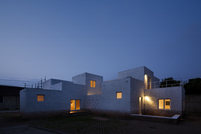
In this heterogeneous context with very different scales and functions, Satoko Saeki and Kok-Meng Tan of the Shanghai based firm KUU, designed a duplex composed of a normal dwelling for the family of a worker combined with a weekend house for the owner of a slipper factory in the compound of the firm’s warehouse. The location seems already odd, and so does the program. The designers based their layout on 19 squares, each three by three meters, to form an irregular grid. At first sight, it is reminiscent of the Dutch structuralist movement of the 1960s, advocated by architects like Hermann Herzberger or Aldo van Eyck.
At second sight, one gets a clue of the specific Chinese cultural context for such an experiment. A shared table forms the centre of the duplex. Two kitchen squares and two courtyards are placed diagonally at each corner of the table, enabling the residents to face each other while cooking through an opening in the central cross of the walls.
The relationship between public/private, or better, collective/individual is challenged by such an arrangement of space. This recalls the experience normal Chinese people had until recently with shared kitchen, bathroom or communal courtyards and semi public collective neighbourhood streets. But in contrast to the forced arrangement by shortage of housing, in this case a choice is offered which creates an opportunity for communication in a cultured way.
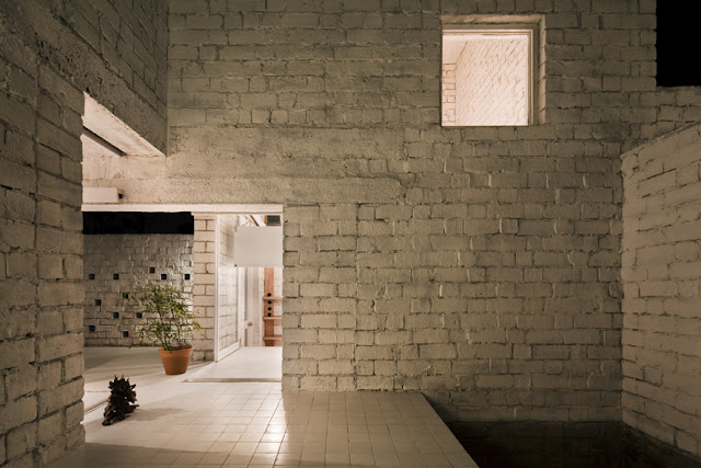
In this concept the architects are interested in the creation of experience and the activation of behaviour, which is part of the collective memory. In this way the rigidity of the grid is used for the creation of possibility based on the specific local cultural background. With six double high units and five courts, the open and the closed cubes create a playful interaction between inside and outside, between vertical and horizontal.
Other projects by KUU








4 Comments
Cuantos metros cuadrados tiene la casa
No consigo entender porqué cuando se copian artículos de otros blogs os quedáis a medias y sólo ponéis la mitad de las fotografías. ¡No os quedéis a medias, por favor! Sólo siguiendo el enlace y viendo el resto de fotografías he conseguido entender la totalidad del proyecto.
Yo lo que no consigo entender es que lo copien. HIC tiene apariencia de una página cuando en realidad debería ser otra cosa, una cuenta de Twitter o de fb… Aporta exactamente lo mismo.
23:52
lo materico es el proyecto.
el cuadrado lo hace posible.
no interesa lo demas, interesa su arquitectura.
23:55