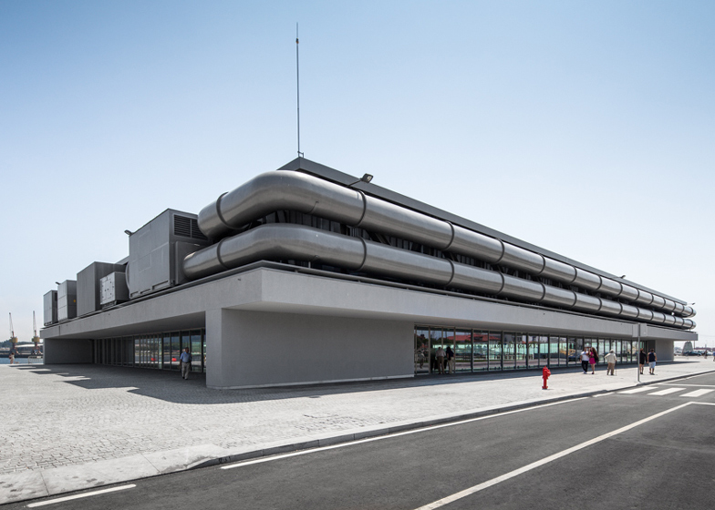
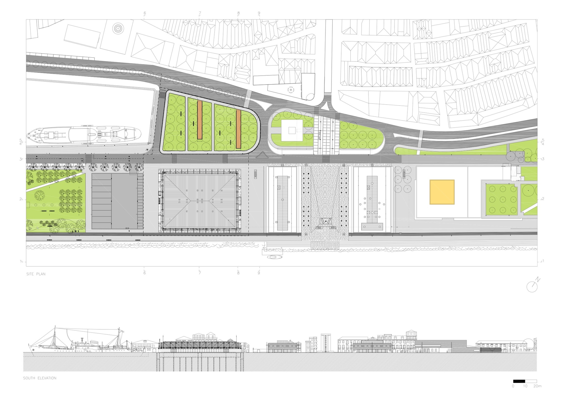
The building is implanted in the zone foreseen in the plan, aligned in the south side with one of the buildings projected by architect Fernando Távora.
In front of the north elevation it is foreseen an arborised square with alleys that mark the entries of the Pavilion. In this square will exist a slope that will make the access to level -1.
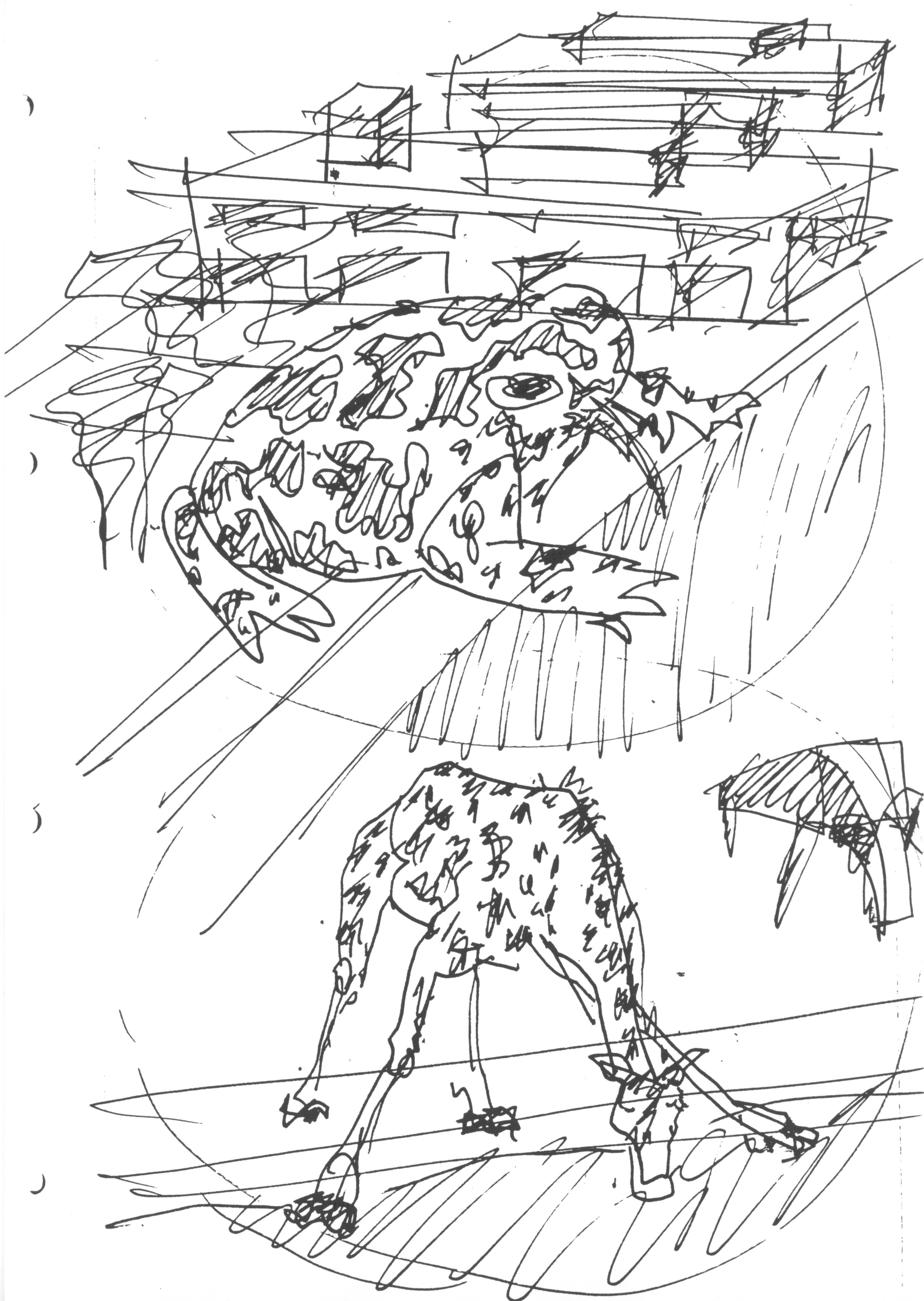
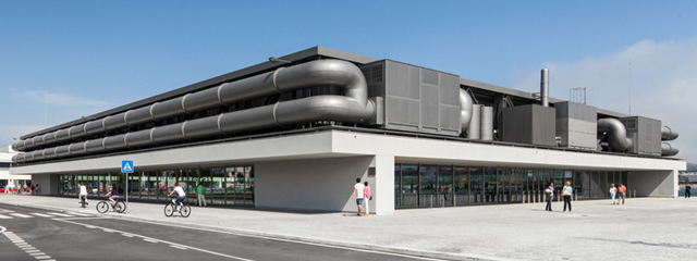
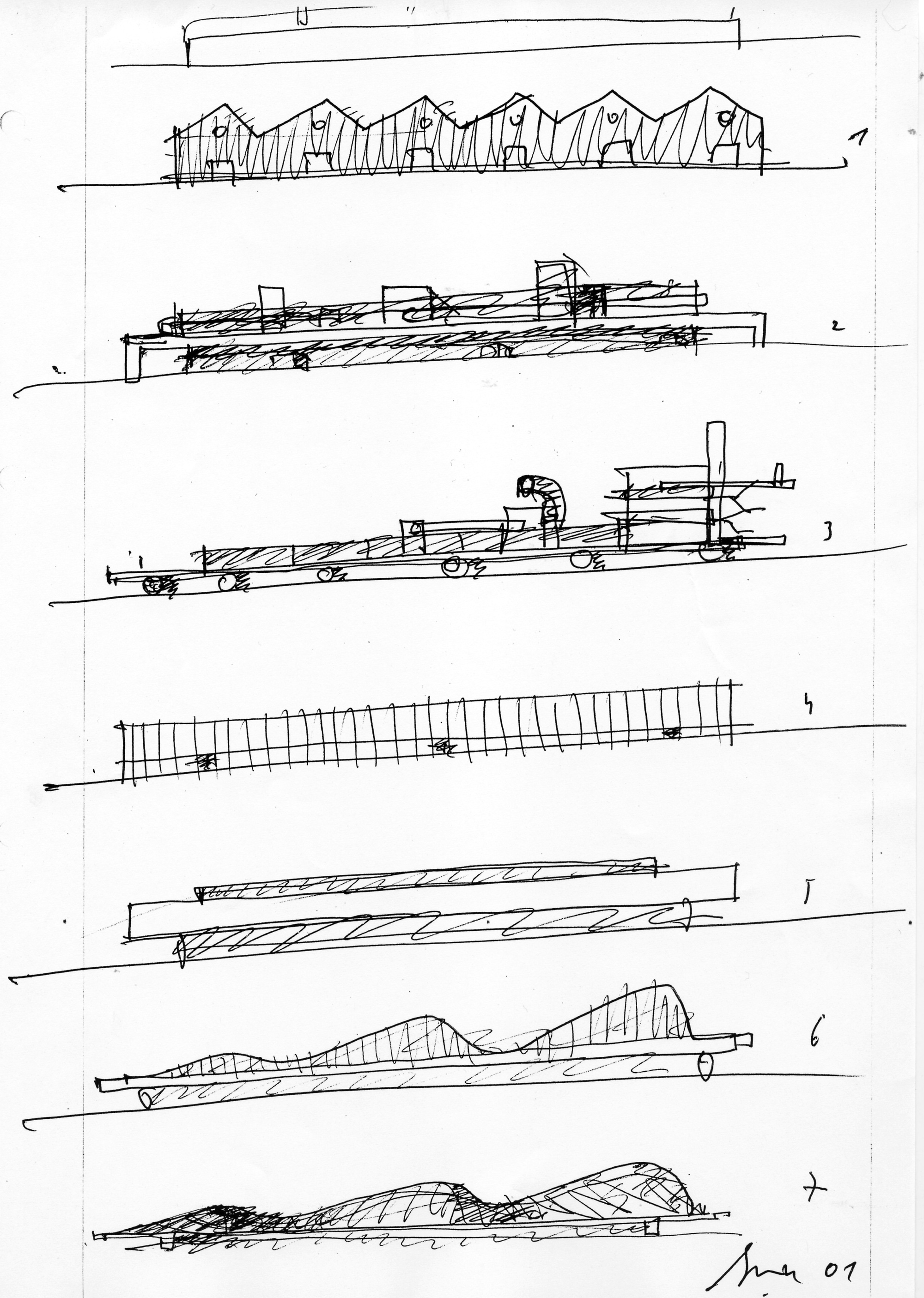
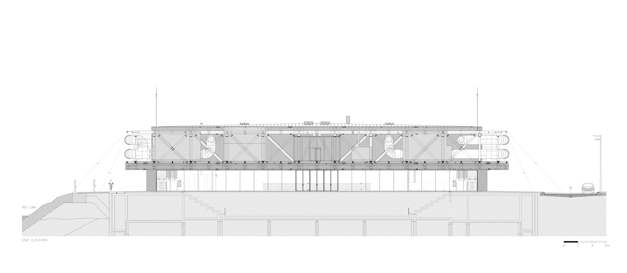
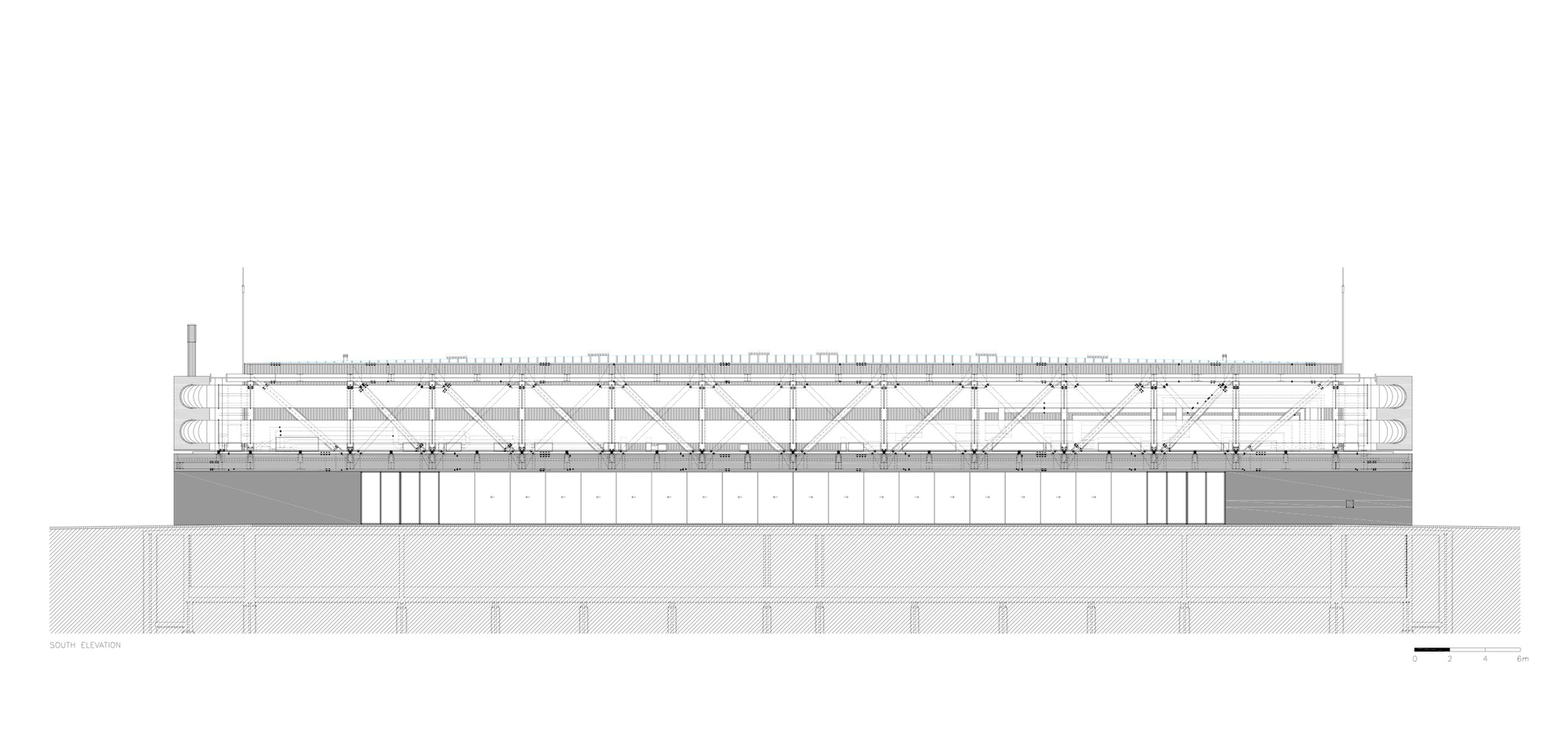
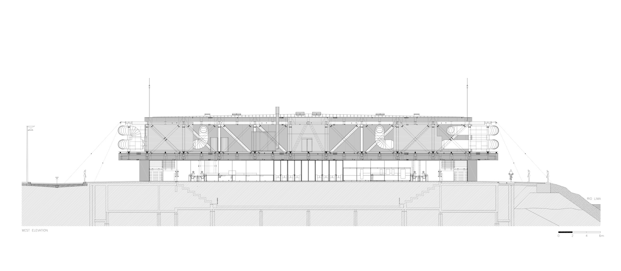
Formally the building is defined by a table where an aluminium box and every necessary equipments to the function of the different activities promoted in its interior will be placed. The whole image intends to be associated with the naval architecture, existing a relation with the image of the “Gil Eanes” ship.
The multipurpose pavilion will be a space directed to cultural and sport events. The main accesses will be situated in the north and south extremities. The service entrances will be made in the other elevations.
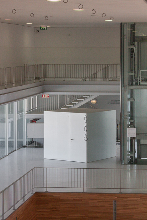
Its interior will be ample and permeable, existing the possibility of viewing the sea from the entrance floor. It is pretended that its transparency will be able to make it as lighter as possible in relation to the other buildings.
















3 Comments
Imposible no remitirse al centro Georges Pompidou. Casi se antoja un homenaje.
El símil con el centro Pompidou es prácticamente anecdótico, se queda únicamente en lo que aquí nos muestran en fachada. Podría decirse que el planteamiento de las circulaciones, el tratamiento del interior y la implantación en el solar y la relación con los vecinos del proyecto de Souto de Moura son lo opuesto al Georges Pompidou.
Totalmente de acuerdo. En el Pompidou es intencionalidad estética. En el Centro Cultural es evidente una integralidad de planteo que trasciende lo meramente estético. Ejemplos hay muchos….