An old brick and timber house appears to have been cut in two inside the new Shanghai flagship store for shoe brand Camper, designed by Chinese architects Neri&Hu
Intended to evoke the look and feel of one of Shanghai’s traditional narrow streets, the newly constructed building was inserted within an old industrial warehouse to turn the store into a “house within a house”.
“The Camper Showroom/Office in Shanghai recalls both the spatial qualities and the vibrant activities characteristic of life in a typical Shanghai alleyway, called a nong-tang,” explained architects Lyndon Neri and Rossana Hu.
Constructed from reclaimed wooden frames and grey bricks, the house structure extends out from one wall of the interior. A mirror runs along one edge, creating the impression of a hinge, while the sliced edges are finished in bright red paint to match the block letters of Camper’s logo.
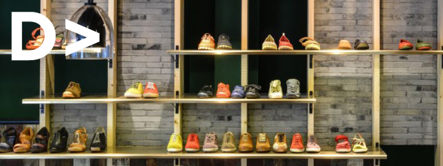
Offices are located within the house’s upper floors, while the lower level accommodates a traditional shop where shoes are presented on perforated bronze shelves that were custom made by the designers.
More shoes are attached to steel hooks and hang down from a series of suspended steel rods outside the house – a reference to clothes hanging out to dry.
The space below offers a gathering area, which can be used for hosting talks and presentations, and is naturally lit via a huge skylight.
Neri&Hu are the latest in a long list of well-known architects and designers to design interiors for Camper. Other recent stores include Nendo’s Camper New York, Shigeru Ban’s House of Shoes and a Lyon store by Studio Makkink & Bey with staircases that seem to go on forever.
Camper Showroom/Office
Shanghai, China
Drawing inspiration from the surrounding urban condition, the Camper Showroom/Office in Shanghai recalls both the spatial qualities and the vibrant activities characteristic of life in a typical Shanghai alleyway, called a “nong-tang”.
The exterior lane extends into the showroom creating a physical sectional cut of the new house and a gathering space used for presentations and talks. A mirrored surface at the end of the lane visually lengthens the sectional cut.
Neri&Hu inserted their interpretation of a brick and reclaimed wood clad two-storey house into the shell of an existing warehouse, resulting in a layering of spaces from exterior to interior to the in-between, which showcases a unique hanging shoe display.
The house is constructed out of timber framing using locally sourced reused wood and grey bricks as infill material. The wood salvaged from demolished lane houses reveal years of patina from paint, newspaper and wallpaper still attached to the planks.
A new skylight addition above heightens the experience of being in an exterior alley by casting long linear shadows across the walls throughout the day.
Several furniture pieces were custom designed for the project; the bronze perforated shelving, the Neri&Hu Solo Chair with special edition red legs, and a ‘Lazy Susan’ table for the Press Room.


1 Comment
Muy buen trabajo el que está haciendo CAMPER en todas sus tiendas, siempre espacios bien pensados y diseñados para mostrar su producto.