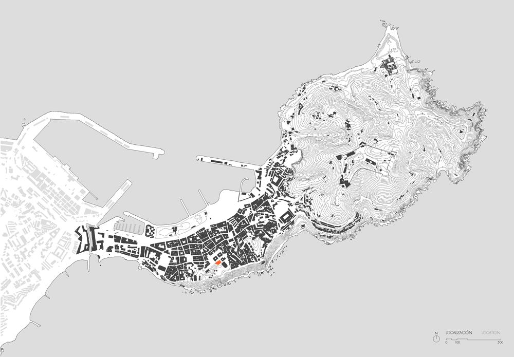
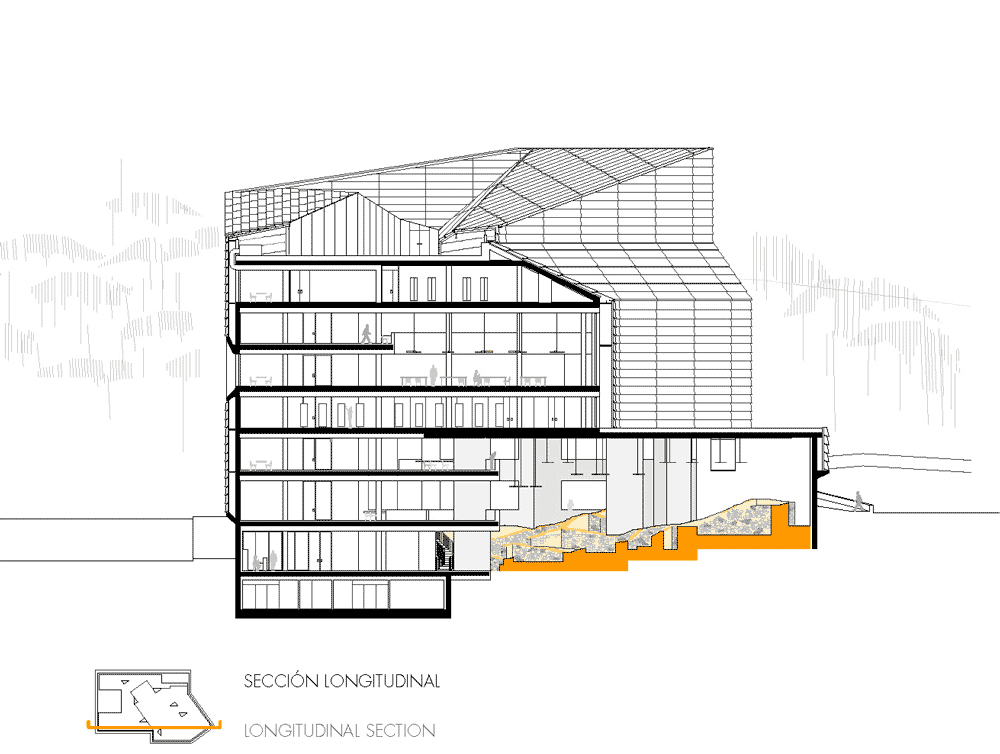
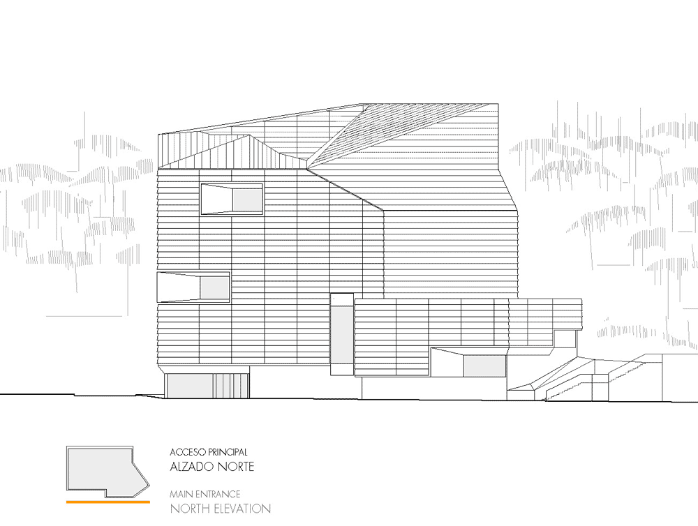
The new Library in Ceuta is conditioned by the steep topography of the plot and by the Arab Marinid archaeological excavation of the XIV century that determine all interior spaces of the Library. Also the lack of space and the compactness of Ceuta, an autonomous Spanish city located on the north coast of Africa on the border of the Mediterranean Sea and the Atlantic Ocean, condition the proposal.
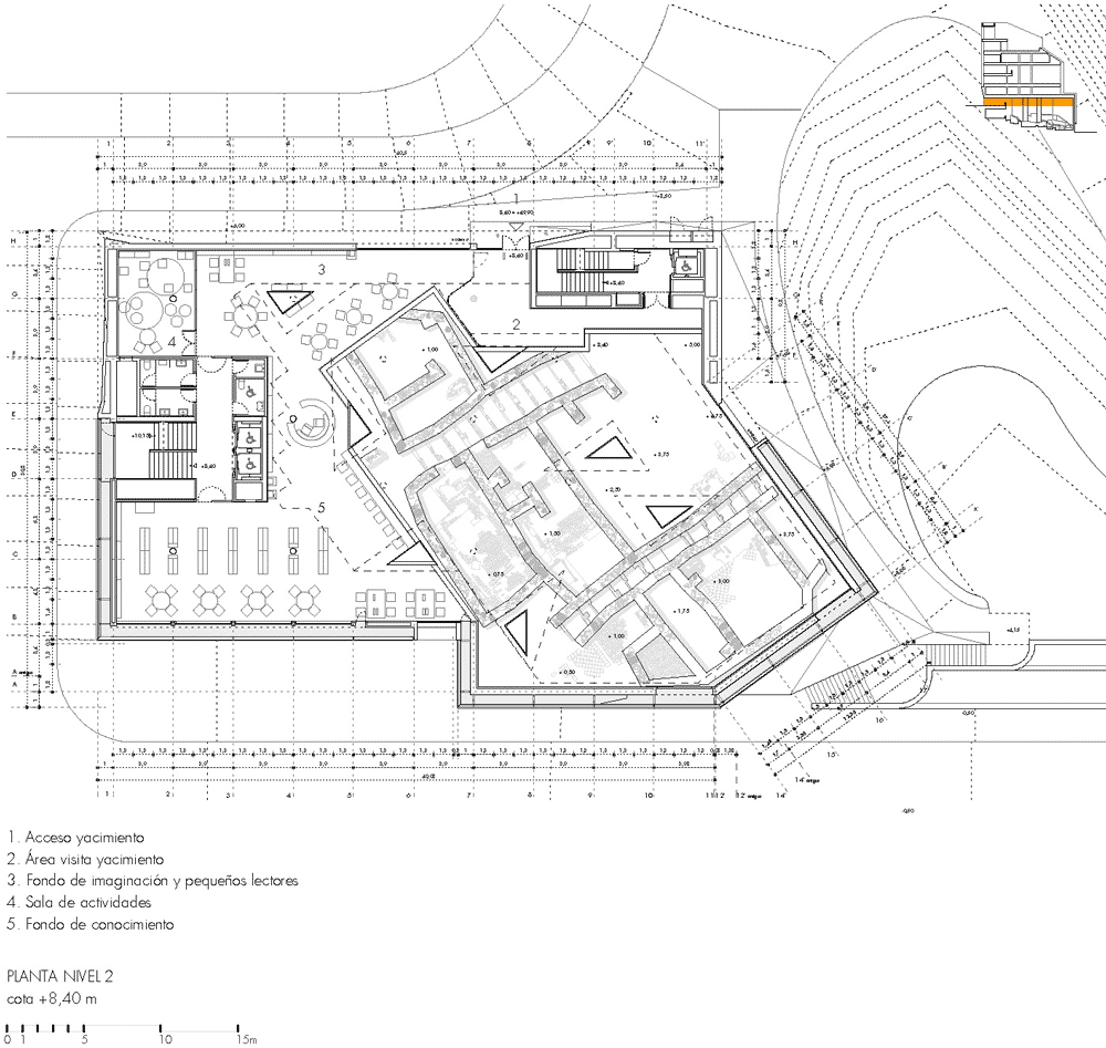
The orthogonal geometry of this ancient settlement is turned from that of the actual urban grid. This fact establishes a triangular geometry for the structure over the archaeological site and the urban value of the Arab city is included in the geometry of new building.
The Library is conceived as a compact volume that preserves the archaeological area as the core of the public spaces, creating a sense of openness and transparency between reading spaces and visitors to the Marinid centre. The library is organised in terraces placed on the slope that embrace the remains of the past. The lecture rooms are stacked in several levels overlooking the void where groups of hanging triangular lamps with peaks in both geometries are set over the archaeological centre. Two different entrances in two levels, one to the Library and other to the visitors centre, are placed linking the inside to the nearby streets.
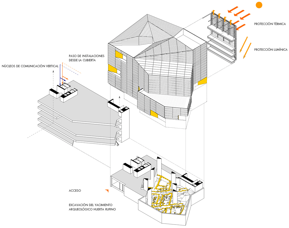
Seven triangular concrete pillars support the building with a program organised vertically. The third floor with the general book display is placed over the concrete structure that covers the archaeological site. Over it a light steel structure in six levels stacks the program being the highest one the book depot, archives and offices.
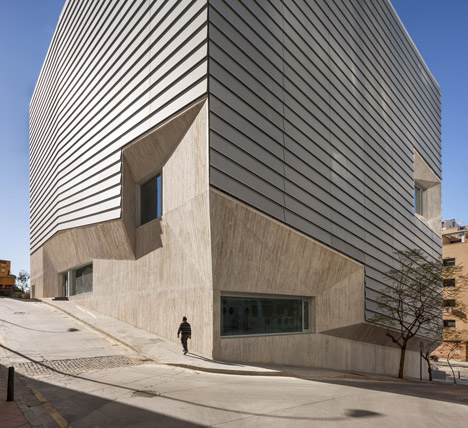
The compact folded volume is entirely wrapped up in an aluminium-perforated skin that reduces glare and solar gain and maximises the use of natural daylight reducing long-term energy costs. The mesh mitigates the sometimes-harsh qualities of daylight thus minimising the use of artificial light to avoid contrast and helping to illuminate the depth of the space.
The final façade includes different glass-metal layers, energy efficient: an interior glass one and an outer metal one, as a veil, that interplay with the changing light conditions protecting the inside from the sun and heat. Slight variations in the make up of the panels, for different orientations, provide the library with a differentiated yet uniform skin, emphasising the faceted shape of the building. Between them a gallery permits easy maintenance of glass openings and simple installations.
A concrete plied basement runs along the steep streets and several concrete structural voids are cut up in the double façade of the Library as viewpoints towards the city. On the terrace in the roof level an open reading room is placed, shaded by the aluminium-perforated skin that wraps up the building that filters sun and open views towards both seas, Europe and Africa.


