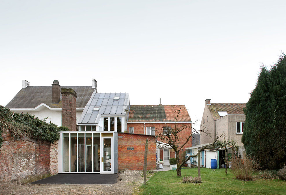
The shoe shop for children with duplex apartment is located on a very small plot at the edge of the old, picturesque town of Belsele, in a typical belgian row of houses with ranging heights and materials.
The volume of the building matches the heights of the existing neighbors and tries to reconcile the various row houses together in order to recreate a continuous impression of the street. This is translated in the front facade by the height difference in the apartment roof. The shape of the roof in the back is an optimization of the building restrictions which were imposed by the planning rules.
The street facade is characterized by the warm glow of the brass storefront, folded towards the inside of the volume. The oversized masonry blocks of the white façade remain visible behind the glass, giving a layered lecture of this facade. The upper part contains the nameplate of the store: during daytime the sun projects the name in soft shadows on the underlying masonry, in the evening it lights on the name in the dark street.
Since the building height is strongly regulated, the ground floor was lowered to emphasize the spacious feeling. The slope that leads to the entrance door offers an overview on the shop and invites the customers to enter. The interior is divided by large and small volumes, including a patio, which distinguishes different zones in the long retail space. A concrete stair leads to the underground bargain department and stock room. The lacquered furniture and brass details form a warm and delicate contrast with the roughness of the concrete floors, ceilings and white painted concrete masonry blocks.
The stairs to and in the apartment are wrapped around a continuous wooden furniture element. This contains various support functions, such as a cloakroom, toilet, storage, kitchen cabinets and techniques. Various height levels along this functional element allow the use of different spaces and bring the two floors of the duplex apartment subtly closer together.
The warm oregon wood is again in contrast with the dark polished concrete floor and concrete ceilings. A void extends the living space to the upper mezzanine with sleeping area. The transparency of the back façade is maximized to provide a direct contact with the green roofs and gardens. By the use of different height levels which provide varied views through the space, the small apartment feels surprisingly spacious.


4 Comments
Un proyecto muy bueno, gran empleo de materiales. Lo que sí creo que esa inflexión de cubierta no tiene mucho sentido…no da para tanto la fachada…
todo es un gran ejemplo de sabiduria de metodo y tratamiento de materiales “pobres”
… la textura de las paredes de cerámica pintada en blanco, la textura del hormigón de la losa, el uso del color dorado, la instalación vista de tubos de latón para la iluminación, etc…
que delicadeza de proyecto: 1_la manera de colocar las aberturas en fachada en relacion al interior. 2_la manera de pasar de una altura del edifício colindante al otro edificio colindante, como realiza ese paso la propia cubierta. 3_la manera de como te introduces en el escaparate para acceder a la escalera.
todo el proyecto es un ejemplo a seguir.