Folkwang University of the Arts is North Rhine Westphalia’s college of art and music. Its main campus is housed in the former Benedictine abbey of St. Ludgerus in Essen-Werden, situated in the southern Ruhr Valley. The small 8th century site was extended into a princely baroque residence in the 18th century, arranged around a magnificent courtyard (Cour d’honneur). The construction of the new library on the south side of the courtyard by the architect Max Dudler replaces a 19th century military hospital building demolished in 1969. In 2006 Max Dudler won the design competition organised by the Duisburg branch of the Building and Real Estate Management Authority, North Rhine Westphalia. The project was generously supported by the Alfried Krupp von Bohlen und Halbach Foundation.
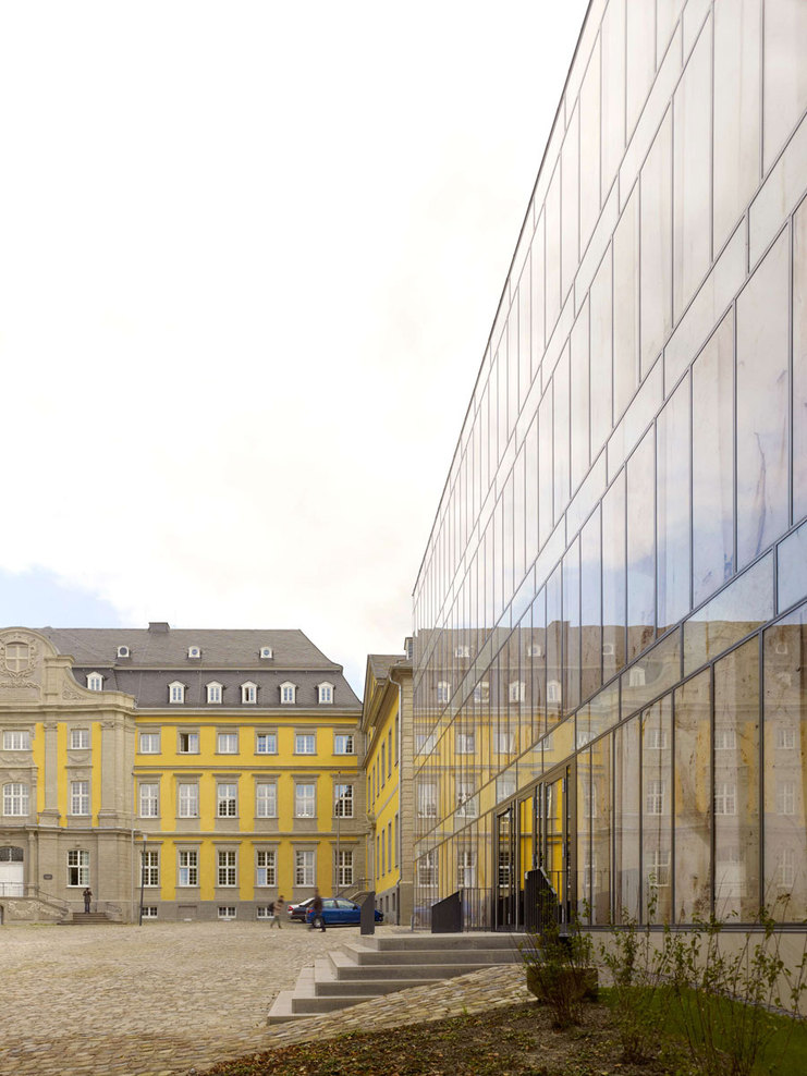
In 1811, while under French occupation, a prison was set up in Werden Abbey. The Prussians extended this and erected a hospital building on the south side of the courtyard. Upon the demolition of the hospital building, the remaining ensemble of buildings looked unbalanced. Without reproducing the original shape of the prison, the new building encloses this side of the courtyard with its voluminous crystalline structure. The new building’s eastern side adjoins the so-called administrative wing of the old abbey. The volume of the new building corresponds approximately to that of the Prussian wing across the courtyard.
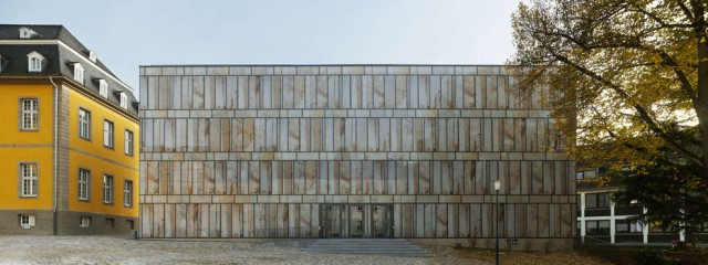
Folkwang Library was conceived as a monolithic body built atop the level base of an old rough stone wall. Max Dudler’s concept for the building is based on the idea of the ‘museum showcase’: An exterior shell protecting the valuable contents within. The functional areas are grouped around the reading room, which lies at the centre of the building. The book shelves are arranged in strict order around this room, thereby lending scale and structure to the building as a whole. There are two entrances to the library: The main entrance is from the courtyard via a flight of external steps, designed to approximate the style of the entrances to the other buildings leading off from the courtyard. The library’s other entrance on the Klemensborn serves as an emergency exit. Lending desks, media cubicles, an administration area and cloakroom are situated on the ground floor; the reading room on the first floor. The compact archives are housed in the library’s basement.
The design of the building’s facade was developed in collaboration with the photographer Stefan Müller. Every pane of glass in the facade depicts a large format close-up of a quarry. These photographs reproduce the unhewn stone in its original size. The photographic works were applied directly onto the glazing using a special technique. In keeping with the elemental meaning of the number twelve in music, twelve motives were pieced together into an overall composition. As with the scagliola technique of the Renaissance used to create stucco marbling, this special photographic technique creates the illusion of the facade being fa- shioned from the stone material itself. At the same time, a tension is created between the imagery of the textured stone and the flat surface of the glass, reminiscent of the historical sgraffito technique, whereby a graphic embossing is etched into a smooth plaster surface. The new building’s smooth glass surfaces create the perfect impression of a polished monolith. But this is called into question by the translucency of the building’s exterior, thereby playfully breaking the boundaries both from inside and out. Silhouettes of people can be seen beyond the facade. The interior is bathed in a soft, filtered light. In the evening, the building illuminates the courtyard outside.
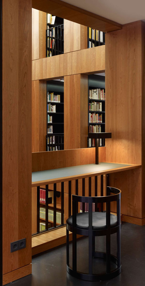
The building comprises a reinforced concrete skeleton with concrete cores to provide stiffening. The glass facade is attached to the building’s projecting structural slabs using the mullion-transom system. The concrete pillars are shaped and positioned according to the dimensions of the book shelves. The pillars are clad in cherry wood, which is also used for the shelving in the reading room. Not all the pillars are load-bearing. Some are used as part of an ‘inert’ air-conditioning system. With the ventilation pipes being channelled directly through the reinforced concrete ceilings, this building material’s potential as a heat sink is thereby put to good use. Through coupling this with a heat exchanger, an innovative contribution to energy efficiency is achieved.










4 Comments
Estoy totalmente de acuerdo con Maria Antonia Mir, he pensado lo mismo cuando la he visto. Un interior con materiales de Kahn y un exterior con materiales de SOM.Un proyecto locuaz.
Me recuerda muchísimo a esta otra biblioteca en Berlin: jacob und wilhelm grimm zentrum
Un volumen y unas fachadas muy interesantes, sobre todo cuando se iluminan de noche… pero el interior no parece muy agradable como biblioteca. Demasiados guiños a los estilos de los años 20 ó 30, espacios demasiado estrechos (dada su altura) y, lo más extraño de todo, un edificio de fachadas de vidrio que no recibe prácticamente luz a través de las fachadas, sino por el techo. De acuerdo, las bibliotecas deben evitar la luz directa, pero: 1- Se trata de Alemania, la luz directa no es un gran problema. 2- Los colores y la rigidez de la disposición geométrica de estructura y materiales le restan aún más luz. No sé, no creo que un edificio deba diseñarse a base de demasiadas ideas, así que los dos proyectos (fachada y espacios), no me parecen muy relacionados…
Me gusta. Mezcla de L. Kahn y de Som.